The top 25 field designs in college football, ranked

The top 25 field designs in college football, ranked
No. 25: Buffalo
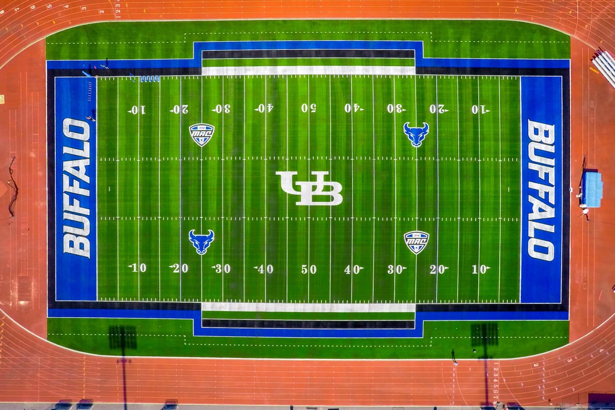
Cool blue end zones with a modern edge to the font. The bull logos on the 25-yard lines are a nice touch, getting the University of Buffalo into the rankings.
No. 24: Notre Dame
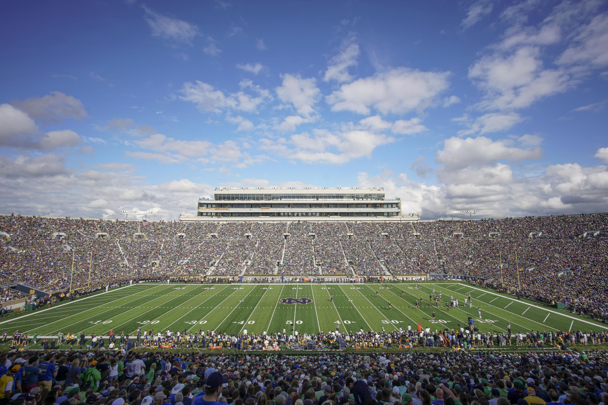
Notre Dame's field has always been a classic look, most notably the slash lines in each end zone. The nine in each end zone total 18 and each line is at a 42 degree angle, symbolizing the year 1842, the school's inaugural year. However, while I appreciate the tradition, the design is boring.
No. 23: Wisconsin
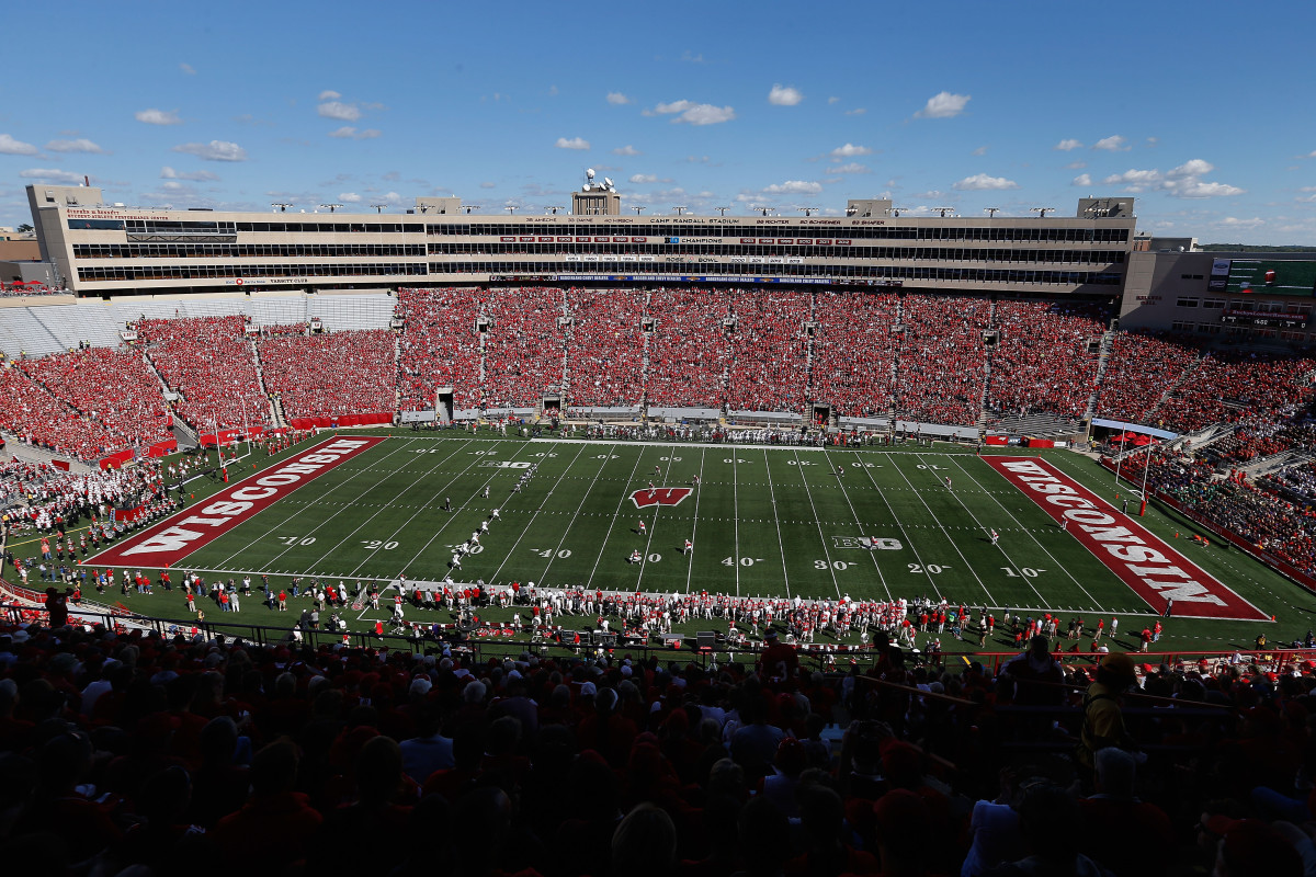
Wisconsin's field has a crisp, bold look. Nothing eye popping, but the font in each end zone goes well with the bright red in the background. The "W" logo midfield is simple, but it works.
No. 22: Coastal Carolina
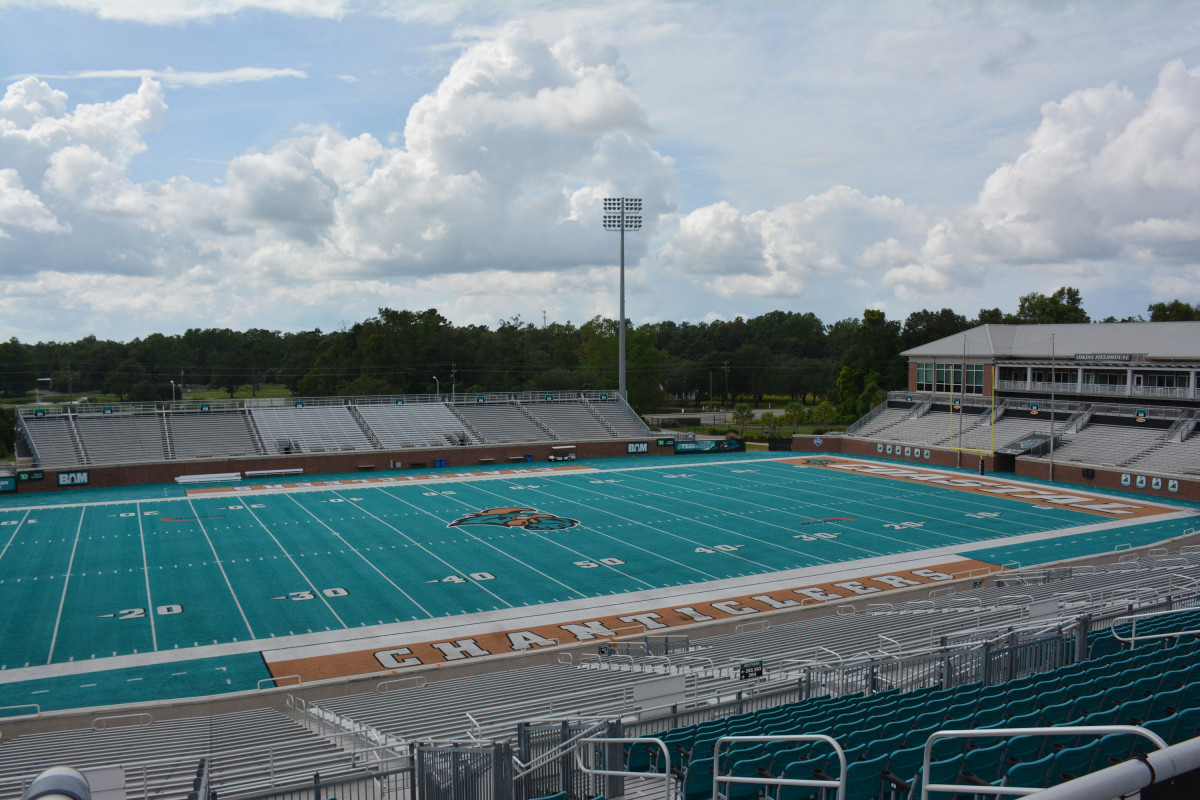
Coastal Carolina put in teal (!) artificial turf in 2015 and it looks good. The Chanticleer logo midfield is a great touch.
No. 21: Ole Miss
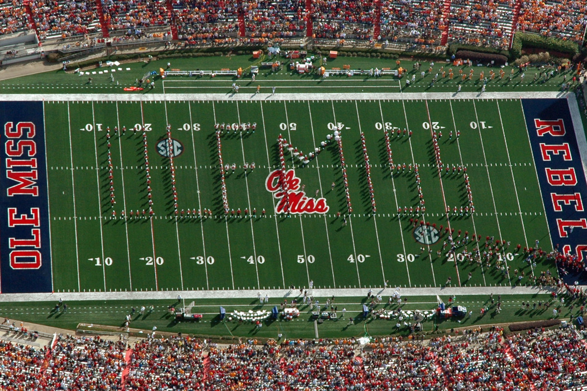
The dark blue backdrop for the red script in each end zone works well. Ole Miss now has a grass field after a number of years with turf.
No. 20: Florida State
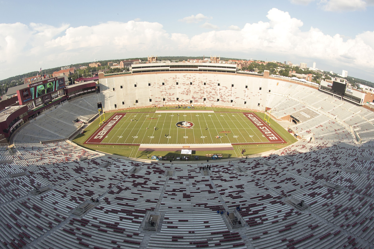
The end zones really lift Florida State here. The color scheme is great, and the font has an edge to it that brings out the field's boldness.
No. 19: Michigan State
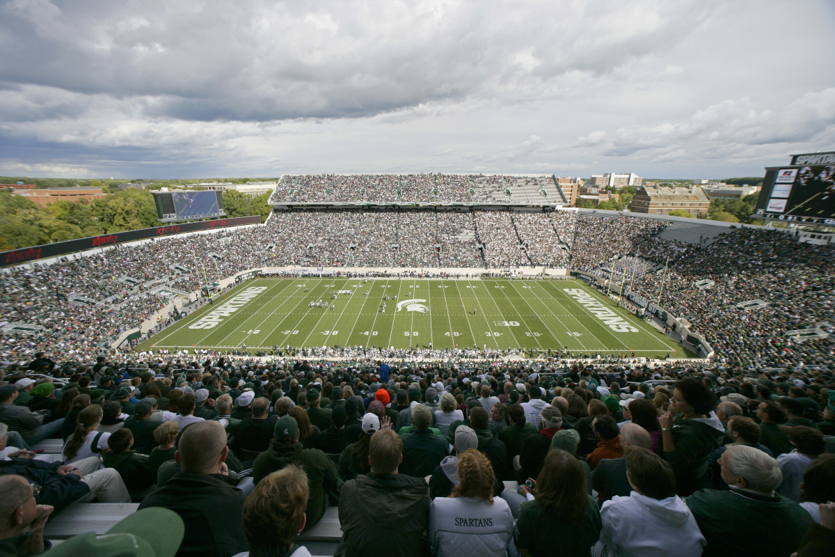
It's simple for Michigan State. The field is all green and the designs are all white. It fits and the font is one of the best in college sports. It helps that the Spartan makes such a cool logo.
No. 18: Kentucky
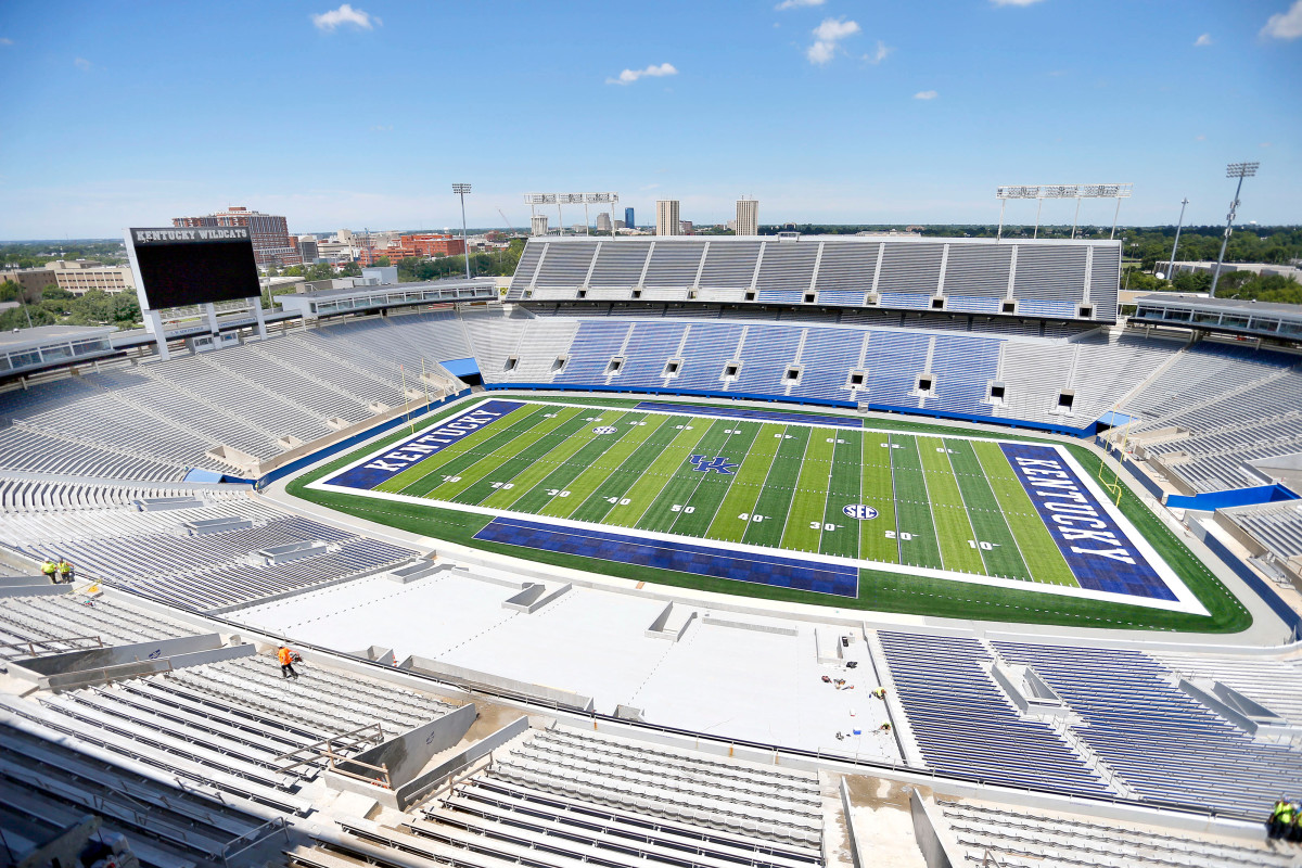
Renovated in 2015, Kentucky's field is far superior to what it once was. Bold blue end zones, and the two-tone green of the field is a perfect match. It's too bad the team hasn't looked as good as its field.
No. 17: Cal
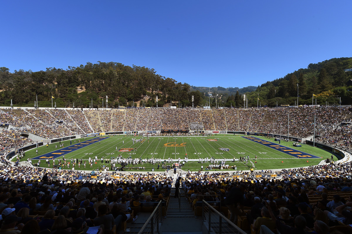
The blue and gold combo Cal rocks is awesome. The script Cal at midfield looks great, and the end zones aren't too shabby either.
No. 16: Texas
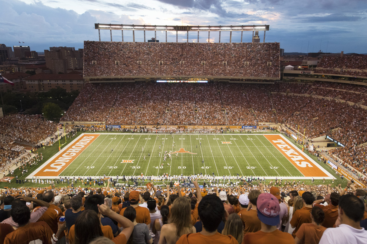
The Longhorn logo is fantastic. The burnt orange and white is a good look too.
No. 15: East Carolina
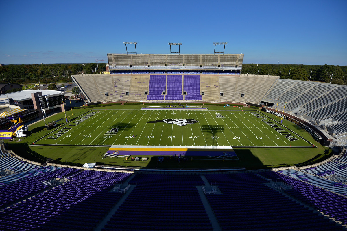
The blend of the state and intimidating pirate logo is awesome. The black, purple and gold is one of the more unique combos in college football.
No. 14: Wyoming
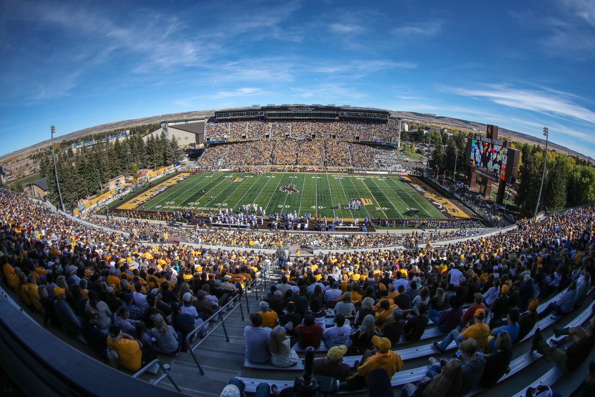
Wyoming's end zones are lined with the Rocky Mountains, a cool looking touch that few schools can do (and have it make sense). Fun fact: The stadium sits at an elevation of 7,215 feet above sea level—the highest of all FBS schools.
No. 13: Tennessee
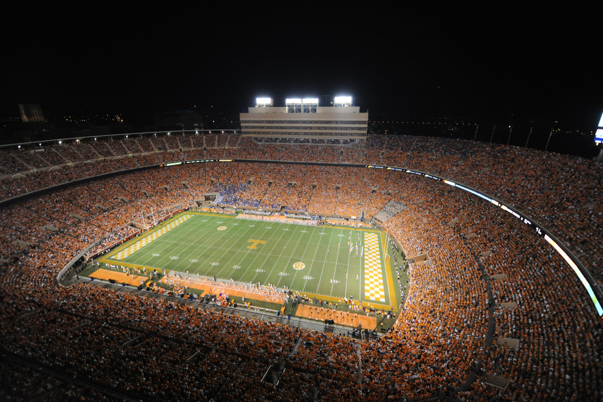
The checkered end zones are clearly what lifts Tennessee in these rankings. The look is better than Fresno State's version. The simple midfield logo is a nice complement to the busy end zones.
No. 12: North Carolina
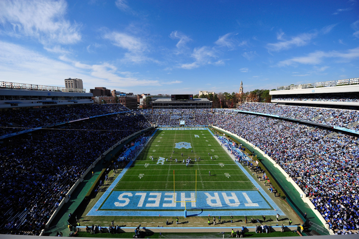
North Carolina changes its field a lot—and every version looks good. Whether it's the black and blue design, patriotic design or bright blue end zones like the picture here, the Tar Heels get it right.
No. 11: Rice
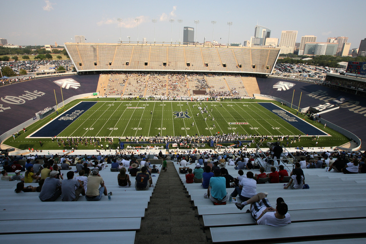
I'm a sucker for some Old English–style script. Rice uses it in each end zone as well as for the school's logo at midfield. It's a great touch that I wish more schools would utilize.
No. 10: Eastern Washington
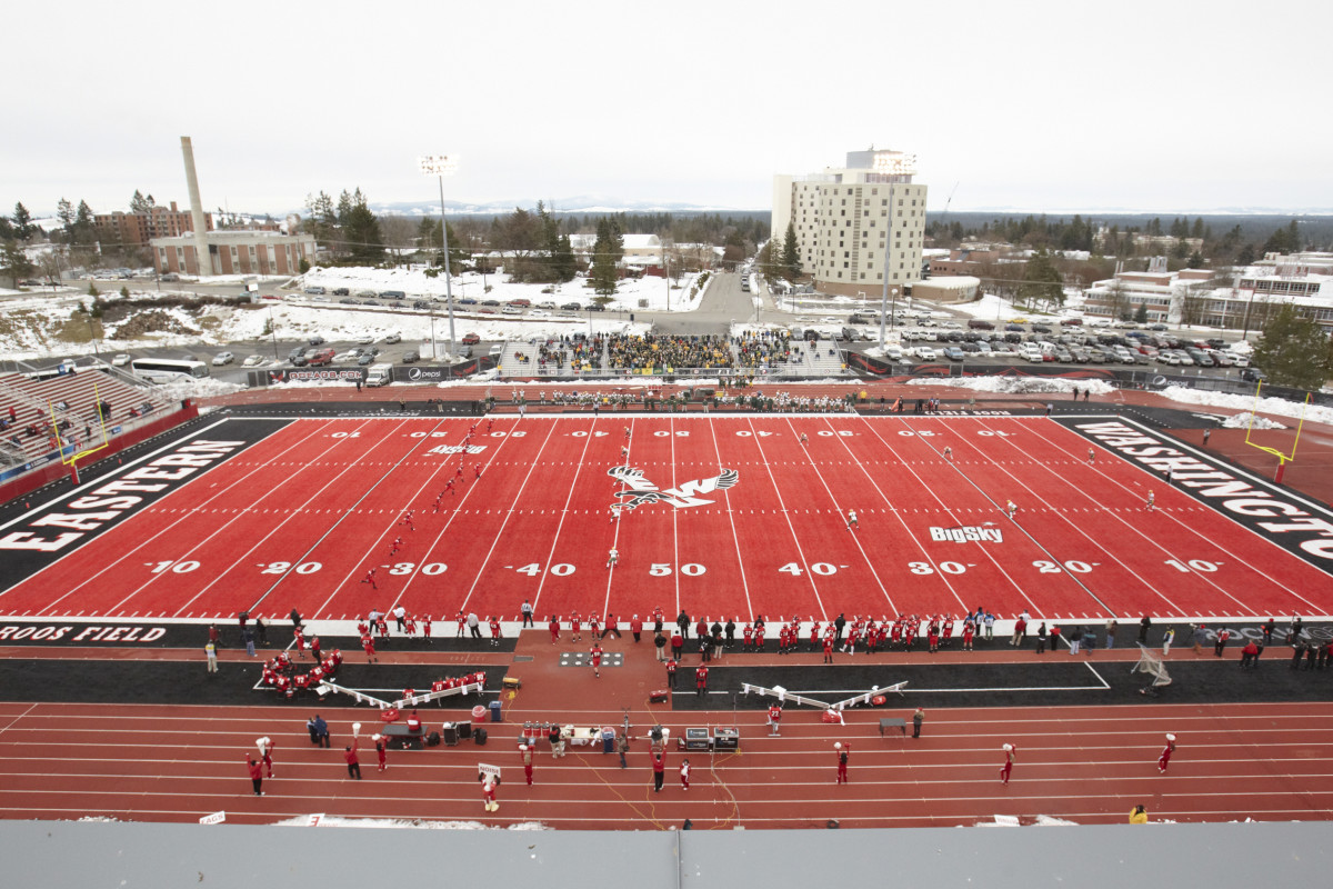
Eastern Washington's bright red field is extraordinarily unique, and that's why I love it. The red turf was installed in 2010.
No. 9: Central Arkansas
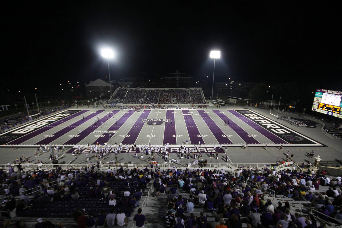
Easily the most unique design in these rankings. The purple and silver stripes are bold and actually look great. The intimidating purple bear at midfield was cool on its own, so put it all together and you have one of the best fields in all of college football.
No. 8: Eastern Michigan
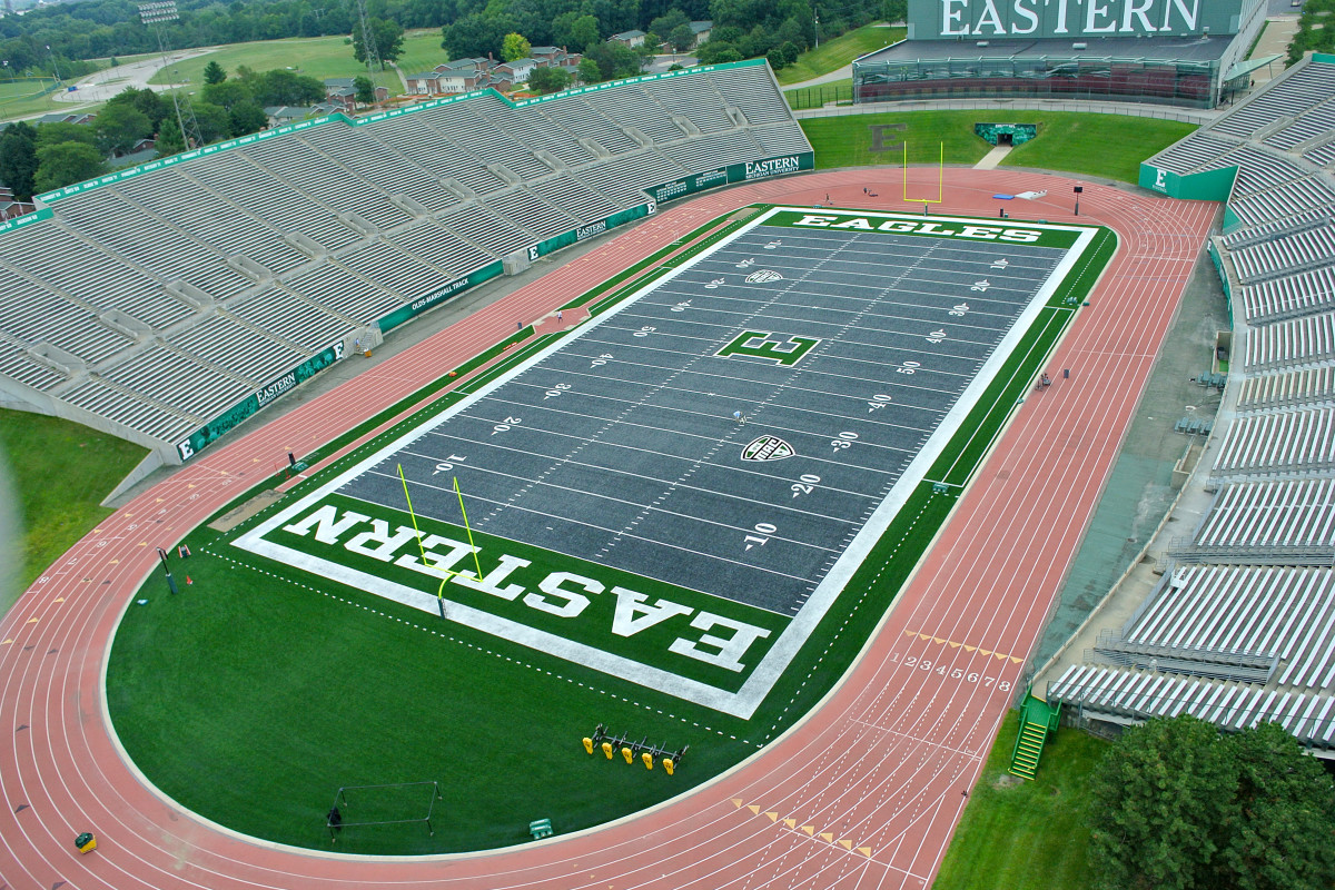
Eastern Michigan also has a non-traditional field color. The steel gray turf was installed in 2014 and looks fantastic. The green in the end zones and midfield logo make it a perfect match. It's not too in your face, but it still manages a distinct look.
No. 7: LSU
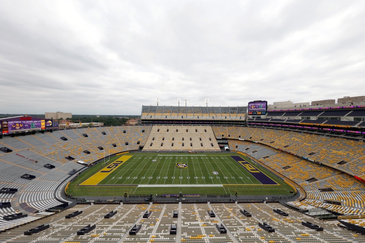
It's the tiger eye. That alone boosts LSU into the top 10. It's such a cool midfield logo, and it really looks intimidating—especially during night games. The end zones are fine, but could be dazzled up more with claw marks or something of that nature.
No. 6: UNLV
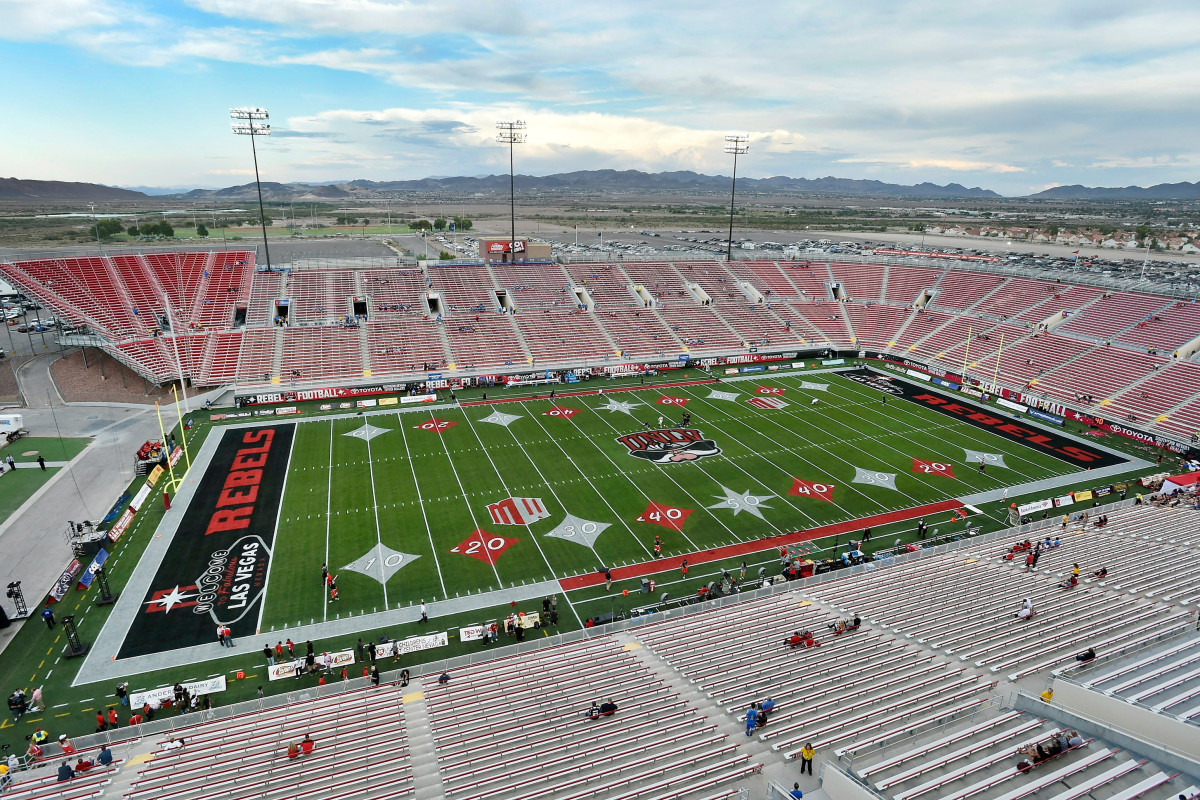
UNLV has one of the most fun field designs in college football. It blends Las Vegas culture with its field and doesn't have the same yard line markers as the rest of the country. What happens in Sam Boyd Stadium stays in Sam Boyd Stadium.
No. 5: Michigan
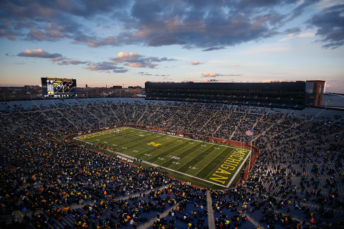
The block M is the best letter logo in college sports. The classic maize script in each end zone pops off the field and creates a very crisp, clean look.
No. 4: Oregon
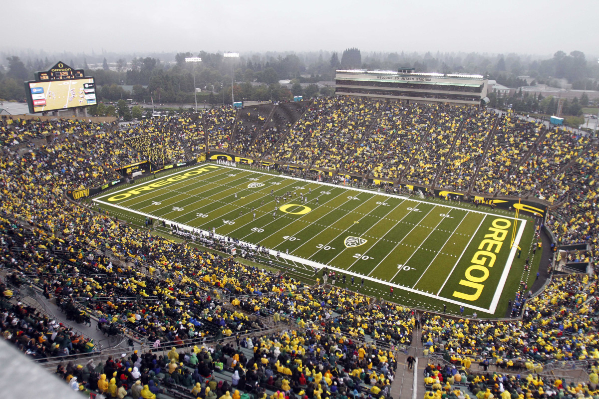
Like Michigan, the yellow just looks good on a football field. The font is unique in the end zones, and like Kentucky, Oregon has a two-tone field with alternating shades of green.
No. 3: Florida
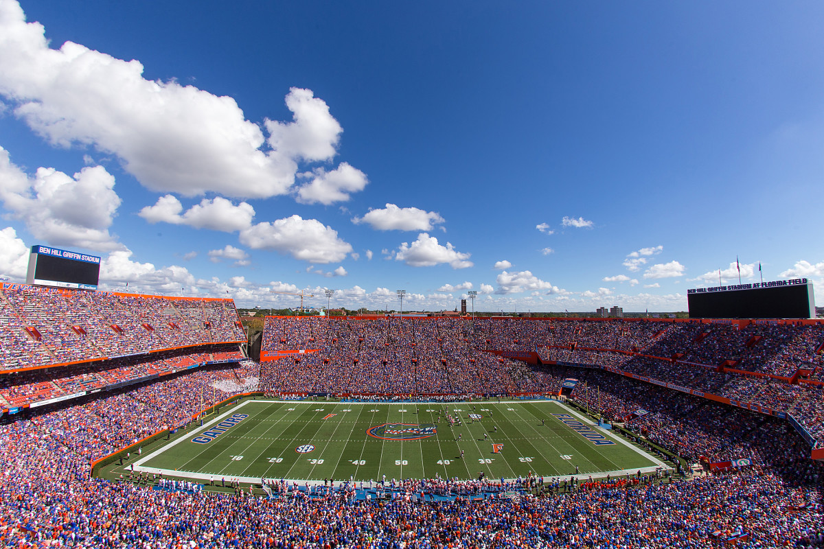
The gator logo is the best all-around in college football. It's a cool, intimidating look full of color. The only way this field could be any better is if the end zones were more vibrant.
No. 2: Boise State
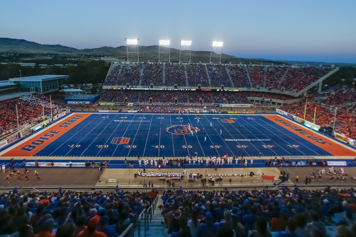
The bright blue field is phenomenal. The electric orange end zones are amazing. The field is so great that I'd watch Boise State games just to see the field. Installed in 1986, the blue field is the original non-traditional look in all of college football. While other colorful fields appear in these rankings, none compare to Boise State's.
No. 1: The Rose Bowl
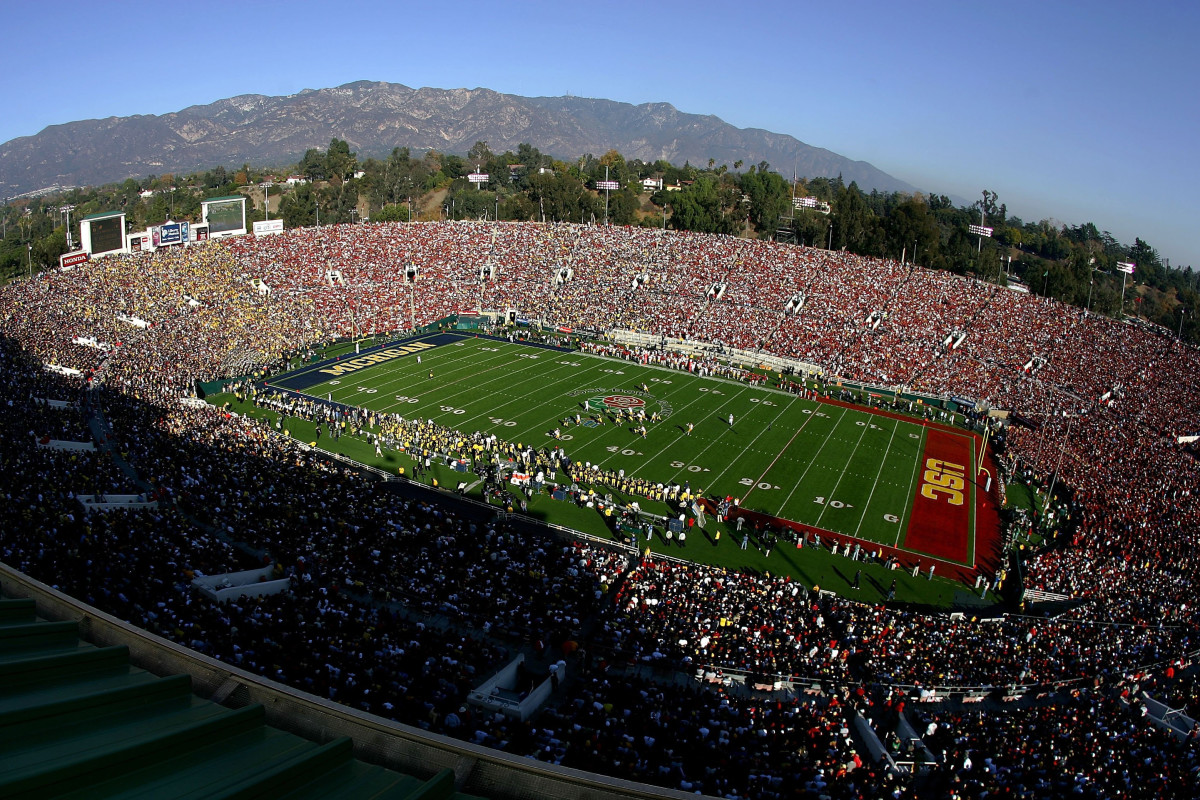
It takes the Granddaddy of them all to top Boise State. There is nothing more classic, nothing more timeless than The Rose Bowl Game. The large rose at midfield is iconic, and each end zone is colorfully painted with each participating team. Ultimately, it's the best overall field design in all of college football.
