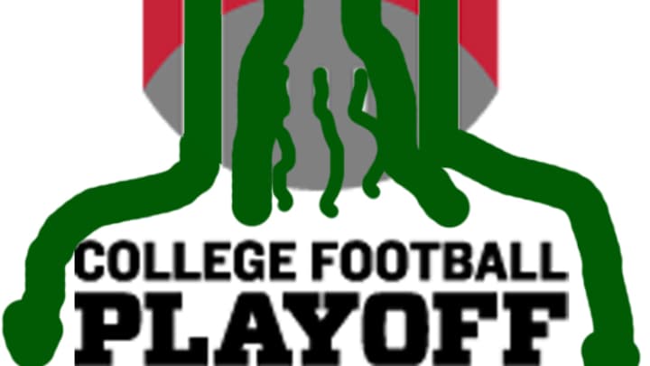
College Football Playoff logos are breathtakingly uninspired

If we can depart from almost everybody else for just a minute: Naming the college football playoff the College Football Playoff was an inspired move. We're not kidding. The worst anyone can say is that it's boring, and this counts as a resounding win for its creators. Stretching beyond naming a thing what it is is how we ended up with "Leaders and Legends."
However. These logos? Are gross. There was no reason to apply the same strategy to graphics work, y'all. At least get the Rose Bowl people to sketch something out for you next time you need to turn up pretty.
http://youtu.be/P5OrLU8tRHU
Interested fans and aficionados of metallic genital imagery can vote for their preferred playoff logo through next Monday. (Afraid of a four-way tie? The good folks of Good Bull Hunting have solved that for you.)
If we may, for a moment, shill for the least of four evils: The badge-looking one on the left evokes nothing so much as soccer, and could serve to bridge the cultural divide between Football People and Other Football People. It's also easily convertible into a Lovecraftian stamp, in anticipation of Cthulhu's return to reassert his dominion over the earth:
But as of this writing, the 16-bit compass rose on the right is the runaway leader. Small wonder a playoff has taken this long to come about, when its controlling interests are clearly operating on computers capable of nothing more complicated than an afternoon playing DinoPark Tycoon.
