10 worst college football uniforms of all time

Notre Dame introduced the Shamrock Series in 2009 when they played Washington State at the Alamodome in San Antonio. Seven years later, the Irish are preparing for a return trip to southeastern Texas with a perfect 7-0 mark in the neutral-site series.
Instead of reaching 8-0 with a victory over Army on Nov. 12, Brian Kelly's team will return to South Bend with a loss, one they earned not for their performance on the Alamodome turf against the Black Knights, but one from their collaboration with Under Armour on some of the ugliest uniforms in college football history.
In the spirit of their Shamrock Series digs, we ranked the top 10 worst college football uniforms ever unveiled.
10. Northwestern
Northwestern Gothic. Coming 10.18.14. #B1GCats pic.twitter.com/Axf1iXSF9j
— Northwestern Football (@NUFBFamily) October 6, 2014
Northwestern has struggled with uniforms for decades, failing to find a common ground of simplicity and panache. Among their failures were the gothic uniforms, first introduced in 2014 and worn again in 2015.
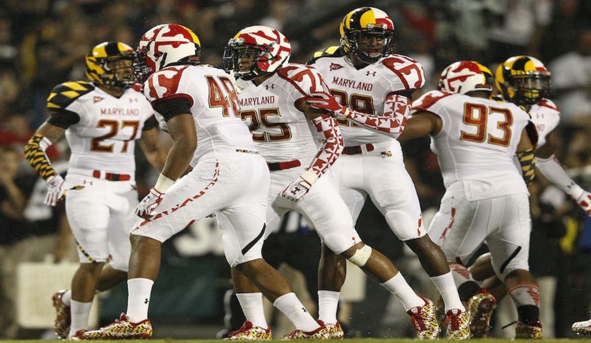
9. Maryland

AP Photo/Patrick Semansky
Maryland's experimentation with the state flag in their "Maryland Pride" collection could not have gone worse. Under Armour has created a few versions of uniforms that resemble a vomiting bumble bee getting slaughtered, and although not all were complete disasters, most were very irresponsibly aggressive.
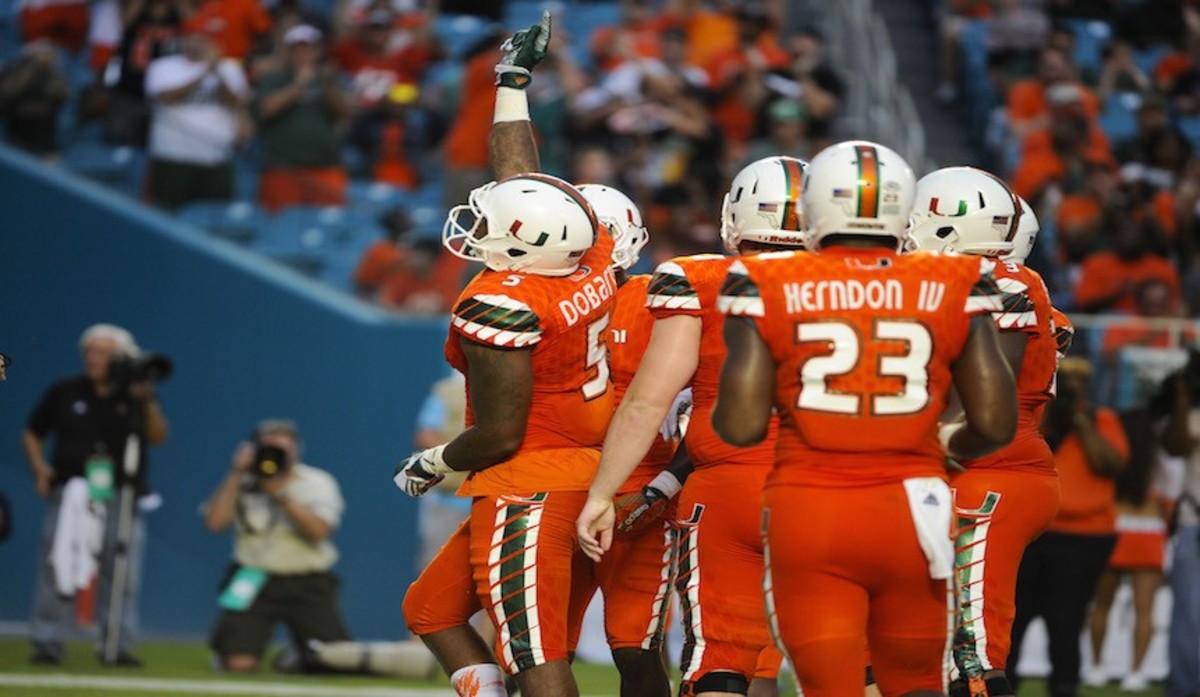
8. Miami

Icon Sportswire via AP Images
Miami, once a premier uniform program, has fallen on hard times. The Hurricanes reached rock bottom in September 2015 when they wore home and away uniforms with arguably the worst lettering in college sports history.
7. Kansas
Kansas introduced the Crimson Chrome uniforms in 2014, and were greeted with harsh reactions. The oversized Jayhawk head helmet logo is overkill, as are the cheap-looking silver and blue shoulder logos.
6. Louisville
Soar Higher. Score Faster.
— adidas Football US (@adidasFballUS) June 25, 2015
Another look at @UofLFootball's #UNCAGED uniform. #L1C4 #teamadidas pic.twitter.com/rkRMmxpa6T
Louisville's 'Uncaged' uniforms from 2015 were an utter failure on many levels. Their bizarre oversized cardinal helmet logo and Pop Warner-quality jersey numbering and lettering are among Adidas' many misfires over the last two years.
5. Notre Dame
You've seen the #ShamrockSeries uniform — now take a closer look at the details. pic.twitter.com/9CNsD9M5wm
— Notre Dame Football (@NDFootball) July 22, 2016
Without the hand-painted helmets, the Irish would rank higher. But unlike Navy's stunning hand-painted helmets from 2015, they're not enough to carry the entire uniform. The dark green and gold makes us wonder if Grey Poupon is the official sponsor of the 2016 Shamrock Series.
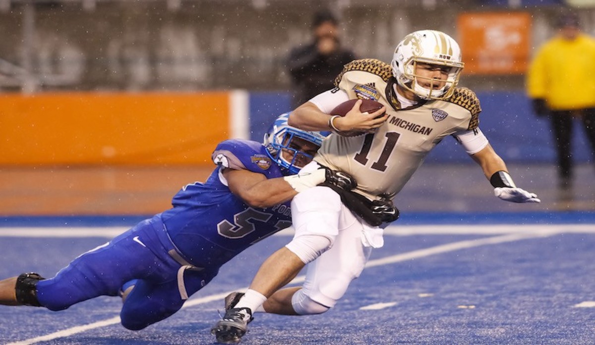
4. Western Michigan

AP Photo/Otto Kitsinger
Brown is a hard color to work with, therefore save a little compassion for Western Michigan. However, adding more brown and hints of gold doesn't make things better, as was the case with their Row the Boat digs in the 2014 Famous Idaho Bowl bowl.
3. UCLA
City of Angels. City of Bruins.
— adidas Football US (@adidasFballUS) July 16, 2014
UCLA pays tribute to L.A. with new #LASteel alternate TECHFIT uniforms.#teamadidas pic.twitter.com/WobZVhu8XI
Gray uniforms are difficult, but the Bruins rolled the dice in 2014 with their "LA Steel" uniforms. Unsurprisingly, they didn't roll snake eyes and were left with atrocious all-dark grey digs with cheap, screen-printed multi-colored numbers.
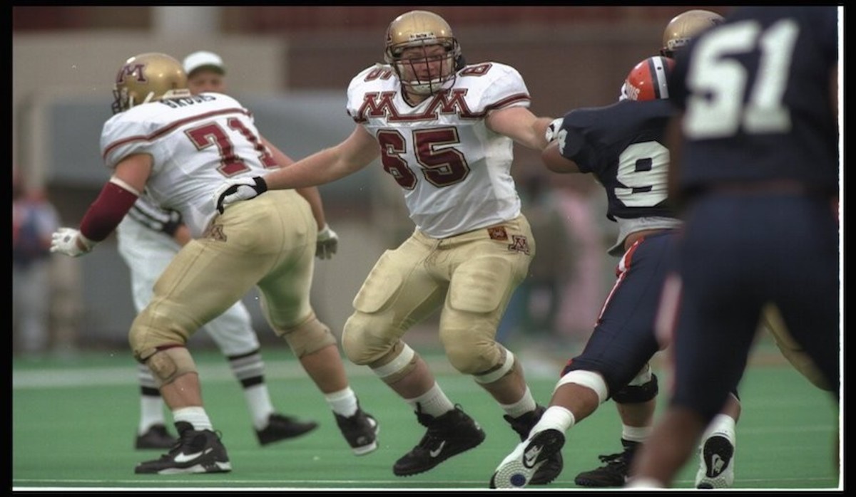
2. Minnesota

Brian Bahr/Getty
Long before the Gophers finally nailed it with their current Nike uniforms, they donned many offensive styles, including this peculiar double-M design from the mid-1990s.
1. Louisiana - Monroe
A little sneak peak of the best new Uni's in the country #BeatWake #CamoOut #RISE pic.twitter.com/YyACGTlR8h
— ULM Warhawks (@ULMWarhawks) August 28, 2014
ULM deserves a hat tip for their creative season-opening Camo Out in 2014. That hat tip is reduced to a casual nod after seeing their camo jerseys. Sorry, Warhawks, swamp camo and football don't mix.
