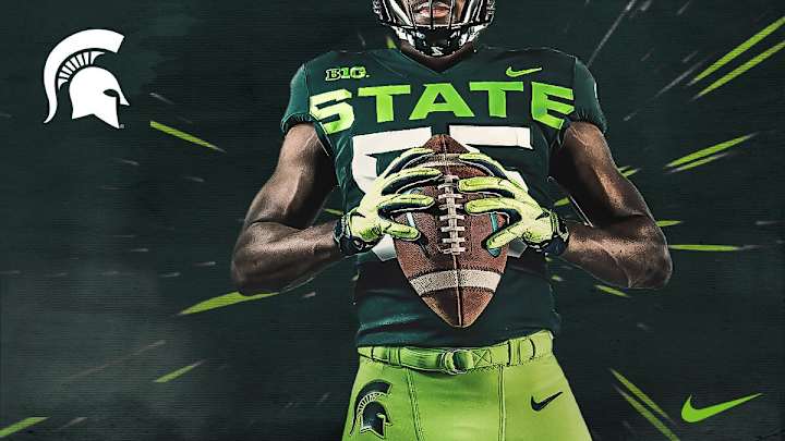
Michigan State’s Abominable Neon Uniforms Are Worse Than We Feared

Sorry, Spartans fans. Your team’s new alternate uniforms for this season are somehow uglier than we initially feared.
Back in April, Michigan State revealed a mock-up for some radioactive-green unis so blindingly bright they’d leave Oregon fans squinting. Between the green-on-green clash and the foot-high “STATE” lettering, there was plenty to hate.
Spartans reveal new alternate uniforms for 2019 👀 pic.twitter.com/qlnFWYMK7c
— Michigan State Football (@MSU_Football) April 13, 2019
But the photos the team shared were filtered in that unnatural way all college football team graphics always are, so there was some hope that the finished product could be more appealing. Sadly, it is not.
The Athletic’s MSU beat writer, Colton Pouncy, shared a photo of the uniform in the flesh at Spartan Stadium.
It’s here pic.twitter.com/Jc71CpRsys
— Colton Pouncy (@colton_pouncy) August 5, 2019
It seems the initial photos actually managed to obscure how atrociously neon the color scheme is. The pants look like they’ve been dyed with Mountain Dew and there’s a hideous white stripe running down the side of them.
The scary thing is, it’s not hard to imagine a scenario in which the unis look even worse. The big white letters and the bright green features really pop under the bright lights of the football facility, but how will they look under the cloudy autumn sky in East Lansing? They could somehow be a dull neon. Yuck.

Dan Gartland writes Sports Illustrated’s flagship daily newsletter, SI:AM, and is the host of the “Stadium Wonders” video series. He joined the SI staff in 2014, having previously been published on Deadspin and Slate. Gartland, a graduate of Fordham University, is a former Sports Jeopardy! champion (Season 1, Episode 5).