Latest Renderings of a Slimmed-Down New Golden State Warriors Arena Released

Latest Renderings of a Slimmed-Down New Golden State Warriors Arena Released
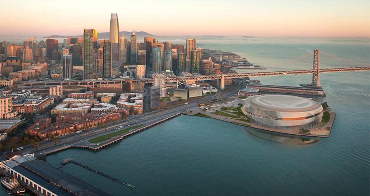
The first of three new images
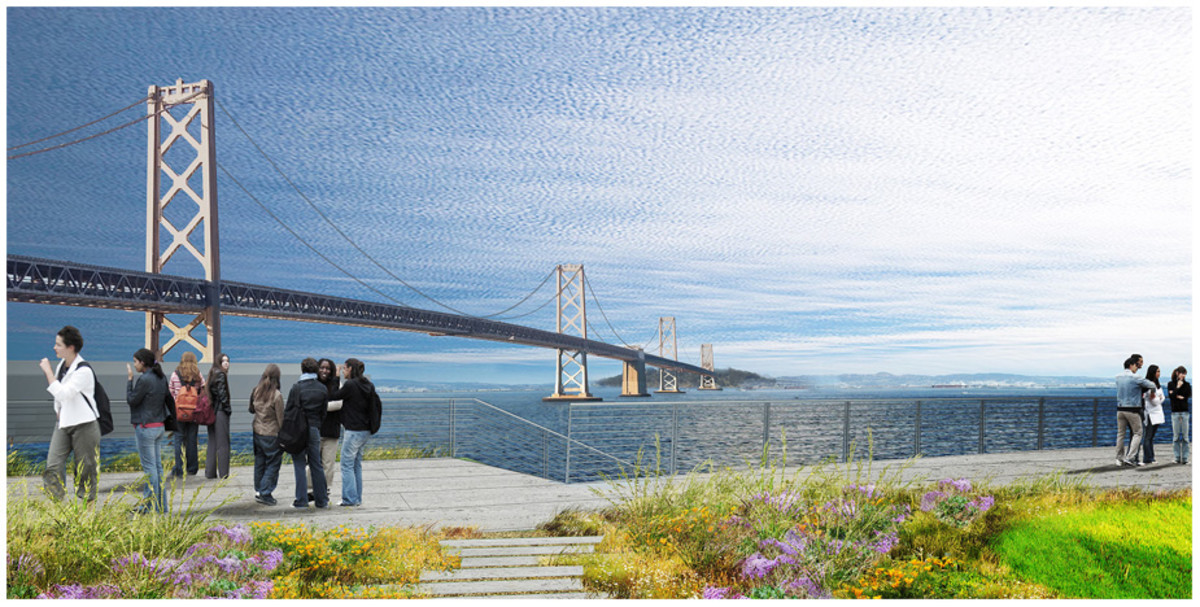
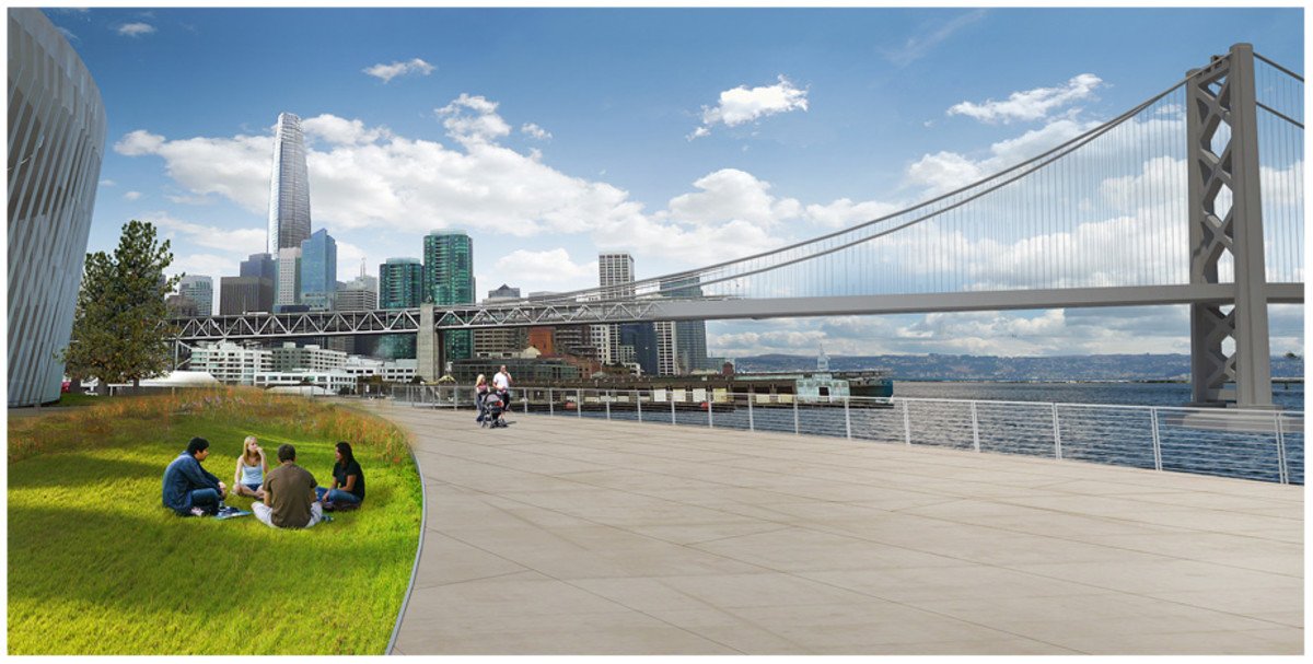
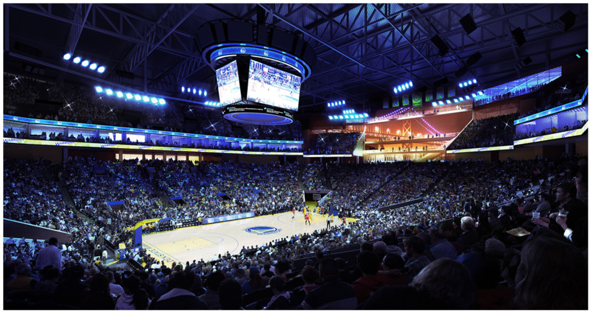
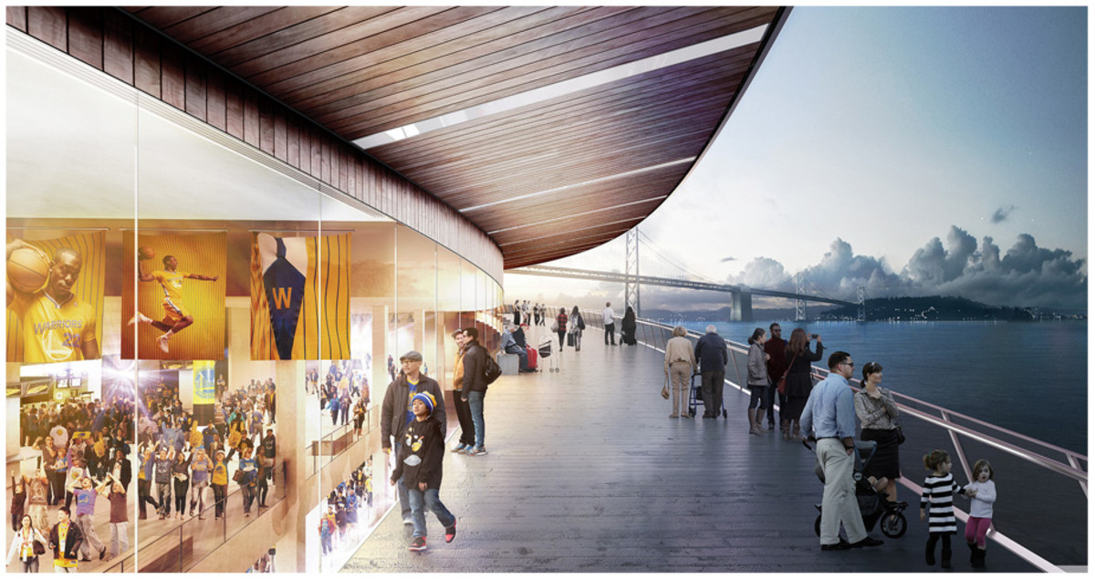
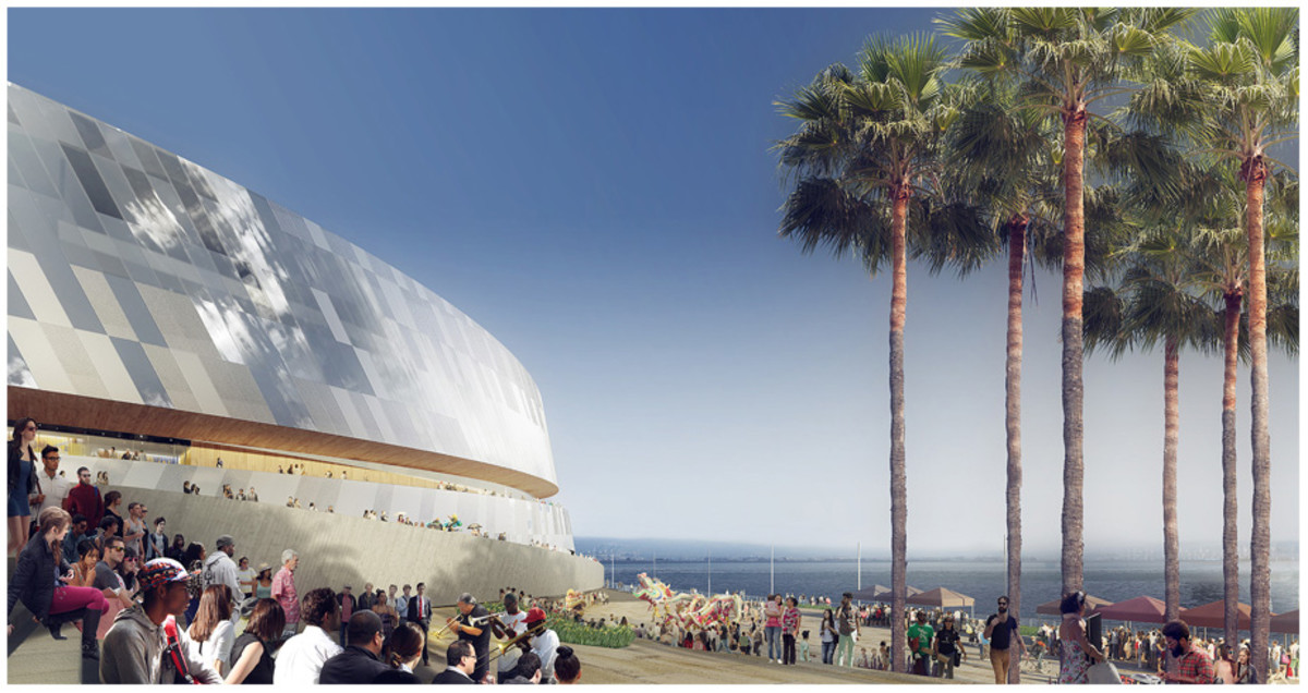
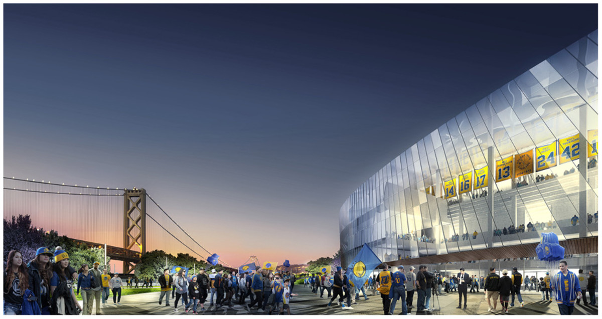
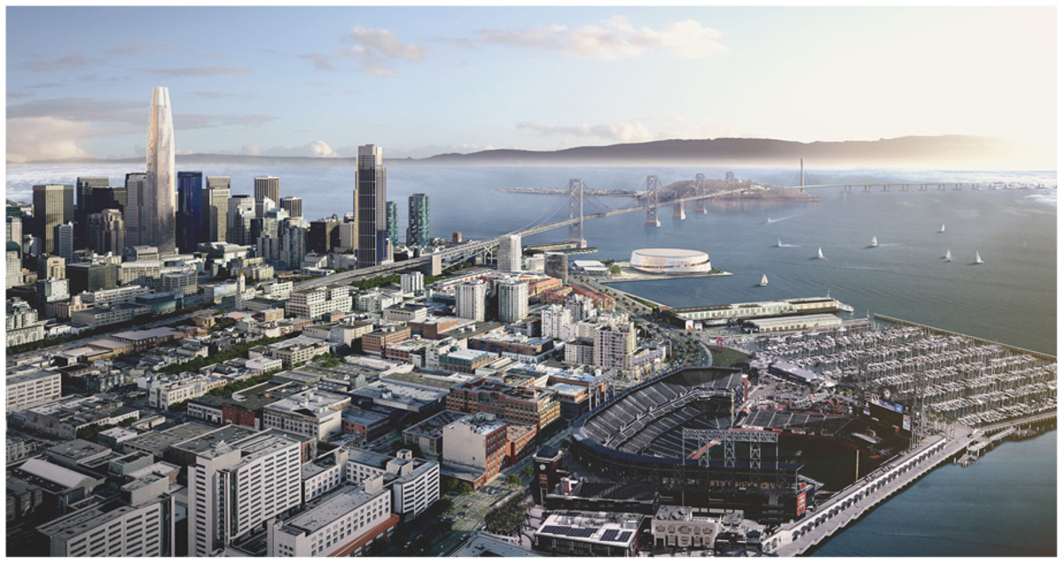
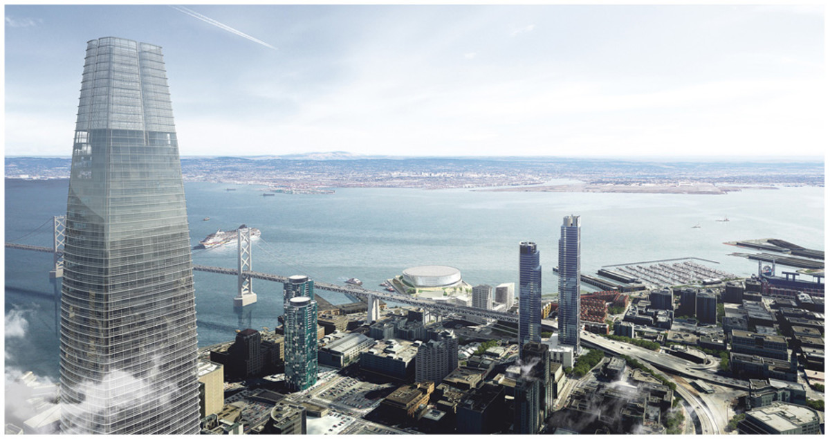
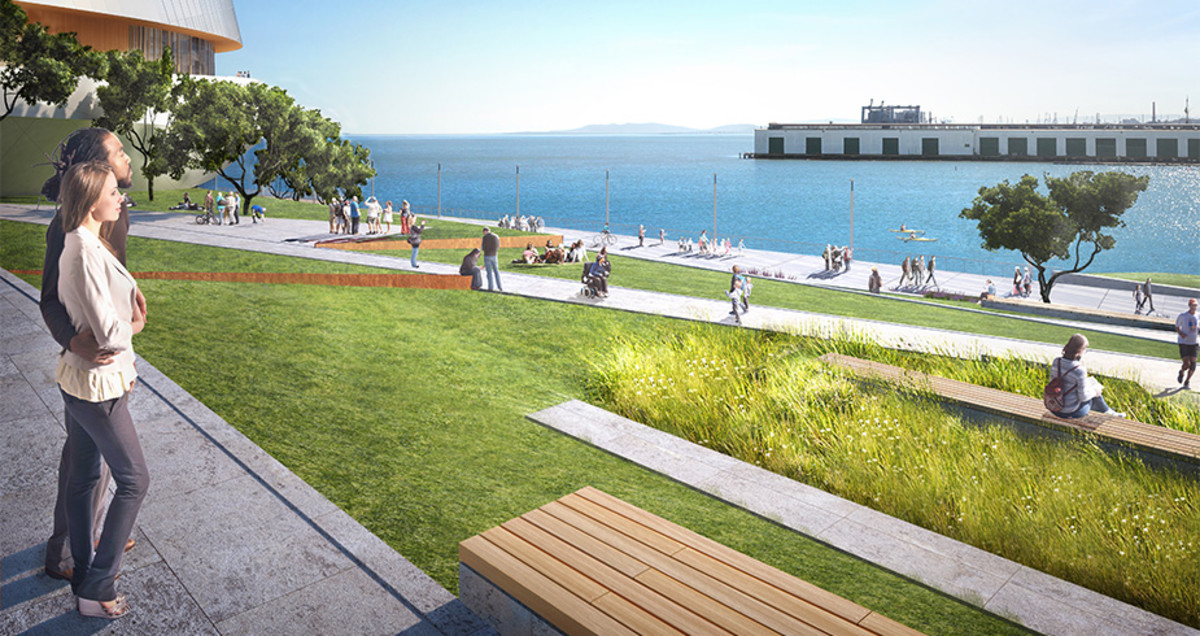
The third of three new images
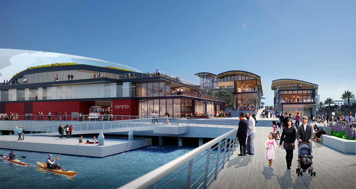
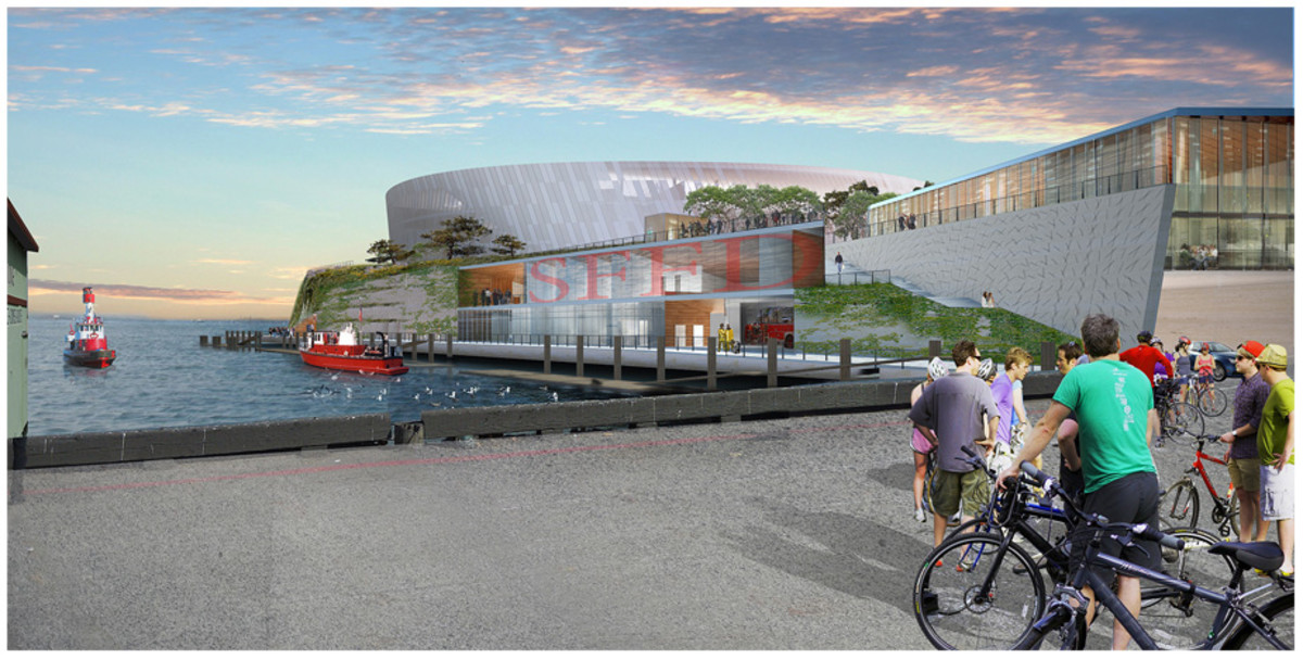
The second of three new images
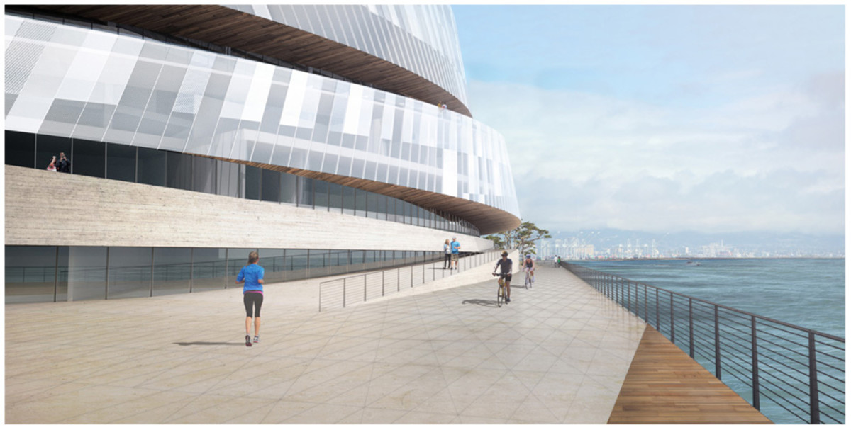
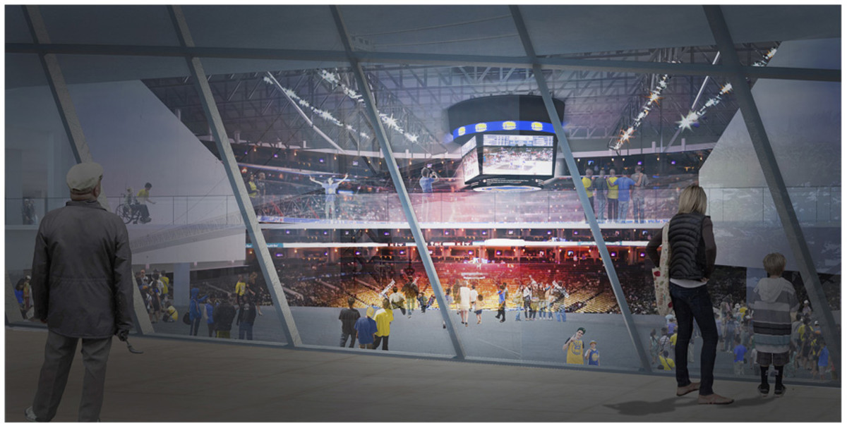
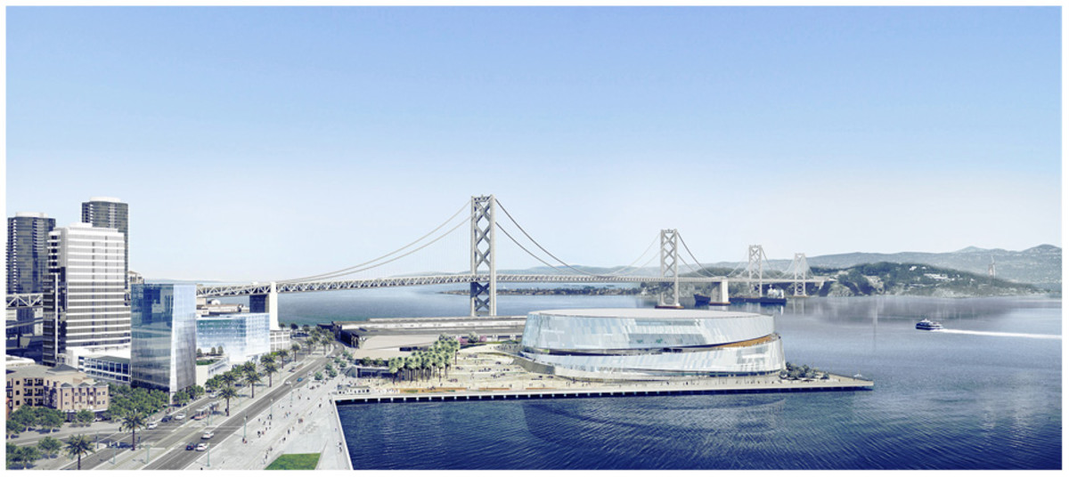
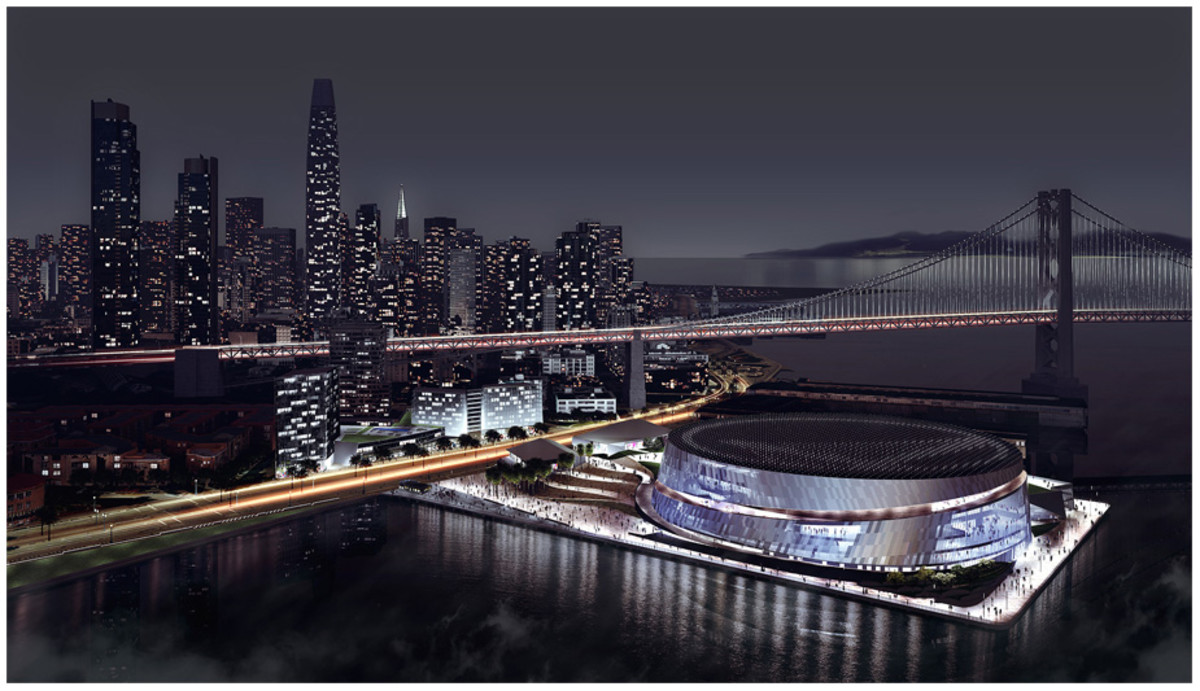
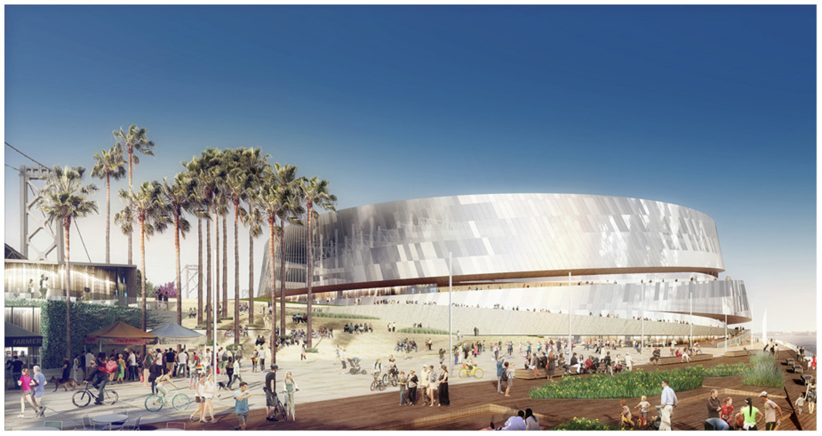
The Golden State Warriors call this newest slate of “event pavilion” renderings from architect Snohetta “Design 3.0.”
Released on Tuesday, the three fresh images for the pavilion—henceforth referred to as an arena—fall in stride with the dozen or so previously released views of the building the team wants to place on what is now a 13-acre pier under the shadow of the shiny new Bay Bridge.
The Warriors want to move from Oakland’s Oracle Arena right across the bay, have the city of San Francisco gift them land—which isn’t a hard sell because the piers need more than $50 million worth of work just to not fall into the water—and spend up to $170 million of private money to rebuild Piers 30-32 on San Francisco’s The Embarcadero. As the team wades through the bureaucracy involved with placing an arena downtown, they’ve offered to pony up and privately finance the building.
By slimming down the latest version of the waterfront plan, they've also try to appease local concerns.
The arena—with a flashy window to let those out look in and those in look at that beautiful new bridge—couples with public parks, plazas, and a fire hall to create something out of what is now basically nothing. This third version cuts the arena roof height to 125 feet tall, as per neighborhood concerns, reduces the space of the entire arena by over 30,000 square feet—but still with 18,064 seats—and increases the total open space to 60 percent (7.6 acres) of the site.
Plus, they added in a deep-water berth. And, come on, who doesn’t want a deep-water berth?
Tim Newcomb covers stadiums, design and technology for Sports Illustrated. Follow him on Twitter at @tdnewcomb.
