Call it a comeback: 90s jerseys that need to be revived - Part 2

In case you missed it last week, we highlighted some NBA & NHL teams who should consider bringing back their 1990s jerseys on a full-time basis. This week we take a look at MLB & NFL franchises who should revisit their '90s fashion statements. There were plenty of amazing jerseys to choose from, but -- just to be clear -- not EVERYTHING from the '90s should be replicated (looking at you, Turn Ahead The Clock jerseys).
Anaheim Angels
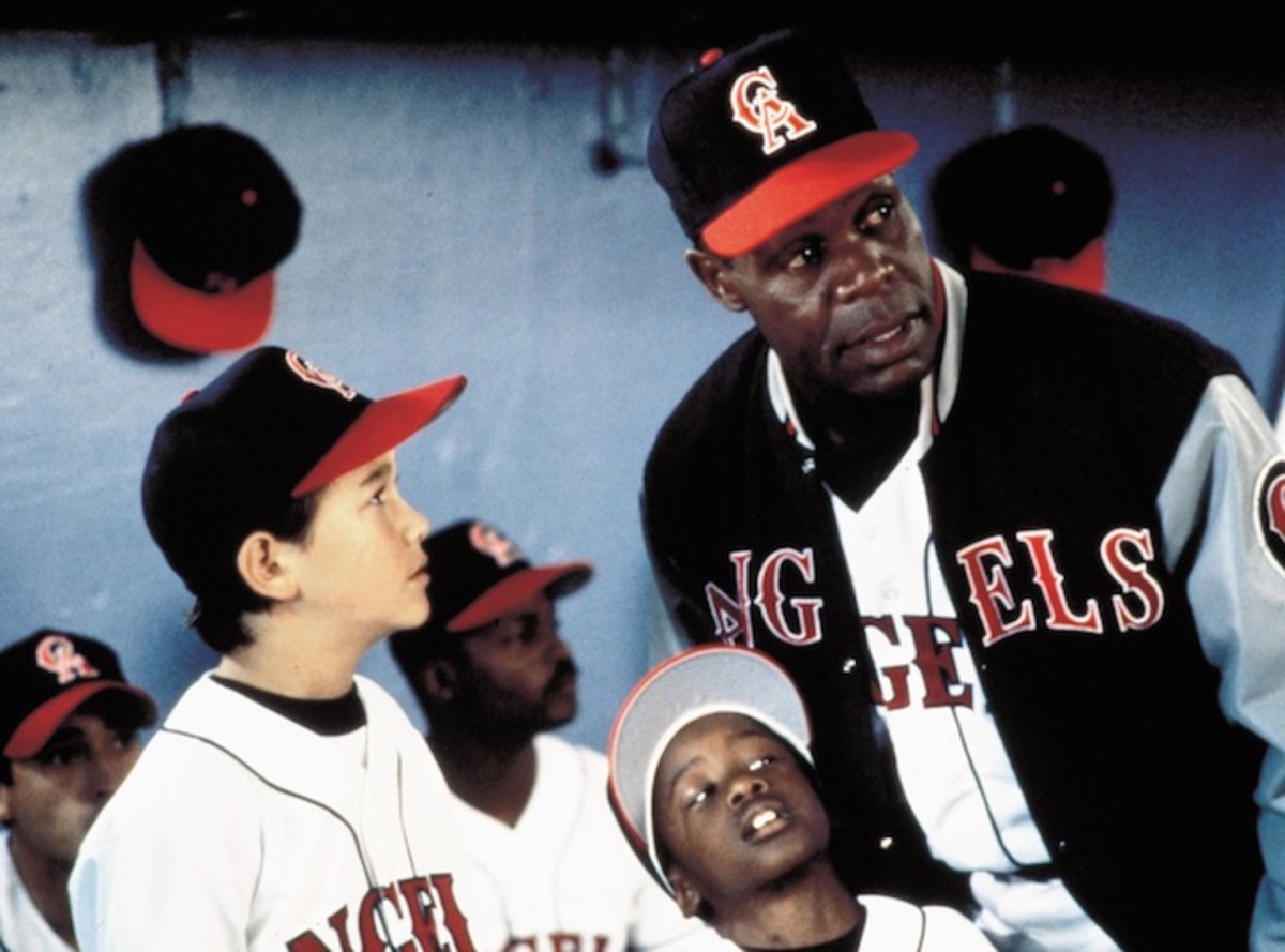
Pretty much all of the California Angels uniforms were better than the ones the franchise used after switching to the Anaheim Angels and, later, the Los Angeles Angels of Anaheim (I still don't totally understand that), but these ones from the early '90s were pretty great.
The 13 most depressing lines from Angels in the Outfield
I'm a huge fan of the hat (especially the two-toned version) and think the team should revert to the California Angels just so it can use them again, not to mention the name would be a lot less confusing.
Bonus points for these unis being used in Angels In The Outfield.
Arizona Diamondbacks
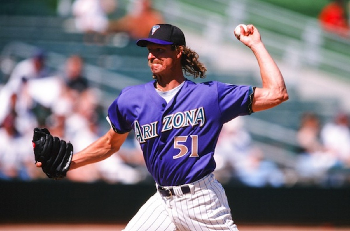
The D-Backs switched to a red, black & sand color scheme in 2006 and – while the new colors are tied to the Southwest desert region of the United States – their new uniforms look so very “blah.” The team’s original teal and purple look was much more unique and attractive.
Milwaukee Brewers
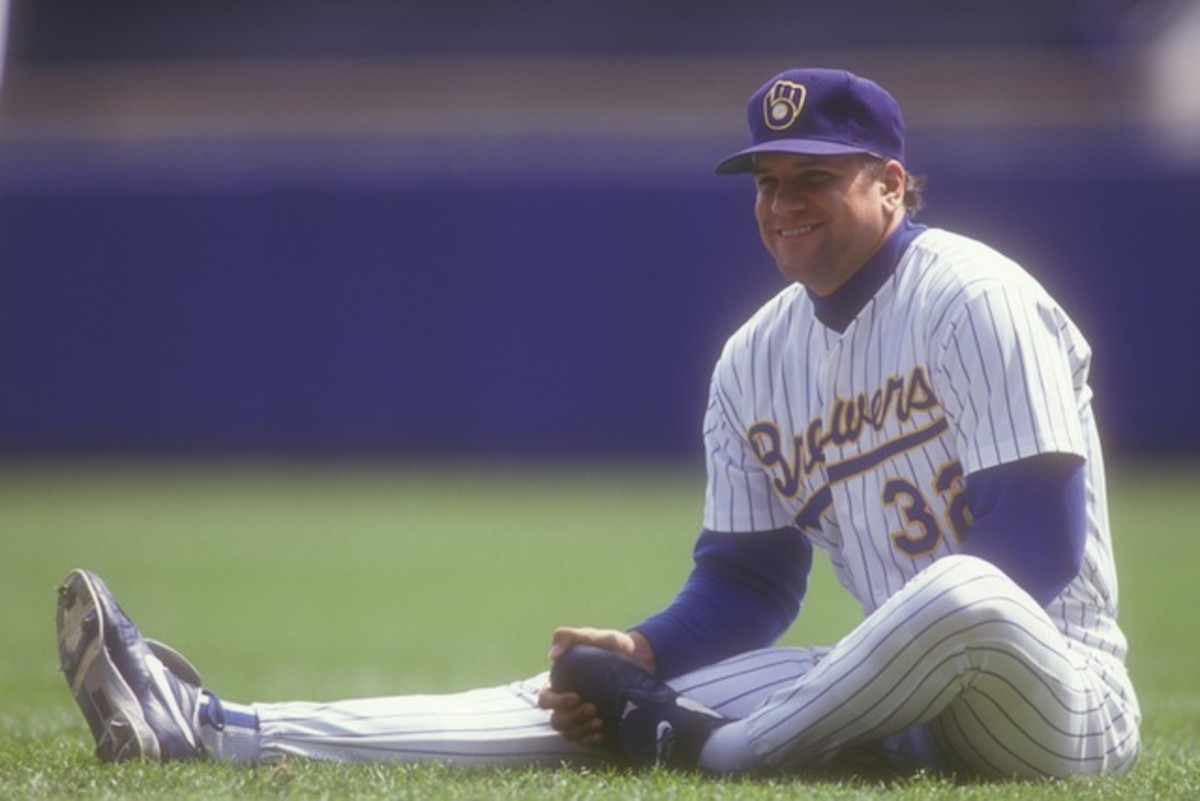
I am of the opinion that the Milwaukee Brewers glove logo is one of the best in the history of sports, and I’ve been pretty glad to see that the team has brought it back on an alternate basis. But a logo that good deserves full-time use, and the uniforms the Brew Crew used in the early '90s were arguably the best in franchise history. I’m a huge fan of the script used on the front and believe the white, gray, and baby blue versions would provide a major upgrade over their current full-time unis.
Florida Marlins
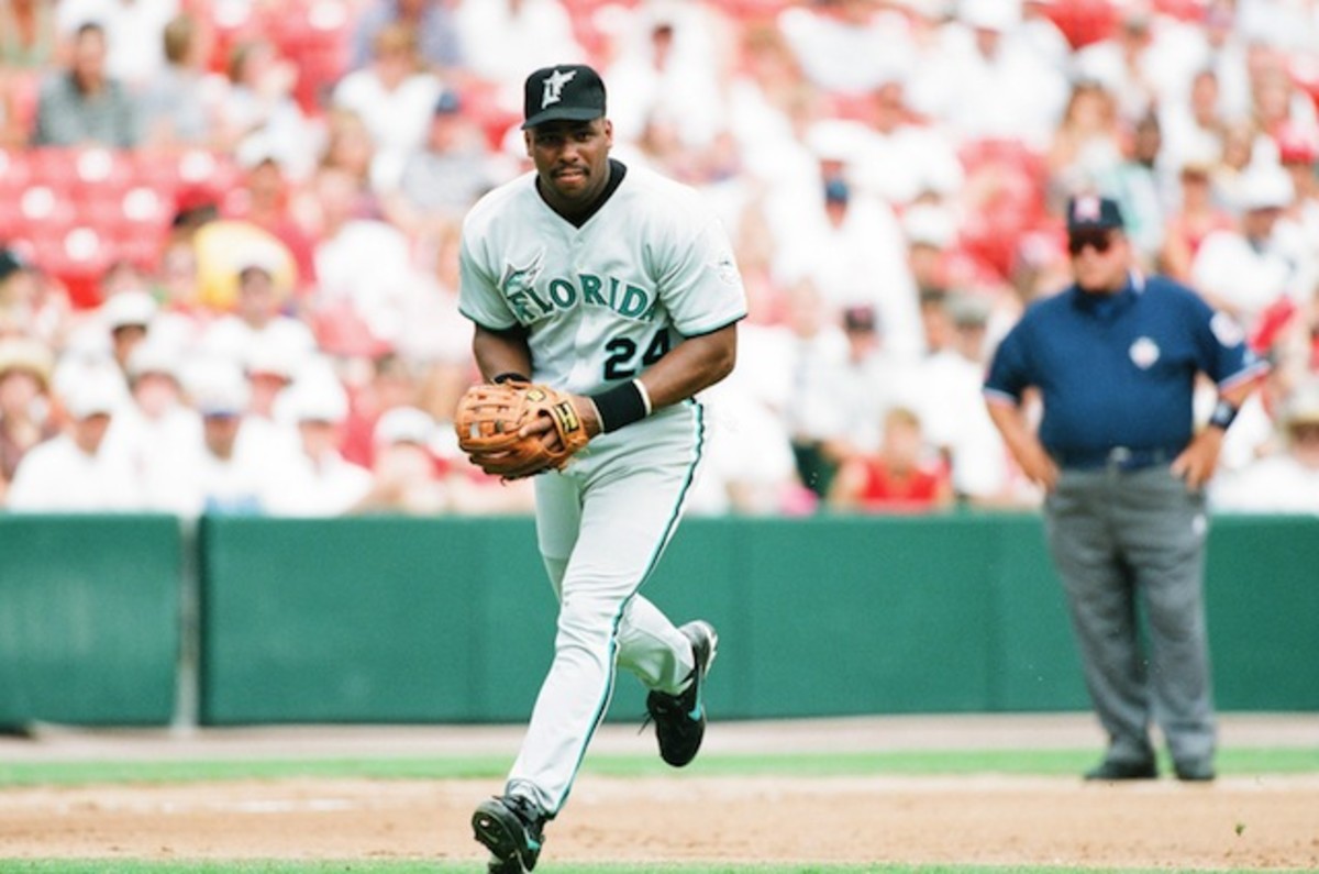
Since rebranding to the Miami Marlins, the team has introduced some very, um, “loud” uniforms that seem to draw polarizing opinions. Regardless, the original teal worked a lot better for South Florida, especially considering the Marlins won a couple of World Series with it.
San Diego Padres
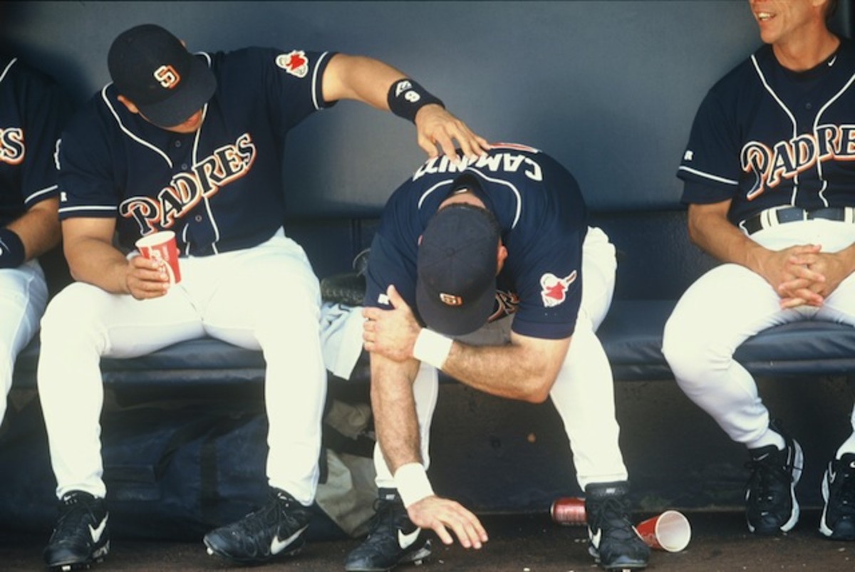
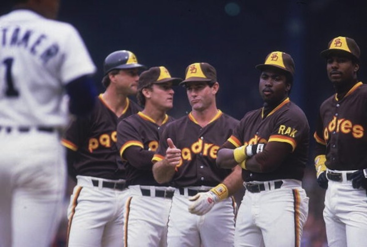
These '90s jerseys would definitely be a big upgrade from the terribly boring jerseys and hats the Padres currently wear, but if we're being honest, the best thing of all would be if they switched back to the brown and yellow digs they repped in the mid-70s and '80s:
Atlanta Falcons
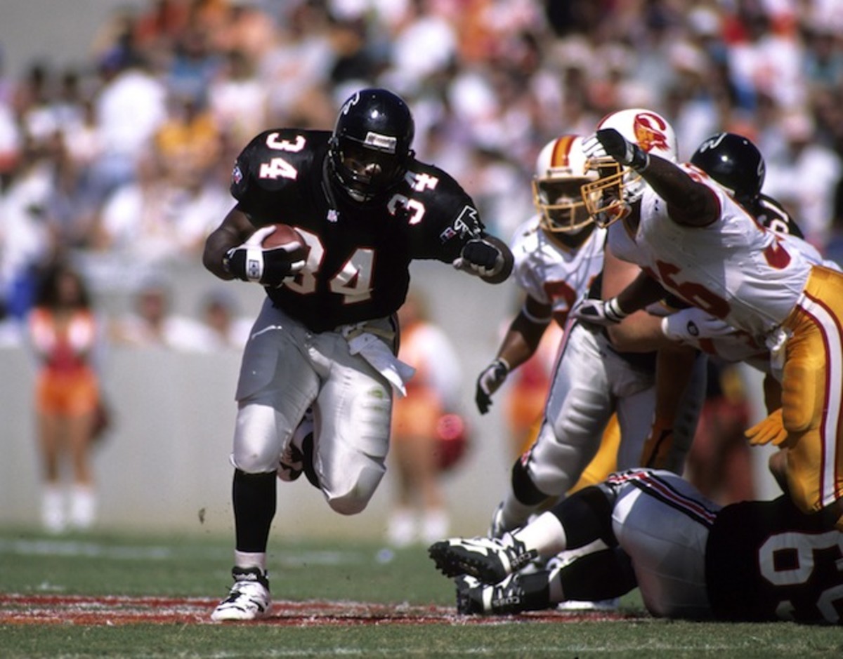
The Falcons were one of the most intimidating teams of the 1990s, and they had the jerseys to match. The all-black look was pretty menacing, and the red and whites were a fantastic complement. They were simple, but sometimes simple can be great.
Denver Broncos
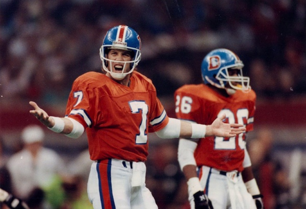
The Broncos never, ever should have moved on from this look. Not only was it one of the best uniforms of the decade, but also it remains one of the best in NFL history. Bring it back and never think about changing again.
New England Patriots
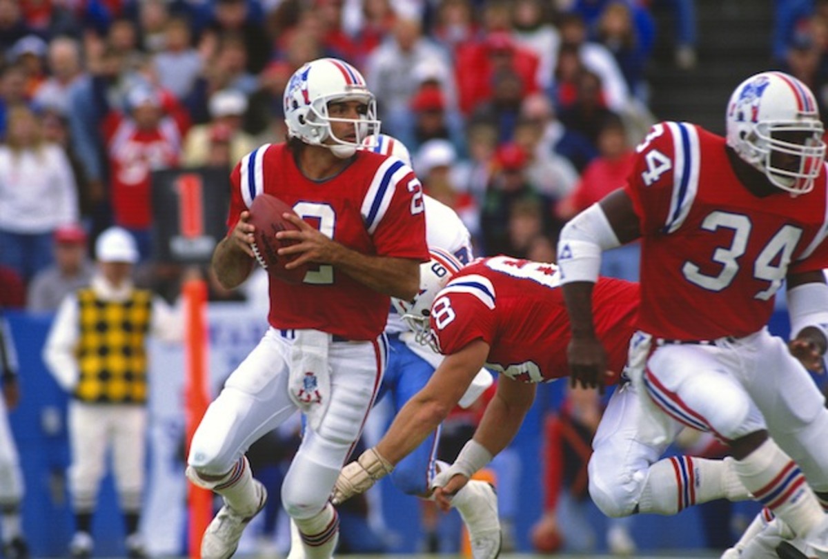
The Patriots' current uniforms are pretty great, but the team hasn't made any significant jersey changes since the turn of the century.
Call it a comeback: 90s jerseys that need to be revived
If and when Tom Brady ever retires, it might be a good idea to revisit the past and bring back the red and/or Pat Patriot logo -- which the team stopped using full-time in the early '90s -- to usher in a new era. It also wouldn't be a bad idea to bring back those simple (but awesome) blue uniforms that helped usher in the Drew Bledsoe era.
Philadelphia Eagles
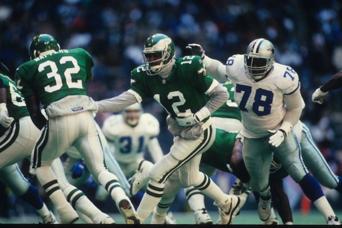
The Eagles moving away from the kelly green to a darker shade in the late '90s was another one of those "what are you thinking?" moments in the history of sports uniforms. The Eagles should always, always, ALWAYS use kelly green. Their '90s look was another one that mastered the art of simplicity.
Tampa Bay Buccaneers
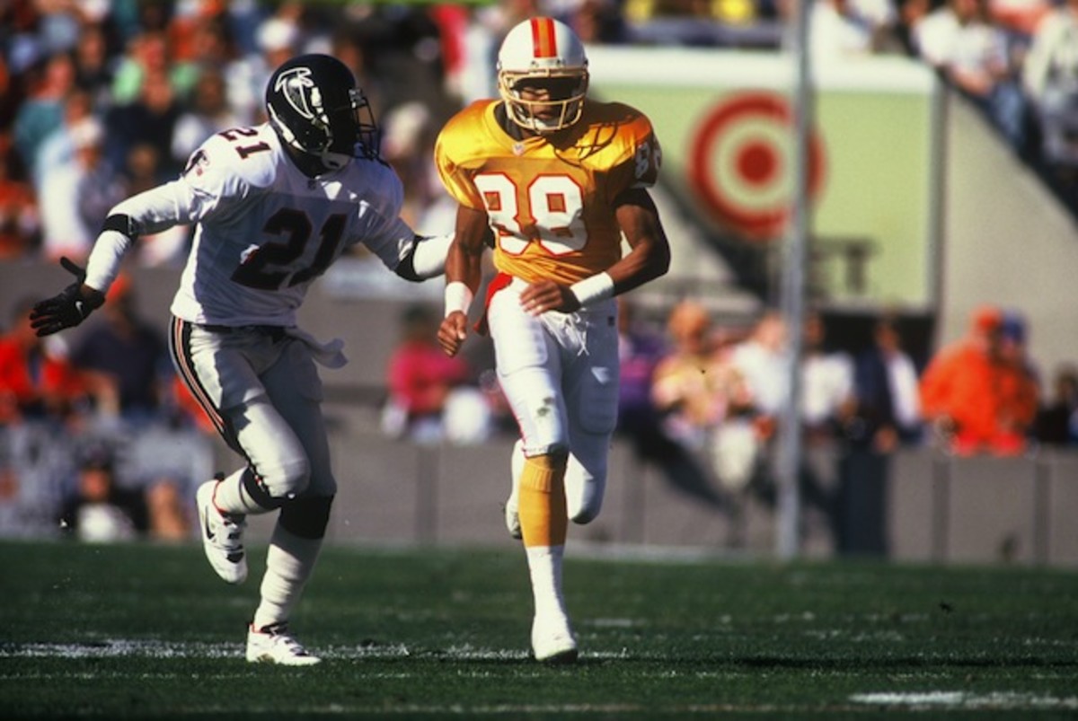
In the mid-90s, the Buccaneers moved on from the awesome creamsicle jerseys that they wore since their inception in 1976 to a darker, maroon-based look. Those were okay, but the team (smartly) seemed to be going back to the orange more and more as alternates, that is until the NFL instated a rule prohibiting teams from using more than one helmet per season -- putting the kibosh on a lot of awesome third jerseys. When the Bucs announced they would be unveiling new uniforms for this season, a lot of people -- including myself -- hoped they'd be bringing back the creamsicle. Instead, they went with these dumpster fires.
Pete Blackburn is a writer for Next Impulse Sports
