Monday's P.M. Hot Clicks: Jenell Hendrix; NHL's 20 Ugliest Jerseys
Follow Andy Gray on Twitter :: Become a fan of Extra Mustard on Facebook
The 20 Worst NHL Jerseys Ever
The 20 Worst NHL Jerseys of All Time
#20: 1995-97 Vancouver Canucks thirds
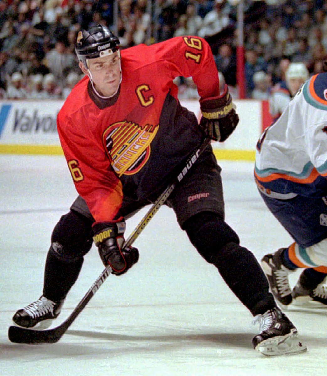
The spaghetti skate might be the NHL's biggest logo fail outside of Vancouver's own original stick-in-a-rink, but it never seemed quite so excessive as when it was applied to these shocking alternates. Add in the unbalanced yellow V that bisects the logo and slides off to the right side and take away the shoulder and arm piping and you're left with a jersey that's somehow overly busy and sadly plain at the same time.
#19: 2009-11 Ottawa Senators thirds
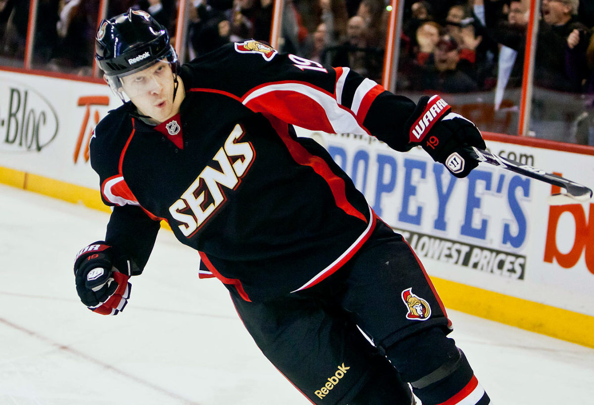
The Canadiens have an abbreviated nickname too, but you'd never catch them slapping it on the front of a jersey.
#18: 1998-2006 Calgary Flames thirds
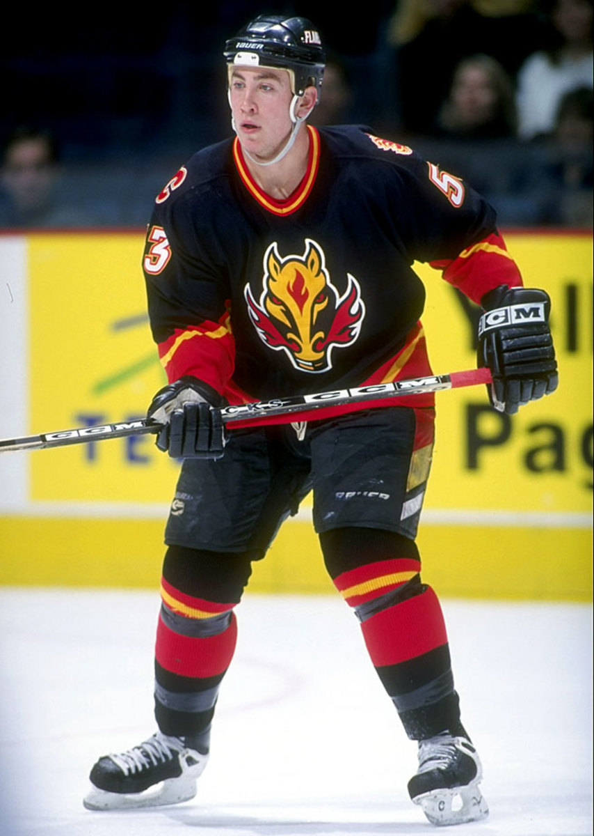
Their home/roads from 1995-2000 could have made the cut as well—does anyone know what was going on with the section of trim that leapt up from the bottom and pushed the logo higher?—but the silliness of the flame-snorting horse gives these the edge. That black base didn't go over too well with fans who loved the C of Red, either.
#17: 2001 All-Star Game
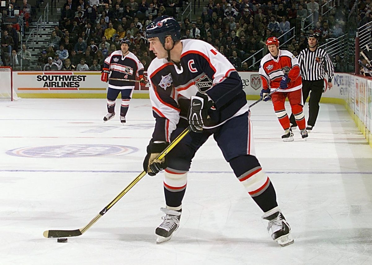
This one feels like the designer was romancing fans of soccer or rugby kits, because it doesn't much look like hockey ... oh wait, there's the NHL logo all tucked away over there!
#16: 2003-07 Atlanta Thrashers thirds/homes
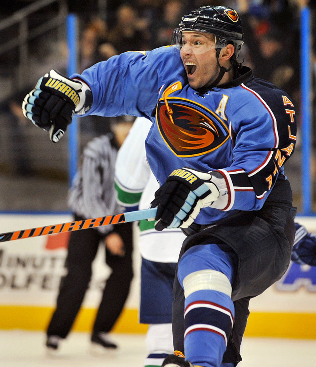
The burnt red “motocross” thirds worn from 2008-11 might be more universally despised, but these get the nod because they went from seldom-worn thirds to their standard home kit. The baby blue base that works for the Penguins fails here because of the complementary colors, but the real disaster is the trim that runs down the left sleeve only emblazoned with the word Atlanta—you know, in case the fans watching at Phillips Arena forgot what town they were in.
#15: 2001-07 Nashville Predators thirds
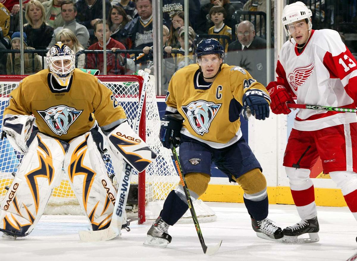
Honestly, the alternate logo on these is pretty awesome, maybe better even than their traditional tiger head. But that hideous mustard yellow base and that square-cut neckline ... did Anne of Brittany design these things?
#14: 2001-07 Edmonton Oilers thirds
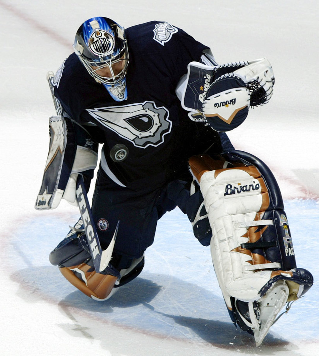
Books should have layers of meaning. Movies, songs ... sure, they can too. But team logos? They just need to look cool. That point was lost on artist/minority owner Todd MacFarlane who tried waaaay too hard when he was asked to come up with something new. Ditching the traditional colors was another big mistake.
#13: 2015 All-Star Game
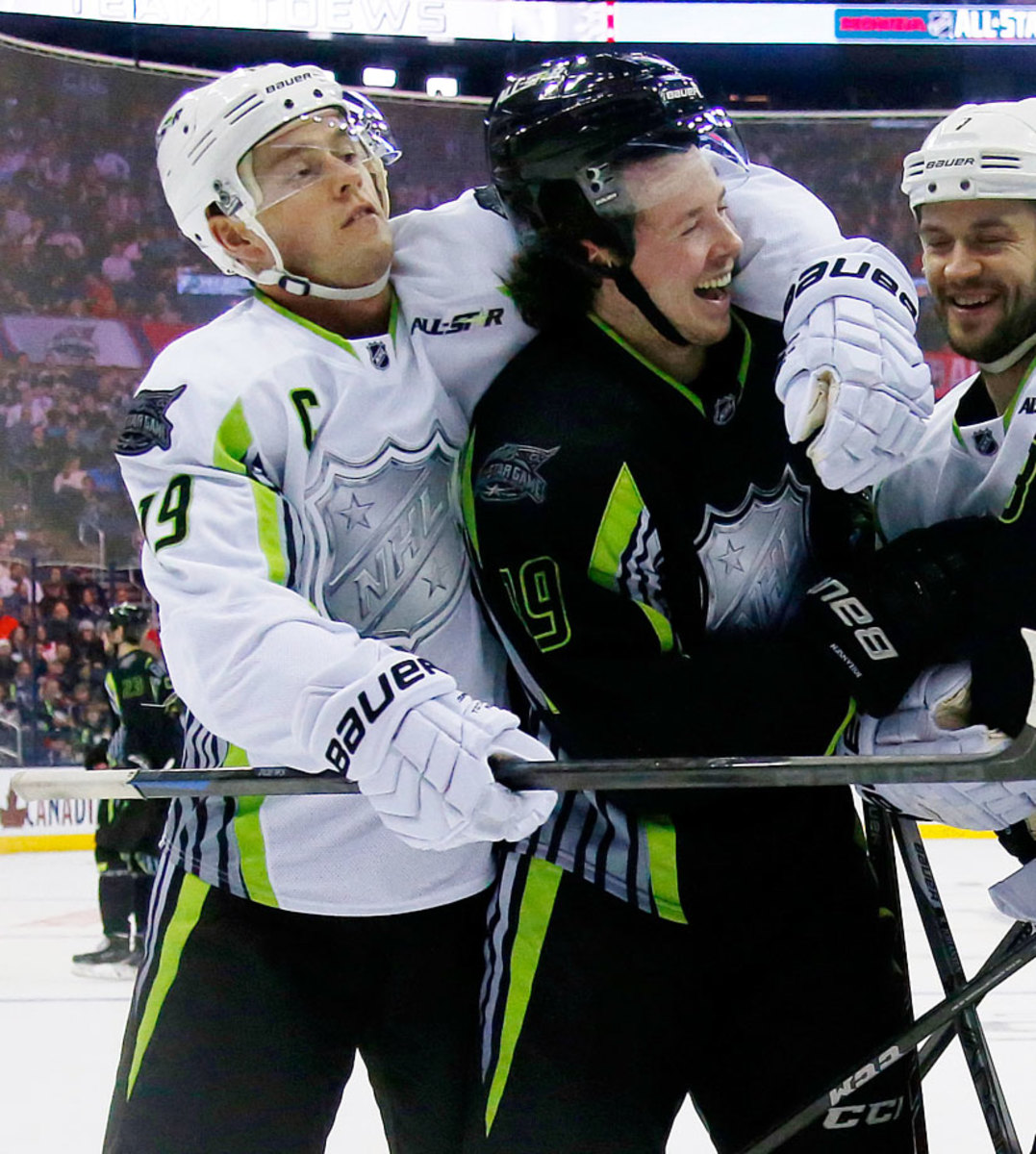
Yes, these were widely panned when they were revealed late last year, but I don't think we've quite yet come to terms with how awful these really are. Give it time, though. The oozing toxic green trim and oversized chrome NHL shield will soon be as fondly regarded as KISS's disco years.
#12: 2011-14 New York Islanders thirds
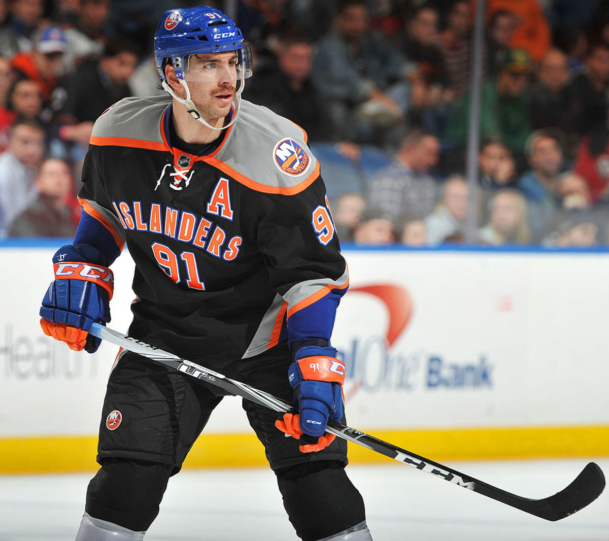
You know how things work these days. Nothing gets into production without market testing, focus groups and God knows how many meetings. At some point in the process, there had to be alternatives on the board ... and yet somehow, a black jersey with a “dynamic” Islanders wordmark above a player number was the option everyone agreed on. Or maybe they just left the whole thing up to an intern.
#11: 1995-96 Los Angeles Kings Burger King
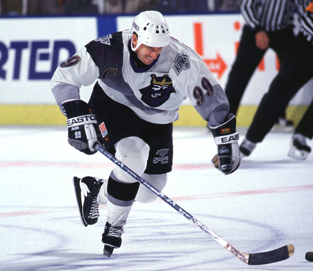
Ray Ferraro wrote just today on Twitter that the worst-dressed game he ever saw was when the Kings trotted these paeans to fast food out against the salmon-clad Canucks. Why am I hungry all of a sudden?
#10: 1998-93 Phoenix Coyotes thirds
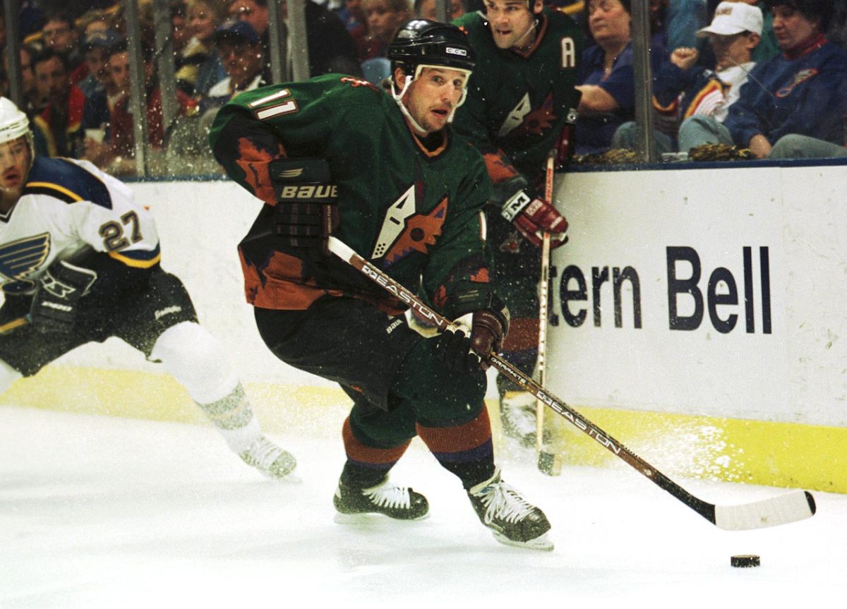
A reminder of just how bad things got in the '90s, these green alternates combined an under-designed alternate logo with a desert green background and a cactus-festooned trim that was as richly detailed as the old 8-bit High Noon game. Peyote may have been ingested during the design process.
#9: 1978-85 Vancouver Canucks deep V
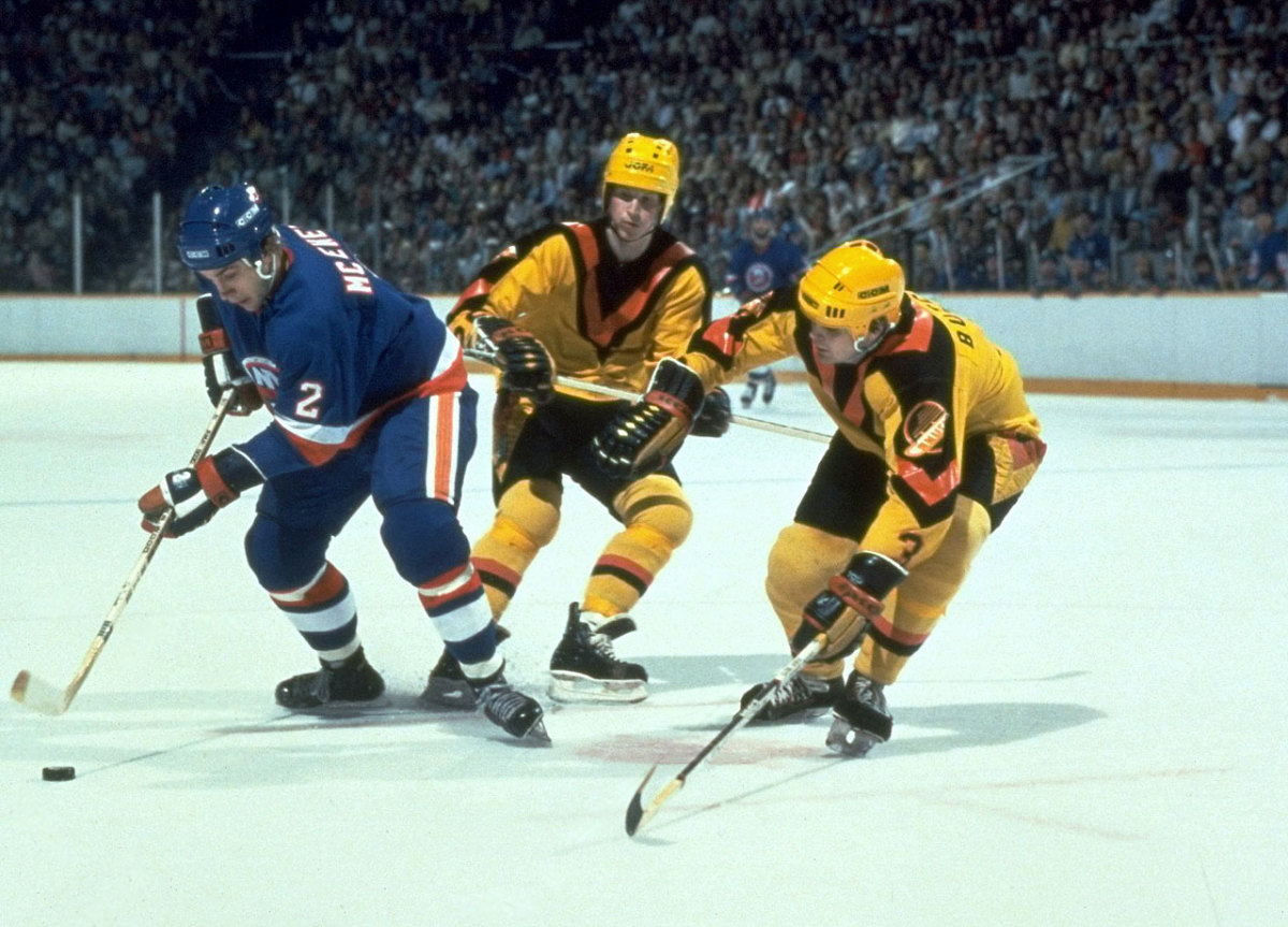
This beaming yellow sweater with deep black and red V neckline instead of an actual logo was the first of many ill-conceived designs trotted out by the franchise. Many fans revere it as an important part of the Canucks' history. And this is why that team can't have nice things to wear.
#8: 2011 Calgary Flames Heritage Classic
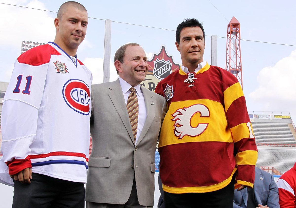
Okay, so maybe they do have a bit ol' timey flavor, but they also look a lot like Ronald McDonald's outfit, especially next to the Canadiens' more dignified threads.
#7: 2003-06 Dallas Stars “Mooterus” thirds
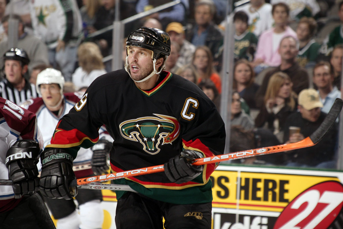
No less a fashion expert than Sean Avery ranked this design as the worst jersey ever in an article in Men's Vogue, and he's not far off. In introducing the design, the Stars said “the new logo depicts a constellation of individual stars aligning to form an unstoppable force of nature, a charging bull.” What they overlooked was that stars also aligned to resemble the female reproductive system.
#6: 1995-97 New York Islanders fish sticks
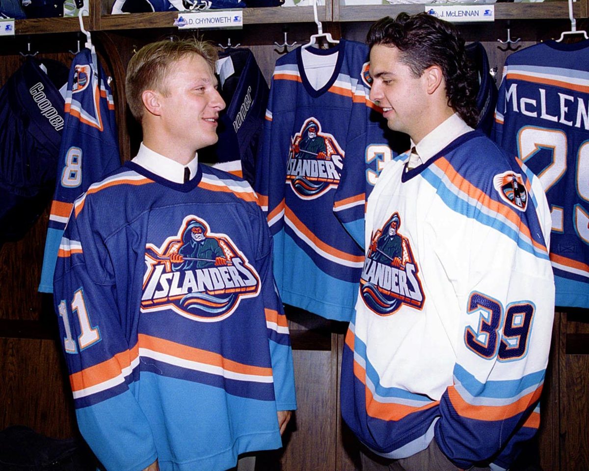
It could have been worse. They could have been inspired by another islander for the logo ... like maybe Gilligan.
#5: 1996-99 Tampa Bay Lightning thirds
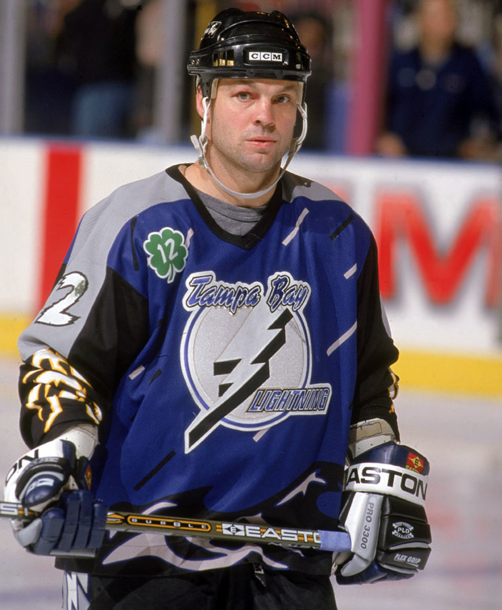
Another standout of the sublimation era, this one was the work of someone who finally made the connection between slashing rain and high seas and hockey. And we're all better for it.
#4: 2013-14 Buffalo Sabres thirds
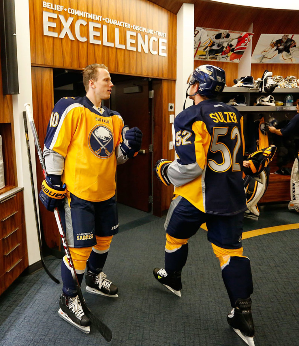
Before #thedress, this horrorshow was the social media fashion phenomenon ... except in this case, everyone agreed: it was mustard yellow and it sucked. In fact, the online animosity was so relentless that Buffalo president Ted Black was moved to utter one of the greatest lines in hockey history: “If it's a turd burger I'll have to put it on a bun and eat it.” We hope that burger came with a shake to wash it down, Ted.
#3: 2009 Montreal Canadiens 1912-13 throwbacks
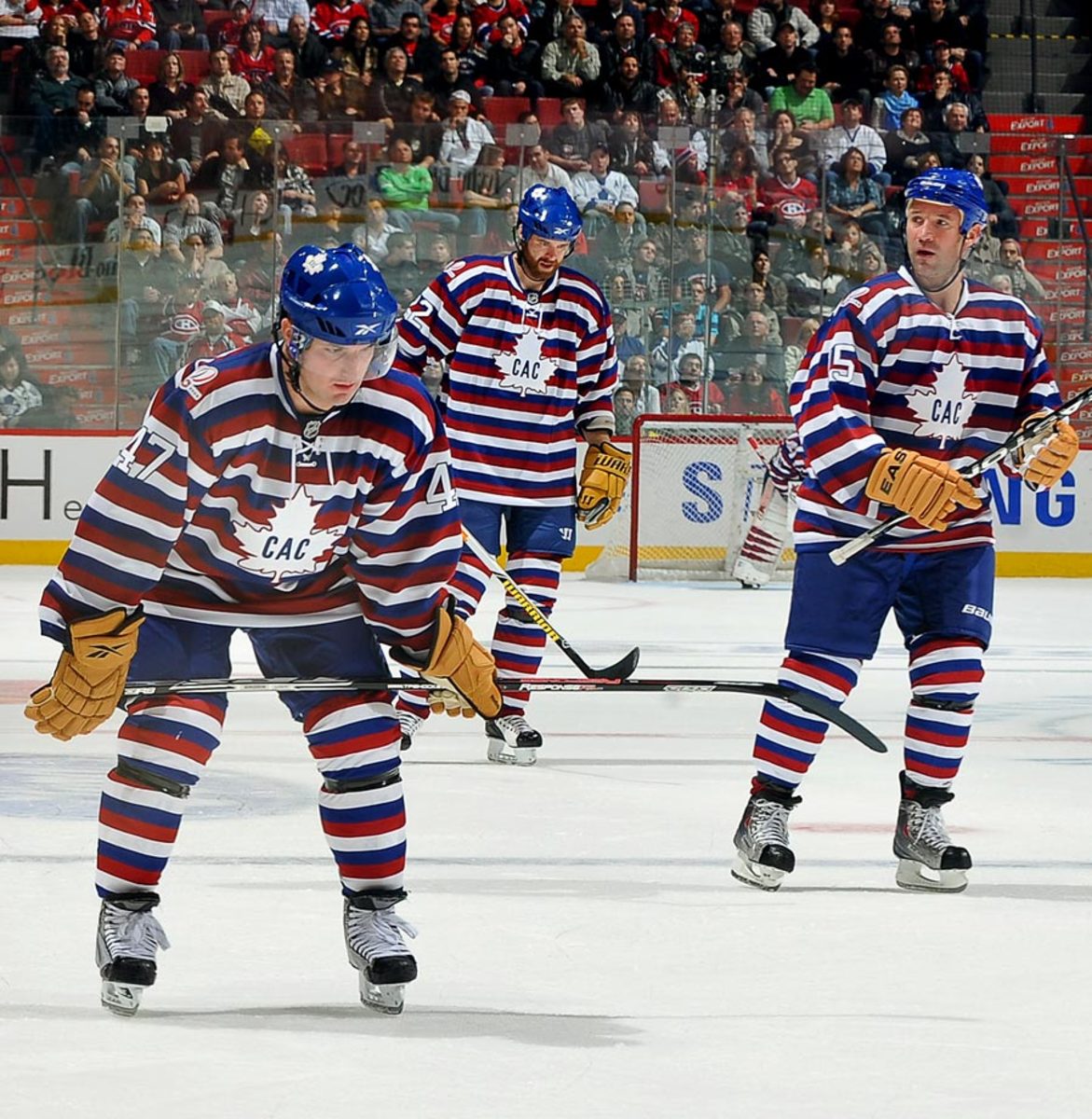
Looking more like the uniform of a 1920s chain gang rock breaker than a legendary hockey team, this tribute to Montreal's centennial season was so ugly that coach Bob Gainey refused to let his team wear it a second time after its Feb. 1, 2009 debut. Boston's Shawn Thornton, whose Bruins beat the Canadiens 3-1 that night, thought that was the right call. “I was really concerned about it in warmup,” he said. “When there were 23 guys skating around, I was dizzy and I didn't know if I got enough sleep or what.”
#2: 1995-96 Anaheim Ducks Wild Wing
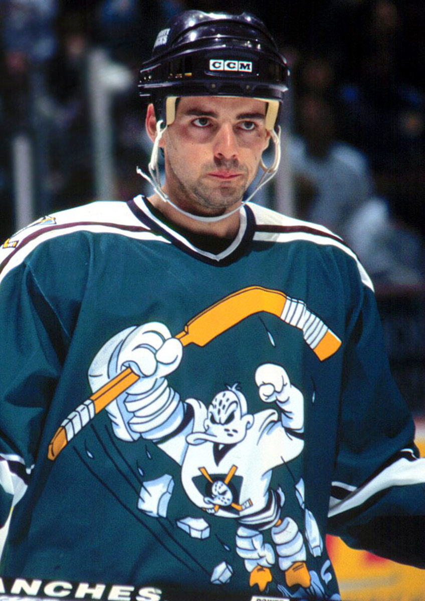
This is the “Showgirls” of hockey sweaters, a debacle so gallingly bad that for some it comes all the way back around to great. Featured a cartoon version of the team's mascot leaping forward in an apparent 'roid-fueled rage along some of the worst name/number graphics ever.
#1: 1995-2006 Bruins Winnie The Pooh thirds
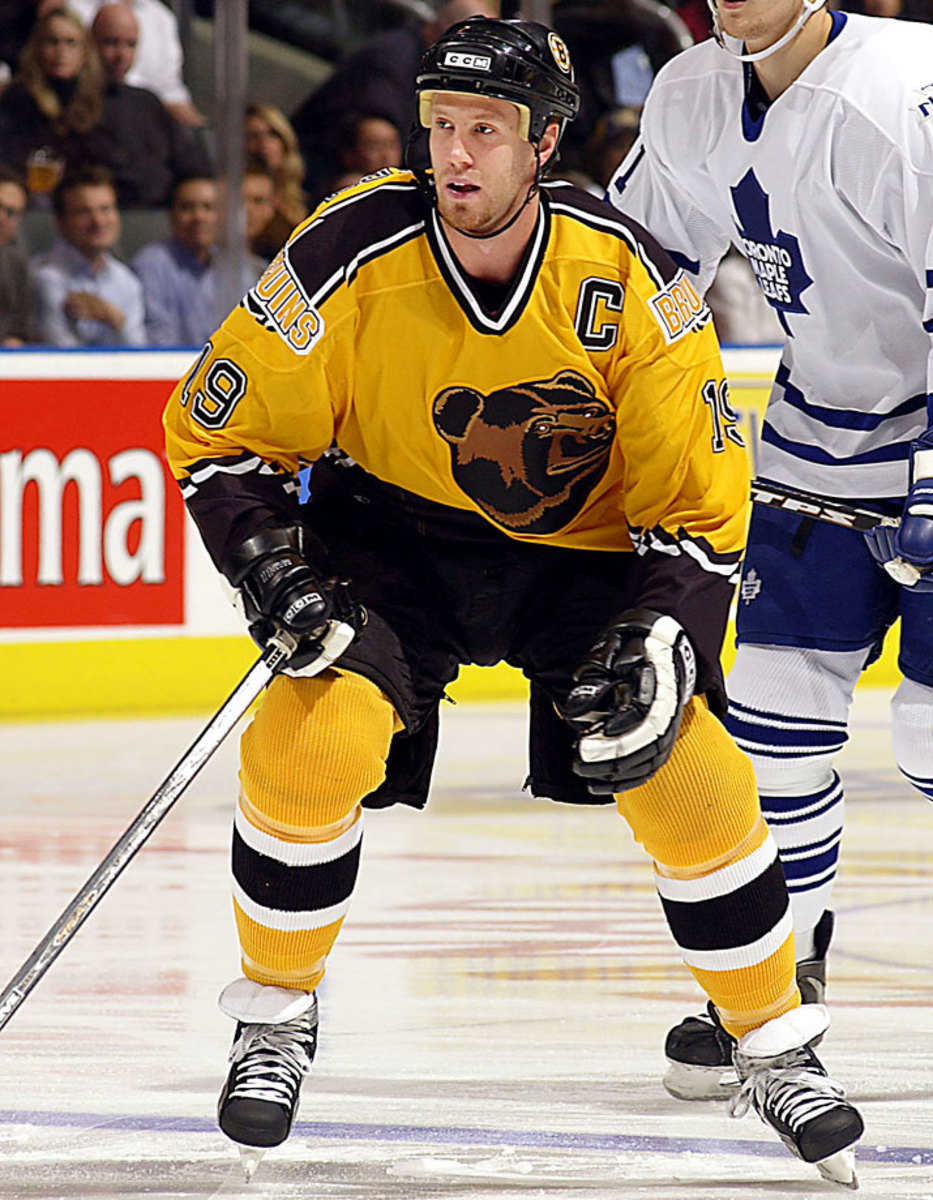
Objectively, this wasn't even the worst third jersey introduced in 1995, but it stuck around so long—10 humiliating seasons—and was such a downgrade from their classic traditional sweaters that it earns the top spot. The dijon yellow body and jagged trim were bad enough, but that sleepy bear head logo? It's like replacing San Jose's fearsome fish with Katy Perry's left shark, only there's no kitsch value here. It was no coincidence the team was so bad for so many of those years. Wearing these took two inches and 20 pounds off those poor souls.
Last Thursday, the Phoenix Coyotes went all #TBT and wore the original jerseys from their inaugural season of 1996-97. This inspired our photo editors to compile the 20 ugliest NHL jerseys of all time -- a list that (for some reason) doesn't include those original Coyotes threads.
Hockey Team Plays in Selfie Jersey
The Columbus Cottonmouths of the Southern Professional Hockey League played their game against Pensacola on Saturday in jerseys made up of fan selfies. Over the past three months, the team has encouraged fans to submit selfies (with the hashtag #snakeselfie), which they used for the uniform. I love this idea (even if it's been done before) and it's my second favorite minor league promotion of the year (after Saved by the Bell Night in June). Also, the Columbus Cottonmouths may be my favorite team name in sports right now.
Yasiel Puig Becomes His Own Bobblehead
A Dodgers fan brought an enormous Yasiel Puig bobblehead to spring training and the Dodgers outfielder couldn't resist trying it on. The bobblehead then made an appearance in the stands, as you can see in the video below.
P.M. Lovely Lady of the Day
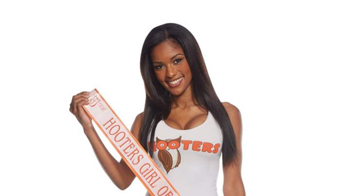
We're 68 days into 2015 and I still haven't posted about Jenell Hendrix being named Hooters Girl of the Year. I apologize and give Jenell LLOD honors (click here for full-size gallery).
Hot Clicks Giveaways: Hooters Calendars
Ever wondered if a Hooters Girls could do your job while you play hooky to watch college hoops? No, no she can’t. Does she make ditching work to watch the madness worth it? Yes, yes she does! And as luck would have it, Hooters is rewarding fans for playing hooky at Hooters. Anyone who visits Hooky.Hooters.com is in with a chance to win one of four ultimate Hooters “Hooky Adventure” excursions, including a trip to the college hoops championship game in Indianapolis, Ind., with a bonus VIP feast while there.
Meanwhile, we're giving away five 2015 Hooters Calendars and Hooters championship rings to help get your bracket-busting celebrations started off right. I'll send them to the 20th, 40th, 60th, 80th and 100th person who emails me (andy_gray@simail.com) the name of Alex Cobb's new dog. The answer was in A.M. Hot Clicks. Please make the subject line "Hooters."
FYI - I'll be giving away five 2015 @Hooters calendars and badass fantasy championship rings in today's PM Clicks. pic.twitter.com/28733gasgw
— Andy Gray (@AndyGray35) March 9, 2015
Update (10:22 a.m.): Contest is closed. Winners will be notified. Thanks.
Help the Eagles Cut Riley Cooper
An angry Eagles fan set up a GoFundMe page to help raise enough money to support Riley Cooper's release. The receiver is due to make $6.2 million this year unless he is cut "with the post-June 1 designation" (I have no idea what that means either). As of this writing (2:59 p.m.), they haven't raised anything.
Bummer
Don't Second-Guess the Indians Lineup. You Will Get Publicly Shamed.
The @Indians WILL make fun of you if you criticize a spring training lineup http://t.co/izXyvc9tpZ pic.twitter.com/7FSXJbVtcY
— Sports Illustrated (@SInow) March 9, 2015
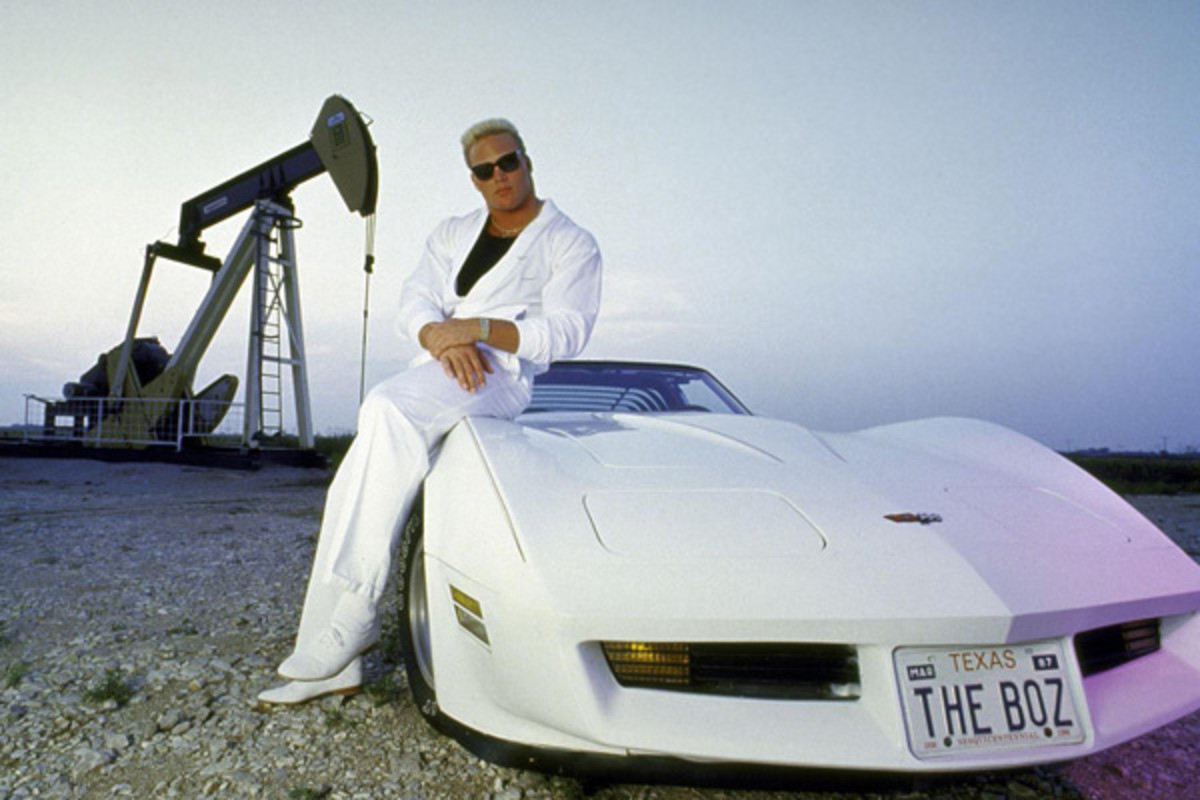
The Boz at 50
Some rare Brian Bosworth photos to celebrate his big day.
The Nation's Best Bench
Texas' bench celebration game was ON POINT yesterday: http://t.co/PASJ3CmPR8 https://t.co/kITyBNBwXu
— College Sports Only (@CollegeSportsO) March 8, 2015
Odds & Ends
UAB is offering a 'History of College Football' class. Interesting choice seeing the school just cut its football program ...Steven Jackson needs your help to #SavetheRunningBack ... See who made SI's 2015 college basketball All-Glue team ... Stephen A. Smith hinted thatChip Kelly's recent personnel moves with the Eagles are racially motivated ... Looks like a cat cafe is coming to Washington, D.C., thanks to a successful crowdfunding venture ... A $5 bottle of water at an airport inspired this lawsuit ...Weird Al Yankovic sang this 'Yoda' parody alongside a 13-year-old with autism ... An all-night 'spin the bottle' diner is coming to Brooklyn ... Funny pictures of people being extremely lazy.
WWE Meets the Flintstones
This is an actual collaboration and here is one of the first videos, featuring a match between John Cena-Stone and Rey Myteriopal.
Spanish Basketball League Brawl
A crazy brawl breaks out during a game between Saski Baskonia and Bilboa Basket. Stay until the end when a player helps comfort a petrified child.
[youtube:http://youtu.be/Bp2TK8JUgEs]
Heads Up!
I really shouldn't laugh at this elderly woman crashing into a China cabinet while playing ping-pong but I can't stop laughing. I am not a good person. (H/T FTW)
Simpsons Couch Gags
[youtube:http://youtu.be/rfDsKaHGDfw]
Click here for previous versions of Hot Clicks and visit our Extra Mustard Page throughout each day for more offbeat sports stories and the Cheerleader of the Week gallery.
