Pro wrestlers have the worst looking websites
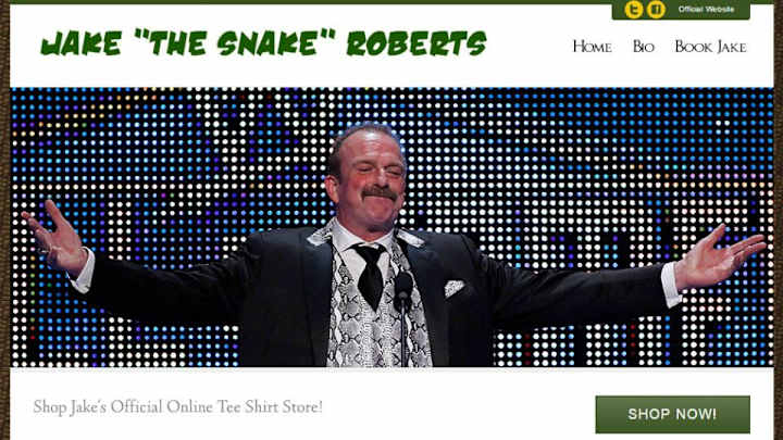
Graphic design and professional wrestling don’t exactly go together.
From millions of terribly photoshopped indie posters, to John Cena’s t-shirts, to the entirety of the Attitude Era, pro wrestling has never perfected the finer aesthetics. I’m not saying it always misses, but, you know, there’s a reason the Diva’s belt still has that awful butterfly engraved on it.
My favorite examples of poor taste and pro graps are the many personal websites that belong to wrestlers. It’s here where the corporate oversight of WWE or TNA doesn’t exist, and chaos reigns. Never trust a man who falls down for a living to make himself look good on the internet. The websites below are gross, harsh, or just straight-up odd, and honestly? They make me love professional wrestling even more.
• MORE WRESTLING: Bret Hart on the State of the WWE, Daniel Bryan's injury
Scott Steiner
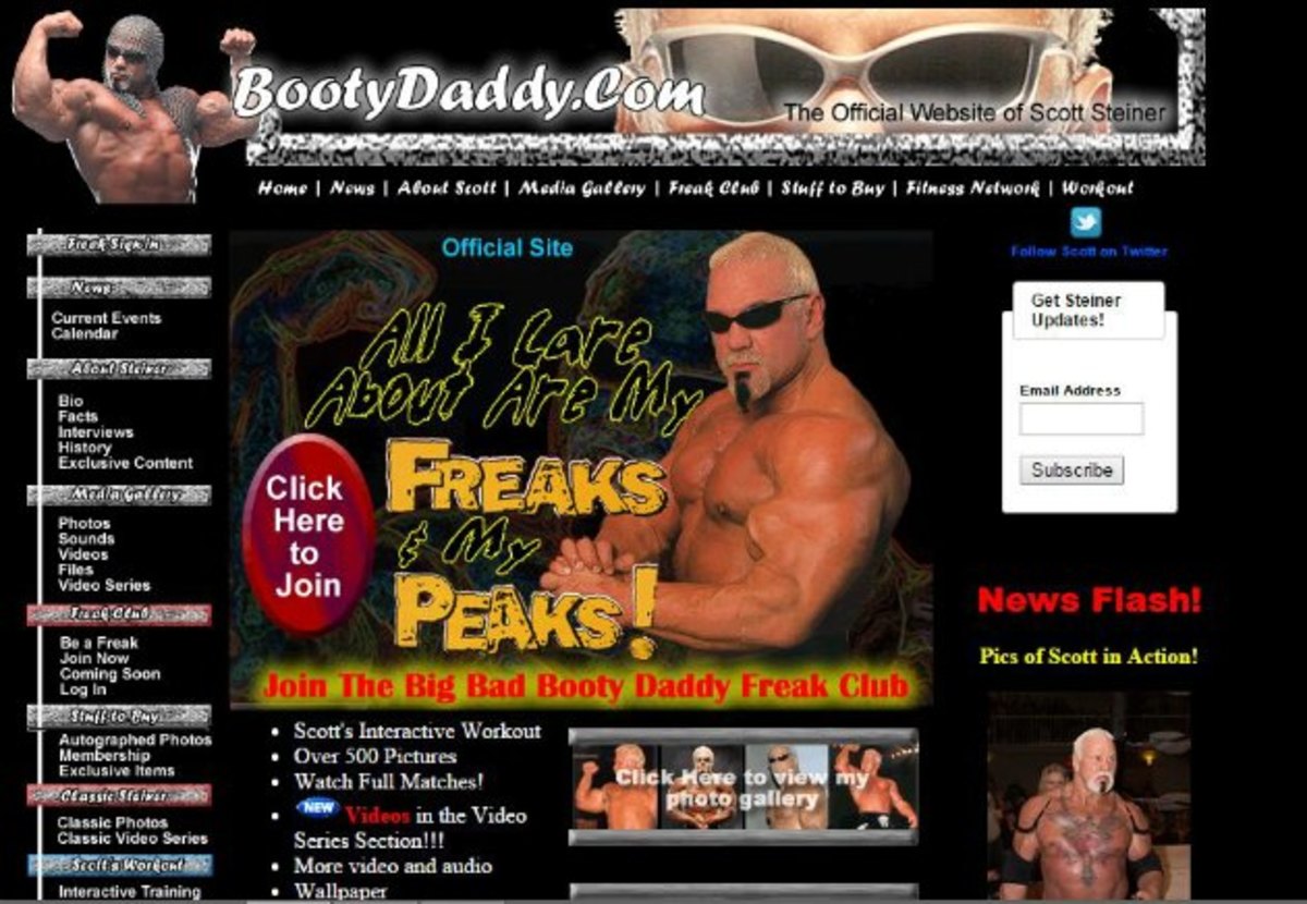
, you’ll be immediately greeted with an embarrassingly low-bit audio blast of Big Poppa Pump himself screaming about his permanent status as the “BIG BAD BOOTY DADDY." I’m almost impressed with Steiner’s unnatural ability to have a complete lack of chill in every facet of life. I guess that’s what it means to be a genetic freak.
Macho Man Randy Savage
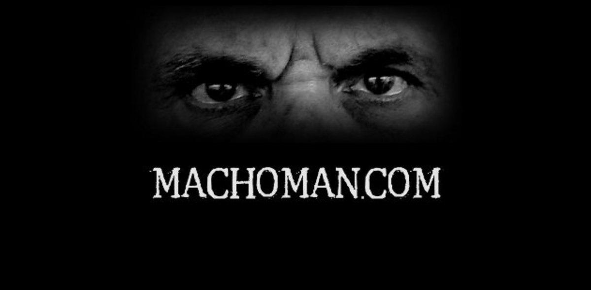
This is more sad than anything else. Macho Man’s official website still exists, and by the looks of things it hasn’t changed since about 2003. You get a retro flash intro, the words COMING SOON, and Macho Man himself saying “I’m back! Ooooooh yeah!” which is depressing on about 9 million different levels. For the love of god, whoever is paying to keep this site on the internet needs to stop.
Eric Bischoff
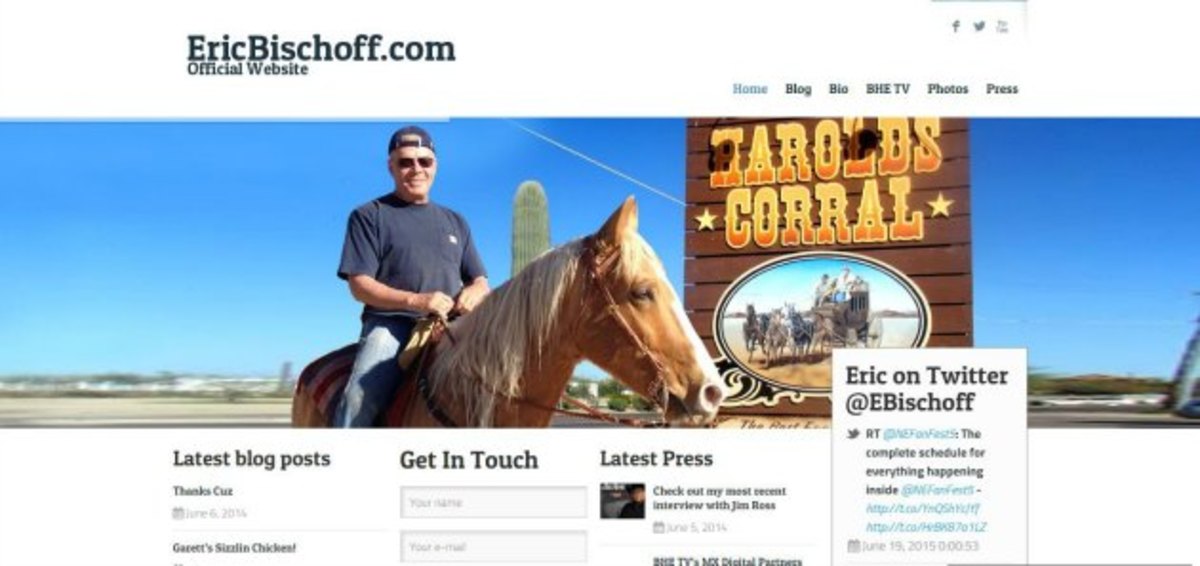
to confirm every suspicion you might have about a man.
Kevin Nash
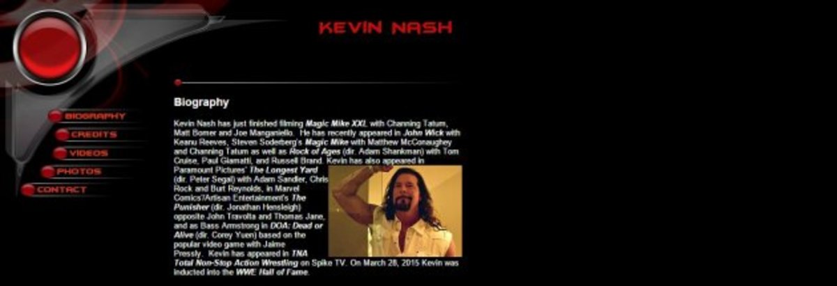
. Actually, why I am surprised? Kevin Nash himself is a pre-packaged Flash template.
Rey Mysterio Jr.
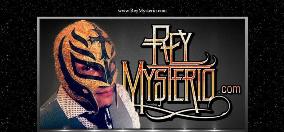
? He deserves that much.
Stacy Keibler

to make sure the world forgets she was ever involved in professional wrestling. I guess I can’t blame her.
Randy Orton
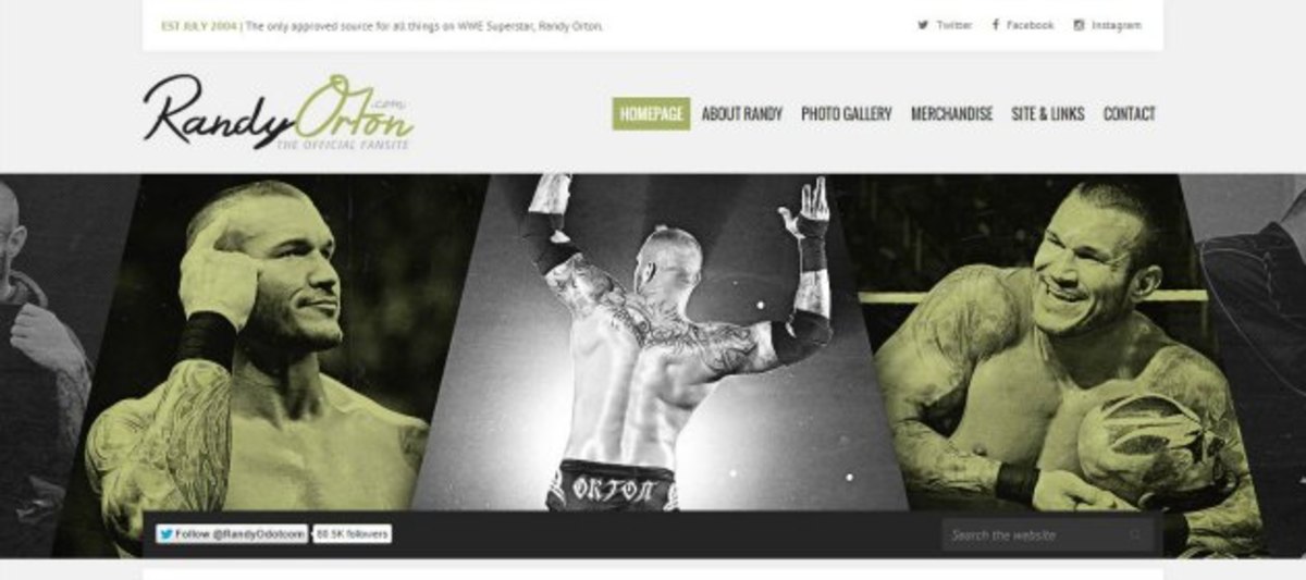
basically identical? How is that even possible?
Jake “The Snake” Roberts
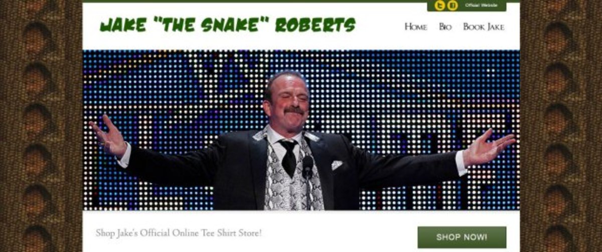
. Never change Jake Roberts, (except for, you know, the addiction stuff.)
Jerry Lawler
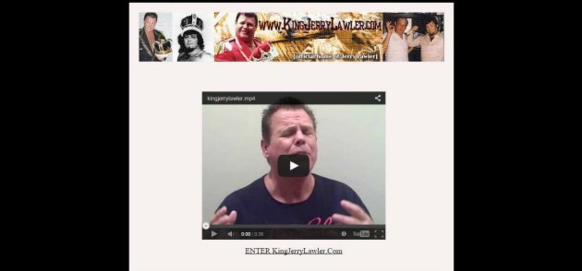
than the Ed Hardy.
TedDiBiase
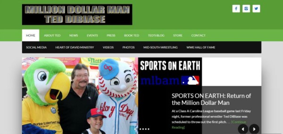
. Not only do you choose block letters, not ONLY do you choose a horrifying checkerboard green color, you decide to superimpose it onto a black box? I expect better of you Million Dollar Man!
Follow Luke Winkie on Twitter: @luke_winkie
