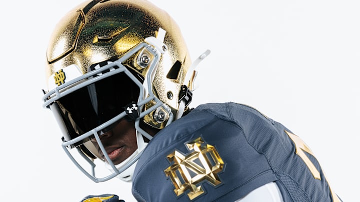
How Under Armour Designed Notre Dame's Shamrock Series Uniforms

In this story:
Making any changes to the most revered uniforms in college football is a daunting task. Fans only get to see the Notre Dame Fighting Irish take the field for a handful of Saturdays every fall. There is no room for error.
Not only has Under Armour proven itself as a trustworthy steward of Notre Dame's iconic threads, but the American sportswear brand can also satisfy the most provincial of football fans with its annual alternate uniforms known as the "Shamrock Series."
This Saturday, Notre Dame takes on the Army Black Knights in a nationally televised game at Yankee Stadium. To celebrate Notre Dame's return to the Big Apple, Under Armour began designing this year's Shamrock Series uniforms roughly 18 months ago.
The Fighting Irish faithful got their first look at the alternate uniforms earlier this summer through a series of super viral social media posts. However, they have not heard the whole story of the uniform's design process until now.
Earlier this fall, Sports Illustrated's Kicks On SI spoke with Adam Dougherty, Senior Graphic Design Manager of Team Sports Apparel, and Colby Smith, Graphic Designer, of Under Armour. Speaking from a conference room at Under Armour headquarters in Maryland, the two pioneers in design poured over the details and story of the alternate uniforms.

Design Philosophy
In recent years, Under Armour has transformed its approach to uniform design, incorporating more sophisticated executions and detail in garment construction. A key feature is the emphasis on metallic gold, inspired by the iconic Golden Dome of the university's administration building.
As the Senior Graphic Design Manager of Team Sports Apparel, Dougherty worked closely with the school to execute a shared vision of the football team's timeless brand.
"Notre Dame presented to us their new branding strategy that they were using across all sports in schools, and their main point that they wanted to make was that metallic shiny gold they considered to be their official school color," said Dougherty.
This gold has historical significance, originating from the tradition of using actual gold paint on the team's helmets, a symbol of Notre Dame's identity. The updated design reinterprets this tradition with metallic finishes that honor the school's legacy.

Historical Background
The Shamrock Series uniforms commemorate the 100th anniversary of the famed "Four Horsemen," a celebrated backfield from the 1924 football season.
The uniforms honor this milestone with Gothic design elements inspired by the architectural features of St. Patrick's Cathedral in New York City, a significant site for the team before games played in the city.
The color palette is influenced by journalist Grantland Rice's description of the Four Horsemen against a "blue-gray October sky."
Dougherty said, "We took that Gothic font and basically made a number set out of it, and then that was the main driving aspect of the story. It's a uniform that pays tribute to Notre Dame's past and present uniforms but then ties to the future by bringing that modernization of embellishments and trim."
Under Armour developed a custom color named "Downpour," a blend of blue and gray, with a number font inspired by Gothic elements from 1924 headlines.

Cohesive Execution
Every uniform detail was designed with a cohesive vision in mind. The use of TPU (thermoplastic polyurethane) across elements like numbers and trims provided a more defined, textured finish, enhancing durability and aesthetics.
The numbering was the most challenging and rewarding part of the project for Smith. As the graphic designer, he worked with a lot of people who contributed to the design elements and process to ensure such a radical design could withstand a football game.
"It's something new and exciting that kind of innovates the game in a way that hasn't really been done before... There has always been a hesitancy about doing the number sizes because they're so big."
Smith continued, "But my favorite part is definitely the numbers. They quite literally reflect Notre Dame's history and legacy. It's something that hasn't been done before on a football uniform to this scale, at least, and their direct call back to the 1924 Four Horsemen."
The gold elements throughout the uniform were made metallic, textured, and shiny, creating a unified look from head to toe. Updates to the ND monogram reflect the evolution of Notre Dame's branding. Meanwhile, the monogram now appears in a simplified gold format without a white outline, offering a cleaner, modern appearance that complements the overall design.
A prime time game in an iconic stadium celebrating the 100 year anniversary of the Four Horsemen — a lot to look forward to with the Shamrock Series game!
— The Fighting Irish (@FightingIrish) October 29, 2024
More on this week's episode → https://t.co/iLUrR6zjCV#GoIrish | @tirerack pic.twitter.com/rJPq6SpdrD
Fan Feedback
Roughly 18 months ago, Dougherty, Smith, and the Under Armour team were handed a dossier of source material that featured newspaper clippings and pictures from Notre Dame's archives. They had to balance themes like St. Patrick's Cathedral and New York Times font with the 037 uniform that had not yet been released.
So, did they please the Notre Dame fanbase? The answer has been a resounding yes. Internal data shows 80% of fans approved of the uniforms and social media has not stopped buzzing about the uniforms since they were unveiled in the summer.
Not only are the jerseys flying off store shelves, but so are the myriad apparel options on the Under Armour website. Fans can watch sixth-ranked Notre Dame face the 18th-ranked Army at 7:00 p.m. EST on Saturday, November 23.
Stay locked into Sports Illustrated's Kicks On SI for all your footwear and apparel news.
More College Football News

Pat Benson covers the sneaker industry for Kicks On Sports Illustrated. As a leading voice in footwear journalism, he breaks news, spotlights important stories, and interviews the biggest names in sports. Previously, Pat has reported on the NBA and authored "Kobe Bryant's Sneaker History (1996-2020)." You can email him at 1989patbenson@gmail.com.
Follow Pat_Benson_Jr