NBA files trademarks for five names to replace Hornets, including 'Pelicans'

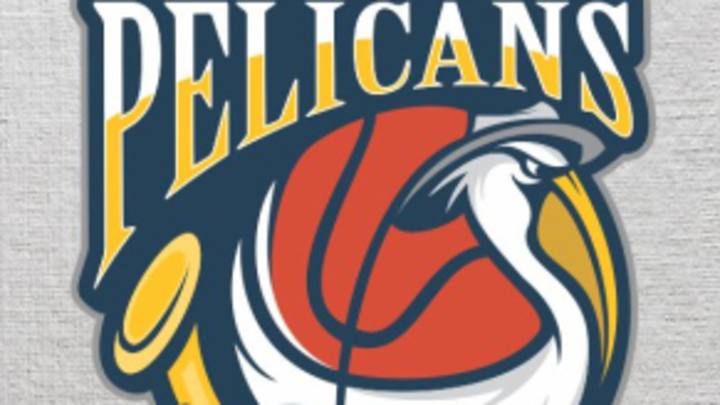
A user-designed logo for the New Orleans Pelicans. (dinoDesigns/99designs.com)
ByBen Golliver
The New Orleans Hornets have taken an important step toward changing their moniker to the "Pelicans" for upcoming seasons.
Earlier this month, Yahoo! Sports reported that the Hornets could be re-branded as the Pelicans, the state bird of Louisiana, as early as the 2013-14 season. NBA commissioner David Stern told reporters on Dec. 5 that Hornets owner Tom Benson, who purchased his franchise from the NBA, would have a "friend in the league office" to expedite a desired name change. Benson had made it clear, as far back as April, that he wanted a more regionally appropriate name.
On Tuesday, BehindTheBuckPass.com reported that NBA attorney Anil V. George had filed trademarks for five potential team names: Pelicans, Rougarou, Mosquitos, Swamp Dogs and Bullsharks. BehindTheBuckPass.com noted that Rougarou is a "beast from Louisiana folklore," a Swamp Dog is slang for an alligator, and that Bullsharks can be found in the Gulf of Mexico. Mosquitos are notoriously prevalent in the region.
George, identified as Senior Intellectual Property Counsel for the NBA in an online profile, has indeed filed identical trademark paperwork for those five nicknames, according to a United States Patent Office records report available on Trademarkia.com. The applications were filed on Dec. 5, according to the site, and cover "entertainment and educational services" related to a professional basketball team as well as various merchandise. The applicant listed is "New Orleans Hornets NBA Limited Partnership."
George's Trademarkia record includes more than 100 entries for logos and slogans related to NBA, WNBA and D-League teams.
The Times-Picayune reported Tuesday that the NBA was not available for comment and that the Hornets declined comment. A Hornets spokesperson said earlier this month that the franchise was "not confirming [Pelicans] is the name" and that the name-change process was "ongoing and still in discussions."
The lack of an official announcement hasn't stopped 99designs.com from launching a massive "Help brand the Pelicans!" logo design contest. As of Wednesday, more than 600 possible Pelicans logos had been submitted to the site. Many of the logos submitted reflect a navy blue, red and gold color scheme. Gayle Benson, wife of Tom Benson, reportedly prefers that combination to the Hornets' current teal, purple and blue design.
Below, check out SI.com's five favorite Pelicans logos from the design contest.
No. 1: This one gets everything right. The color scheme is good, the font works, the Pelican is sufficiently fearsome (the scowl) and dignified (the hat), a basketball is incorporated nicely with the wings and there's a Jazz instrument that plays off the bird's beak perfectly and nods to the local music scene. Big time ideas; big time execution. Darken the green to navy blue and it's good to go right now. Somebody alert Tom Benson.
(dinoDesigns/99designs.com)
No. 2: Like No. 1 above, this one nails all the details. The colors are bold and well-coordinated, the Pelicans name is clear, the peak is prominent, a basketball is involved and there's a crescent moon, paying homage to New Orleans' "Crescent City" nickname.
(Mark/99designs.com)
No. 3: This one can easily be pictured as the centerpiece on a million T-shirts at your local sporting goods store. Perhaps a bit simpler than the two designs above, the bird looks great, the font leaves little question as to the team's identity and the basketball is placed centrally for immediate recognition. Swapping blue for green could make this work even better.
(kingsandy/99designs.com)
No. 4: Hey, we had to include something totally different. The name "Pelicans" is a throwback to an old New Orleans baseball team and it has an ABA vibe to it, too. This design captures the quirky nickname in a way that would certainly appeal to hipsters. Including a basketball wasn't forgotten either, but it's done subtly so that the viewer's attention is on the bird first, as it should be.
(Giulio Rossi/99designs.com)
No. 5: This one got the colors right, played the basketball and beak off of each other, had a great bird altogether and the "Pelicans" font looks very NBA. The wave motion in the center of the design might serve as an unnecessary distraction and the "New Orleans" font isn't the greatest. The shield look is very cool.
(KiMLEY/99designs.com)
All designs included here with permission from 99designs.com.

Ben Golliver is a staff writer for SI.com and has covered the NBA for various outlets since 2007. The native Oregonian and Johns Hopkins University graduate currently resides in Los Angeles.