Bobcats unveil new 'Charlotte Hornets' logo for 2014-15 season

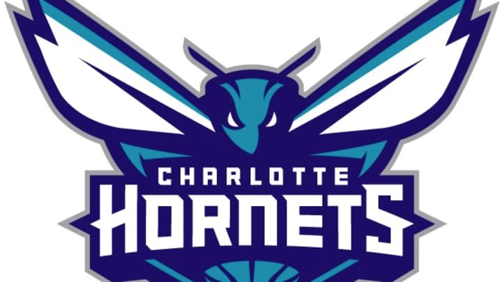
The new "Charlotte Hornets" logo. (Bobcats)
The Bobcats unveiled Saturday a new logo that will serve the franchise once it re-brands as the "Charlotte Hornets" for the upcoming 2014-15 NBA season. The new logo, seen above, was announced during halftime of Charlotte's home game against Utah at the Time Warner Cable Arena.
"Tonight is a special night for all the fans in the Carolinas," Bobcats owner Michael Jordan told the home crowd. "You guys asked and we delivered."
A video for the new logo promised that the Hornet depicted was "more tenacious, relentless, and armed for action" and that it was "back to protect and attack."
"The logos are the foundation of an organization's brand identity, and our goal was to design logos that would have awareness, be relevant and resonate with fans," Bobcats president Fred Whitfield. “We developed a logo that physically depicted the characteristics and DNA of the type of team we want on the court, as well as those of hornets and the city of Charlotte."
The Bobcats also announced Saturday that the original Hornets' popular mascot, "Hugo the Hornet," will also return next season. Merchandise bearing the new logos will be available on Jan. 18.
Jordan announced in May that the Bobcats would re-brand as the Hornets shortly after the New Orleans Hornets relinquished the nickname by becoming the "Pelicans" for this season. The original Hornets joined the NBA as an expansion franchise in 1988 and spent 14 seasons in Charlotte before being moved to New Orleans by former owner George Shinn in 2002. Shinn opted to keep the nickname but eventually sold the franchise to the NBA in 2010. In April 2012, the league sold the franchise to Tom Benson, who sought the Pelicans name change to better reflect the team’s home.
The Bobcats joined the NBA as an expansion franchise in 2004. Jordan purchased a majority stake in the Bobcats in 2010. While Bobcats are indigenous to the Carolinas, the Charlotte Observer noted last December that the “Charlotte Hornets” moniker drew its inspiration from the 1700s.
The Hornets nickname in Charlotte dates back to the Revolutionary War, when British General Charles Cornwallis compared the resistance in Charlotte to a hornet’s nest. It has been used in sports by a minor league baseball team (1901-73), an upstart football league team (1974-75) and the city’s first NBA franchise.
The Bobcats offered this conceptual background on the new primary logo.
The primary logo utilizes the purple and teal color palette and features an aggressive-looking hornet that is ready to attack. Its piercing eyes, raised antennae, expanded wings and pointed stinger depict its relentless intensity. Incorporated within the logo is a basketball that doubles as the hornet’s body. The Charlotte Hornets wordmark is written across the insect. The logo contains several odes to that of the original Hornets with its white wings, white accents within its eyes, a stinger and the inclusion of a basketball.
In addition to the primary logo, the Bobcats announced a secondary logo and a logo for Hugo the mascot.
The secondary logo features a side view of the hornet in an attacking position with elongated wings, aggressive eyes and extended stinger. The body once again consists of a basketball, while the curled body shape represents the letter “C” for the city of Charlotte.
The Charlotte Hornets' new alternate logo. (Bobcats)
Here's the mascot logo.
The Hugo logo is a modernized version of the original Hornets logo that is designed to be used for the mascot and its brand. It supplies us with a separate identity for the mascot. The refreshed Hugo logo contains several similarities to the original, with Hugo wearing white gloves and basketball shoes, possessing that trademark smile and having the letter “H” on his chest. Rather than bouncing a basketball, the updated logo continues the theme of the basketball as part of the hornet’s body.
The Hornets' new mascot logo. (Bobcats)
Here's a look at the previous Hornets logos used by the original Charlotte Hornets and, after their relocation, the New Orleans Hornets.
Official logos for the Charlotte Hornets (left) and New Orleans Hornets (right). (SportsLogos.net)
Here's a look at the Bobcats' current logos, which will disappear following this season. Images via SportsLogos.net.
Official logos for the Charlotte Bobcats. (SportsLogos.net)
Charlotte announced in November that the new Hornets would take on the original Hornets' popular teal and purple color scheme.
The new team colors for the Charlotte Hornets. (Bobcats)
The decision to return to the Hornets' original moniker and color scheme came about following an extensive public opinion survey. A team press release confirmed that the survey results were in line with conventional wisdom: that the Hornets' colors, which were among the most popular and recognizable across the country during the early-1990s, still had staying power. The Charlotte Observer reported recently that the Bobcats have seen a rise in season-ticket sales in anticipation of the return of the Hornets.
The transition from Bobcats to Hornets will also include new uniforms, a new dance team and a new court surface. The new uniforms are expected to be unveiled next summer.
To promote the new color scheme, the Bobcats -- who have already been referring to Charlotte as "Buzz City" -- launched a "Painting the City" marketing campaign, which includes images of a basketball being doused in purple and teal paint.
The Bobcats are launching a marketing campaign around their new colors. (Bobcats)
This week, graphic design website 99designs.com launched a Hornets logo redesign contest, and The Point Forward selected its five favorite designs from the early contenders. All told, more than 1,100 entries were submitted. The site named the design shown below as the winner.
The winning entry in 99designs.com's Charlotte Hornets logo design contest. (Eren G./ 99designs.com)

Ben Golliver is a staff writer for SI.com and has covered the NBA for various outlets since 2007. The native Oregonian and Johns Hopkins University graduate currently resides in Los Angeles.