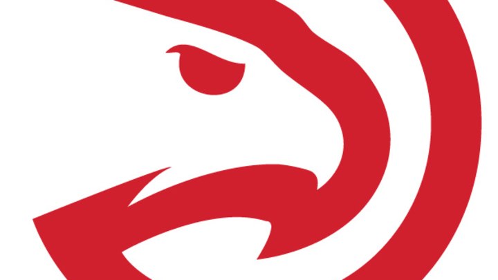
Hawks unveil updated Pac-Man secondary logo

The Hawks have unveiled a new secondary logo.
The Hawks announced Thursday that their iconic "Pac-Man" style logo has been updated and will be used as the franchise's new secondary logo.
The red-and-white, letterless logo combines the silhouette profile of a Hawks face inside the munching mouth that everyone associates with the classic video game. The Hawks originally used a Pac-Man style logo from 1972-1995. As you can see below, the new version tilts the bird's head, tweaks the beak and gives it an edgier eye, but otherwise maintains a similar concept.
The Hawks' old logo (left) alongside their new secondary logo (right). (SportsLogos.net)
Atlanta's Pac-Man logo has endured in the nearly 20 years since it was used, even though the Hawks never advanced to the conference finals during the two-plus decades it was used. Much of the credit for that staying power goes to the likes of Dominique Wilkins and Spud Webb, who both wore the logo on their shorts during the golden age of the NBA's Slam Dunk Contest.
Dominique Wilkins wears the Hawks' Pac-Man logo during the Slam Dunk Contest. (Andrew D. Bernstein/Getty Images)
The unveiling of the new logo corresponds with Atlanta's unexpected postseason success. The Hawks finished the season with just 38 wins -- the fewest of any playoff team -- but they now hold a 3-2 first-round series lead over the Pacers. Fans attending Game 6 at the Philips Arena on Thursday will get a Pac-Man style t-shirt.
To be clear, the Pac-Man logo is complementing, rather than replacing, the organization's primary logo, which depicts a red and blue bird with wings spread and talons clutching a basketball.
The Hawks' current primary logo. (SportsLogos.Net)

Ben Golliver is a staff writer for SI.com and has covered the NBA for various outlets since 2007. The native Oregonian and Johns Hopkins University graduate currently resides in Los Angeles.