Milwaukee Bucks unveil new primary, secondary, tertiary logos

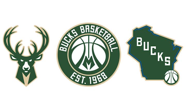
The Milwaukee Bucks unveiled three new logos on Monday, marking the franchise's largest design change under owners Wesley Edens and Marc Lasry, who purchased the team last season. While all three logos maintain the franchise's trademark green-dominated color scheme, they ditch red elements that have been present since the 2006-07 season in favor of cream and blue.
The primary logo features a familiar head-on look at a green Buck, whose antlers resemble a basketball. "Milwaukee Bucks" appears in white block letters against a green background below the animal. A cream circular design completes the new logo.
Milwaukee's secondary mark nods to the franchise's history with the words "Bucks Basketball" and "Est. 1968" above and below a white basketball with an "M" design in the middle. Again, a circular design and green background is used.
The tertiary logo features the word "Bucks" in diagonal block letters across a green outline of the state of Wisconsin. A basketball logo appears in the bottom right of the state and blue lines trace portions of the cream border.
“The Milwaukee Bucks are committed to honoring our history while ushering the franchise into a bright future," Bucks executive Alex Lasry said in a statement. "We’re establishing a new global identity that reflects the growth, energy and innovation in Milwaukee and throughout the state of Wisconsin. This is an exciting time for the city and our team, and these new logos embody the passion and intensity that will define us in this new era of Bucks basketball.”
• POWER RANKINGS: How the teams stack up as the regular season ends
Here's a look at the Bucks' new primary logo (left) side-by-side with the franchise's previous primary logo (right), via SportsLogos.net.
The Bucks are building their color scheme around regional themes.
Good Land Green: The traditional color of the Milwaukee Bucks with a timeless twist. Emblematic of the deep woods and diverse landscapes of Wisconsin, the green is a hallmark of our brand throughout our 47 years of existence.
Cream City Cream: Just as Cream City brick is the foundation upon which Milwaukee was built, Cream City Cream is the foundational color of the Milwaukee Bucks brand identity. This color is unique to the Bucks, as we’re the only NBA team to feature a cream hue.
Great Lakes Blue: Blue underlines the importance of the Great Lakes and multiple rivers in the history and future of our city and state. In fact, some think the word Milwaukee was derived from the Algonquian term “Millioki,” which meant “gathering place by the waters.”
With a 40-40 record entering Monday's action, Milwaukee is headed back to the playoffs this season under new coach Jason Kidd. The Bucks had the league's worst record last season.

Ben Golliver is a staff writer for SI.com and has covered the NBA for various outlets since 2007. The native Oregonian and Johns Hopkins University graduate currently resides in Los Angeles.