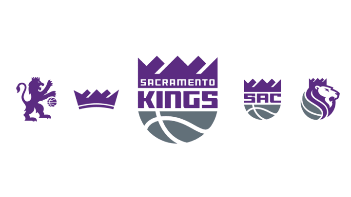
New Kings logo features connection to Sacramento roots

The Kings have taken 1985 and made it modern. As Sacramento prepares to move into a brand new building for next season, they’ll do so with a brand new look meant to honor the franchise’s heritage.
Sacramento will replace its shield logo with a (modernized) return to its crown logo, an updated take on the red-and-blue mark the Kings introduced when the team left Kansas City and moved into town in 1985.
“The new identity represents the new era in Sacramento,” Kings president Chris Granger tells SI.com. “When the Kings came to Sacramento in 1985 the city was transforming with a new sense of community spirit. Those things are happening again.”
• MORE NBA: Paul's injury could derail Clippers | Spurs will test Thunder
The new primary mark offers a reshaped crown atop the logo in purple, an updated basketball at the base in granite and a fresh typeface. “Overall we were looking for something that was cleaner, more modern and bolder than what we’ve had in the past,” Granger says. “You see that manifest in the typeface that we think is clean, bold and strong.”
The crown has thicker crevices in between the peaks for a “stronger” look.
Adam Silver digest: NBA commish on Prince, Kobe, All-Star and more
While the Kings won’t unveil a new uniform family until sometime this summer, the logo already gives us a look at the colors we’ll see, with a darker purple—for a “richer” look—and moving granite into the forefront of the team’s identity.
“Granite from the Sierras is the foundation of our new arena,” Granger says. “It is a nice nod to what’s happening to our physical life as well as what’s happening in the brand identity.”
Granger says that while you don’t see black in the logo, it remains part of the Sacramento color palette.
The mix of purple and granite carries over into the team’s secondary looks. The crown takes center stage in two of those logos while the Kings’ lion gets featured in two others. The crown is meant to reflect the rich tradition of the team, while the lion represents leadership and strength, the team says.
Purple and granite replace red and blue. New fonts and bold crowns replace less impactful versions. And 2016 replaces 1985.
Tim Newcomb covers sports aesthetics—stadiums to sneakers—and training for Sports Illustrated. Follow him on Twitter at @tdnewcomb.

Based in the Pacific Northwest, Tim Newcomb covers stadiums, sneakers, design, training and technology across all sports.