Grading New-Look Phoenix Suns Uniforms

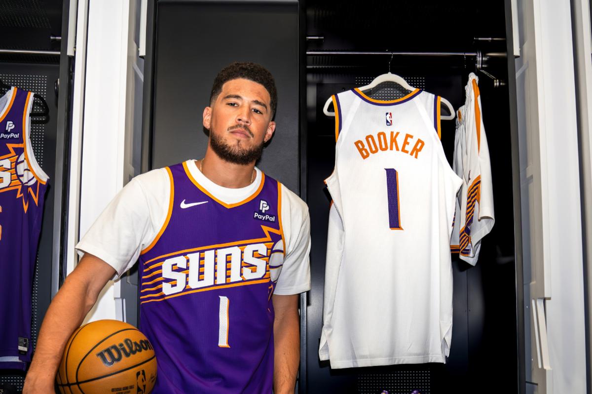
The Phoenix Suns officially ushered in a new era with the reveal of the new Association and Icon edition uniforms earlier this week, ditching an era where the old looks were a mixed bag.
There were some beloved looks, such as "The Valley" City edition, but the old Association and Icon versions have largely been received with lukewarm enthusiasm.

“The sunburst is an iconic design that is one of the most popular among Suns fans; it represents some of the most defining moments in our team’s history,” said Phoenix Suns Chief Executive Officer Josh Bartelstein. “These new uniforms seamlessly blend the nostalgia of the past with the excitement of the future as we begin the next great era of Suns basketball.”
The new uniforms fortunately are a success. The font is sharp and well-paced while the orange trim on both uniforms add a dimension of personality. The sunburst logo is obviously the star of the show, though. This is pretty clearly a recreation of the uniforms the franchise wore from 1992-2000, and that isn't a bad thing at all.

Too many teams are too worried about creating entirely new concepts when the truth is the most innovative uniforms came out in the 90's, and many of those looks have become insanely popular among NBA fans. Modernizing the very iconic and well-received sets from a memorable era of Suns basketball is quite possibly one of the best decisions that could've been made.
If there was one thing to critique, it would be that the icon edition purple could look a little more vibrant. Other than that these are an exquisite look.
Not only is the franchise sending an acknowledgment of what came before, they're also creating their own future in a new era headlined by three star players, an electric fanbase, and a governor (owner) who is the polar opposite of the previous one.
Grade: A-
