Nike says Rob Gronkowski's logo looks too much like the Jumpman

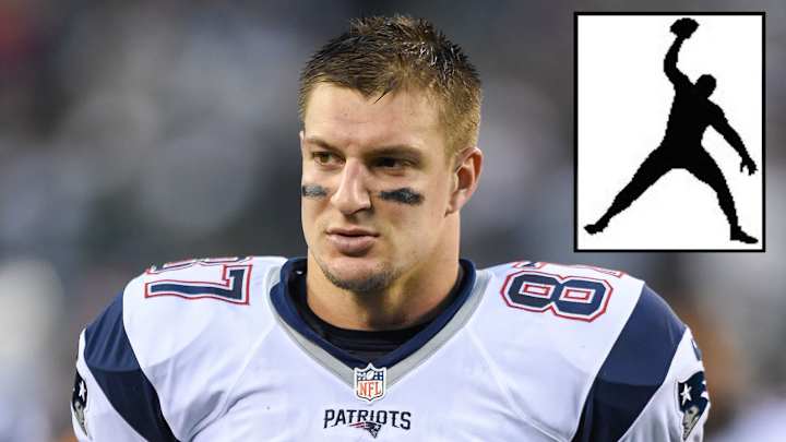
Nike is saying the logo Rob Gronkowski filed to trademark in 2016 is too similar to the Jumpman logo, according to ESPN.com.
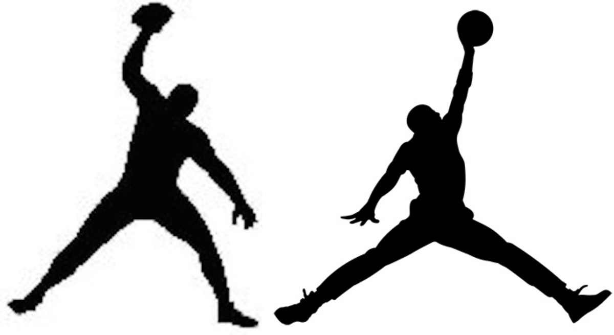
Last April, Gronk Nation L.L.C. filed a trademark on a logo that is a silhouette of Gronkowski performing one of his signature spikes, ESPN reports. They added that earlier this month, Nike filed an opposition to the trademark, claiming it looks too much like the logo Nike has been using.

There are clear similarities between the logos, such as the outstretched arm holding a ball and the wide-spread legs. There is also the difference of the football being in Gronkowski's right hand, compared to the basketball being in Jordan's left hand.
Gronkowski's attorney Troy Carnite told ESPN he's "optimistic" the two sides will come to a solution. Considering Gronkowski wears Nike cleats when he plays and Nike has the rights to the official NFL uniforms, it seems like both sides would want this to be handled as easy and quickly as possible.
