The Eagles Unveiled A New ‘Refreshed’ Wordmark Logo

In this story:
The Eagles unveiled a new logo font on Thursday, replacing their previous logo with a more straightforward and bold font.
The now old logo said “Eagles” in an arch shape, with sharp edges coming off of the “E” and “S.” The wordmark also looked 3D. Now, the logo is written straight, with those sharp edges now inwards on just the two “Es.” The font is still in white. It’s a more modern approach to the name.
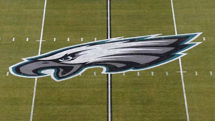
Additionally, the organization is keeping the classic eagle logo above the word. So, all that’s changed, really, is the font. Here’s what the two wordmarks look like.
The Philadelphia Eagles have unveiled a "new, refreshed wordmark" as part of their brand identity 🎨 pic.twitter.com/uqQ5RdQU4t
— Front Office Sports (@FOS) June 16, 2022
In the team’s press release, the new wordmark was called “new” and “refreshed.”
According to The Athletic, the new logo will not appear on the jerseys until 2024 at the earliest. The eagle head will remain the main logo shown on uniforms.
Fans were generally not happy with the minimalistic new logo. Change is difficult for sports fans, but especially when the logo is so dramatically different than what it previously was.
Here’s a summary of the Twitter response regarding the Eagles’ new logo.
Ehhhh no thank you https://t.co/7cMjXXpYLP
— Deana Harley (@Deanaharleynews) June 16, 2022
This is... not good. 🤷 https://t.co/EmQQpOHkPZ
— Ricky Sayer (@RickyReports) June 16, 2022
Even the Eagle is angry. https://t.co/AU1OERW1Cy
— Martin Frank (@Mfranknfl) June 16, 2022
Holy super minimalistic look Batman! https://t.co/oKpqGQUrNh
— Sean Barie FOX 13 (@SeanBarieTV) June 16, 2022
Change is not always good!
— Connie Carberg (@ConnieScouts) June 16, 2022
I feel like I’m waiting for the rest of the Eagles logo, to load up. That’s all of it?
— FOST (@GeorgeFoster72) June 16, 2022
More NFL Coverage:
- Texas GM Says Deshaun Watson Trade Couldn’t Be Undone
- New Orleans Saints Unveil New Helmet for 2022 Season
- OBJ Sends Message Amid Free Agency Speculation
- Eagles Today: Nick Sirianni Explains His Evolution from Play-Caller to CEO
For more Philadelphia Eagles coverage, go to Eagles Today.

Madison Williams is a staff writer on the Breaking and Trending News team at Sports Illustrated, where she specializes in tennis but covers a wide range of sports from a national perspective. Before joining SI in 2022, Williams worked at The Sporting News. Having graduated from Augustana College, she completed a master’s in sports media at Northwestern University.