Cowboys Lousy Logo? America 'Meh' on 'America's Team' Star
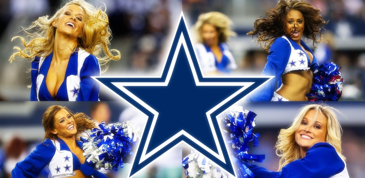
The Dallas Cowboys' royal blue, metallic silver and white star logo brings deep meaning to its fan base. It represents "America's Team", one of the few organizations with five Super Bowls and many historical players and coaches.
But according to a new survey by Quality Logo Products, the Cowboys' star isn't so special. In fact, it's ranked as the NFL's 16th-worst logo.
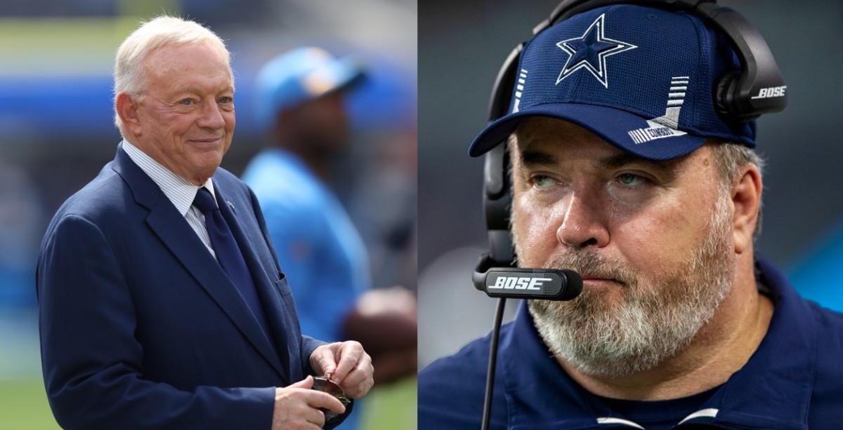
Jerry Jones, of course, sees it differently.
"You take the passion, tradition, entertainment value and visibility and go to town with the [Cowboys] brand," Jones said at the INTA Annual Meeting in 2013.
One NFC East rival has it even worse in the blog.
The Washington Football Team is ranked with the worst logo the NFL - and in all of sports.
"[The WFT logo is] boring," the Quality Logo Products Blog article said. "[It] went from a Native American logo to a bland logo ... at least it's not offensive."
Of all the sports teams in the U.S., the Philadelphia Eagles were listed with the third-best sports logo in America and the second-best in the NFL.
"The team's [Eagles] name was actually inspired by the NRA [Franklin Roosevelt's National Recovery Administration]," the article said.
"The eagle is the picture of concentration, epitomizing the "eagle eye" ... white with silver accents, outlined by the dark, rich colors of midnight green and black."
The New York Giants were ranked with the seventh-worst logo in the NFL.
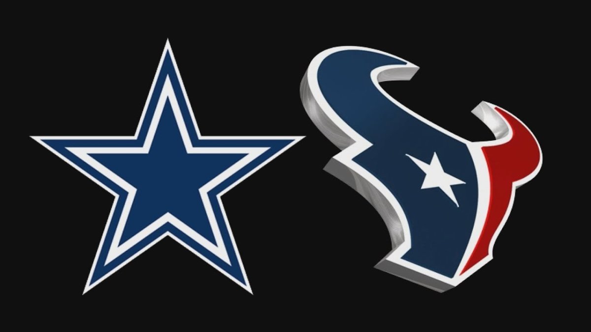
The Houston Texans defeated the Cowboys in the 'logo' Battle of Texas. The Texans finished with the ninth-best logo in the NFL.
