Bad Season, Worse Logo? Where’s Fan Survey Rank Atlanta Falcons?
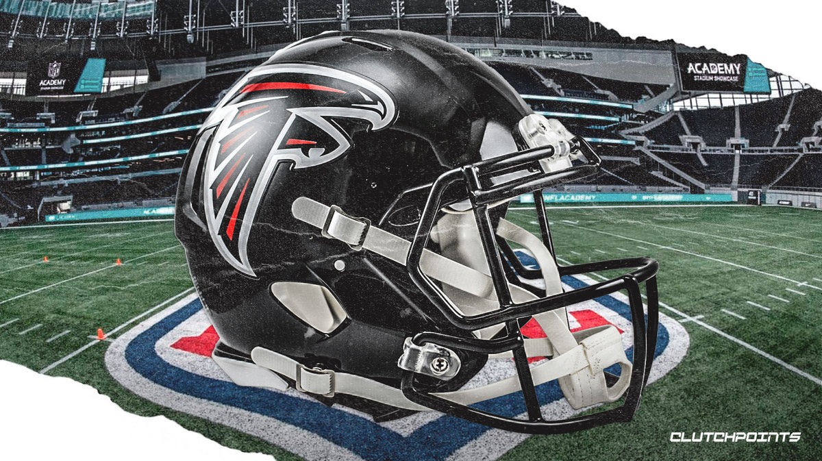
The Atlanta Falcons have the 15th-worst logo in the NFL, according to a new fan survey conducted by Quality Logo Products.
Despite the middle-of-the-pack ranking, the Falcons have always tried to keep true to their identity.
"The Falcon got a sleeker redesign so that it appears to be inflight and received silver and red accents to make it more powerful and aggressive while still resembling a capital letter 'F,'" sportslogohistory.com said.
The Falcons' logo received the lowest ranking of any team in the NFC South. The Tampa Bay Buccaneers were listed with the fourth-best logo in the NFL and fifth-best in all of American sports.
"Respondents preferred the Bucs' sleeker, more sinister look, against the backdrop of a tattered deep-red flag flying from a brandished sword," the Quality Logo Products Blog article said.
Tampa Bay, the Jacksonville Jaguars (No. 2), the Philadelphia Eagles (No. 3) and the Baltimore Ravens (No. 4) were in the Top 10 of all logos. The Carolina Panthers have the 12th-best logo and New Orleans Saints 14th-best.
While Atlanta did end up in the NFL's 'worst-logo' category, the team nearly made it to 'best-logo' level. The Falcons were two spots away from that category.
The blog says Atlanta's logos in the NBA, MLB, and the MLS don't get any better.
The Atlanta Hawks have the eighth-worst logo in the NBA, the Atlanta Braves have the 11th-best logo in the MLB and the Atlanta United have the fourth-worst logo in the MLS.
Maybe it's time for a new logo in Atlanta?


