Worst Logo in Sports? It's Washington Football Team
The Washington Football Team will unveil a new team name and logo Feb. 2. According to a new fan survey, the change is coming not a moment too soon.
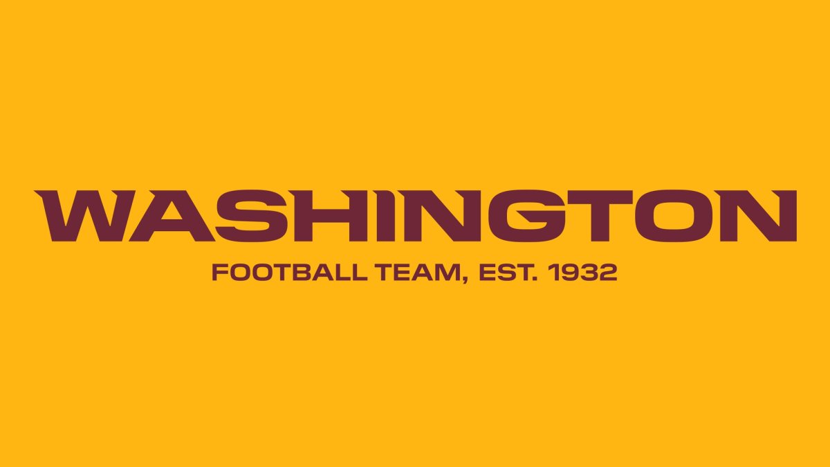
Washington's current logo - which has less than a week to live - is ranked as the worst logo in the NFL, and all of sports.
Ouch.
"The Washington Football Team went from a Native American logo to a bland logo," The Best and Worst Sports Logos article says. "Yes, it's boring, but at least it's not offensive."
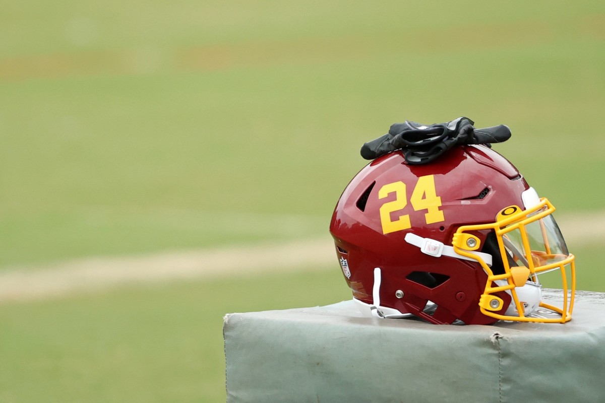
While this is certainly not a compliment, the blog did say the WFT doesn't have the least creative helmet logo in the NFL.
"The only less creative helmet logo in the NFL is probably the Cleveland Browns' logo-less plain orange model," the article said.
The Philadelphia Eagles, of all teams in America, was ranked with the third-best sports logo and the second best in the NFL.
"The eagle is the picture of concentration, epitomizing the 'eagle eye,'" the article said. "Both logos are ... outlined by the dark, rich colors of midnight green and black."

Rounding out WFT's NFC East brethren, the New York Giants have the seventh-worst logo in the NFL and the Dallas Cowboys have the 16th-worst.
While Washington's helmet may be 'boring' at the moment, head coach Ron Rivera and general manager Martin Mayhew looked to be amused as they saw one of the 'main' helmets for the new team name.
"I think the look is going to be hot," Rivera said in the finale of the "Making the Brand" YouTube series. "I think the fans appreciate the look as well."


