Rating the NHL's new third jerseys
Rating the NHL's new third jerseys
Pittsburgh Penguins
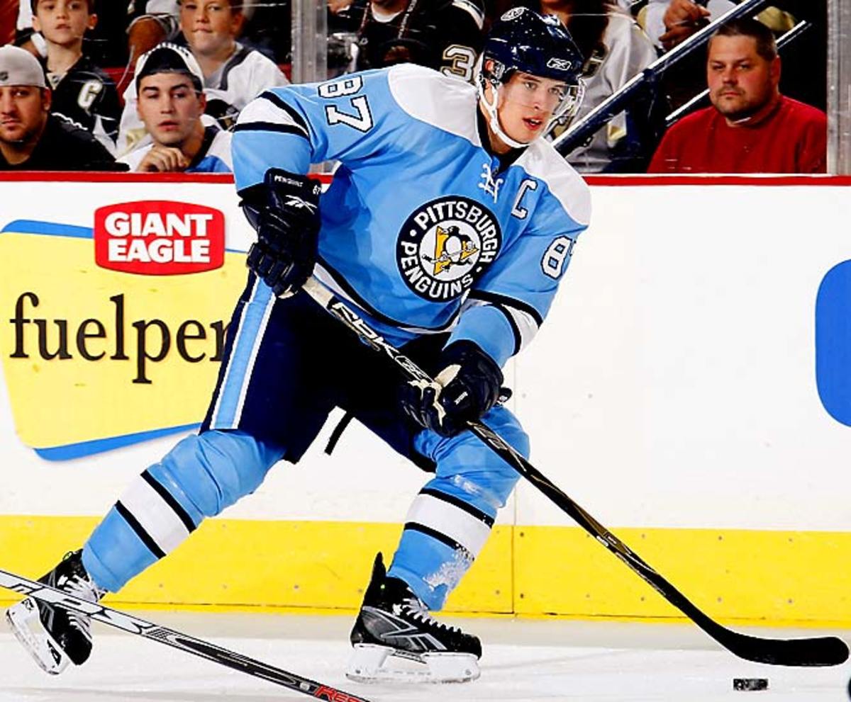
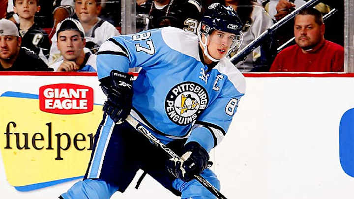
If you're going to create a third jersey, you might as well make it a memorable departure from the normal fare. Of the 19 new ones in the NHL this season, the Penguins' threads were actually unveiled last January as a one-timer for the Winter Classic. The response to the powder blue was so overwhelmingly positive that they decided to keep it around. The color, a nod to the Pens of the `70s, and the vintage look make this a perfect marriage of tradition of fun -- and our pick as the best of the new 19. Now, the rest in order of preference.
St. Louis Blues
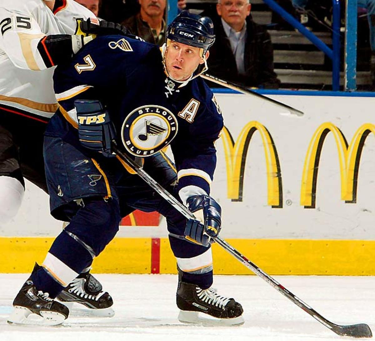
Owner David Checketts became enamored with the city's famous arch when he took over the club in 2006 and wanted to feature it on their uniform, something no other St. Louis-based team has done. So, with a design that winger Paul Kariya says is "the best-looking third jersey I've ever seen," the Blues have definitely made an upgrade.
Philadelphia Flyers
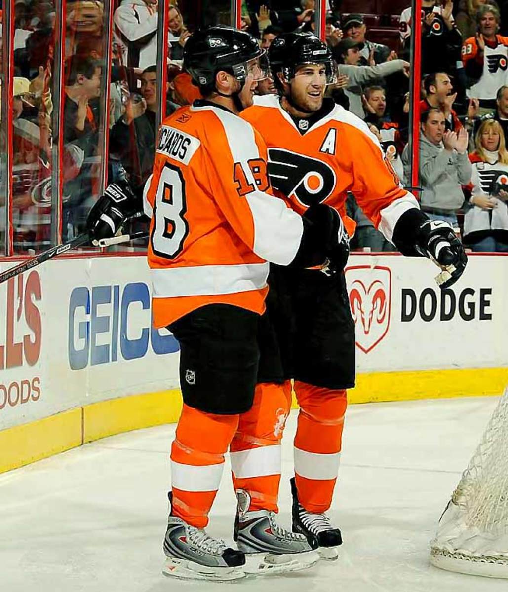
Maybe they look like a bunch of pumpkins on ice, and, yeah, the black and orange is a bit Halloweeny, but this third is less trick than treat. Besides, the bright orange means no excuses for missing them when they barrel in to plant you against the glass.
Montreal Canadiens
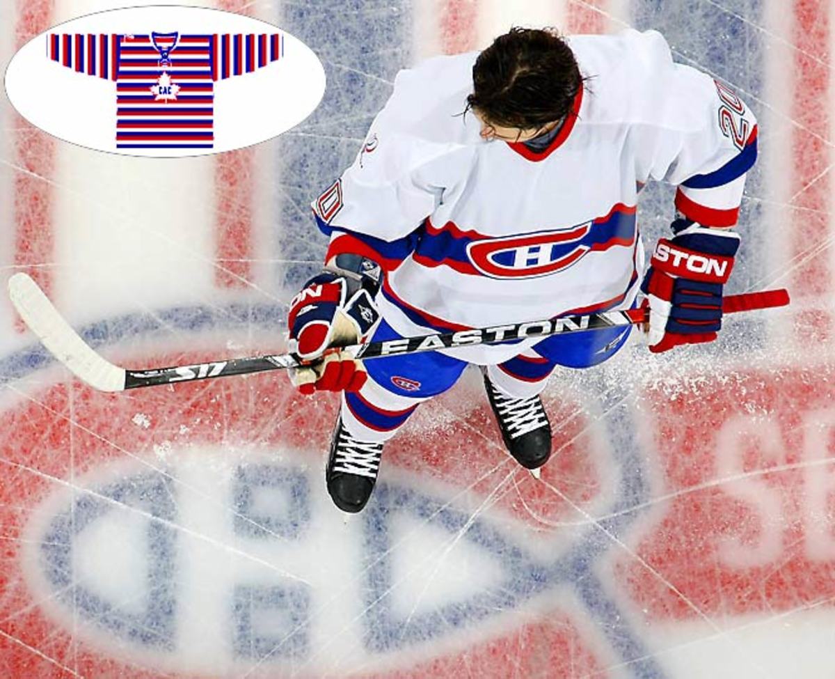
Just one of the three special jerseys the Habs will sport during their centennial season. While it may err on the side of boring, it's so classically well-designed that we can't find fault in the team for doing something timeless. That said, keep your eyes open for the super-vintage throwback (inset) the Habs wore for one season, in 1912-13. They call it the Barber Shop jersey, but it's more like something clowns wear during a jailbreak. The horizontally-striped sweater is right out of Ernie from Sesame Street's closet. Big points for doing something outside the box -- and we're sure it'll distract the other team.
Chicago Blackhawks
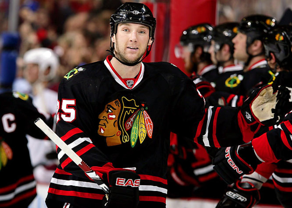
Staying true to their iconic look, this Original Six team can't go wrong so long as their logo stays intact. The black jersey has long been the third option for Chicago, so we can't blame them for using the tired color. And hey, if you're called the Blackhawks, it's pretty appropriate, right?
Edmonton Oilers
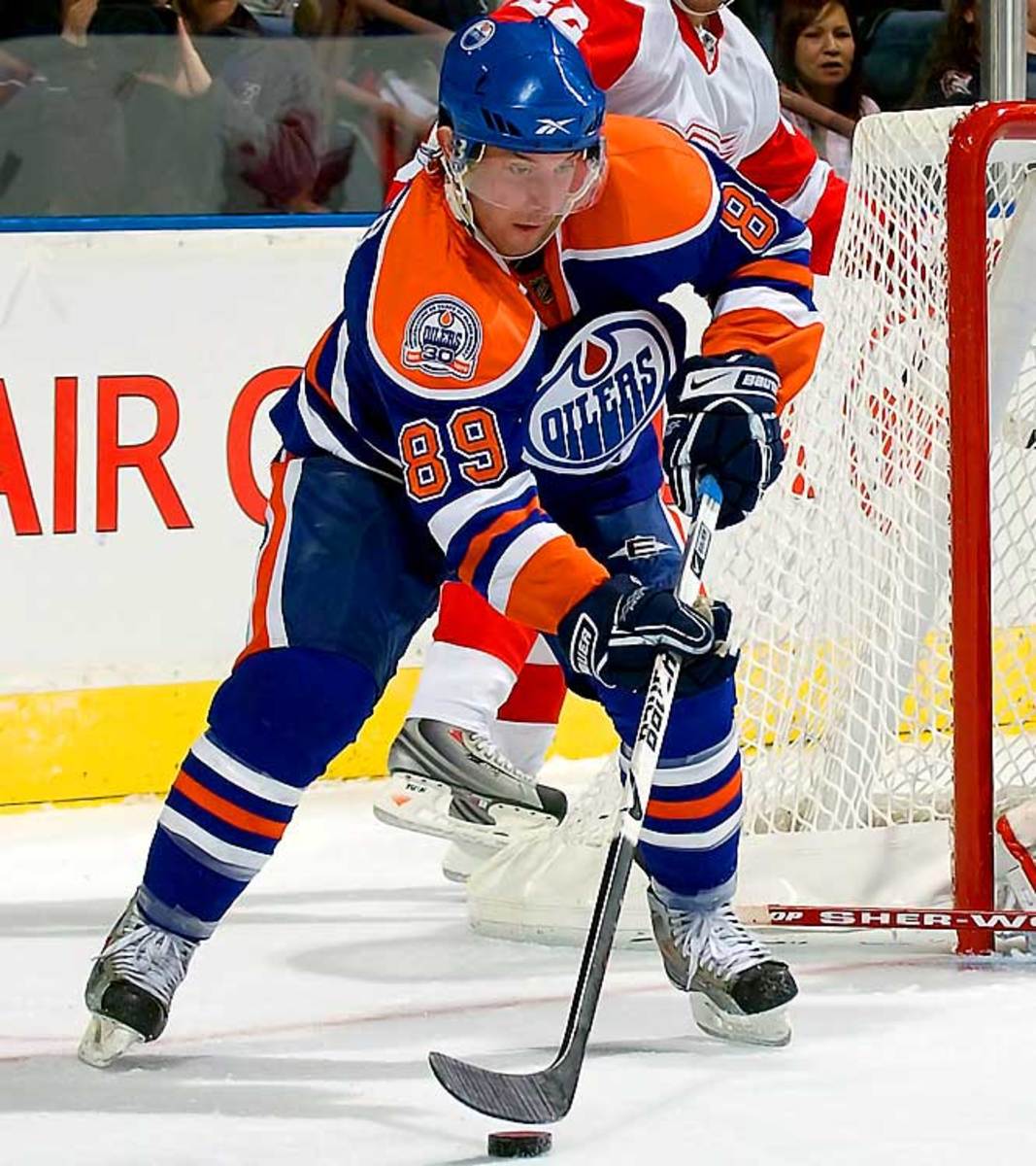
At first, we were a bit bored by the old color scheme. But since the Oilers are also celebrating their 30th anniversary, it's understandable that they'd want to pay homage to their heyday. The colors are just sooo `80s that the whole system looks dated, but upon closer examination, this third grew on us. And, hey, fans in Edmonton are still living for a return to those glory days.
Buffalo Sabres
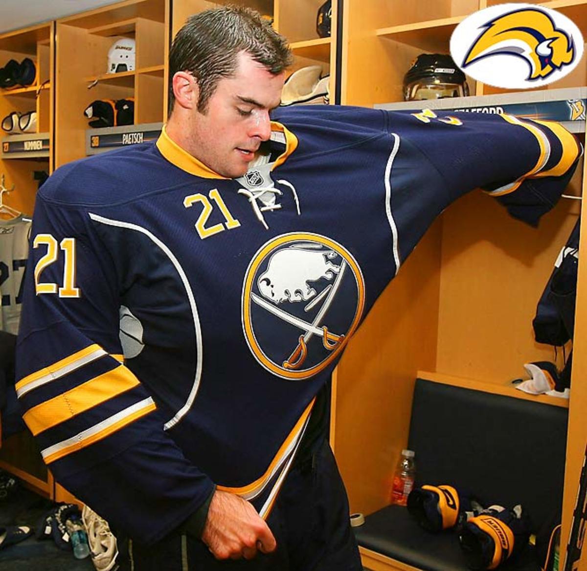
Bringing back the crossed sabres crest was a good move, but anything other than the buffaslug (inset) -- "Is that a lemming... or a tadpole?" one of our uniform-judging panelists asked -- would be an improvement. The best thing about this one just might be that it isn't busied up with logos on the shoulders and stripes everywhere.
Toronto Maple Leafs

It's tough to alter an iconic look without slapping your fans in the face, so we give the Leafs points for doing it well. The old leaf, with its more jagged edges, does have a little fiercer look. That's hard to achieve when your crest is a leaf.
San Jose Sharks
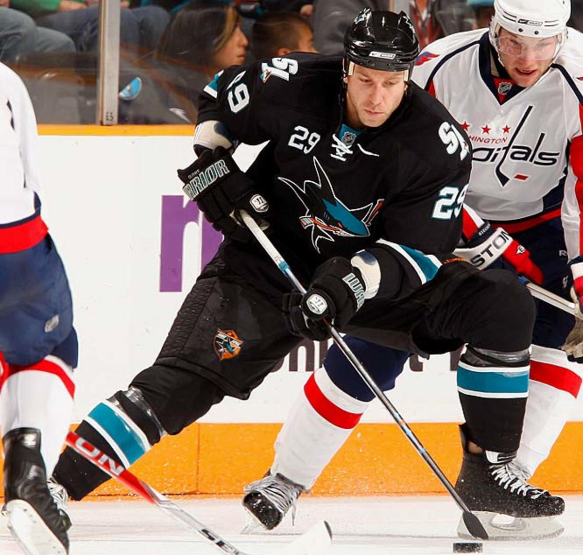
The BlackArmor thing, while gimmicky, still gets points because it actually achieves what it set out to do: intimidate. But the more subtle changes (the meaner-looking shark) are a bit lost. Unfortunately, the shark's exposed tail looks like it belongs on a dolphin, which (if hours of watching Planet Earth have taught us anything) would be anatomically incorrect. Are sharks really limber enough to bend their tails in half?
Boston Bruins

It's weird not to see the famed spoked wheel front and center. Sure, the Bruins get some credit for trying something different, but again, the wheel is such an icon that it seems out of place relegated to the shoulders. Also, making this yet another all-black jersey was a ho-hum mistake.
Phoenix Coyotes

Okay, they can't really pay homage to their past without opening a Pandora's box in Winnipeg or revisiting the infamous Picasso Coyote (inset) from 1998-99. So, it makes sense to look "further extend their brand" as team president Doug Moss says, by introducing some new logos. But maybe they went one too far. Now, along with the running dog on the front, there's a circular crest with a paw print on one shoulder and another 'yote on the other.
Carolina Hurricanes
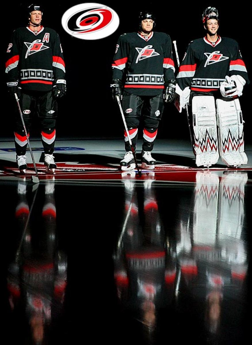
We like the maritime warning flag on the hockey stick. It beats the current crest (inset), which <i>The Hockey News</i> cheekily said "looked like a toilet flushing." But the execution here leaves something to be desired. The boxes that line the bottom look vaguely Aztec. And this is yet another black uniform, after all.
Vancouver Canucks
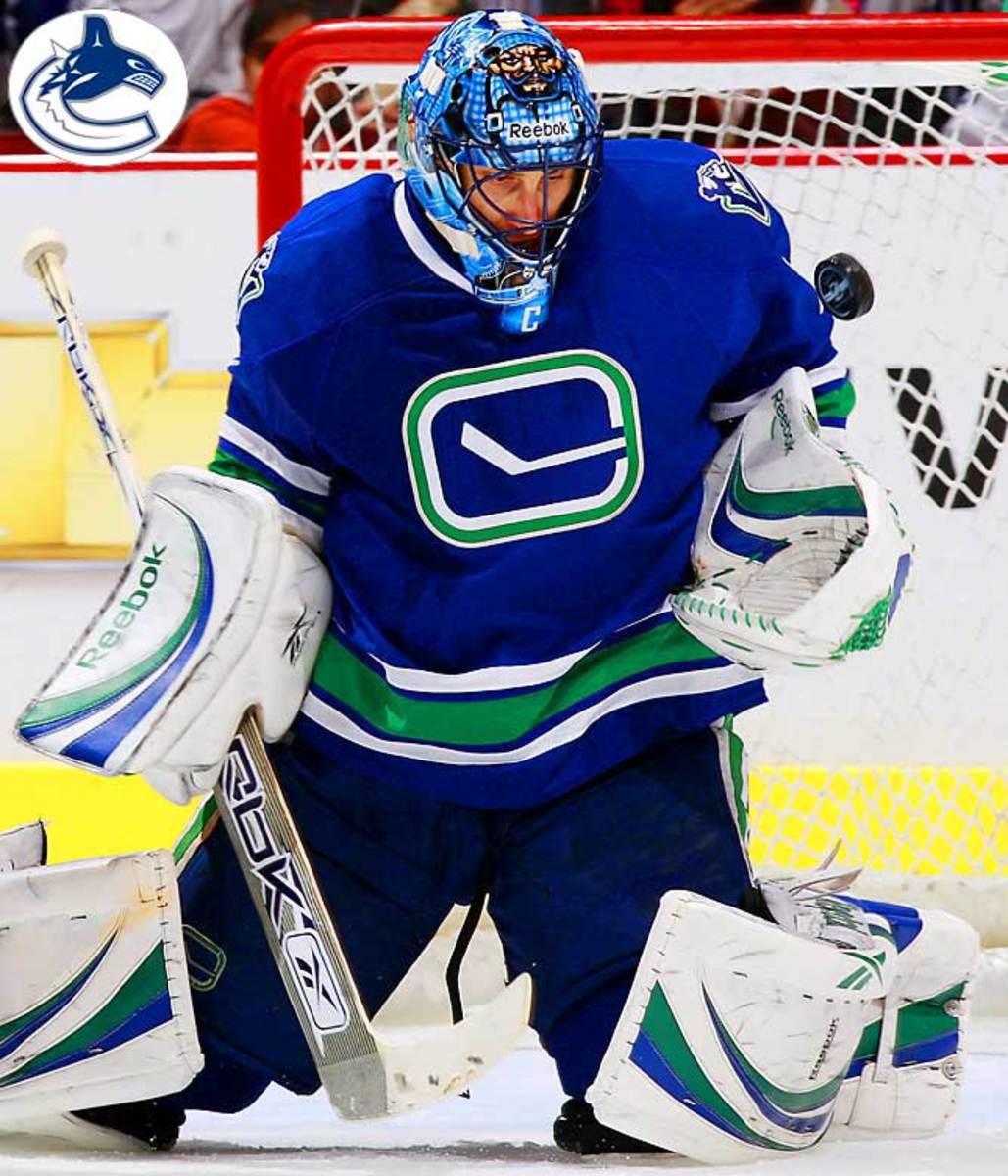
Let's start by saying that one staffer here hates the current crest (inset) -- a C with an unidentifiable marine animal (we think) -- so much that it actually angers him. That said, this simple hockey stick isn't that much better, although it looks quite chic. But chic doesn't count for much in hockey unless you're Sean Avery. Vancouver, the only Canadian team without an iconic crest, should find one once they find an identity.
Tampa Bay Lightning
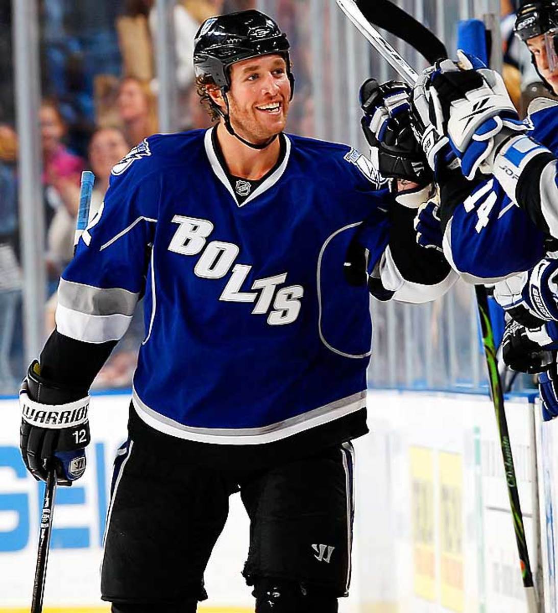
We commend the Bolts for trying something different, but other than the brighter color, this third falls a little flat. There's nothing about it that makes us think of lightning. In fact, the font is so big that it looks more heavy than quick.
New York Islanders

Automatic points for keeping the fish sticks guy (inset) off of it. Going back to the old colors, again, is nice if only for reminding Islanders fans that this was a dominant, winning team once upon a time.
Los Angeles Kings
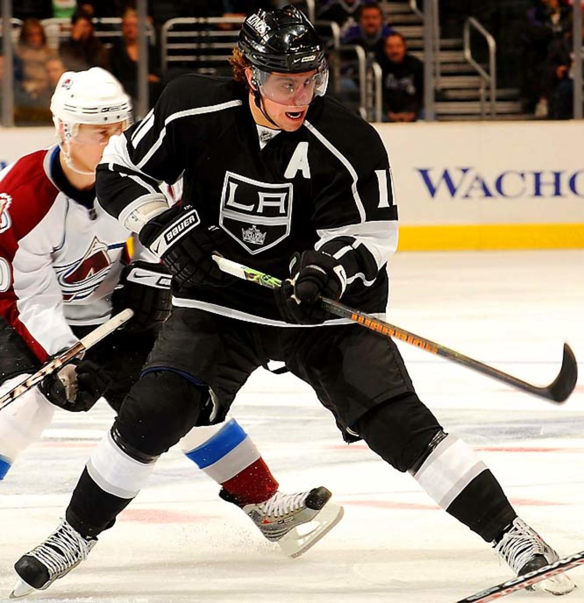
Another third jersey, another boring black sweater. At least this third doesn't have "Los Angeles" across the crotch.
Ottawa Senators
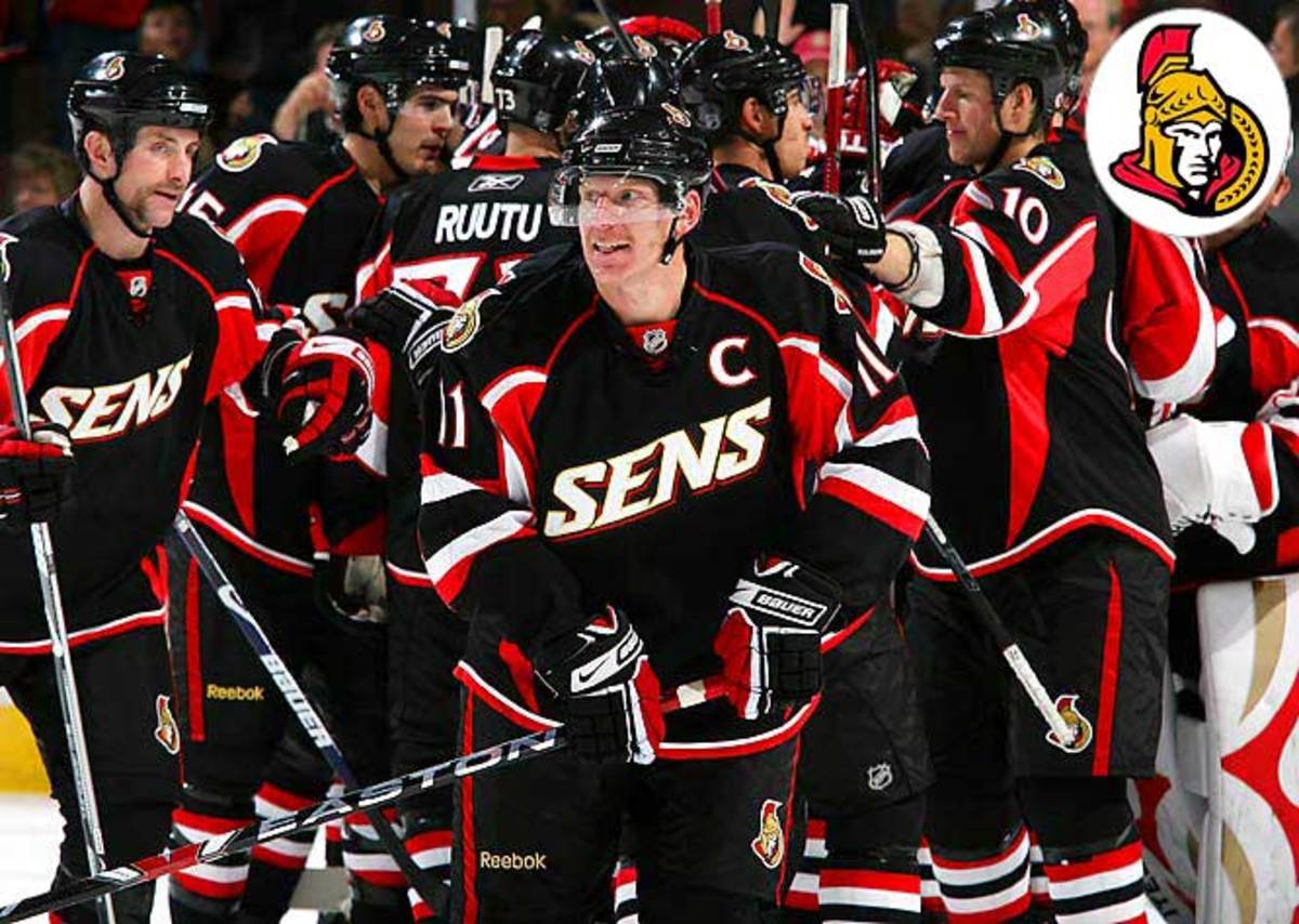
The team's revamped Senator (inset), facing front and looking perhaps a little too lifelike, has its detractors. The real crime with this third is that he's been lazily replaced by . . . Sens? Come on. And like so many third jerseys, it comes in any color you like -- as long as it's black.
Atlanta Thrashers
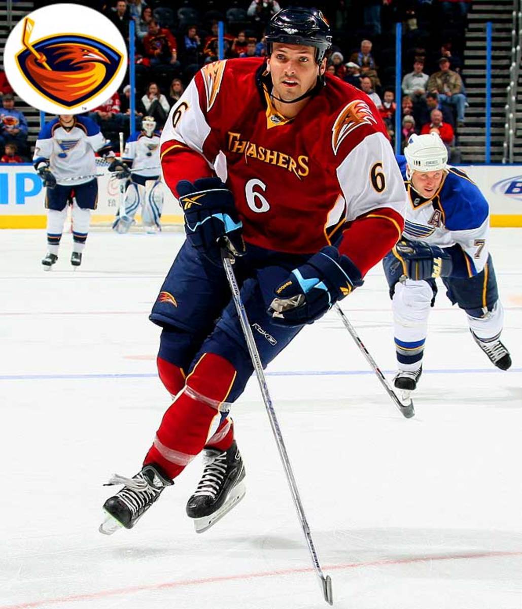
We don't love the original crest (inset), but this new design makes us yearn to see it more. Where do we begin picking at this one? The frightening bird heads on the shoulders? The shin-pad socks? No, let's start at the confused front. Thrashers across the chest and a number centered below look more like a basketball uniform, though one waggish league exec opined: ''No, more like an arena football jersey... Wait, no, like a <i>Canadian</i> arena football jersey.''
Dallas Stars

You'd think a team with Vogue intern Sean Avery on it would be a little more stylish. But not only does this boring jersey bring absolutely nothing new or interesting to the table, it's white. Who makes their third jersey for road games? Maybe it's just a fashion statement about what's been going on in Dallas of late.
