Great NHL Logos of the Past

Great NHL Logos of the Past
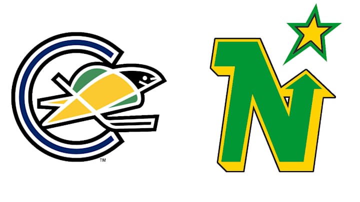
California Seals (1967-68) | Minnesota North Stars (1985-91)
A fan at the American Airlines Center religiously wears a Seals sweater to every Dallas Stars home game. He understands the roots of the franchise go back to the 1967 expansion when the North Stars and Seals entered the NHL. That Seals underwent name changes before their brief stop in Cleveland and merger with the North Stars in '78. It would have been ideal to see the Stars honor their Minnesota roots during their 20th anniversary celebrations in Dallas, but it's not too late to bring this beauty back as a third or perhaps at an outdoor game against the Wild. They should honor their California roots, too.
Chicago Black Hawks (1926-27)
When you have the best uniform in hockey—maybe in all of sports—there's no need to mess with the status quo. Still, it's a good bet the Hawks will either host, or be the invited guest, for another outdoor game before long. And when that happens, they should go all the way back to their very first logo. The stark two-tone look, especially when displayed on a black-and-white sweater, makes for a dramatic shift from the vibrant modern version. And that's what makes it so powerful.
Hartford Whalers (1979-92)
The whale tail HW logo is one of the most clever ever designed for an NHL team, and it's one that, judging by memorabilia sales, has stood the test of time. The Hurricanes need to work this up, even as a one-night special, to honor the New England heritage of the franchise. Have to think GM Ron Francis would be on board, right?
Kansas City Scouts (1974-76) | Colorado Rockies (1976-82)
If we learned anything from rapper Swoop G, it's this: Don't forget where you came from. The Devils began life as the Kansas City Scouts in 1974, then became the Rockies from 1976-82 before arriving in New Jersey. They've left their logo virtually unchanged since then and, to be honest, it's getting a little bit stale. Not that it's going to change any time soon, but a one-game tribute to the organization's roots might make for a nice change of pace.
Los Angeles Kings (1995-96)
In a lot of ways, this was an absolute disaster from the moment it debuted on Jan. 27, 1996. The sublimation, the relegation of the logo to the left breast, the purple freakin' hair/beard combo. Still, it's fondly regarded by a sizable number of Kings fans and might actually make for a decent look with a few minor alterations. Sew it on. Enlarge it and move it to the middle. And for the love of Gretzky, give it some hair that's suited for a hockey player, not a YouTube makeup expert. Do that, and they might actually have something here.
Montreal Canadiens (1911-12)
The Habs trotted out many of their quirky early looks during their 100th anniversary season, but this one with the red and blue sash and calligraphic C displayed over the left breast didn't make the cut. It's a one-year-only curiosity but so strikingly unique that it deserves another look, even if only for a one-off event like a Winter Classic.
Montreal Canadiens (1924-25)
This logo is so cocky that you have to love it. Imagine wearing this target on your chest all season. The Habs might not be able to use it again for awhile (unless Carey Price starts scoring, too), but theres no reason why it couldn't be passed along so that a reigning champ could don it, even if only for the banner-raising at the season opener.
Quebec Nordiques (1985-95)
Much like the Winnipeg Jets, the Nordiques would be wise to pursue a fresh, modern logo if/when they return to the NHL via expansion. But that doesn't mean this classic (albeit confusing) original design needs to stay in mothballs. Either the first Nords (now the Colorado Avalanche) need to bust it out again—Joe Sakic, Peter Forsberg and Adam Foote wore it for warmups during a 2002 preseason game at Le Colisee—or the new Nords need to acquire the rights in order to mix it in as a third.
Toronto Maple Leafs (1926-27)
Time to drop some science: leaves, especially those from the mighty maple, are not blue. They are, in fact, green. So Toronto's original color scheme is not only striking, but it's more true to nature. Even if it was worn only for half a season, it deserves a second look for a special event or anniversary.
