New Ducks, Avalanche third jerseys accidentally revealed
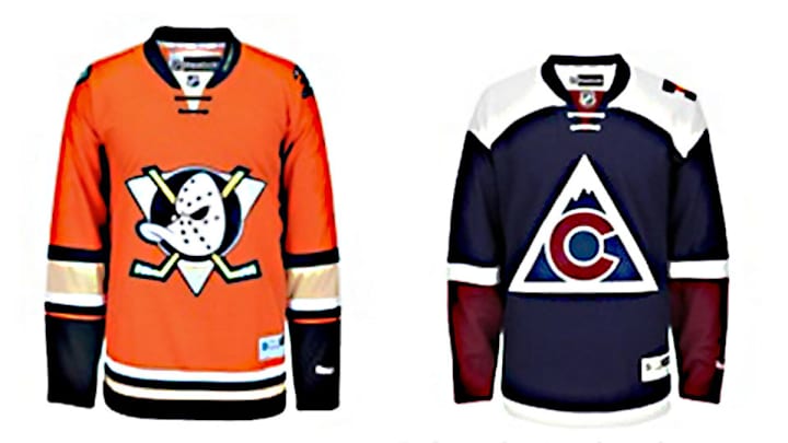
Someone over at the NHL is probably wishing they’d taken Labor Day off.
Instead, they showed up for work on Monday and inadvertently revealed the highly anticipated third jerseys for the Anaheim Ducks and Colorado Avalanche weeks ahead of their official release.
The images were quickly removed from the league’s international online store, but not before they were captured for posterity:
The new @Avalanche 3rd jersey is 🔥! Ordering one the second I can. #GoAvsGo pic.twitter.com/i2xFBDwQla
— Adam Greenbaum (@Greenbaumly) September 7, 2015
Report: New York Islanders get new logo, alternate jersey
The designs won’t surprise anyone who’s been paying attention, though, as the final versions mirror the leaks that have popped up on jersey design sites over the summer. Anaheim’s new alternate returns to the orange appeal of the Stadium Series specials worn last winter but features the vintage Mighty Ducks logo. The Avalanche dumped their lame wordmark thirds for a more old-school look. The logo leans on the state’s flag for inspiration while also paying tribute to the old Colorado Rockies. The color scheme uses a navy blue base with burgundy on the sleeves and a white highlight on the shoulders.
Just as interesting as what the snafu revealed is what it didn’t: the expected black-and-white alternates set to be worn by the Islanders in their debut season in Brooklyn’s Barclays Center.
The way things are going over at NHLI, though, it’s just a matter of time.
GALLERY: Bizarre NHL Third Jerseys
Bizarre NHL Third Jerseys
Los Angeles Kings
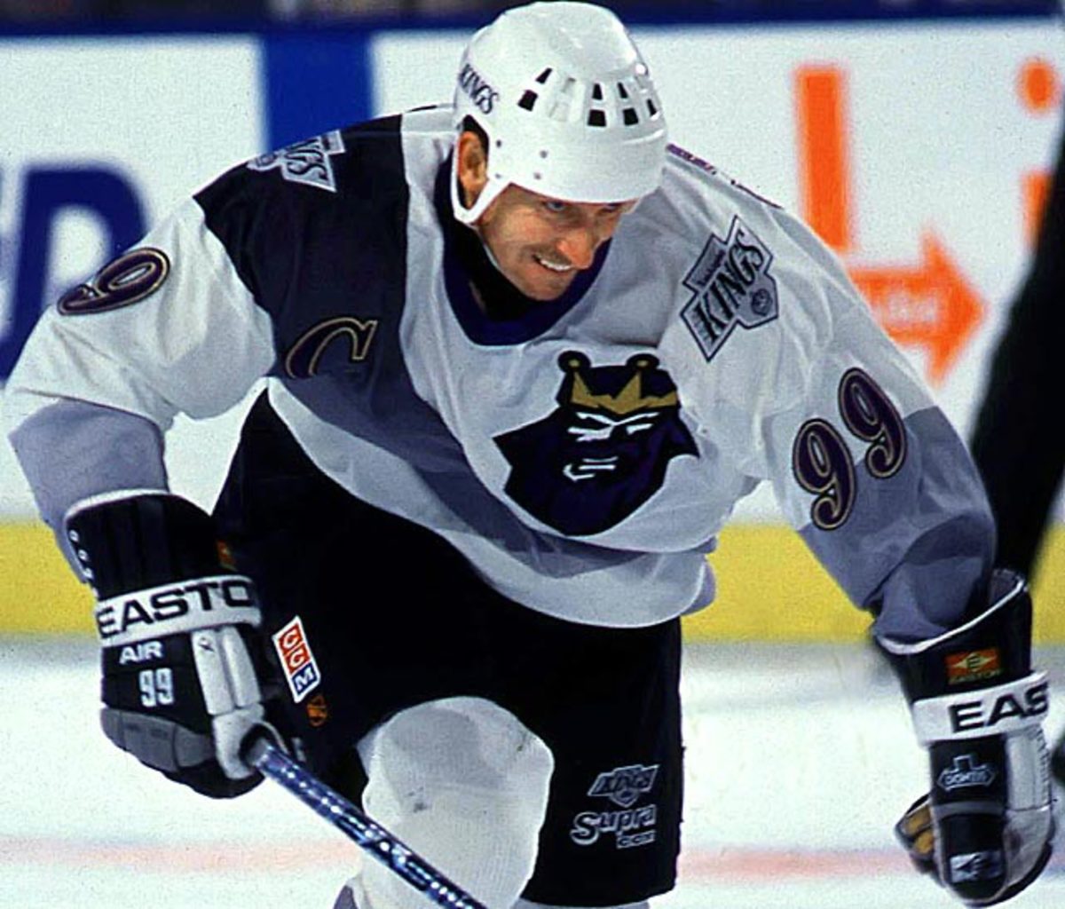
Starting next season, NHL teams will be permitted to have only home and road jerseys as Adidas takes over for Reebok as the official outfitter of NHL uniforms. There will be no third jerseys, in order to make the initial implementation of new sweaters easier. This sad news has inspired us to look back at some the NHL's more bizarre third jerseys of the past two decades.
Mighty Ducks of Anaheim
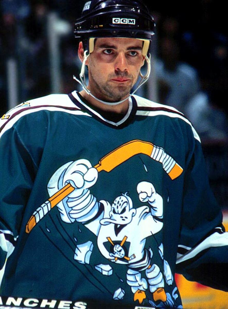
When it came to shameless cross-promotion, few teams could top the Disney-owned Ducks, who used their players to plug the Mighty Ducks movie franchise. This corker of a jersey looks like a mash-up of Teenage Mutant Ninja Turtles and Slap Shot. After one season, it was dispatched to the fashion penalty box, from where it has (thankfully) never gotten free.
Boston Bruins
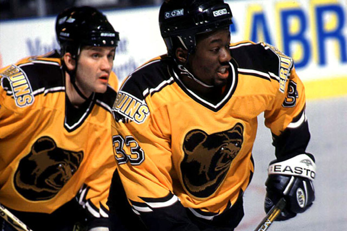
Introduced in 1995 and in use until 2006, Boston's throwback bear's head looked more jolly than menacing.
Tampa Bay Lightning
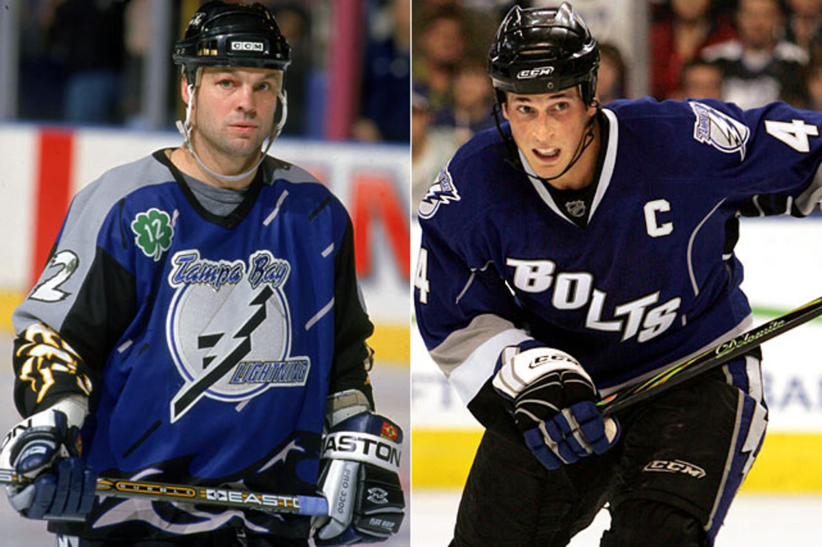
The threads on the left, with their driving rain, lightning bolt, roiled waves and windblown spinach leaf on the right shoulder evoked Snoopy's classic literary opening, "It was a dark and stormy night." And so it was until the clouds cleared and the duds were deep-sixed for 1999-2000. The sweater on the right, which Tampa Bay rolled out in 2008, looks like either a tribute to hardware stores or to heavy industry.
Vancouver Canucks
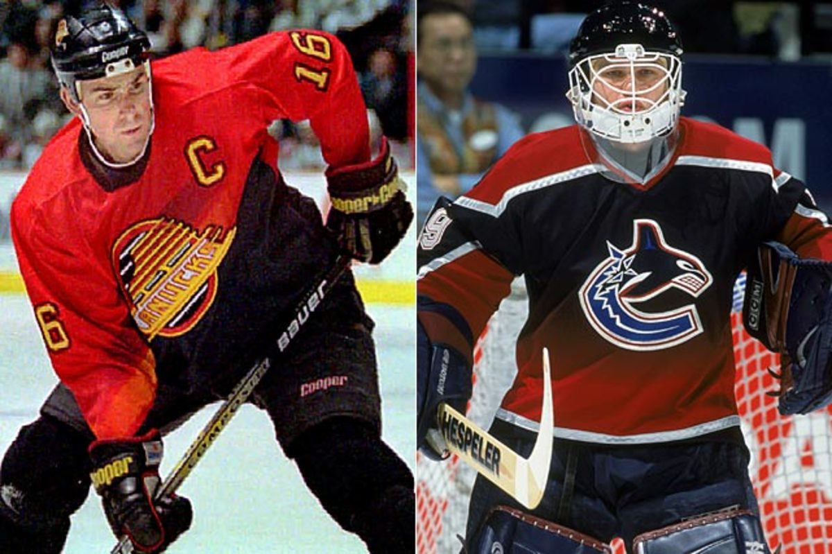
The good folks in Vancouver who gave the world some of the most memorably garish gladrags in hockey history -- the Canucks' eyepopping orange, yellow and black V-necked sweaters of the late 1970s and early '80s -- launched another psychedelic assault in '95 with a new alternate. The later model on the right isn't all that bad, just a far cry from the team's current, and blessedly soothing, blue, green and white scheme.
Phoenix Coyotes
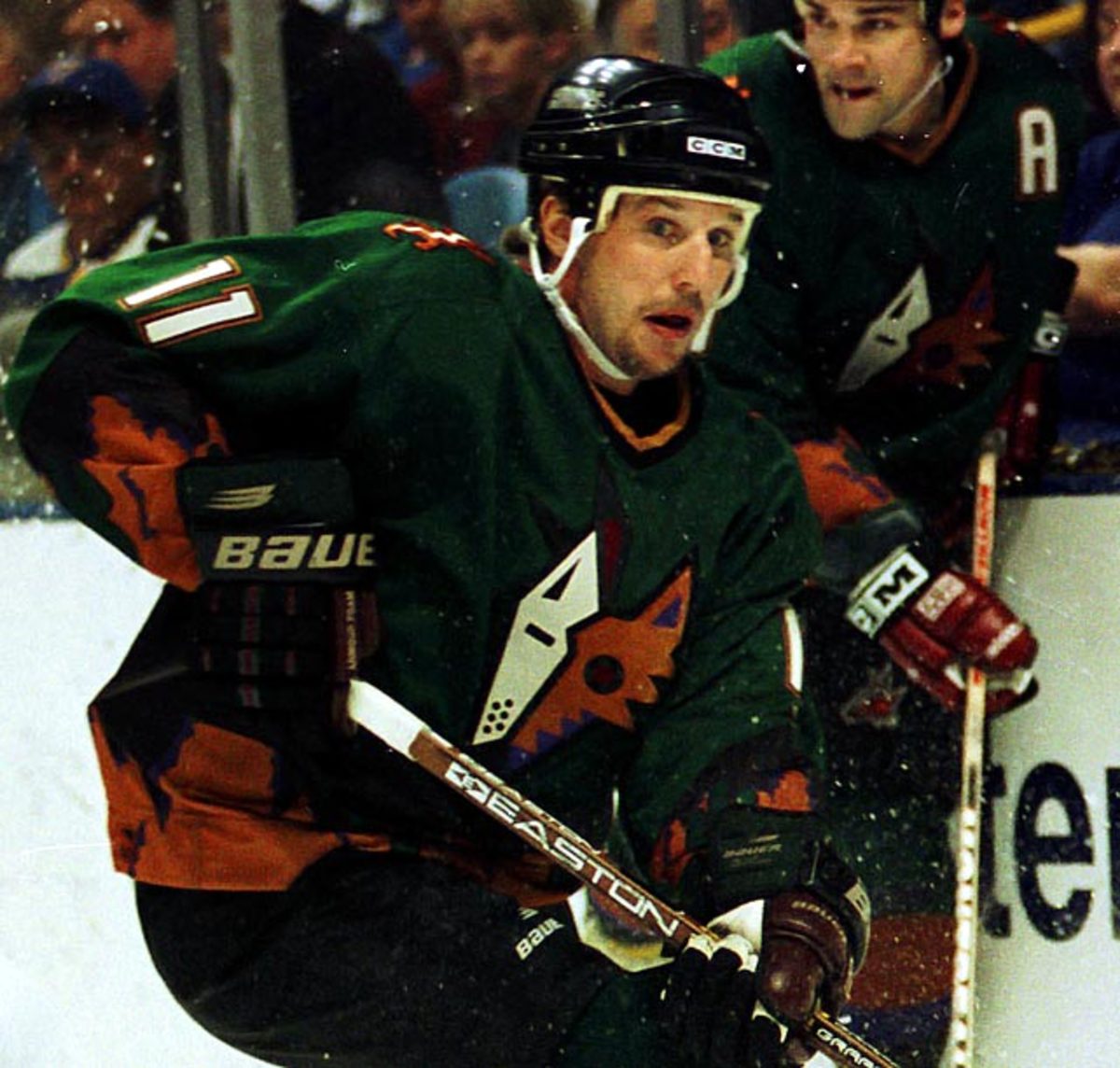
Worn for five seasons, the color scheme summons to mind an upset stomach. Crest by Pablo Picasso?
Calgary Flames
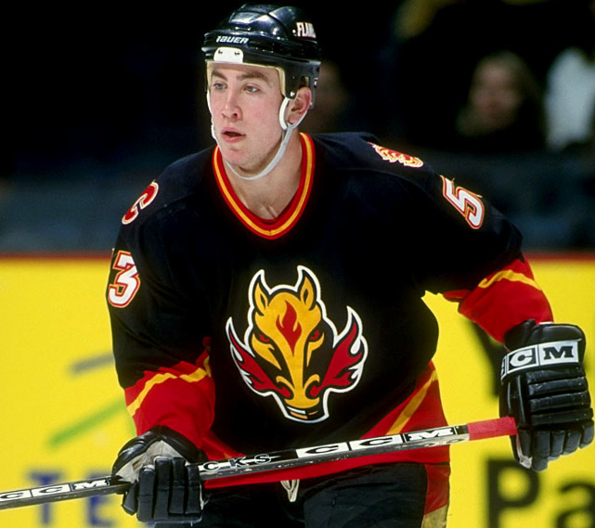
Depending on your sensibilities, there was something either vaguely satanic about Calgary's fire-breathing steed, or else it looked like a label lifted from a bottle of hot sauce. Introduced as an alternate in 1998, it found its way onto the team's road sweaters in 2000.
Edmonton Oilers
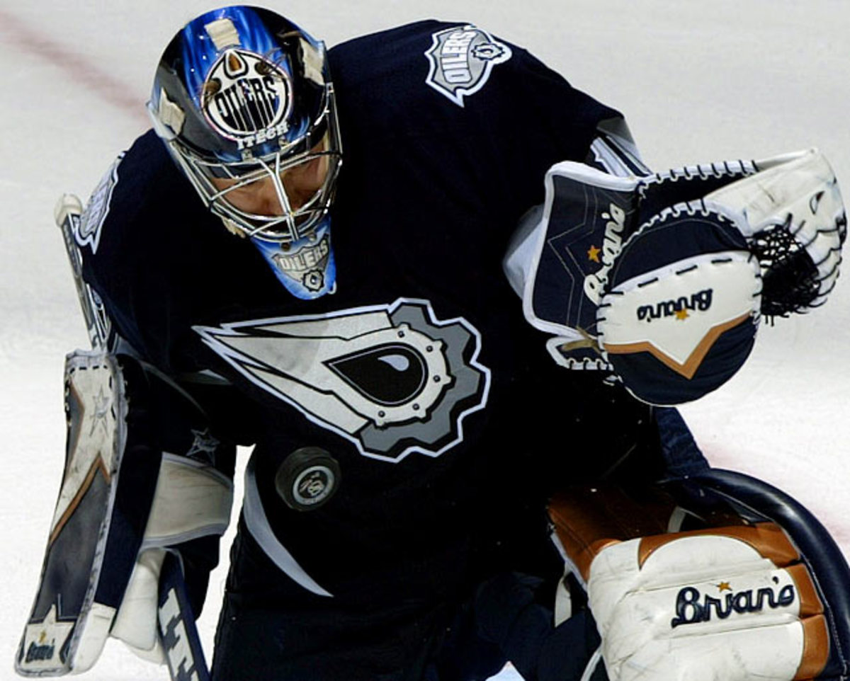
Last seen in 2006-07, this alternate's crest looked like an evil mechanical eye or a refugee from an episode of Pokemon.
New York Islanders

As if their infamous "Fish Sticks" attire of 1995 through '97 hadn't been bad enough, the Islanders wore this alternate for four seasons. The blue bat wings on the sides only enhanced the jersey's distinct Halloween motif.
Dallas Stars

What the crest on this lulu actually symbolized was anybody's guess. Ours? A space alien being buzzed by a comet, or some kind of interstellar eel. Worn for two seasons.
Team USA
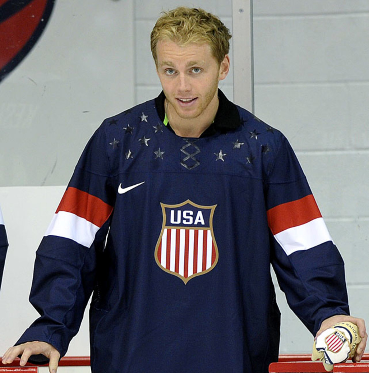
With their fake lacing, and with shiny stars sublimated on their shoulders, these sweaters worn by Team USA in Socchi made quite the fashion statement.
Carolina Hurricanes
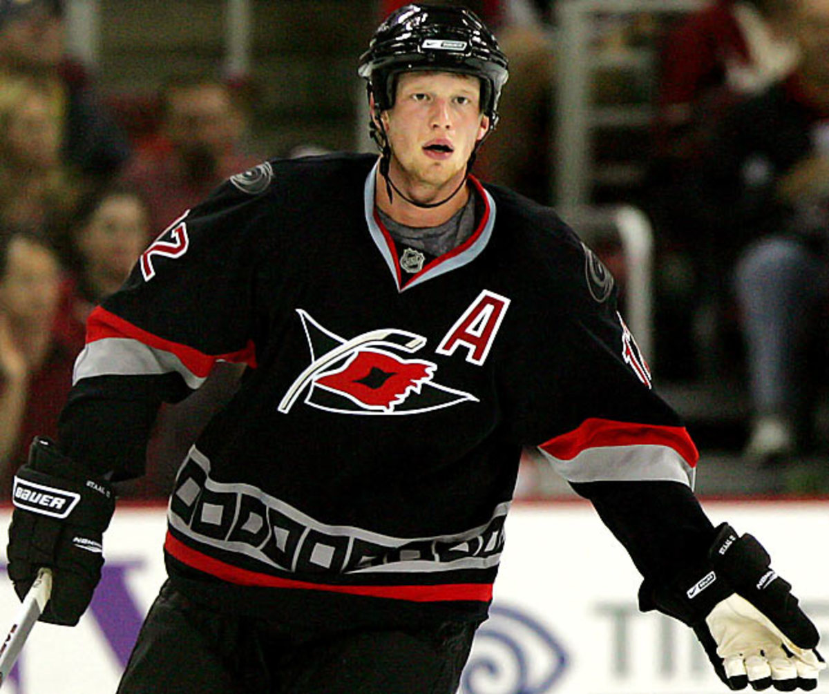
The colors are stock gangsta, but at first glance, that storm warning crest appears to be a knock-hockey stick menacing a tattered pair of lips.
