Best and Worst NHL All-Star Jerseys

Best and Worst NHL All-Star Jerseys
Best: 1989-91 Road
The NHL ditched the league orange base for the “visiting” team after 15 years and went with black, creating a more dramatic appearance. The star-studded trim and the orange and white accents were perfectly proportioned, creating the classic look
Best: 1964-68
This vintage gem came from a time when the All-Stars battled the reigning Stanley Cup champs. Clean, simple and sharp. Just imagine a line centered by Jean Beliveau with Gordie Howe and Bobby Hull on the wings wearing these beauties.
Best: 2004
Both draw heavily on a vintage theme, along with the color scheme of the hometown Minnesota Wild. The Western greens are more vibrant, although the Eastern cream and red feel more like they could have been lifted from a showcase at the Hall of Fame. These sweaters captured a moment and a place better than any other design.
Best: 1947-59
These date back to the first All-Star Game back in 1947 when the stars fought back from a 2–0 deficit to beat the Maple Leafs, 4–3. The heavily striped shoulders are reminiscent of a football design, but they worked just as well in this set. The design was copied in 1992 (pictured) to honor the 75th anniversary of the league.
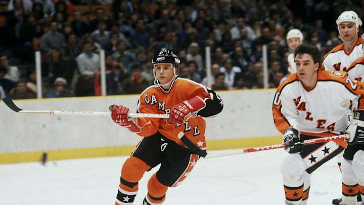
Best: 1984-86
You have to love vintage Halloween colors and the Wales and Campbell conference names slashing across the chest in the old New York Rangers font.
Worst: 2015
Neon (er, sorry, “elite”) green. Piping that ran halfway down the inside of the sleeves. And that garish chrome crest. Just ghastly.
Worst: 2012
What’s with the pit stains? And the number centered above the NHL logo? And the overzealous striping that splits the sleeves? This is design-by-blender.
Worst: 1994-97
The colors, man, the colors! The purple-and-black combo feels like something Nike would trot out today as an edgy college football kit. That would suck, but not as much as these.
Worst: 1982
Apparently someone took the All-Star thing too seriously and tried to put all the stars they could find on each of these jerseys. Overkill.
Worst: 2016
Apparently a black and white jersey is cool because “they are the colors found in musical instruments such as piano keys, which speaks to the cultural identity of the city of Nashville,” and they “recall the dramatic visual of Nashville’s Broadway at night, illuminated by the neon signs of honky-tonks and music venues.” Yeah … uh, no. These are dull as dishwater and even a splash of Preds' yellow can't save 'em.
