2018 NHL Third Jerseys

Anaheim Ducks
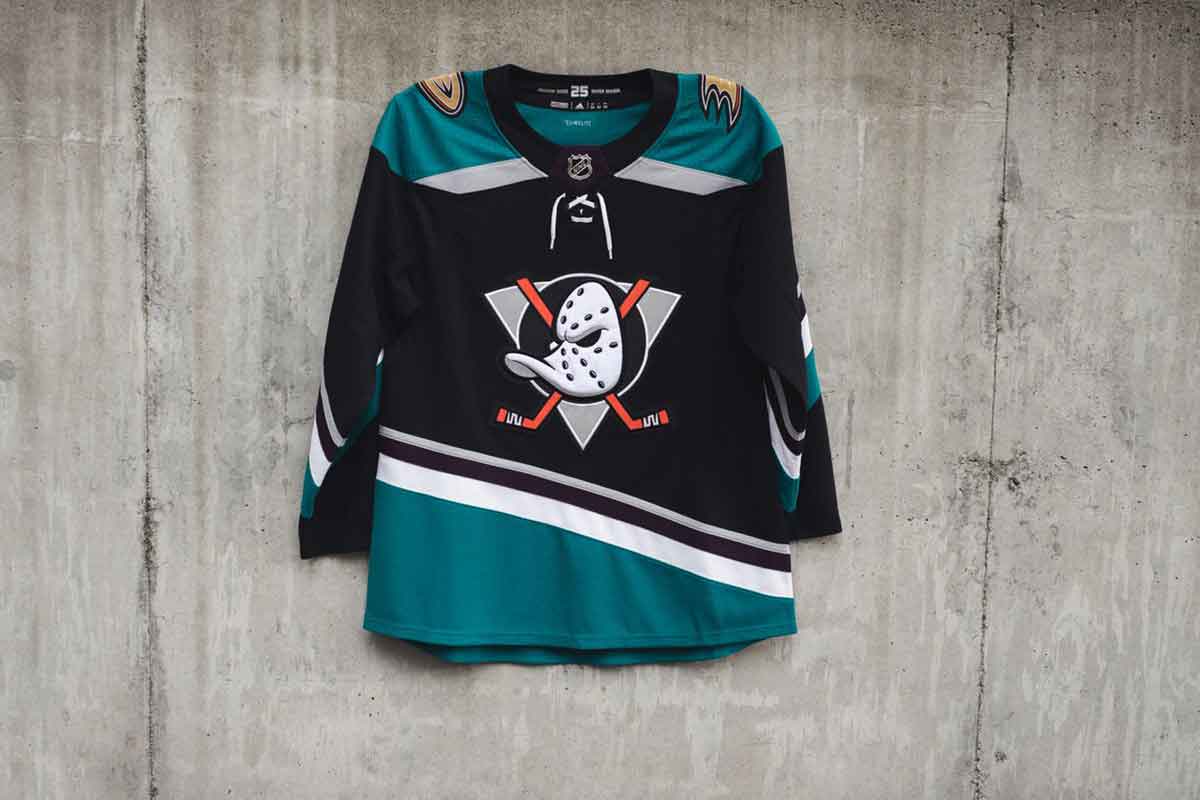
For their 25th season, the Ducks went ahead and combined elements from every jersey the the franchise has ever worn, past and present. That includes the iconic duck mask logo with spalshes of orange, eggplant and jade.
HBD's take: I’m not as big a fan as most on the original jerseys that these new ones are based on, but there’s no question the originals are superior in almost every way. While trying to create a modern and exciting update to the original jerseys, almost every change imposed on these new jerseys (inconsistent striping, black base) have diminished the luster, appeal and nostalgia that made people love the originals so much.
Philadelphia Flyers
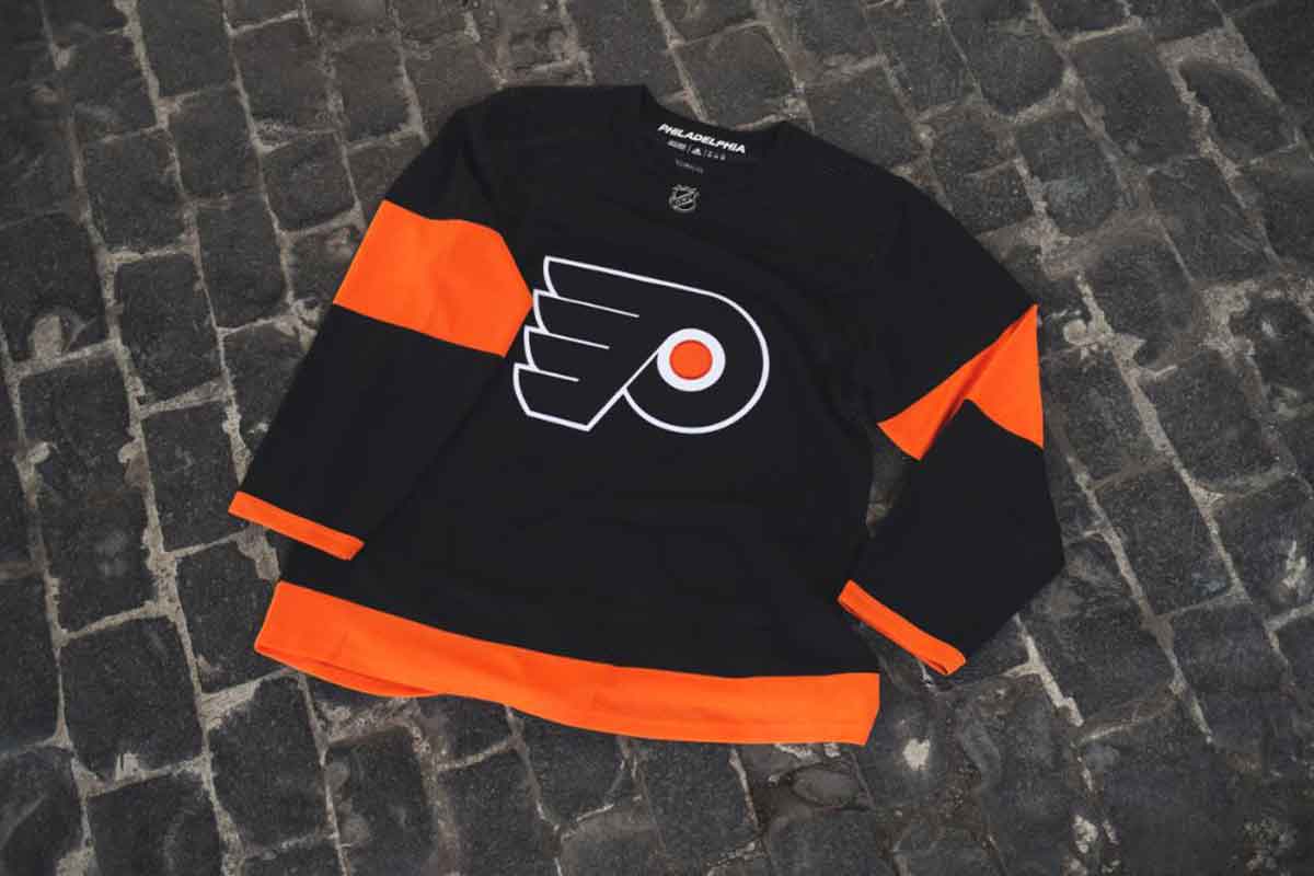
The Flyers' thirds are the same ones they wore for the 2017 Stadium Series game in Pittsburgh, but—maybe more importantly—won't be the ones they wear when they renew their outdoor matchup with the Penguins in February.
HBD's take: It’s boring. It’s practice-jersey-esque. And they’re seemingly keeping the oversized sleeve numbers from the Stadium Series. I understand it’s difficult to create something amazing when you’ve already got one of the best jersey sets in the league, but this is a complete missed opportunity to do something that was at least somewhat interesting.
New Jersey Devils
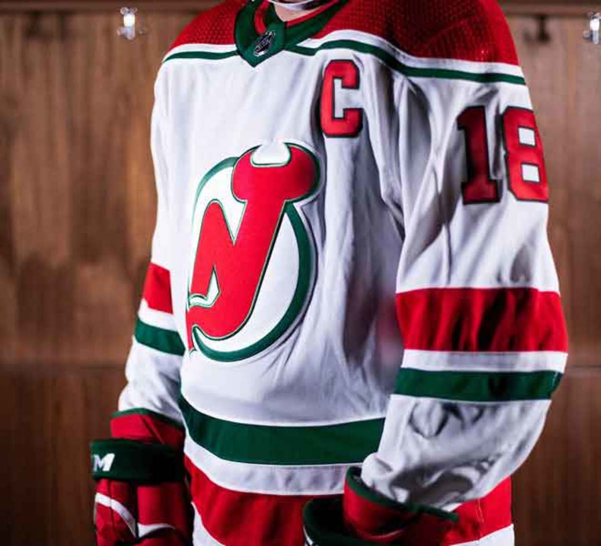
It's a return to the team's jersey roots for the Devils, bringing back the ever-popular Christmas colors from the franchise's inaugaural season in 1982-83. New Jersey will wear these beauties four times during the regular season, all at the Prudential Center.
HBD's take: The Devils have not had many jerseys, but re-introducing these fun, unique and aggressive originals is never a bad move. Not many teams have ever tried the red-and-green Christmas color scheme, on a strangely consistent but inconsistent jersey with some great quirks, it’s hard not to call these a winner.
St. Louis Blues
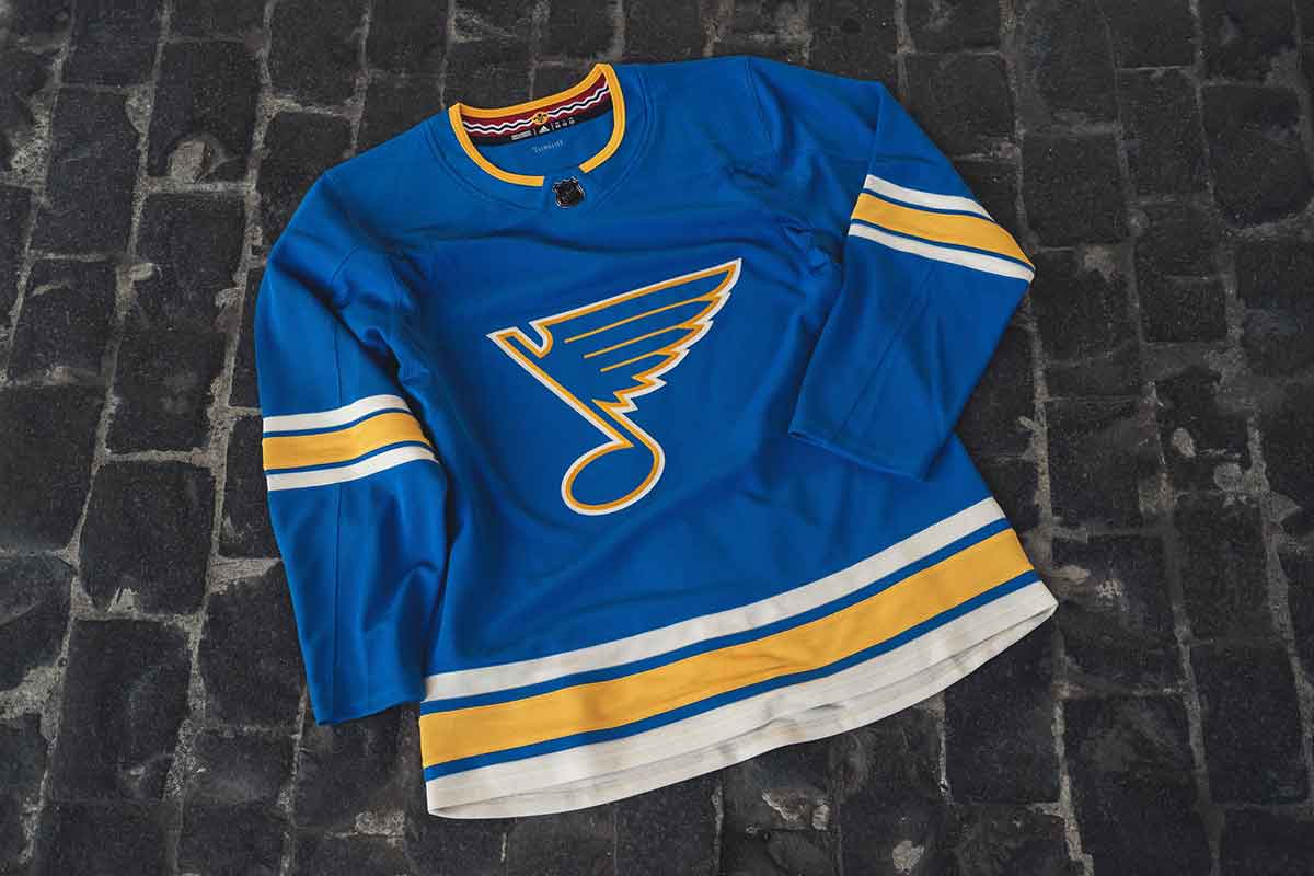
Based on the franchise's original 1967 jerseys also worn in the 2017 Winter classic, the Blues added the city of St. Louis flag inside the collar. The team will wear their heritage uniforms on 11 Saturday night home games, and they're already a hit with the players. "That original jersey was one of my favorites growing up," St. Louis native Pat Maroon said.
HBD's take: Glo-ri-ous! The striping is classic old-school aesthetics. The colors are fantastic. The Adizero collar—while not necessarily “Heritage”—made the best decision possible given the possibilities. And the logo is awesome, as always. For a Heritage jersey, it hits all the right … wait for it … notes.
Arizona Coyotes
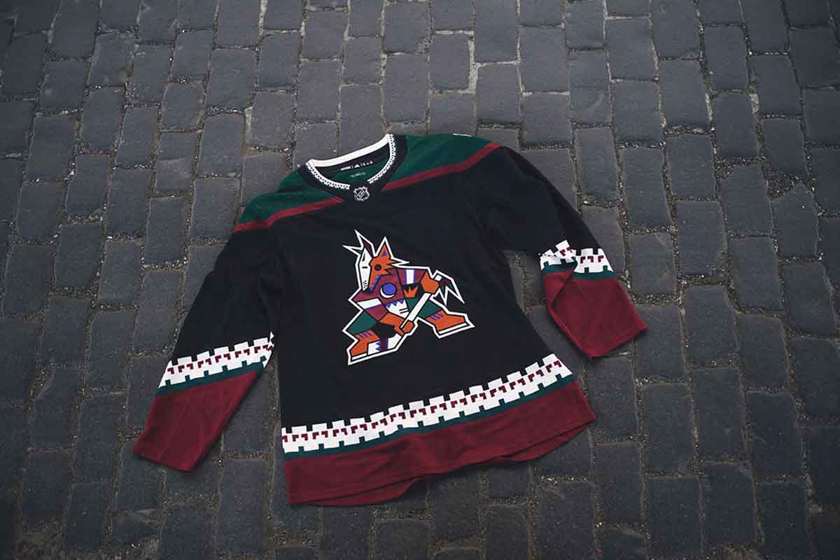
The Coyotes went back to 1996 for a taste of nostalgia, bringing back the inconic kachina jerseys for every Saturday night home game in 2018-19. Goalie Antti Raanta is taking things a step further with a new set of pads, to be worn specifically with the Arizona thirds.
HBD's take: Though I’m fairly certain I’m in a vast minority, these are not great jerseys. And it’s a lazy cash grab for Arizona and the league when they could’ve tried something new, forward-thinking and much more interesting. And the love affair with these will again end with a “what the hell was I thinking?” splat … until another 25 years pass.
Carolina Hurricanes (Third)
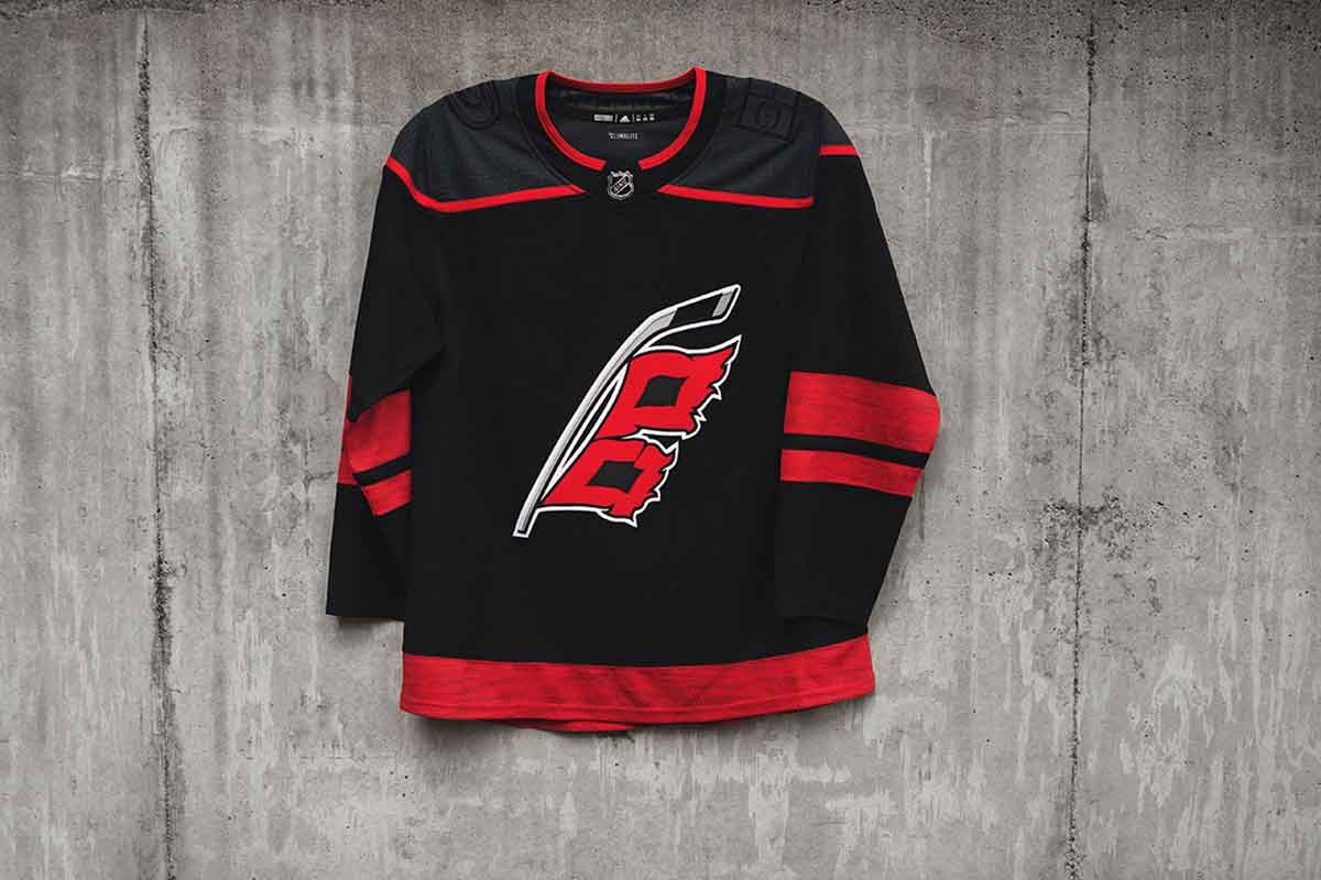
The Hurricanes turned to black for their 2018 thirds, using a two-flag hurricane warning (with a little North Carolina in the negative space between them!) for the alternate logo. The uniforms also feature heathered red stripes, Storm Gray shoulder yokes and a new Canes wordmark for the helmets.
HBD's take: It’s unbalanced with awkward amounts of negative space, uses a poorly-executed logo and inexcusably grays out its shoulder patches, for no reason other than that it might look “cool.” While there’s a few really great details, it’s a hard pass from me. Over/under is set at 3.5 seasons.
Colorado Avalanche
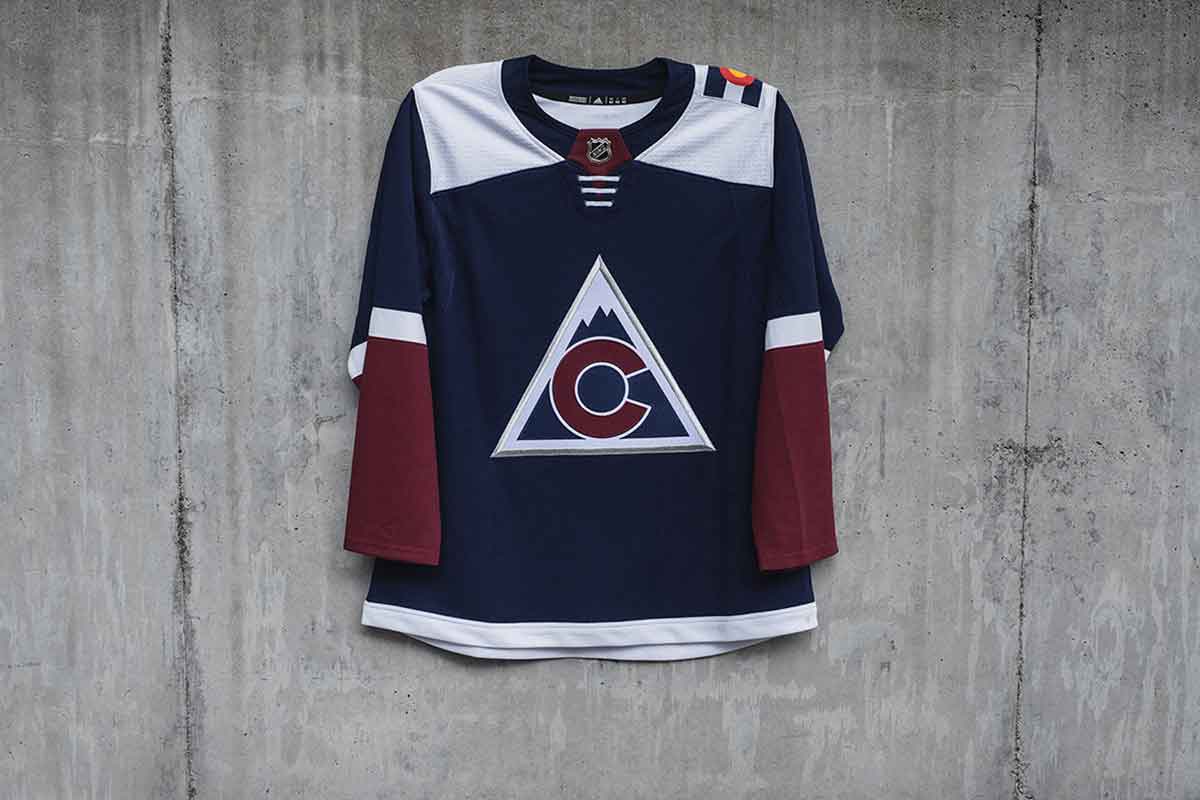
It's a familiar look for the Avs, who wore an iteration of this jersey during the 2015-16 and 2016-17 seasons. Inspired by the Colorado Rockies franchise of the late 1970's, the logo is the 'C' from the state flag on a triangular crest. The Avalanche plan to wear these 12 times during the season against Central Division opponents.
HBD's take: Minor issues aside, the design is a great mix of modern and vintage: It’s drawing from the team’s history, the specific location of the team, and brings in some modern (and minimalist) touches that create something unique. I’m a fan. Not a massive fan, as there’s still some issues that keep it from being really great, but a fan nontheless.
Winnipeg Jets
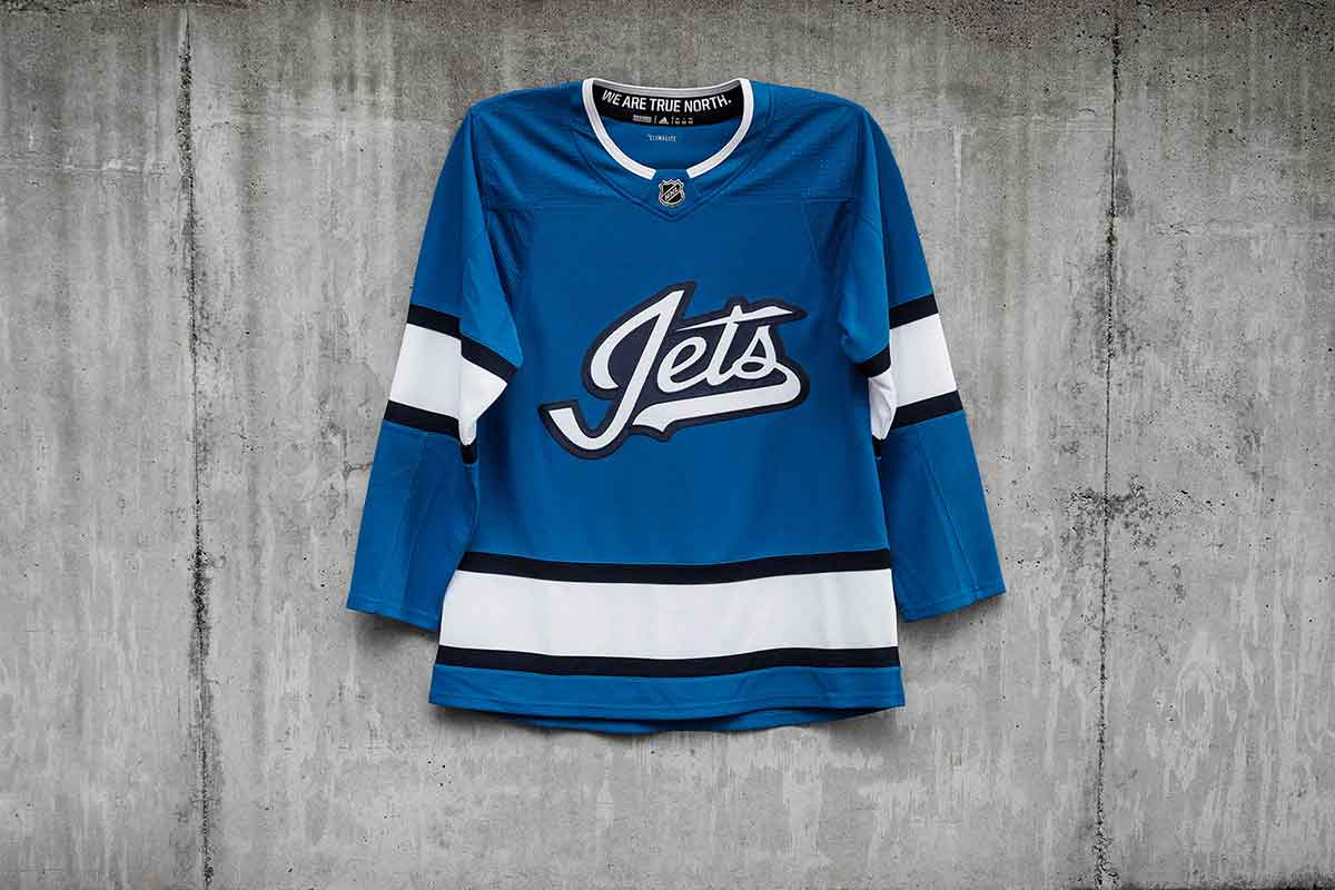
A look inspired by the early 90’s Jets uniforms—and infused with their current color palette—the third jerseys in Winnipeg feature an updated word mark, with the t in ‘Jets’ forming the outline of a fighter jet. The team plans to don the aviator blue sweaters 14 times during the season.
HBD's take: I like the elegant simplicity of it, and I love the baby blue color, but there’s no question it feels incomplete. Another color? Some shoulder yokes? Something was needed. But, there are severe intellectual copyright issues (the EHL’s Johnstown Jets wore eerily similar jerseys in the 1950's—too similar to be coincidence) which blackmark these jerseys more than anything else for me.
Columbus Blue Jackets
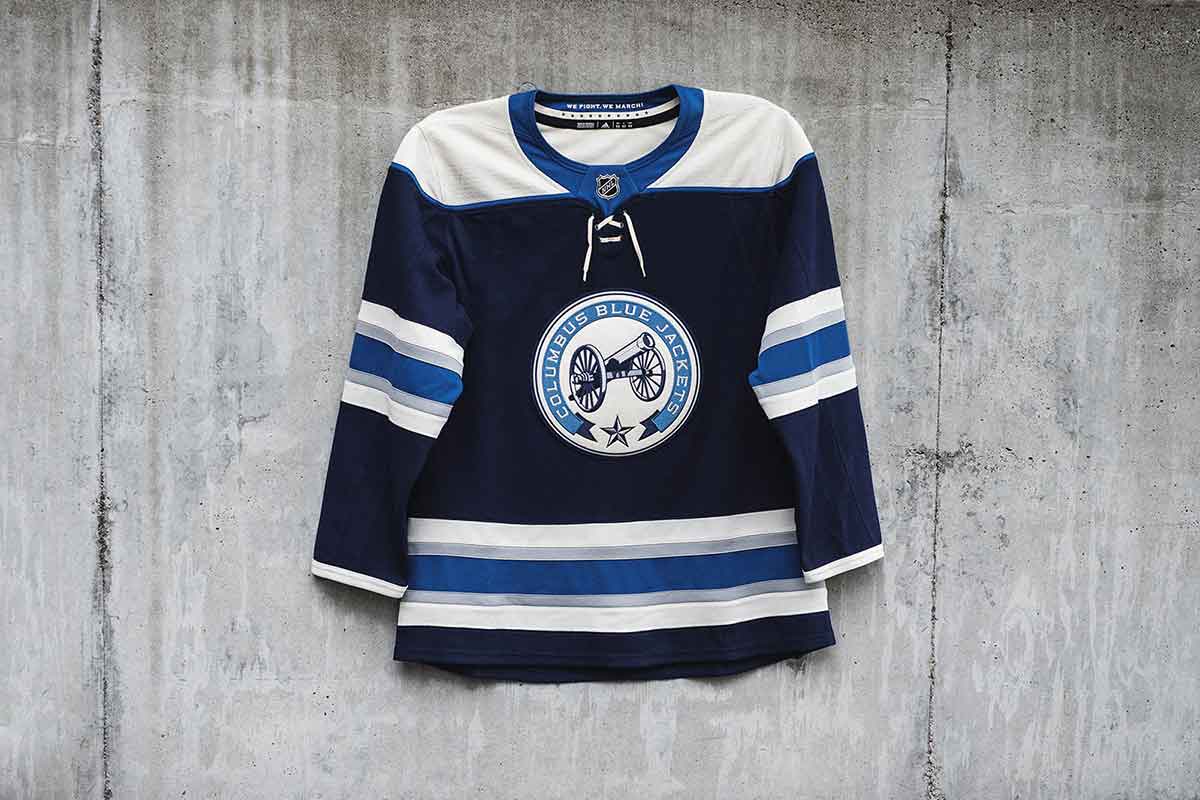
The cannon is back for the Jackets, now featuring updated name and number fonts and 'We Fight, We March' emblazoned in the neckline. The 10 stars on the inside are a nod to the franchise's 10 NHL seasons. Expect to see it 12 times during the regular season.
HBD's take: It’s a jersey that further establishes the Blue Jackets’ historical identity and looked more like an honest attempt at creating something unique than an attempted cash grab. It’s classically-designed with great details, great balance throughout and a great alternate logo. This is easily the best jersey that Columbus has ever worn.
Calgary Flames
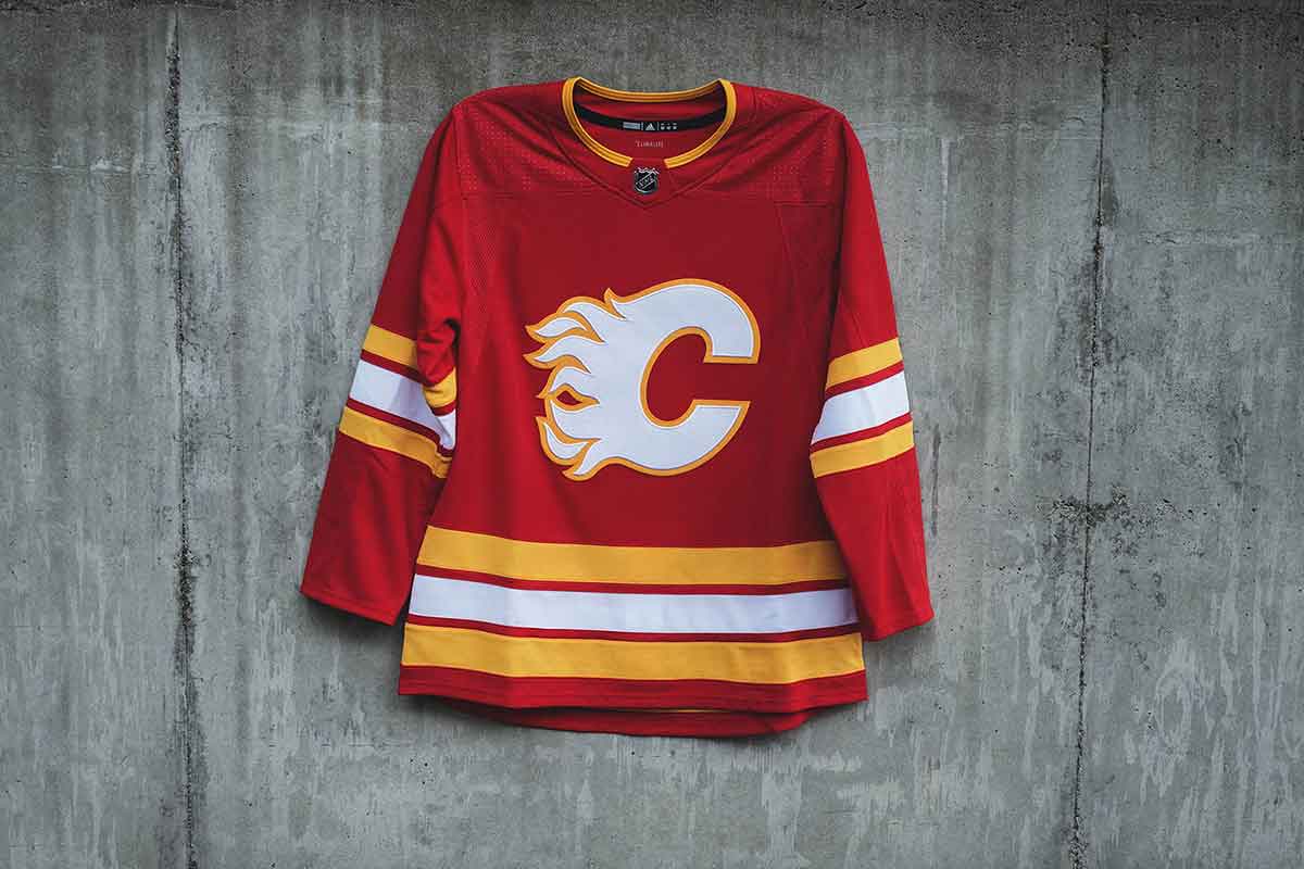
The Flames' new threads honor the 30th anniversary of the 1989 Stanley Cup victory, featuring the iconic red base and flaming 'C' logo.
HBD's take: These jerseys are simple, stylish, bold and aggressive … extremely fitting for a game of hockey. They look great on the ice (bright and brash) and they’re as identical as they can get to the jersey that raised the Stanley Cup in 1989, which makes any jersey look better than it would otherwise be considered to be. And they’re way better than anything the Flames have worn recently.
Washington Capitals
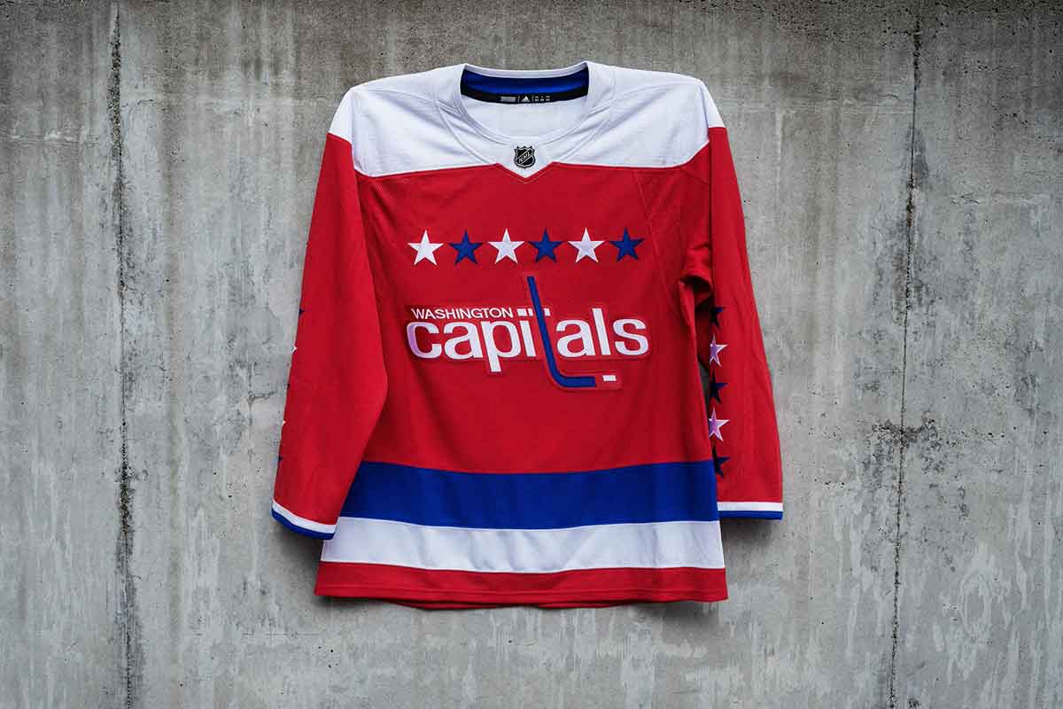
D.C. fans will be treated to these retro sweaters 12 times this season, a throwback to the team's original red jerseys worn for 20 years. The jerseys feature the iconic hockey stick wordmark and will be complemented with blue pants and red helmets.
HBD's take: These jerseys have a bad logo. The stars seem pretty cheesy. The stripes along the bottom of the jerseys are just really large and dominating. But, somehow, they just work. The colors are traditional, logical and nicely balanced. The concept is strong, simple, iconic and grounded in the city’s (and country’s) symbolism. It’s a fun, unique and aggressive jersey.
San Jose Sharks
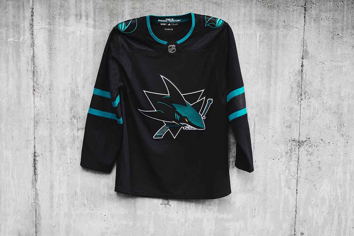
The Sharks set out to create a jersey that pays homage to Silicon Valley and the Northern California tech region with their 'Stealth' design. The main shark logo was made to look more predatory, while the tonal shoulder patches are a throwback to the franchise's original jerseys. San Jose will wear the all-black look at home on Thursdays and Fridays.
HBD's take: It’s the return of the Black Ice jerseys, but luckily that epidemic is limited to the San Francisco Bay area this time around. Calling it “Stealth” doesn’t improve it at all, as it’s nothing more than a black jersey with almost as little color on it as they could manage. The only interesting part of it (the sleeve stripe pattern) is barely visible. Yawn. Pass.
Edmonton Oilers
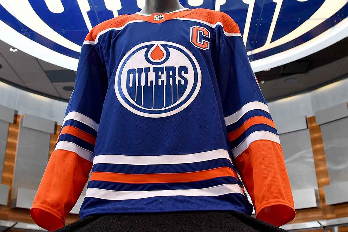
The Oilers are turning back to their classic royal blue and orange for their 40th NHL season and plan to wear them four times this season, all against former Smythe Division foes: L.A., Calgary, Winnipeg and Vancouver. All the team's jerseys this season will feature a commemorative patch, as well.
HBD's take: It’s hard to separate legacy and history from the cold analysis of a design, but it’s hard not to enjoy these. Classic. Iconic. Raised multiple Cups. It’s a symbol of success. The colours are aggressive, but complementary, and the royal blue is way better than the darker blue they introduced this last year. The world would be a better place if they just went back to these full time.
Carolina Hurricanes (Heritage)
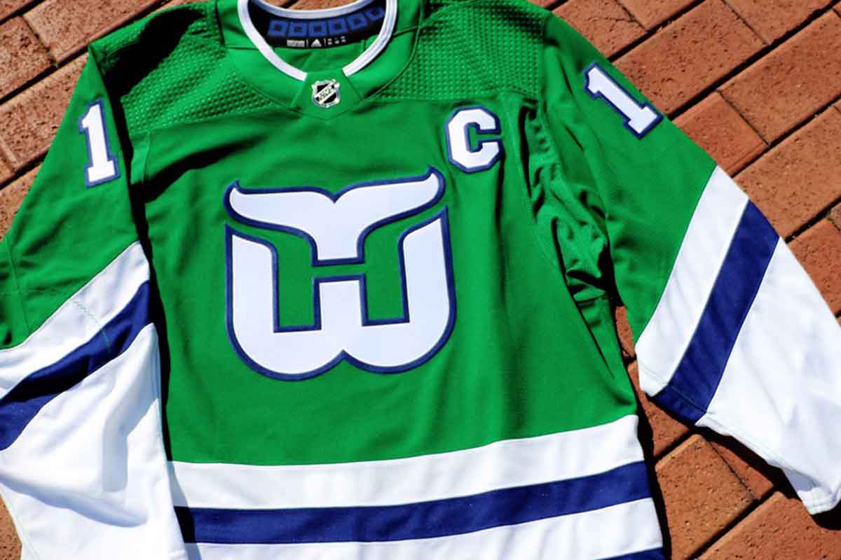
The Hurricanes will go back to their Hartford roots and wear these green Whalers jerseys only twice during the season—both times against the Bruins. Modeled on the late 80's/early 90's uniforms, there's no word on if the kits come with copies of 'Brass Bonanza.'
HBD's take: The kelly green. The iconic logo. The white-and-blue striping. The unflinching green-ness of it all. Simple, classic, strong, iconic, everything you could ask for in a hockey jersey. One of the best jerseys in the League’s history. Carolina doesn’t care about your hurt feelings Hartford, because when you have the opportunity to wear a jersey this great, you do it.
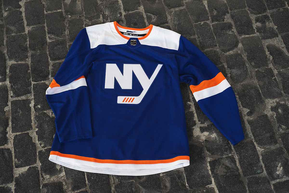
The Islanders debuted their new thirds just days ahead of the season, showing off a ‘signature look’ that includes a re-designed NY crest and nods to the team’s heritage with the color palette, striping system and numbering similar to that of the inaugural 1972-73 jerseys. The neckline includes a graphic of Long Island.
HBD’s take: Based on their old Stadium Series/alternates, it does what third jerseys are meant to do: play around a little bit, see what might work and push the conversation forward in an innovative way. Oh, and make more money for the teams/league, of course. They’re too much on the bland side, but at least they got rid of that awful chromed version of their alternate logo.
