Capitals Reveal Sentimental Addition to Red Line Logo

In this story:
Teams across the NHL are prepping for the 2024-25 season and laying down their ice surfaces and the Washington Capitals have done something special for their 50th anniversary season. Along with the 50th anniversary logo taking center stage, the Capitals hid an easter egg in their red line.
The center red line at Capital One Arena features 50 stars to represent the 50 seasons of Capitals hockey. The Capitals have quite a few promotions and events prepared for their landmark season, but the new ice feature is one that will be witnessed every home game.
fun fact: our red line has 50 stars for 50 years of #ALLCAPS hockey https://t.co/Tc7NVC5dPD pic.twitter.com/7hDdLOS07v
— Washington Capitals (@Capitals) September 4, 2024
There has been a trend of teams getting creative with their center ice logos heading into the 2024-25 season and the Capitals made sure to have their own special touch. 25 stars sit in the bold red line on each side of the center circle. Within the circle, the red line turns into outlines so you can see as much of the 50th anniversary logo as possible.
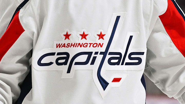
The logo is styled after the inaugural logo the Capitals wore from 1974 to 1995, with the main feature being the iconic stick. In any word mark logo the Capitals have used, the “T” has been morphed into the shape of a hockey stick.
The Capitals will also wear a 50th anniversary patch on their uniforms all season in the same style as the center ice logo. A bold 50 with the year of establishment and a red stick between the numbers.

Nick Horwat is a contributor with Breakaway On SI. He was previously a credentialed reporter for The Hockey News covering the Pittsburgh Penguins. A Pittsburgh native, Nick graduated from Point Park University and started reporting on news and sports with KDKA Radio and 93.7 The Fan. After hosting a Penguins talk radio show in college, he morphed the show into a podcast. The Tip of the Ice-Burgh Podcast has been a leading Penguins podcast since 2019. Follow him on Twitter @NickHorwat41.