Toronto FC's Jozy Altidore voted MLS Player of the Week

Jozy Altidore has played in only one game since returning to Major League Soccer and he already has some hardware to display.
Altidore spearheaded Toronto FC's 3-1 win over the Vancouver Whitecaps with a pair of goals, and he was voted the MLS Player of the Week by the North American Soccer Reporters (NASR).
After Toronto fell behind early, Altidore scored the equalizer in the 32nd minute, latching onto a pass from fellow new Designated Player signing Sebastian Giovinco to beat goalkeeper David Ousted.
Toronto then went ahead early in the second half thanks to a goal from Robbie Findley. In the closing minutes of the game, Altidore capped off his MLS return by drawing a penalty and then successfully converting the spot kick with a chip down the middle.
Altidore becomes the eighth player in Toronto FC history to earn MLS Player of the Week honors, and the first since Jermain Defoe secured the distinction in Week 2 last season. Toronto returns to action on March 14 against the Columbus Crew.
- Josh Sanchez
GALLERY: Critiquing all 20 MLS team uniforms
Critiquing every MLS uniform, head to toe
New York City FC
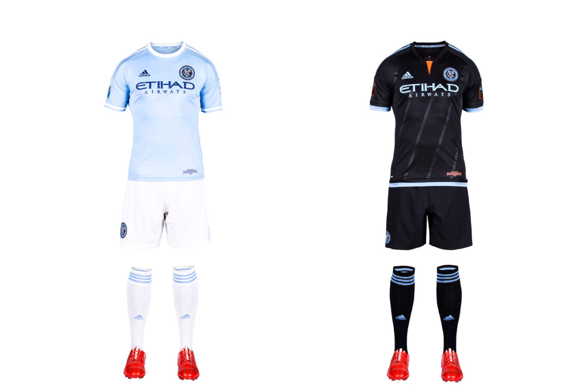
New York City FC took some heat for its sky blue home shirt, which looks a whole lot like the one worn by parent/sister club Manchester City. But an homage was inevitable, and NYCFC has differentiated itself from MCFC, and the rest of MLS, with the white shorts and socks. It’s a sharp look. The away kit, highlighted by a flash of orange (from the city flag) at the neck and five stripes you can barely see that "represent the five boroughs of New York City," is lazy. With a blank template, NYCFC should’ve come up with something other than the mono-black already worn in D.C. and Columbus.
LA Galaxy
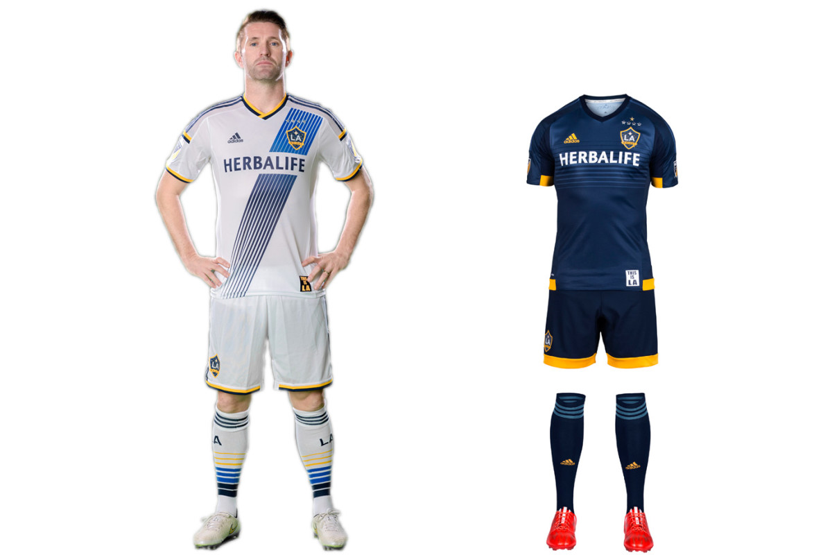
After several overhauls—LA wore black and teal, then teal and yellow, then yellow and green—the Galaxy’s white and blue brand has taken root. Three championships in four years certainly help. The sash on the home uniform, re-introduced in 2012, has quickly become iconic, and, along with the socks, helps make this all-white kit stand out. The new secondary set maintains the same feel as its recent predecessors. The yellow accents look sharp, but we can’t help but feel a white or yellow sash would tie the uniforms and brand together.
Chicago Fire
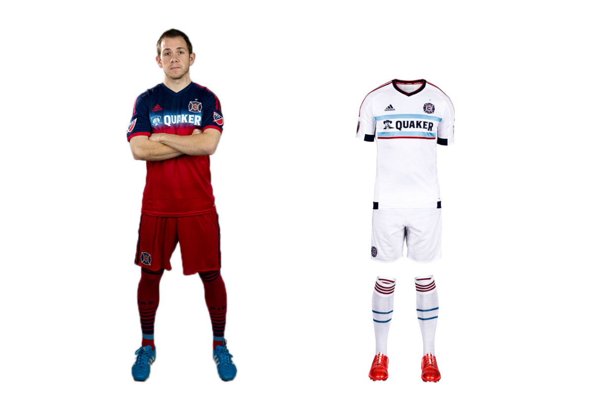
Of the four MLS teams with an all-red home uniform (that’s 20 percent of the league), the Fire were first. They’re the “Men in Red,” after all. But Chicago began veering away from its traditional look in 2012. First the famous white hoop became blue. Then last year, the blue expanded to the chest and shoulders. It doesn’t look bad, but it doesn’t seem right, either. The new away kit is another all-white offering. But at least designers put a bit of thought into this one. The thin, light blue hoops on the shirt and socks, intended to reflect the design of the city flag, are a nice touch.
Montreal Impact
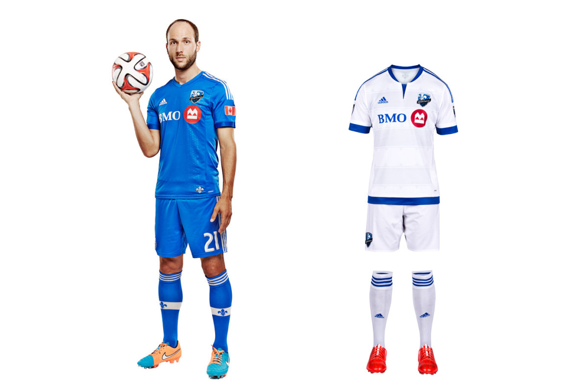
Montreal exemplifies MLS/Adidas’ fixation on tiny details rather than the impact (sorry) a uniform makes when viewed from more than three feet away, which is where most people watch a game. The new away kit features a tiny silver fleur-de-lis affixed to the back and more woven subtly into the fabric. But overall, it’s just another anonymous all-white uniform that mirrors the existing, plain blue primary set. The tragedy is that Montreal’s gorgeous blue-and-black striped alternate, which would be the only striped kit in MLS, is gathering dust. It should be the club’s primary.
D.C. United
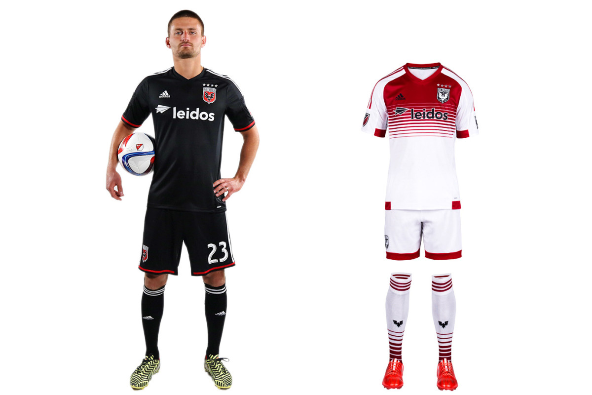
D.C. United calls itself the “Black and Red,” but its uniform palette typically has ignored the latter. That’s been rectified with the club’s new secondary kit, which features a welcome splash of red on the traditional white jersey. The home uniform, which carries over from 2014, still looks unfinished without the white chest stripes that were dropped in 2008. If D.C. could find a way to re-introduce them, perhaps above the sponsor logo and behind the crest, it once again would boast one of the sport’s most distinctive designs.
Real Salt Lake
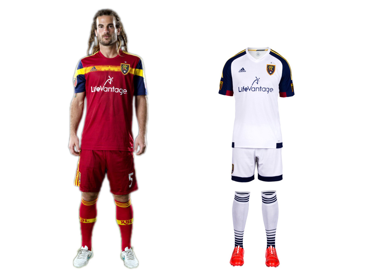
RSL stubbornly refuses to look great. It took a small step forward with its new secondary uniform, which now features two blue sleeves. It's too bad there isn’t even more of RSL’s beautiful claret, cobalt, and gold color scheme in the kit. The red home set carries over from 2014, making it six seasons since RSL abandoned the claret shirt, cobalt shorts/socks combo it wore when winning its only MLS title. The yellow chest stripe adds a little something extra, but RSL’s preference for an all-red kit similar to others around the league instead of a classy, one-of-a-kind look with championship pedigree is baffling.
Toronto FC
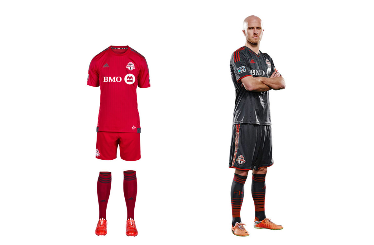
Toronto FC’s new home set could be the reddest uniform in the history of a league that loves red uniforms, which we suppose is noteworthy (guess Adidas insisted on the contrasting three stripes). Club management has focused on building a team capable of ending an eight-year playoff drought, likely leaving little time for kit design. The holdover secondary set is charcoal gray, which features in the TFC logo and is a unique uniform color in MLS. The hooped socks finish off a striking look and make us wish there was a bit more gray in the primary.
New England Revolution
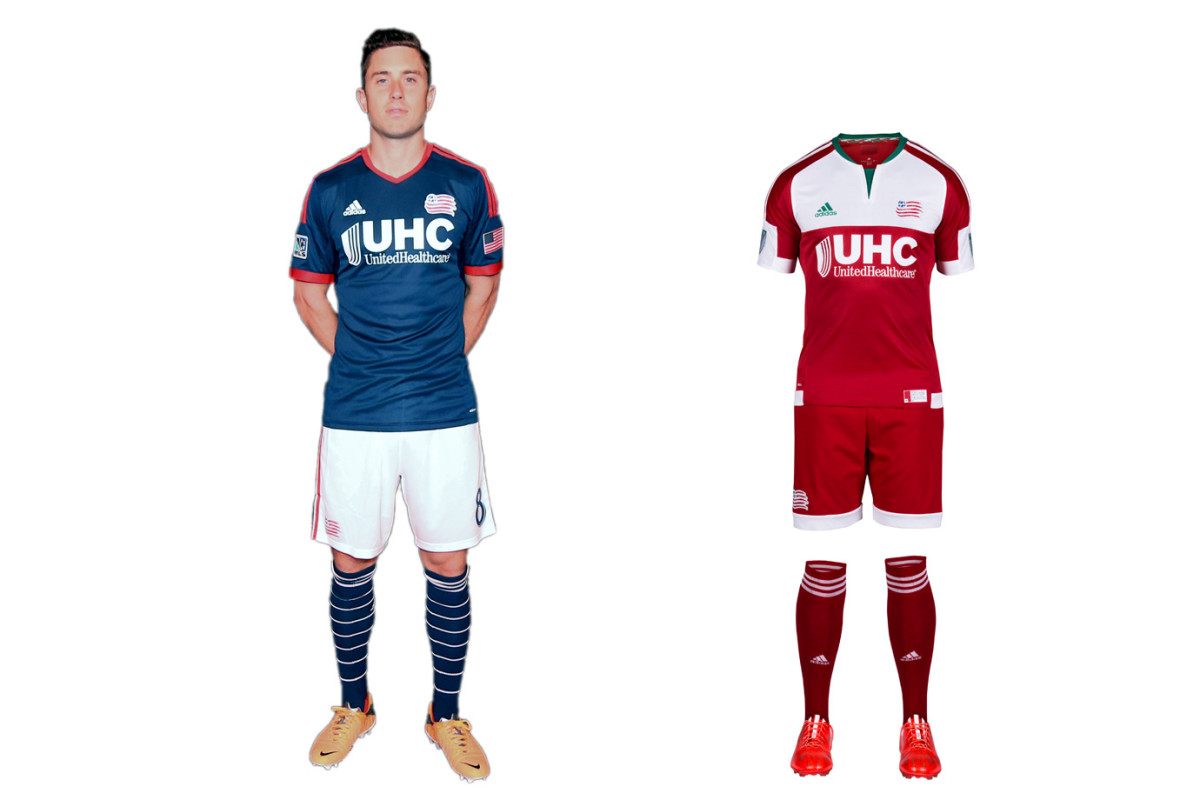
The Revs are Exhibit A for the effect a second color, even if it comes from something as mundane as a plain pair of shorts, has on a club’s brand. Long a believer in boring, N.E. last year overhauled its home blues with white shorts and hooped socks. It’s a classy yet instantly recognizable look. The image shake-up continued Tuesday with a new secondary kit inspired by the regional flag flown during the American Revolution. The red-and-white set is clunky and geometric, but it’s different, daring and local. Better to take a chance than look dull and anonymous.
Philadelphia Union
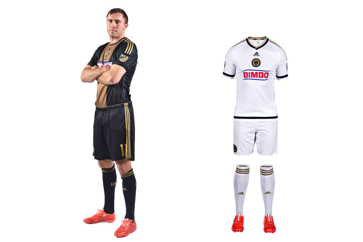
The Union got it right in 2010. The inaugural navy kit with the gold center stripe, reflecting the Philadelphia flag, was iconic. The gold-and-blue away set, a reversal of the primary, was one-of-a-kind. The holdover home uniform still looks great, although the sponsor’s logo wrecks the balance. But the new secondary is a disaster, a needless departure from the brand and an 10th all-white MLS kit. Once innovators, the Union are now followers. The “WE ARE ONE” collar slogan, the tiny snake below the neckline and the embossed stars on the front are lost in a sea of white.
Vancouver Whitecaps
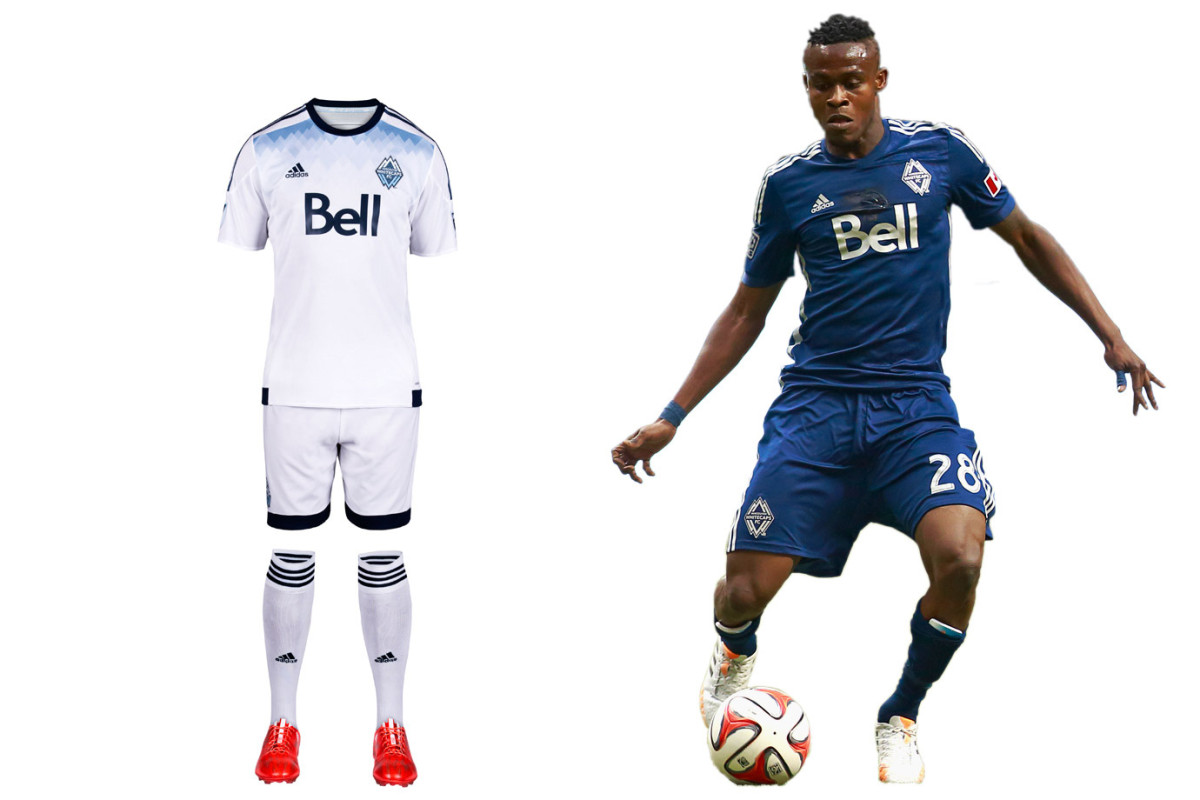
The Vancouver Whitecaps new primary uniform is meant to be experienced up close. It’s slogan heavy. “Our All. Our Honour.” appears inside the neck and on the hip. “SINCE 1974” is on the back. The thin, diagonal pinstripes that featured on the previous home kit have been replaced by light blue shading designed to represent Vancouver’s water and mountains. It’s all a bit too subtle. The shirt will look nice with jeans, but in the end, Vancouver’s all-white kit—and the holdover mono-navy secondary—simply blends in.
Portland Timbers
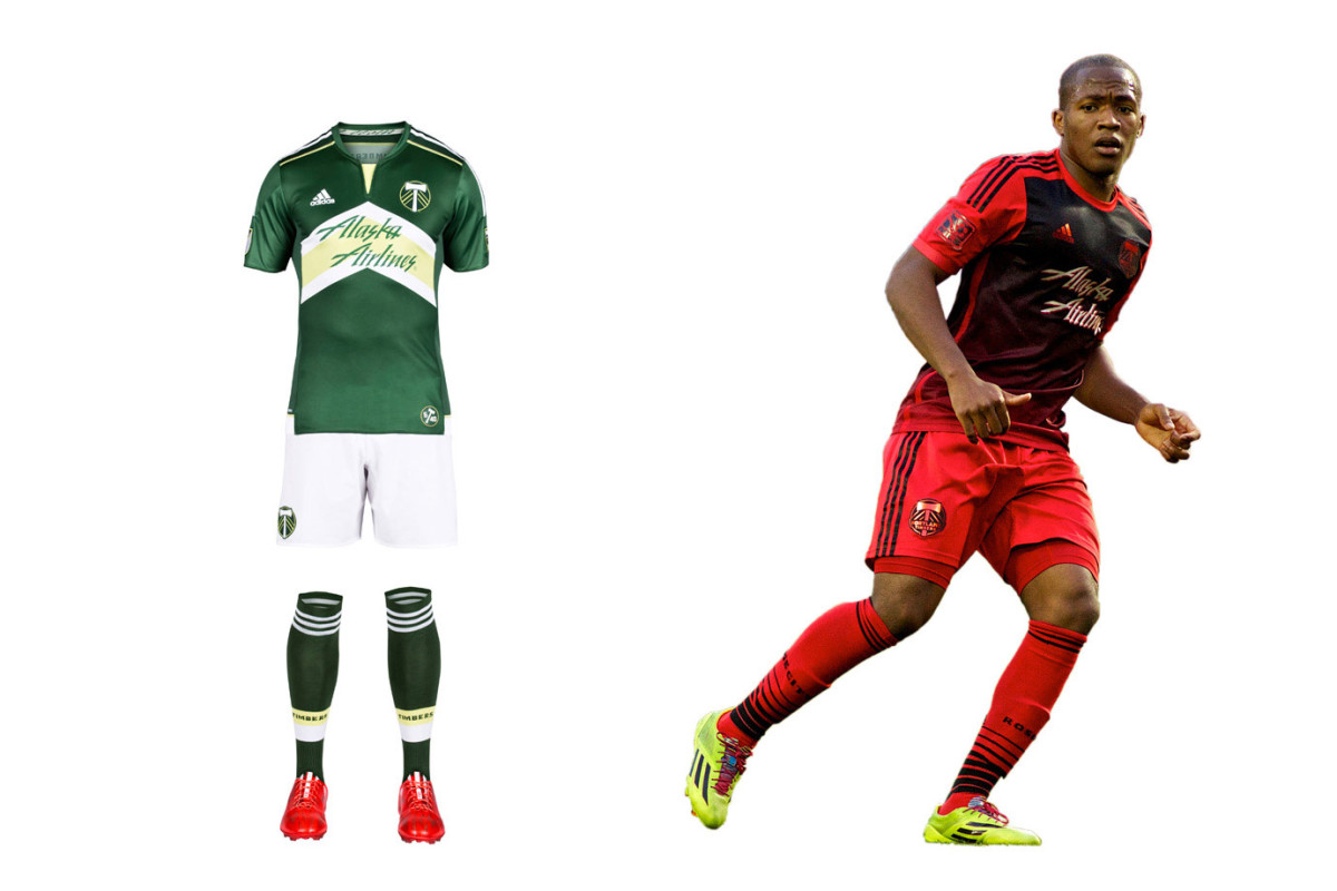
Portland quietly switched crests, from a logo featuring its name to a simpler version focusing on the axe and chevrons (the old logo lives on elsewhere). Few teams wear a badge with no writing, but the Timbers can because they’ve built such a powerful brand. Only they could wear the new home set, a bold green-and-white offering anchored by the chevrons. They're a bit wide, and the yellow below the collar clutters the shirt, but it's impressive overall. The road kit, released in 2014, is everything a good one should be: distinctive, perhaps edgy, yet connected to the club. In this case, Rose City red.
Columbus Crew
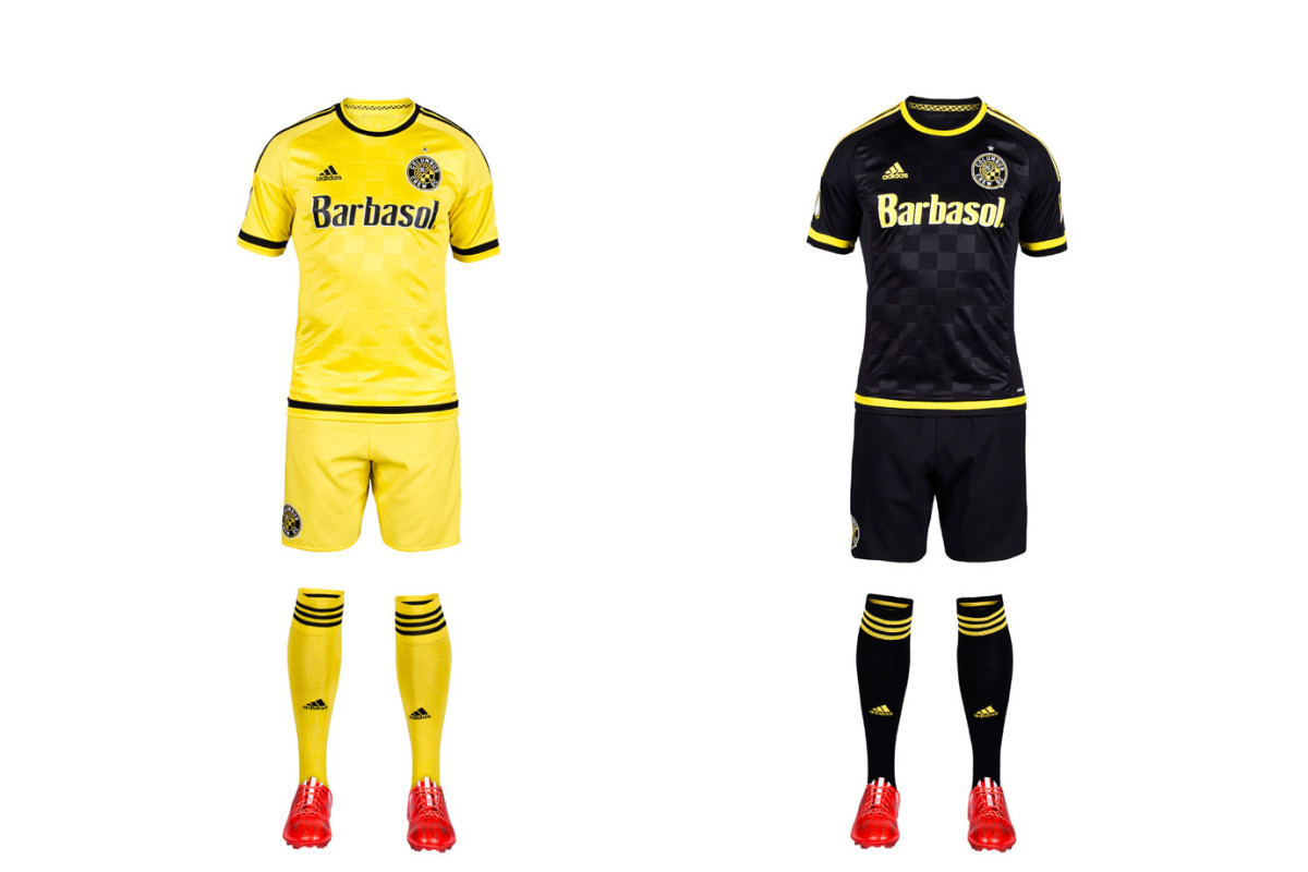
The Crew released new home and away sets featuring the club’s revamped logo, a roundel that looks nice enough but makes sense only with a cheat sheet. The explanations (the ‘O’ for Ohio, the founding year, the checkerboard pattern found in flags waived by fans) certainly tie the club to Columbus more than the goofy construction workers did. As the Crew forge ahead, they’ll stay true to their sartorial tradition. The all-yellow primary is simple but elegant, and certainly recognizable. The mono black secondary could use a bit of flourish–why so subtle with the checkers? But it works and shouldn't be needed that often, anyway.
Orlando City SC
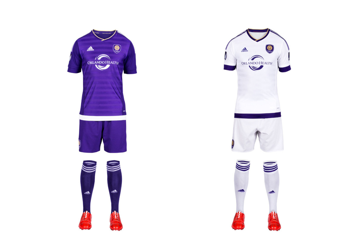
The Lions’ love for purple is welcome in a league featuring so many similar looks. But it didn't result in creative inaugural kits. The home uniform features more up-close details, like “jacquard engineered banding…representing Orlando City’s transition to a new era” and even the club's old USL logo inside. The mono-white secondary has colored hoops on the waist and sleeves and includes more small symbols and slogans. But it’s still just another white set. The answer is obvious—swap the socks. The “Chelsea” look is underrated. White hosiery at home and purple on the road would make all the difference.
New York Red Bulls
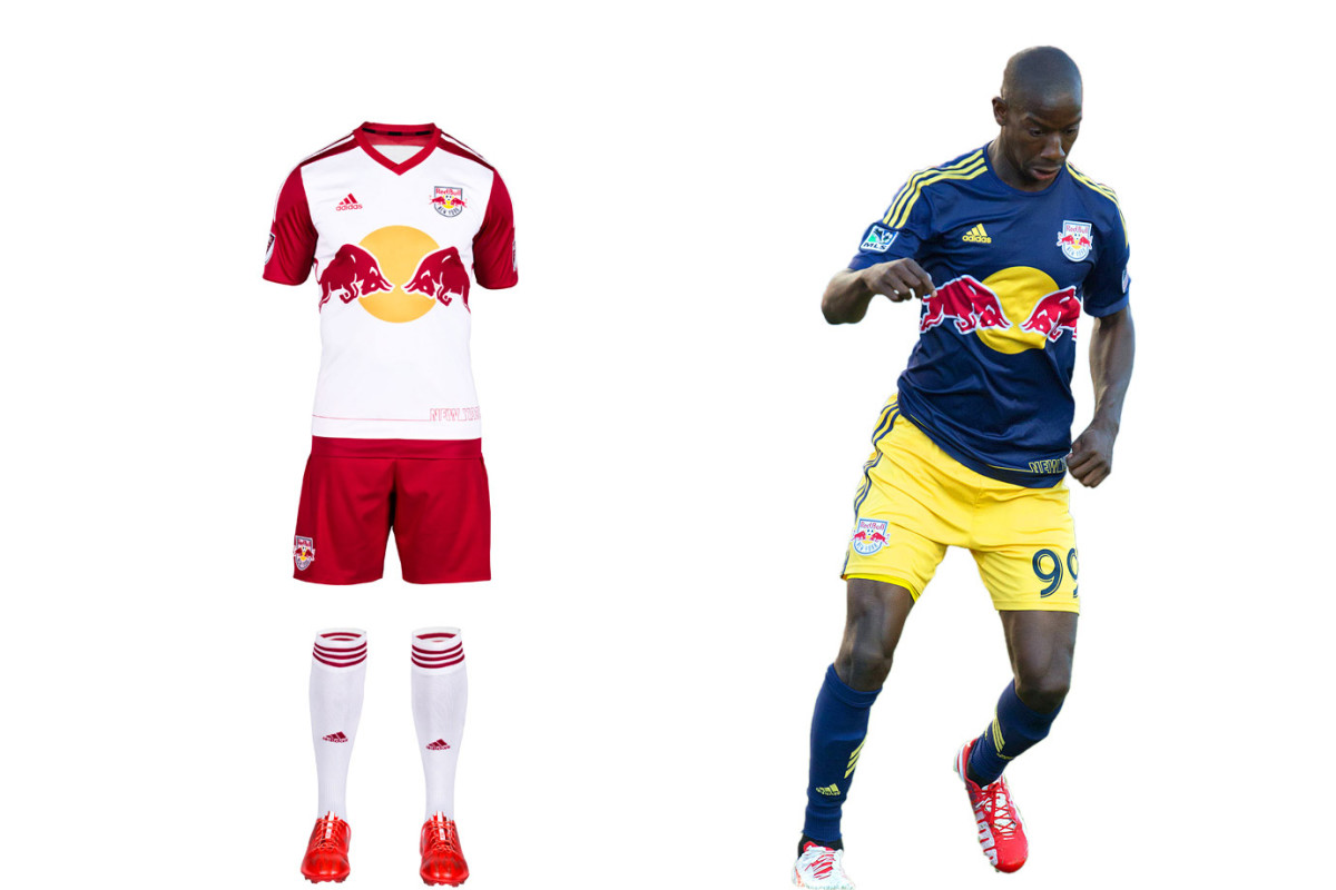
The Red Bulls have company in New York so have set out to reinforce their tenuous connection to the market within the constraints of the club’s corporate brand. The only white-red-white team in the league, RBNY now must compete with NYCFC’s pale blue. The Red Bulls’ new home set doubles down on that contrast with red sleeves and “NEW YORK” emblazoned on the shirt’s lower left in a manner “mimicking the iconic New York skyline.” The “EST.1996” on the back collar reminds fans who was there (or nearby) first. The holdover secondary definitely is unique and is great in reasonable doses.
Houston Dynamo
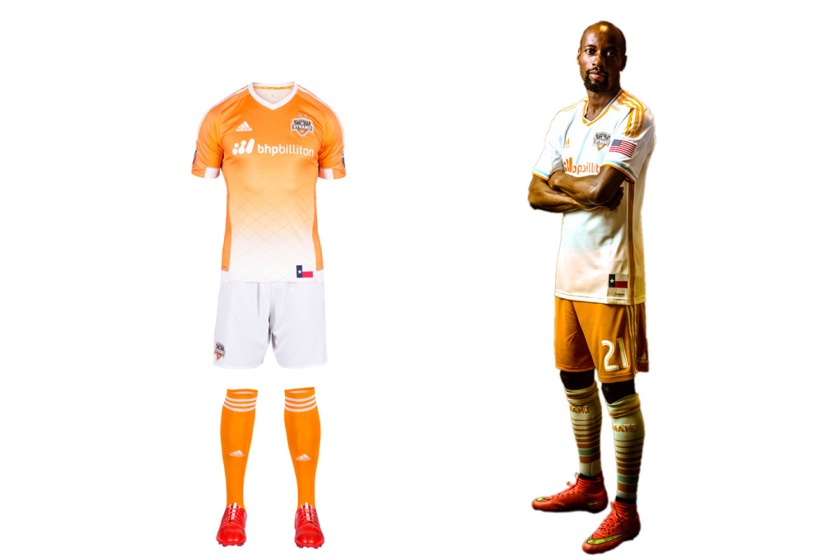
Houston’s club motto is “Forever Orange,” and while that remains the cornerstone of the brand, the Dynamo typically add a wrinkle here and there to ensure we’re not beaten over the head with it. The new home uniform is a great example. The white shorts and checkered fade on the jersey add the right amount of contrast. On occasion, the Dynamo have worn monochrome both home and away. But there’s no need to do so, especially on the road. The balance in the primary kit and the immediately identifiable orange shorts with the secondary set showcase the Dynamo at their best.
Sporting Kansas City
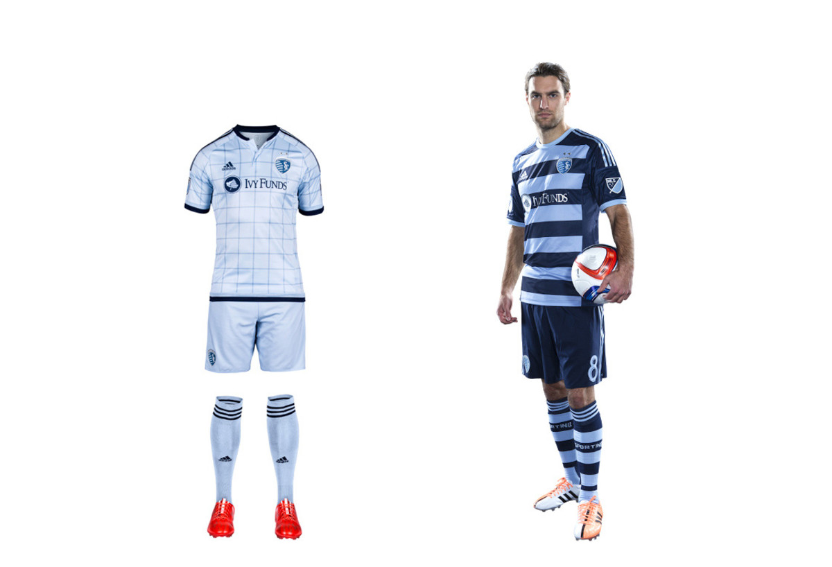
From irrelevant to trendsetting, SKC has profited from one of the most successful sports rebrands in recent history. The club now must share light blue with NYCFC, but Sporting still stands out. The new home set is a departure form the bicolor “state line” uniform of 2013-14 and is anchored by a “fashion-forward window pane pattern” that’s almost as preppy as the recent argyle alternate kit. The secondary uniform is stunning. The hoops, which mirror the stripes on the club crest, highlight one of the most eye-catching sets in MLS history. It’ll be tough to see it go after this season.
FC Dallas
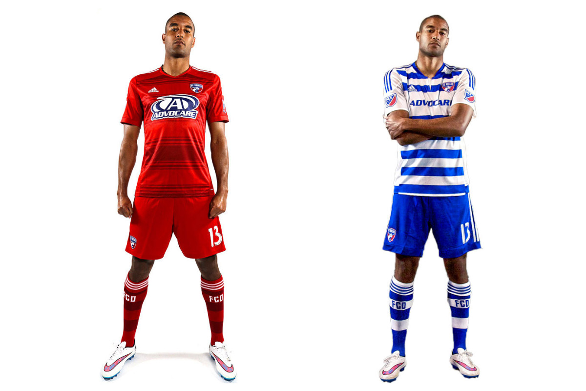
FCD’s kits are an example of a good idea, poorly executed. The club made an inspired decision to go with hoops when rebranding in 2005, but the jerseys always let them down. Unnecessary seams, plackets and panels always ruined the shirt. Dallas gave up last year and went with a boring all-red primary. But it stuck with the hoops on the new blue-and-white secondary, where the side panels and sleeves still disrupt the flow. Both blue and white shorts are an option. Our 2016 ideal: a primary jersey with seamless, sleek red and blue hoops. Unique and colorful, but less jarring. Make it happen.
Colorado Rapids
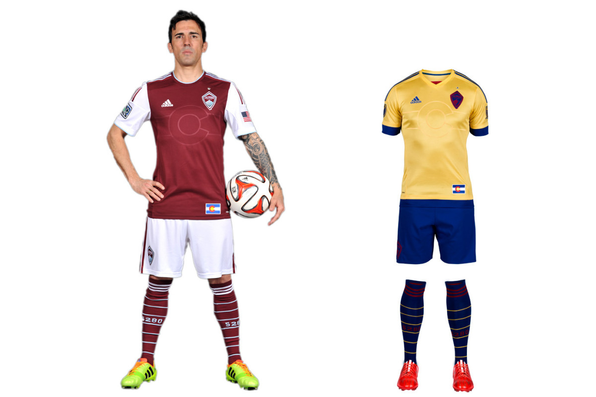
Another club that’s bounced from brand to brand (green-and-white, blue-and-black), the Rapids have settled in nicely with the unique but elegant burgundy-shirt, white-shorts combo. The sleeves, which mirror those worn by sister club Arsenal, add a subtle touch of flair. The new away uniform is a prime example of how a secondary kit can be tasteful and connect to a club’s brand. Last season’s mono blue state-flag set has evolved into a sharp gold-and-blue kit that maintains Colorado's colors and stands out from the crowd. We’re not fans of recolored badges—logos should be sacrosanct—but overall it’s a winner.
Seattle Sounders
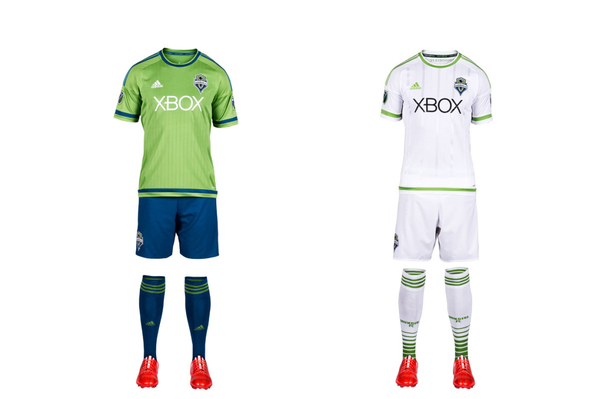
The club that brought us rave green, cascade shale, super cyan and electricity has succumbed to the all-white virus. Seattle is one of five MLS clubs to adopt the look this season, ensuring half the league now embraces the white-out copout. The Sounders new away kit is especially devoid of any personality—a surprising choice for a club that has much of it. The new home set features a less cluttered shirt than in seasons past. It’s a template, but it’s a step up. The uniform also features blue shorts and socks for the first time. Here’s hoping we see it as often as possible.
San Jose Earthquakes
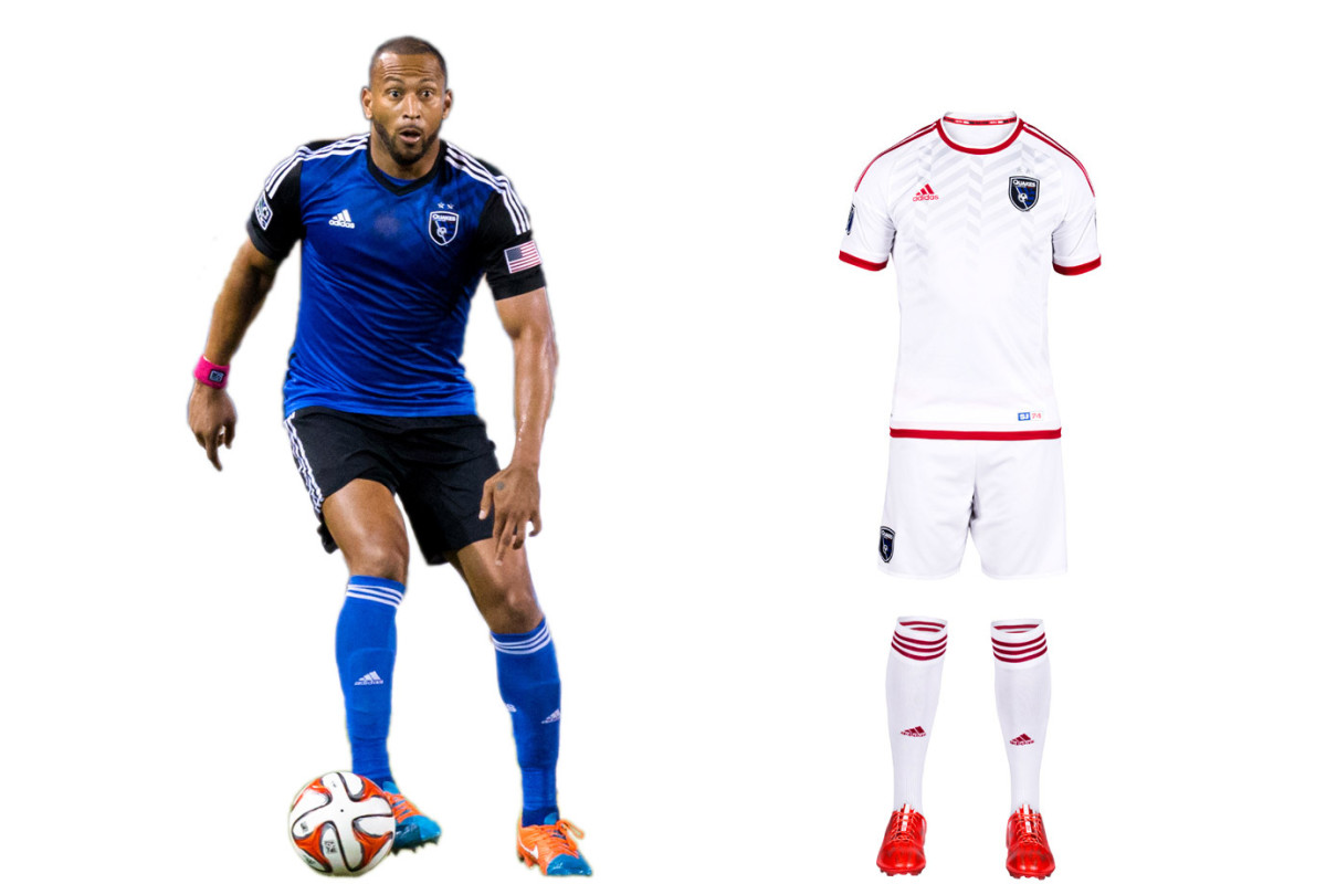
"Earthquakes" is an appropriate moniker for a club that’s experienced so much upheaval. While the new Avaya Stadium offers stability, the brand remains in flux. SJ’s '14 overhaul produced a beautiful blue-and-black primary kit that’s already a modern classic. But the logo, awkwardly anchored by “Quakes”—a nickname of a nickname—lacks gravitas. We liked the re-introduction of the NASL-era red, which inspired last year’s away kit. That’s been replaced by a new white secondary set (yes, another one). It lacks the creativity, individuality and ambition that should be associated with a Bay Area club on the rise.
