Man with The Plan: Inside Ali Curtis's task of revamping the Red Bulls

HARRISON, N.J. – Some two months had passed since Ali Curtis moved into his Red Bull Arena office, but the room overlooking the pristine pitch still was relatively bare. The only notable personal possessions were a colorful Valentine’s Day card from his four-year-old son and a vintage Duke soccer jersey, which came in a package sent by former Blue Devils assistant coach Mike Jacobs.
Curtis, now 36, wore the No. 9 in Durham, N.C., and won national player of the year awards in 1999 and 2000. The shirt conjured memories and arrived, along with a timely message of support, during a day Curtis called, “one of my toughest.” The Valentine and jersey helped ground him during a period of upheaval, reminding him that there was something stronger and more enduring than the storm he’d been facing.
Two more things caught the eye upon entering the office. The first was a large, framed photograph of Thierry Henry sliding on his knees, fists in the air as he celebrated a goal for Arsenal.
The other was a massive three-ring binder lying on the desk. Its cover featured the New York Red Bulls logo and read, “Confidential Property of Ali Curtis.” There, in the plastic and paper flesh, was the only copy of The Plan. Part vision, part roadmap and part manifesto, the binder contained, in detail, the DNA sequence of the club that Curtis and Austrian owner Red Bull GmbH intend to build.
MLS Power Rankings Week 6: NY Red Bulls rise; Colorado, Orlando break out
Before Curtis was hired away from his role as Major League Soccer’s senior director of player relations and competition in late December, the Red Bulls’ fragile identity was embodied in two men. One was Henry, the charismatic and cosmopolitan French forward. The other was Mike Petke, the fiery Long Islander who personified whatever connection had been established between the famously frustrating club and its competitive and skeptical home market.
Petke, a defender, played more games for the Red Bulls than anyone else before assuming head coaching duties in 2013. He and Henry led New York to its first major trophy, the Supporters' Shield, that season before coming to within a goal of the MLS Cup final last year.
The photo and The Plan represented the elephantine ghosts in the room. Henry had retired after four-plus years in New York, leaving a gaping tactical and technical hole in the first team. And Petke was fired in early January. The move surprised few around MLS—Red Bull management had sought interviews with at least two opposing coaches, Portland’s Caleb Porter and Columbus’s Gregg Berhalter, last summer. But it shocked and infuriated many fans. Curtis, who pulled the trigger, replaced Petke with former Montreal Impact manager and U.S. national team assistant Jesse Marsch.
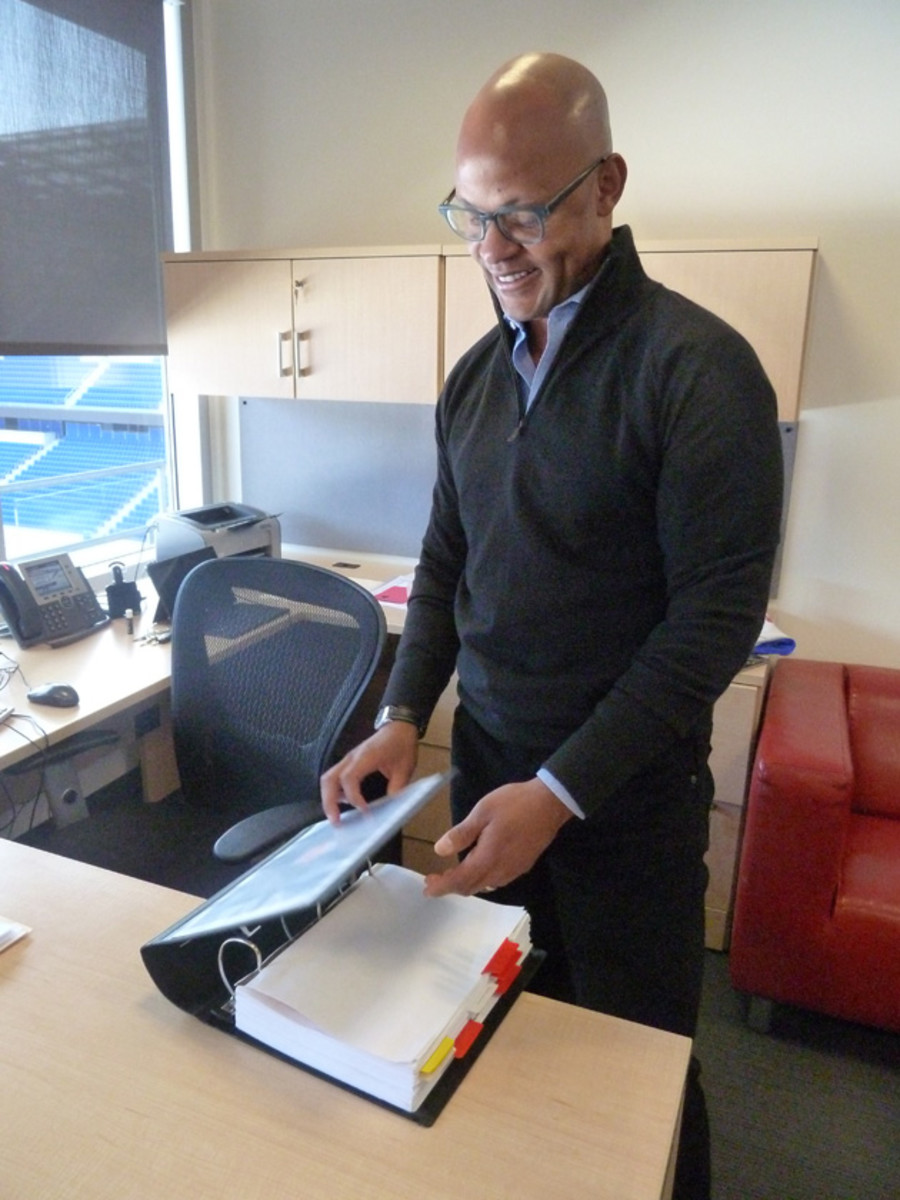
Curtis referenced The Plan in an introductory video shot when he was hired as the Red Bulls’ new sporting director. By the time around 300 season ticket holders gathered at an unprecedented “town hall” meeting a few weeks later, the binder symbolized not only Petke’s abrupt departure, but the maddening disconnect fans observed between their club and its corporate overlords.
At that point, Curtis’ plan was little more than a vague, impersonal mission statement and a pink slip for their beloved coach. Red Bull GmbH was the target of an organic campaign highlighted by a billboard on I-280 that featured Petke lifting the Shield and the words “#RedBullOut” and “Our Legend, Our Club.” Curtis was the primary target at the town hall, where fans interrupted him frequently, shouted obscenities and revealed their desperation.
“No corporate lingo, just answer the question,” one fan yelled as Curtis avoided specifics about Petke’s dismissal.
“How does this team represent this area and the people in it?” another asked. “We don’t know what our identity is, and it’s a huge problem.”
Speaking to SI.com a few weeks later, Curtis sat on a sofa underneath the Henry photo and acknowledged that while he preferred the fans’ passion to apathy, making his point in that sort of environment wasn’t among his strengths. He’d been cloistered behind the scenes since joining the league office in 2007 and was far from his comfort zone that night.
“It was really hard. It was painful. It was a difficult experience,” he admitted.
But he was undeterred. For Curtis, Marsch, GM Marc de Grandpre and the club’s owners, The Plan represents the path to a sustainable identity. It’s a path Red Bull had ignored for years. Signing big-name players who didn’t always fit, hiring unfamiliar or unprepared executives and coaches and thirsting for a quick fix hadn’t produced sustained success. The 2014 season was a lot tougher on the Red Bulls than it appeared from the outside, and ownership’s investment in the youth academy and stadium wasn’t paying off.
Soccer at Baseball Stadiums
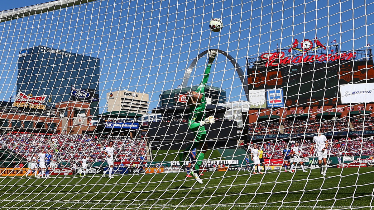
The U.S. women's national team played New Zealand in a pre-World Cup friendly at St. Louis's Busch Stadium on April 4, 2015.
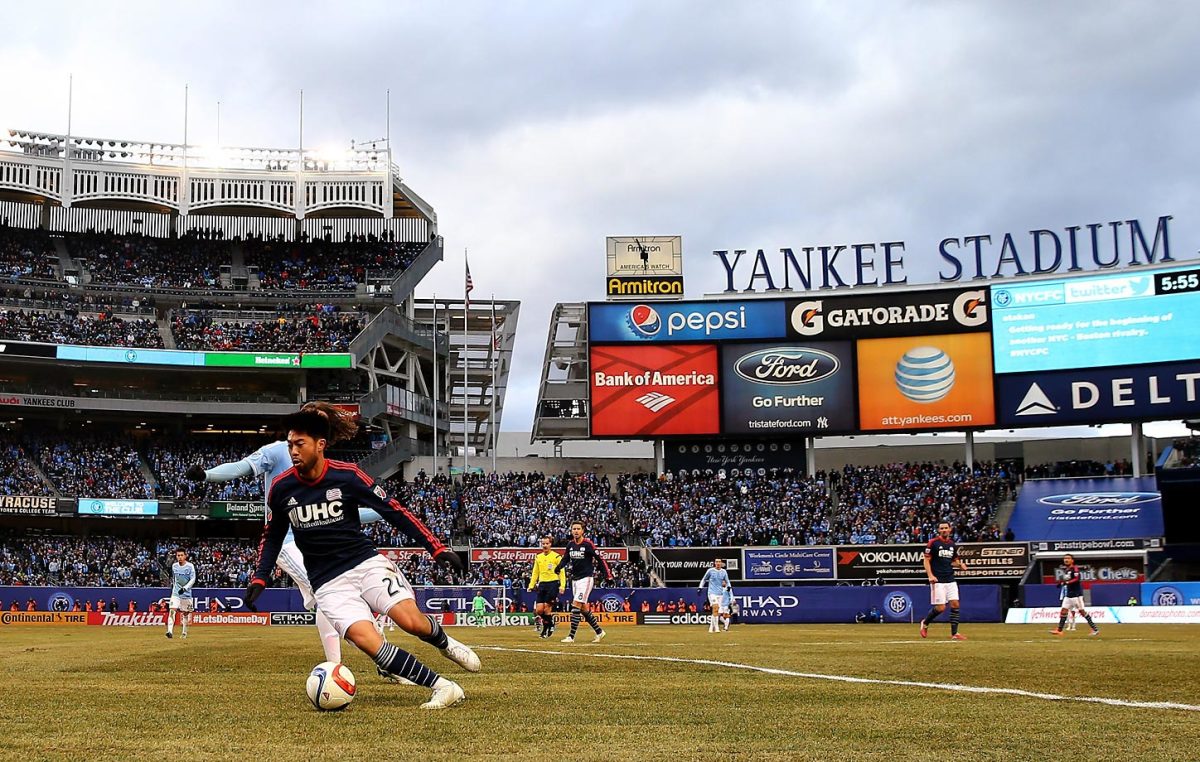
New York City FC kicked off its Yankee Stadium era Sunday evening with a 2-0 victory over the New England Revolution. The MLS expansion club will play at the famed baseball venue for the foreseeable future, as it continues its quest to land a soccer-specific stadium in the Big Apple. But it’s not the first team to play soccer in Yankee Stadium–new or old–and it’s just the latest instance of soccer being played on Major League Baseball fields. Here are some instances throughout the years.
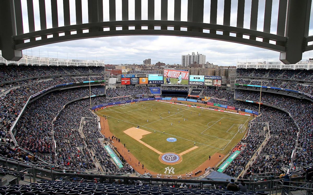
New York City FC takes on the New England Revolution during the club's inaugural game at Yankee Stadium on March 15, 2015.
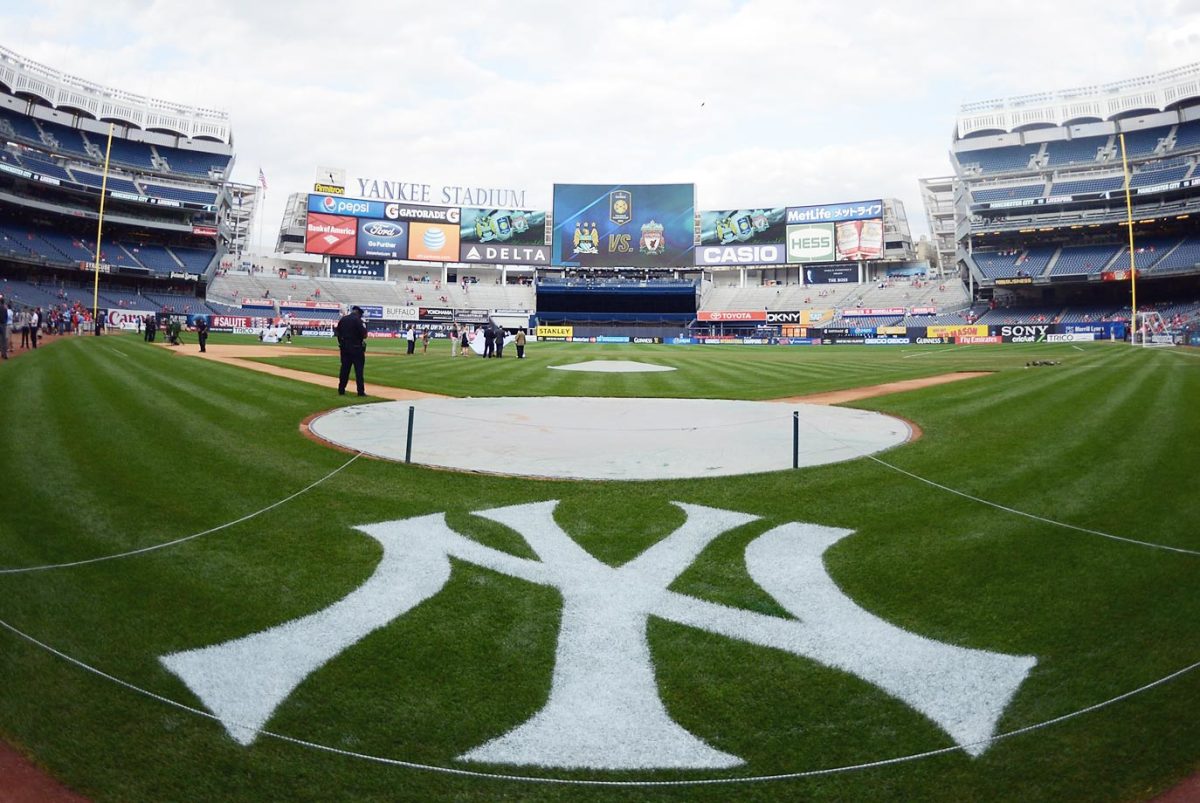
Yankee Stadium set up for soccer on July 30, 2014.

Before the club's rebrand to Sporting Kansas City, the Kansas City Wizards played the 2008-2010 seasons at CommunityAmerica Ballpark, the everyday home of the minor league Kansas City T-Bones.
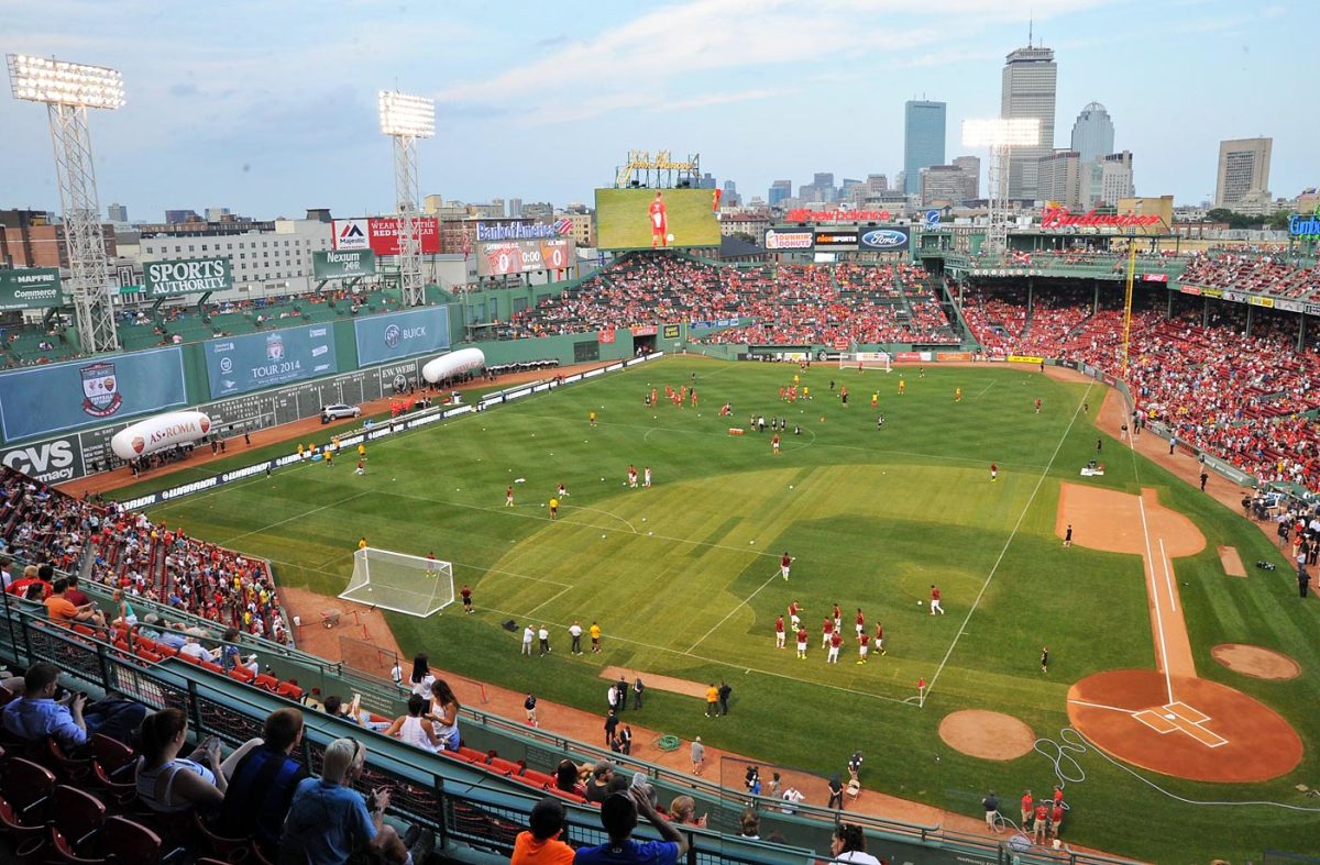
Liverpool played AS Roma at Fenway on July 23, 2014.
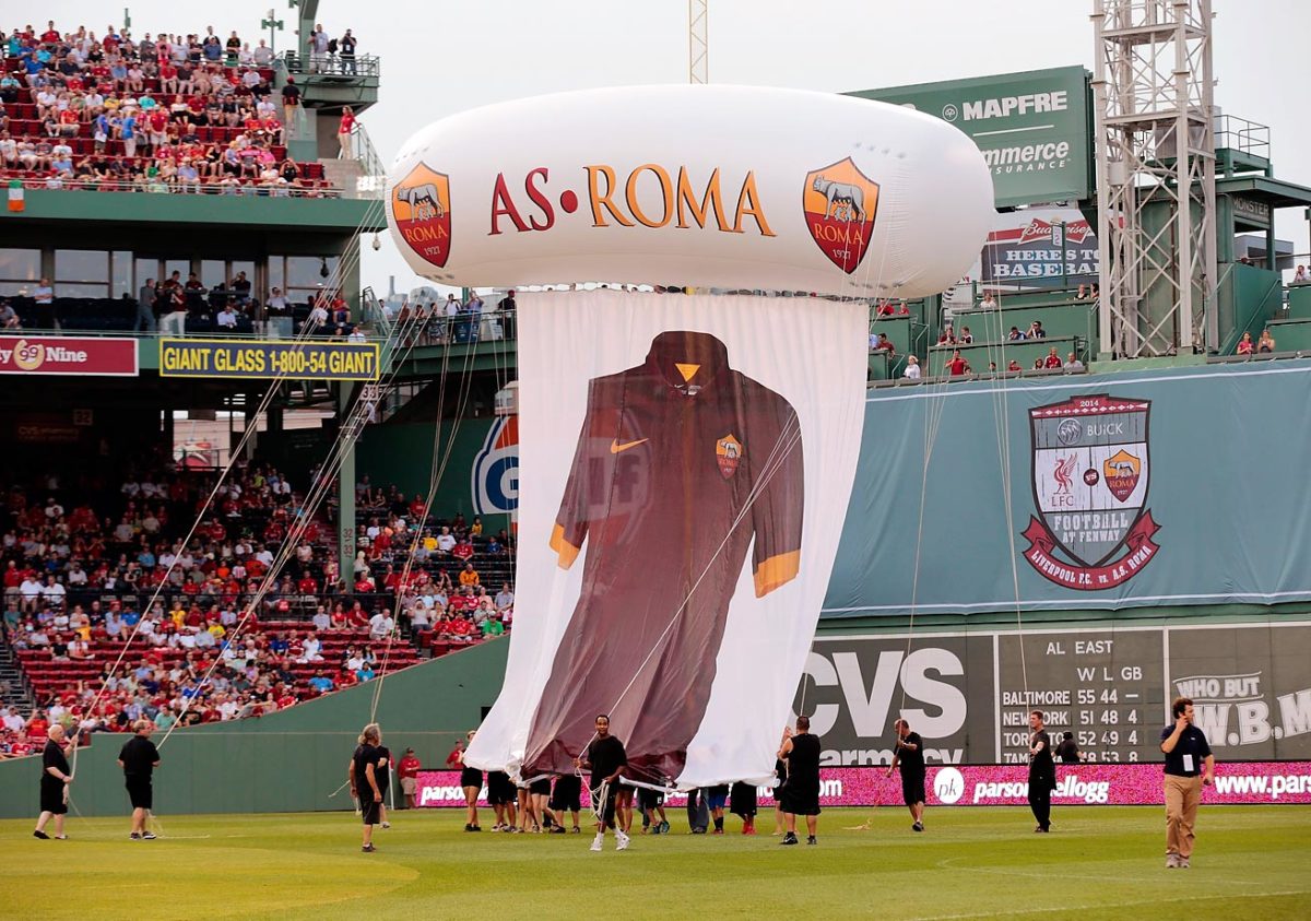
Liverpool played AS Roma at Fenway on July 23, 2014.
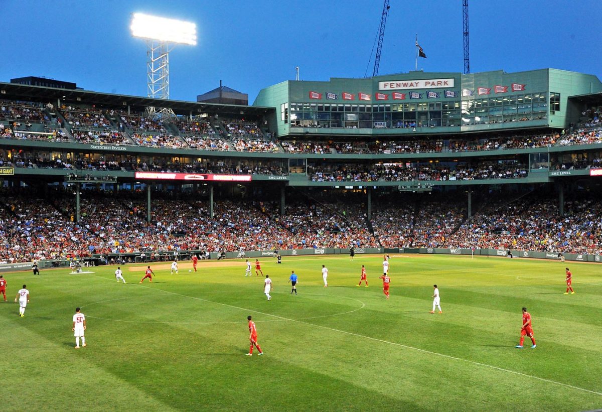
Liverpool played AS Roma at Fenway on July 23, 2014.

A Chelsea-Manchester City friendly match in 2013 at Busch Stadium.
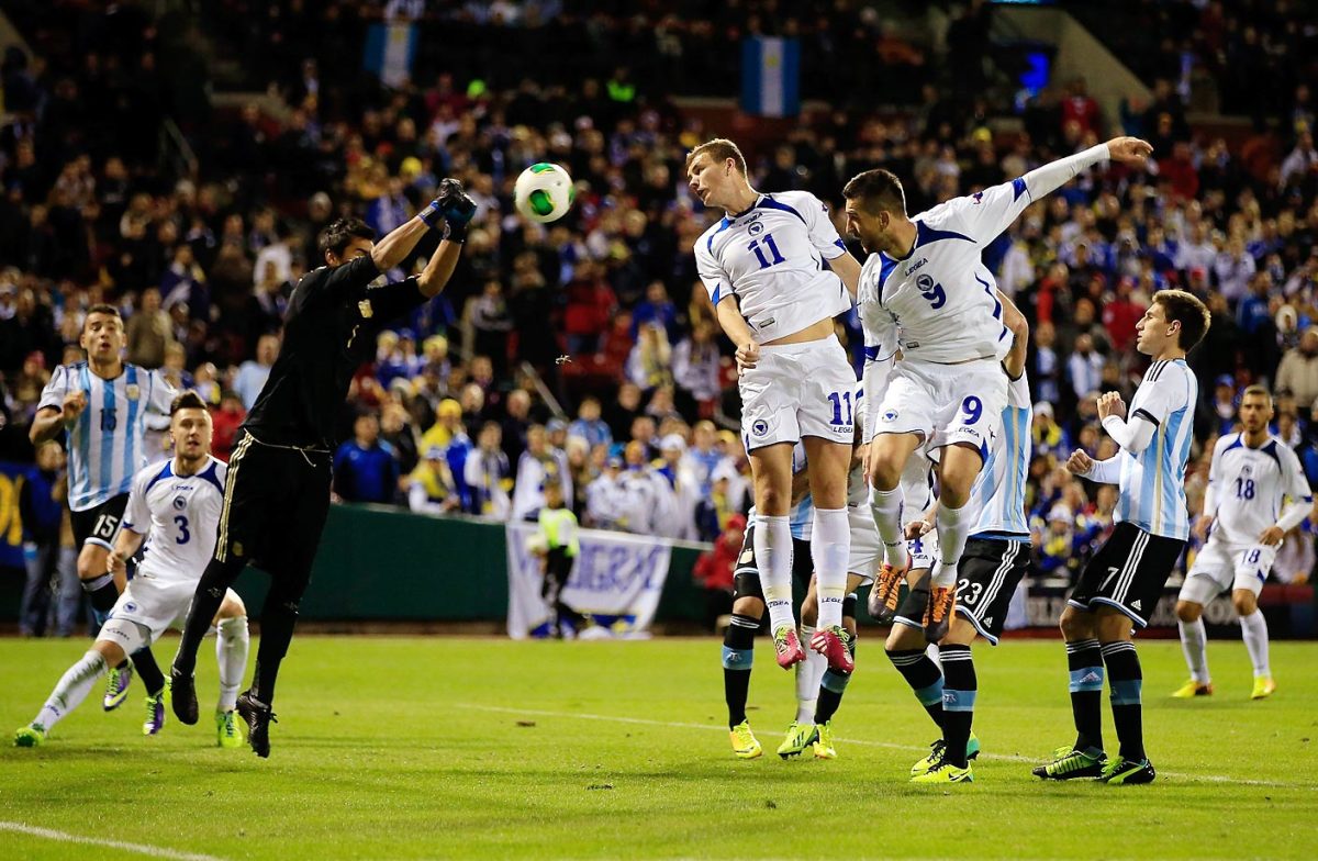
Argentina played Bosnia-Herzegovina during the international friendly match at Busch Stadium on November 18, 2013.
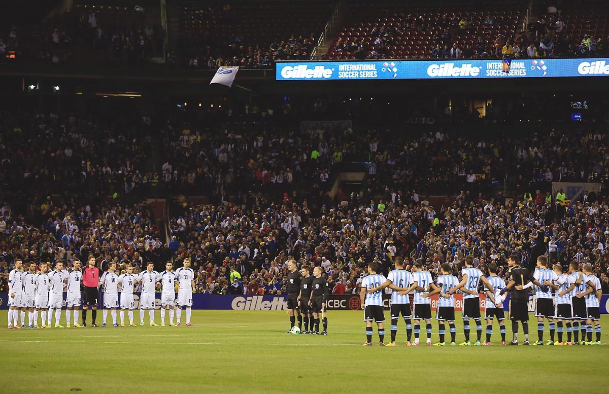
Argentina played Bosnia-Herzegovina during the international friendly match at Busch Stadium on November 18, 2013.
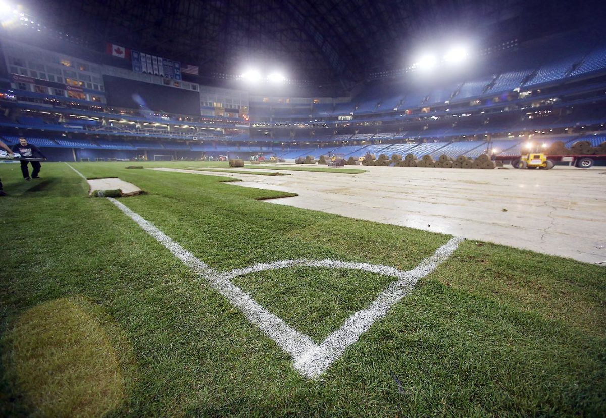
Brazil played Chile at Rogers Centre in Toronto on Nov. 19, 2013.
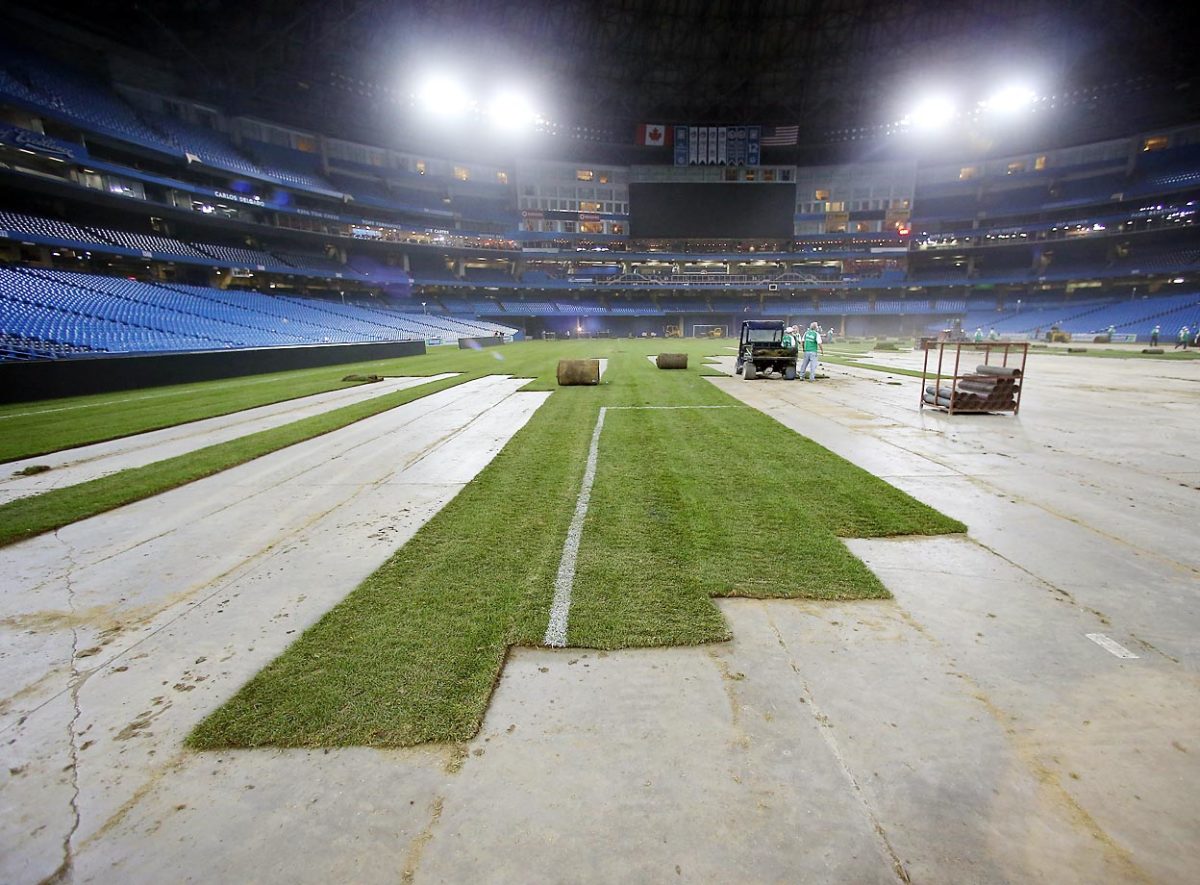
Brazil played Chile at Rogers Centre in Toronto on Nov. 19, 2013.
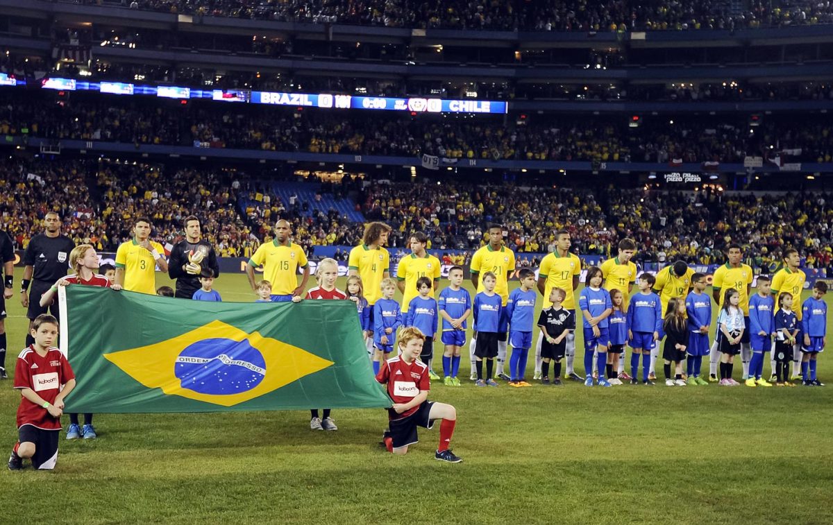
The Brazil team on the field before playing Chile at Rogers Centre in Toronto on Nov. 19, 2013.
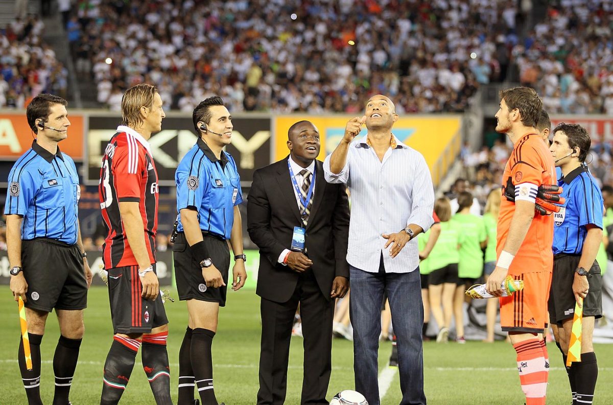
Mariano Rivera of the New York Yankees tosses the coin before the International Friendly match between Real Madrid and AC Milan at Yankee Stadium on Aug. 8, 2012.
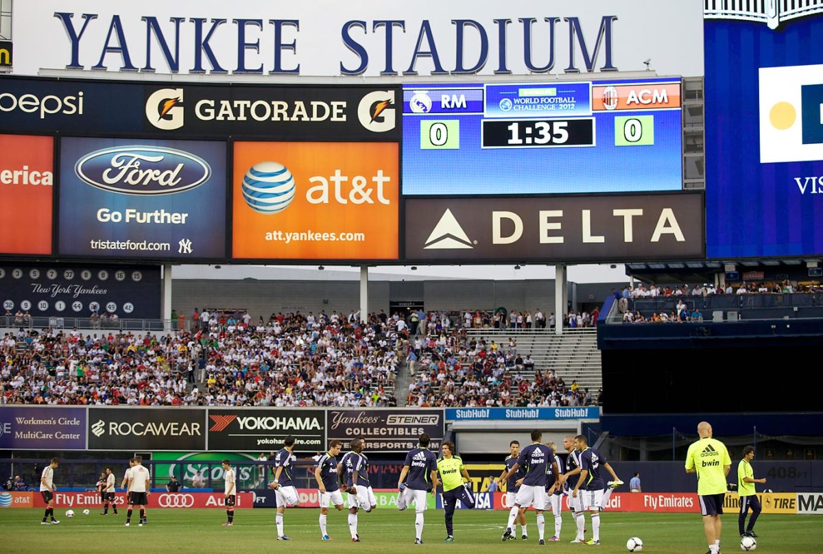
Real Madrid played AC Milan at Yankee Stadium on Aug. 8, 2012.
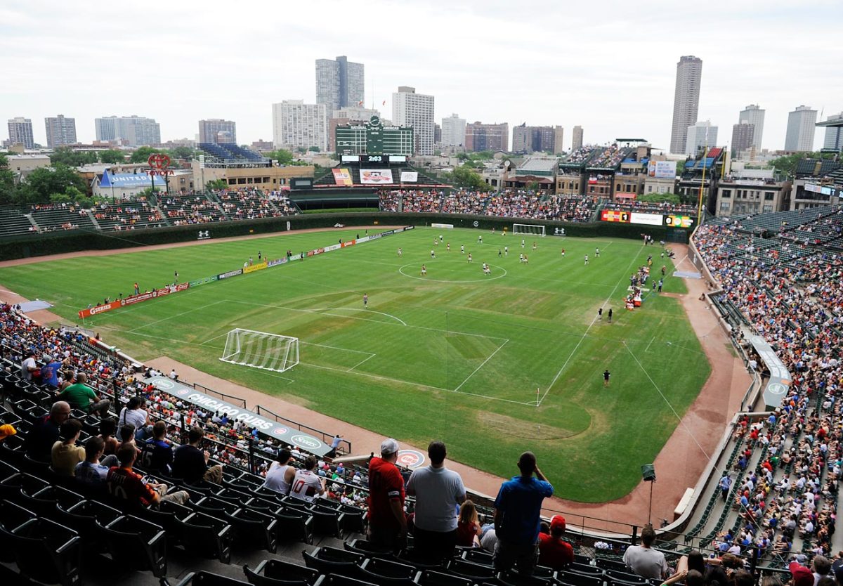
A.C. Roma played Zaglebie Lubin at Wrigley Field on July 22, 1012.
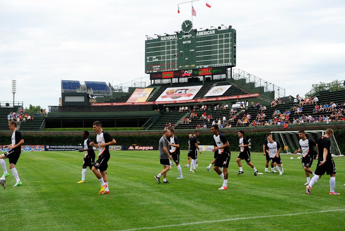
A.C. Roma played Zaglebie Lubin at Wrigley Field on July 22, 1012.
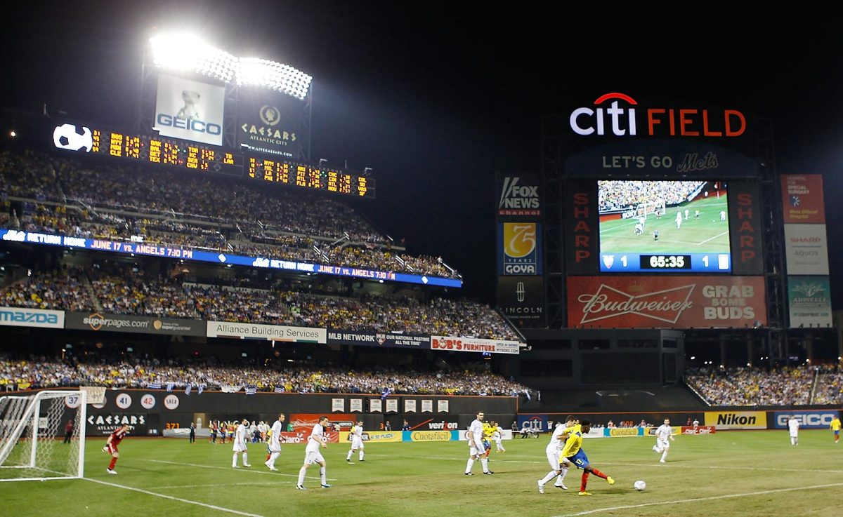
Ecuador played Greece at Citi Field on June 7, 2011.
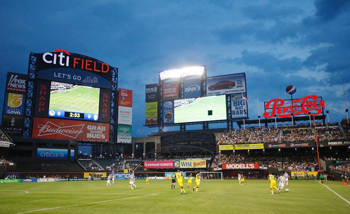
Juventus FC played Club America at Citi Field on July 26, 2011.
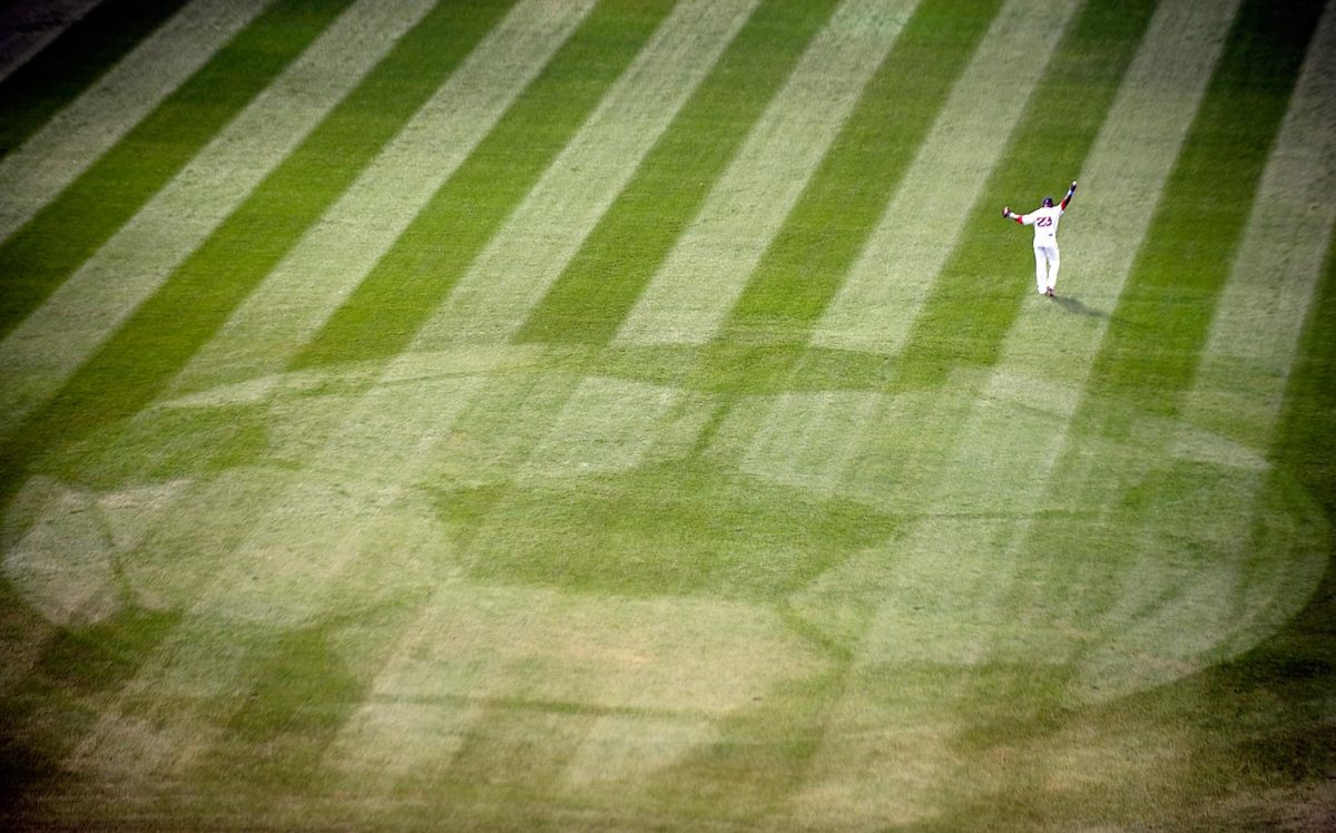
Mike Cameron of the Boston Red Sox on the field at Fenway before the start of a game against the Los Angeles Dodgers on June 20, 2010. An image of a soccer ball was mowed into the center field grass to promote a match between Scottish club Celtic FC and Portuguese club Sporting CP that is set to take place at Fenway Park on July 21st.
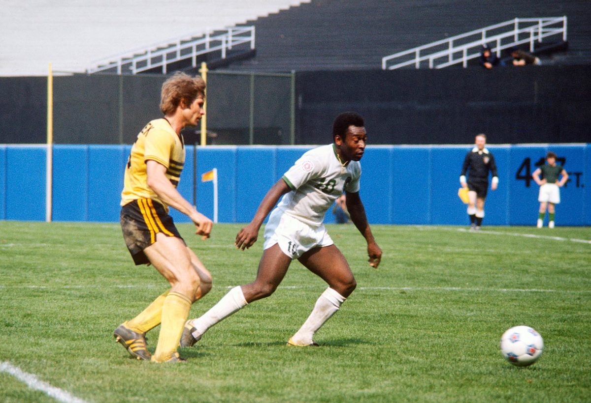
Pele, while playing with the Cosmos in the 1970's, played in Yankee Stadium.
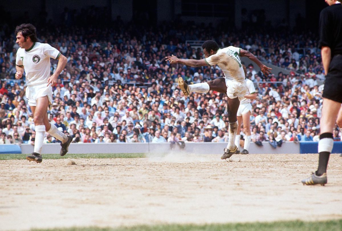
Pele played for the Cosmos from 1975-77.
“Their belief about the way to achieve success has changed, and I think they have placed a greater priority on really bringing in a team of folks that understand this league and have been around this league and understand the nuances, the coaching landscape, the youth development landscape and the union and CBA landscape,” Curtis said. “My vision was consistent with their vision and the way I thought about moving this club in the direction it needs to be moved.”
Said Marsch last week, “It’s a shift that was being made. I think their attraction to me was that they felt I was a guy who was going to come in and, through the grassroots, from the bottom up on the soccer side, help make this thing better. I think over the years, going after the big names and high-profile coaches led them down treacherous roads. They felt like it was time to invest in the infrastructure of the organization and the people in this organization and try to build a stronger foundation. Ali’s doing a really good job of that in terms of taking all the resources and the good people that are involved here and tying all the loose ends together so there’s a consistent, strong vision.”
Marsch said that moments after the town hall, he shared an “intense, we’re-all-in, I’ve-got-your-back type of hug” with Curtis and De Grandpre.
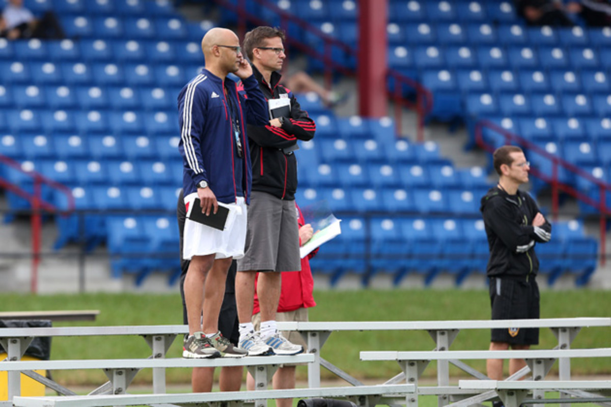
“We’ve already been through some tough moments,” the new coach added. “I think as Ali gets more comfortable in his skin and with how to put everything in place here, there will be a better appreciation for his vision. I think we’ve already gotten stronger.”
The Plan is a solution for the long term, written by a man who always took a longer view. Curtis, the second overall selection in the 2001 MLS draft, was preparing for life in a suit and tie before putting on his first pro uniform. He double majored in political science and sociology at Duke, with a minor in markets and management, and interned with Merrill Lynch during the summer before his senior year. Curtis turned down Merrill’s full-time job offer and joined the Tampa Bay Mutiny.
“I wanted to play pro soccer,” he said. “I told myself before I signed that I wanted to play for three or four years and if I was going to play in a World Cup, I’d continue. And if not, I wanted to do something different.”
There would be no World Cup. Curtis tallied nine goals and eight assists in 65 MLS games with Tampa Bay, D.C. United and FC Dallas, and in 2004, he hung up his boots and took a job with J.P. Morgan. He spent a year and a half in Chicago and then moved to Los Angeles, where he was on a team that advised “high-net worth individuals.”
He learned that when working on a transaction or investment valued in the millions, it was best to come prepared—everything charted, everything accounted for. Curtis described it as a six-days-per-week, 6 a.m.-to-9 p.m. job. And that left him enough time to maintain an email correspondence with MLS commissioner Don Garber, who Curtis contacted soon after leaving Duke.
“I knew I wanted to get back involved in soccer at some point,” Curtis recalled. “Don said, ‘Hey, when you’re ever in New York, come visit.’ So I called his assistant and said, ‘I’ve been corresponding with the commissioner for the last two-plus years and he said when I’m in New York, come visit him. And I’m going to be in New York all next month. When’s a good time to come?’ I knew I wasn’t going to be in New York for a month, but I figured if I could at least schedule the date, I’d force myself to be in New York at that time.”
Curtis spent his first three years at MLS working in business development, sponsorship and expansion and then transitioned to the player relations and competitions department. He managed the league’s relationship with the union and helped teams and players negotiate the complex litany of regulations (some of which Curtis wrote) that govern signings and acquisitions. He worked with successful clubs and struggling ones, and he picked the brains of the GMs and technical directors who ran them.
MLS's footprint in Brazil provides an option amid domestic league woes
Everything Curtis gleaned over the course of his life as a player, banker and league executive played a role in shaping his vision for how an MLS team should operate. It was often on his mind. Curtis yearned for the “adrenaline you have working for a club … the wins, the losses, the highs and the lows,” and when negotiations started last summer, he found the resources and potential at Red Bull offered the ideal opportunity. And he didn’t even have to move.
“The job I’m now sitting in, they’re hard to get. I began to think through, how do you get those roles,” he asked. “If I’m an owner and I’m spending millions and millions of dollars on a club, if I asked someone, ‘How are you going to run my club,’ I felt I needed to be able to not just talk the talk and tell them what I’m going to do with youth development, the first team, how I could sign a certain player, my connections to agents and different scouting platforms. I need to be able to show them, to illustrate it.
“If it’s not written down, it doesn’t get done.”
Curtis claimed, and Marsch confirmed, that The Plan is a “living document.” Curtis can come across as aloof in a setting like the town hall, but he isn’t arrogant and is far more personable in more intimate settings. “No one has all the solutions,” he said.
He’ll continue to seek opinion and input from others. Curtis will fly to Europe approximately once a month to meet with Red Bull counterparts in Salzburg or Leipzig, optimistic that the resources and ideas he’ll find there are eclipse any potential hassle resulting from foreign ownership. He recently sat down with Jurgen Klinsmann and promises to remain accessible to colleagues in Harrison.
- GALLERY: Great tifos around the world
Curtis’s attempt to bridge the disparate components of his own organization range from efforts to link the youth ranks to the pros, such as bringing academy director Bob Montgomery to the January player combine for the first time in his nine years at the club, to fostering more efficient communication in the New Jersey office. Department heads meet weekly, staffers now are required to respond to incoming calls or emails within 24 hours and youth coaches will be encouraged to attend and contribute to MLS and USL training sessions.
“There’s been a shift in terms of how we do things on a daily basis, so it becomes something that’s more about the entire organization, the group, then it’s about any one individual,” Marsch said. “That’s in line with what they do in Europe, and I think it’s also in line with what’s successful in MLS.”
That ethos certainly defines the Red Bulls’ style of play. For Curtis, defining the Red Bulls’ on-field approach set everything else in motion, from the type of coach and players who’d anchor the MLS team to the curriculum established for the academy’s youngest members. Absent Henry, New York would evolve into a more youthful, aggressive side.
Bob Foose, Todd Dunivant reveal new details on 'best deal' for MLS CBA
“High pressure, aggressive. We press. We hunt. We go forward. High tempo. High pressure. High energy … We’re trying to get on the same page as to what this needs to be, so that we can give this to the U-12 coach, the U-12 player, the U-14, U-16, U-18, the USL team as well as our first team,” Curtis said.
The Red Bulls can no longer wait for Henry to create goals out of thin air. They now must impose their collective will.
It takes a locker room full of players who’ve bought in to pull off that sort of style.
“Thierry was a guy that always commanded the ball, because that’s the type of player he was. He was that good,” Red Bulls captain Dax McCarty said. “But I think sometimes in the past couple of years, we’ve relied on that too much and we found ourselves struggling for solutions if Thierry wasn’t there or if he wasn’t having his best night.”
McCarty continued, “It was explained to me in the very beginning that if the right player at the right price came round, they would absolutely sign a big-name player. But the general consensus is that this is going to be a team that does things a little bit different.”
Impact fall to Alajuelense, but advance on away goals to CCL final
Curtis was convinced that Marsch, who learned the pro game under mentor Bob Bradley, was the best man for the job. The 41-year-old, who left Montreal after guiding the Impact to a 12-16-6 record in its inaugural MLS campaign, shares Curtis’ first-one-in, last-one-out, hyper-detail-oriented approach. McCarty and his teammates, who’ve started the 2015 season 2-0-2 and are one of only two unbeaten MLS teams, already have noticed an evolution.
“They work harder than everyone I’ve ever seen,” the midfielder said, adding that training sessions are “a lot” longer and more demanding than in the past.
“Those guys are in the office going over every single little detail and every single little plan that will make our team better,” McCarty said. “I know when I step on the field, every single guy from Luis [Robles], the starting goalkeeper, all the way down the bench to [player] No. 18, they know their job and they know their role.”
Curtis discusses the coaching change with caution. He’s well aware of the place Petke occupies in the hearts of many fans and recognizes that those organic bonds are a huge part of any organization’s identity. He’s well aware that 2013 and 2014 probably were the two most successful seasons in club history. The new sporting director simply felt he needed a manager ready to embrace and execute his vision.
“The role of the traditional coach is not just changing—it’s changed,” Curtis said. “You no longer have a traditional coach who can focus primarily on the first team and only has to understand how to organize a training session and the Xs and Os. If that’s the route you’re taking three or four years from now, you’re going to be left behind. This club needed a head coach who not only could understand the direction the club needed to take, [but] be involved in all those areas, from youth development to performance and data analysis to communication—processing the style of play that we wanted to play. We needed a head coach that just wasn’t just involved and integrated, but that had that in his DNA.”
By the end of January, The Plan’s public implementation had become about something more than Petke’s firing.
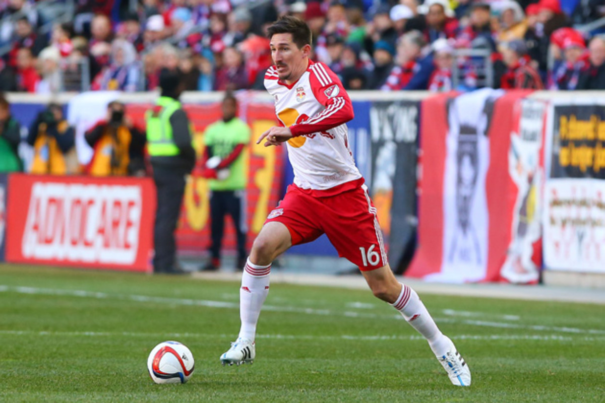
“Ali told me, ‘What players do we want?’ I told him, ‘Sacha Kljestan and Felipe Martins. Those are two guys who would make our team better right away,” Marsch said. “He cranked away at it every day and when he came back to me and said, ‘The deal’s done. We’re there,’ I almost couldn’t believe it. I think that’s a product of his understanding of how the business works and how to systematically move through different negotiations, different scenarios, and how to get them done.”
Curtis beat the LA Galaxy to Kljestan, who was ready to return to MLS after winning three Belgian Pro League championships at Anderlecht, by executing a trade with Montreal that sent the Impact’s spot in the allocation order, plus Martins, to Red Bull Arena. Curtis then was able to use allocation money to buy down Kljestan’s contract below the designated player threshold. On SuperDraft day, as the final terms of the trade were hammered out, Curtis also pulled off a potential steal with the selection of UCLA midfielder Leo Stolz, the Munich-born college player of the year. Conventional wisdom suggested that Stolz eyed a return to Europe, but Curtis negotiated and recruited and was convinced he’d get his man.
MLS at 20: Epic original branding, logos for the league's first 10 teams
“One of the things on my mind was, ‘OK, we got this reaction from the fans regarding the coaching change. If I draft this guy in the first round and he doesn’t sign, I’m not going to make it to the opener,” Curtis said. “So there were some risks involved. But we felt good about Leo as a player and from an off-the-field perspective, and then from the work we did leading up to the draft, we felt pretty good about our chances to get him signed.”
Stolz already has started three times (and scored) for New York Red Bulls II, the USL team coached by former New York midfielder John Wolyniec that’s designed to season younger pros and bridge the gap between the academy and the MLS squad. A significant part of The Plan is devoted to the bolstering of what Curtis hopes will be the most productive player development program in North America. Ideal attributes for coaches and players at all positions and age groups are detailed, as are the targets Curtis intends to reach, from the number of minutes academy products should be contributing to Marsch’s team to how much transfer revenue the club expects to earn.
The Plan progresses from the granular to the aspirational. Curtis has considered the Red Bulls’ response to a pro player's midseason marriage, how different clubs allocate salary cap space to different positions and the ideal location for hand sanitizer dispensers at the stadium.
Resources are not an issue. Curtis has what he needs to implement The Plan, and he expects to do more hiring in the coming months.
“Because they aren’t spending the big DP dollars, now they care less about what’s going on in New York? I can tell you from the inside and discussions I’ve had with people who’ve been here for 10 years that they’re putting more resources into how this team operations on a daily basis then ever,” Marsch said.
Said Curtis: “We’re laying the foundation such that the identity of this club is clear, distinct and everyone knows exactly who we are and what we’re trying to be."
It’s difficult to talking about “Building a lifelong connection between the club and the community that transcends the sport,” without sounding like a corporate pitch man from Duke and J.P. Morgan. Curtis knows that, as well as the fact that the transcendence of Petke and Henry says as much about them as it does the club’s meandering past. There’s been so much drama and disappointment. From the controversial Red Bull rebrand to a parade of 14 head coaches and nine GMs/sporting directors across 20 seasons, the only constant has been change.
NASL seeks to outgrow 'minor league' label as fifth year kicks off
When history isn’t flattering, when years fly by without a championship, it’s tempting to reboot every now and then. Roots have been difficult to plant as a result, especially in a market that maintains such high standards. The arrival of New York City FC and the New York Cosmos has raised the bar further. Red Bull fans are thirsty for something beyond the namesake beverage.
The Duke jersey in his office reminded Curtis of the bronze inscriptions at Cameron Indoor Stadium that honor every Blue Devil All-American.
“I’ll always feel a connection, because I know I can bring my family back to see that,” he said.
Curtis now wants to see a similar installation at Red Bull Arena. If “soccer is a people business,” as Marsch said, then it’s through long-term connections among Red Bull players, staff and fans that a lasting identity will be forged. Curtis already has had dinner with former players like Mark Lisi and Steve Jolley. He wanted their opinions about what he’s done so far and hoped to get their thoughts on how alumni might contribute.
Curtis is planning a “speaker series” that will offer former players and their families the opportunity to return to the club and spend time with current players and staff. Retired Colombian legend Juan Pablo Ángel, who starred for the Red Bulls in 2007-10, is scheduled to stop by this month.
Curtis pledged to continue his dialogue with supporters as well, knowing that The Plan’s ultimate success depends on his ability to convey its contents to a fan base that demands direction and transparency.
“I’m not sure it’ll be exactly like that event,” Curtis joked, referencing the January town hall, “but we’ll do that sort of programming throughout the year … Events where we can speak directly to them, where they can speak directly to us.”
NYCFC's Yankee Stadium debut helps satiate city's desire for soccer
Petke and Henry certainly haven’t been forgotten, but the mood around Red Bull Arena seems to have brightened a bit. More than 21,000 spectators showed up for last month’s home opener against rival D.C. They celebrated a comprehensive 2-0 win. Season ticket sales are up 10 percent over this time last year. There’s still some hurt and plenty of understandable skepticism. But the community, identity and victory those supporters seek can be found only at a stadium, and Curtis is confident the Red Bulls will evolve and deliver.
“It’s why we cheer and love sports to begin with. More than the winning and losing, it’s a connection. It’s about memories, families and friends—a lot of those different types of things,” he said.
Last week, Curtis confirmed that he’s finally had a chance to move fully into his new office. He’s made it his own. A new identity is taking shape at Red Bull Arena.
“When I look at Red Bull, I look at it as a tribe,” Curtis said. “Tribes live off the land—what’s around them. From a Red Bull standpoint, how can we touch our community and live off it in such a way that we’re embracing that community? Bringing in the right players, creating different ways to engage so that we finally create this identity as the New York Red Bulls. All of our decisions are dictated by that identity, by what we are as a tribe. I’m so excited by what’s happening at this club and what we can achieve. There’s a lot of energy here, and we’ll keep feeding off each other.”
GALLERY: Critiquing every MLS team's jerseys
Critiquing every MLS uniform, head to toe
New York City FC
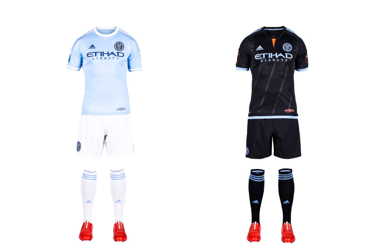
New York City FC took some heat for its sky blue home shirt, which looks a whole lot like the one worn by parent/sister club Manchester City. But an homage was inevitable, and NYCFC has differentiated itself from MCFC, and the rest of MLS, with the white shorts and socks. It’s a sharp look. The away kit, highlighted by a flash of orange (from the city flag) at the neck and five stripes you can barely see that "represent the five boroughs of New York City," is lazy. With a blank template, NYCFC should’ve come up with something other than the mono-black already worn in D.C. and Columbus.
LA Galaxy
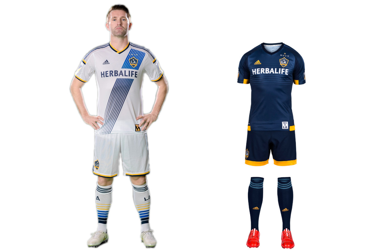
After several overhauls—LA wore black and teal, then teal and yellow, then yellow and green—the Galaxy’s white and blue brand has taken root. Three championships in four years certainly help. The sash on the home uniform, re-introduced in 2012, has quickly become iconic, and, along with the socks, helps make this all-white kit stand out. The new secondary set maintains the same feel as its recent predecessors. The yellow accents look sharp, but we can’t help but feel a white or yellow sash would tie the uniforms and brand together.
Chicago Fire
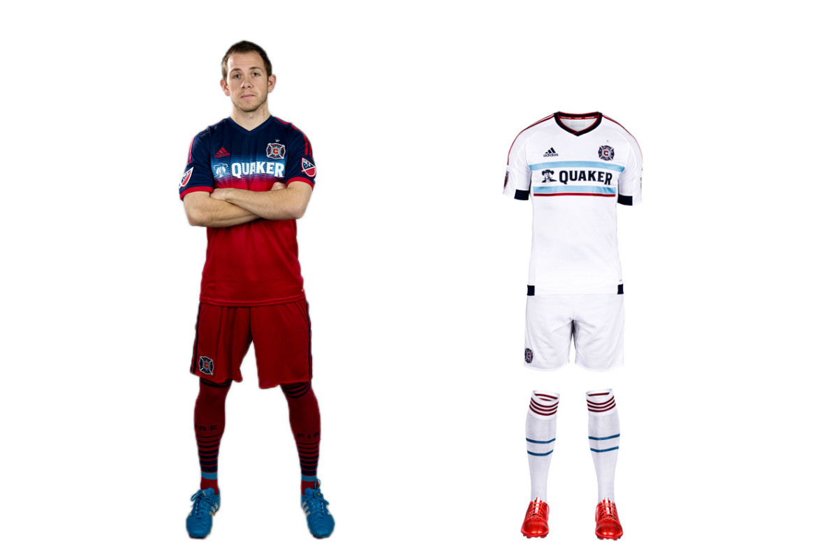
Of the four MLS teams with an all-red home uniform (that’s 20 percent of the league), the Fire were first. They’re the “Men in Red,” after all. But Chicago began veering away from its traditional look in 2012. First the famous white hoop became blue. Then last year, the blue expanded to the chest and shoulders. It doesn’t look bad, but it doesn’t seem right, either. The new away kit is another all-white offering. But at least designers put a bit of thought into this one. The thin, light blue hoops on the shirt and socks, intended to reflect the design of the city flag, are a nice touch.
Montreal Impact
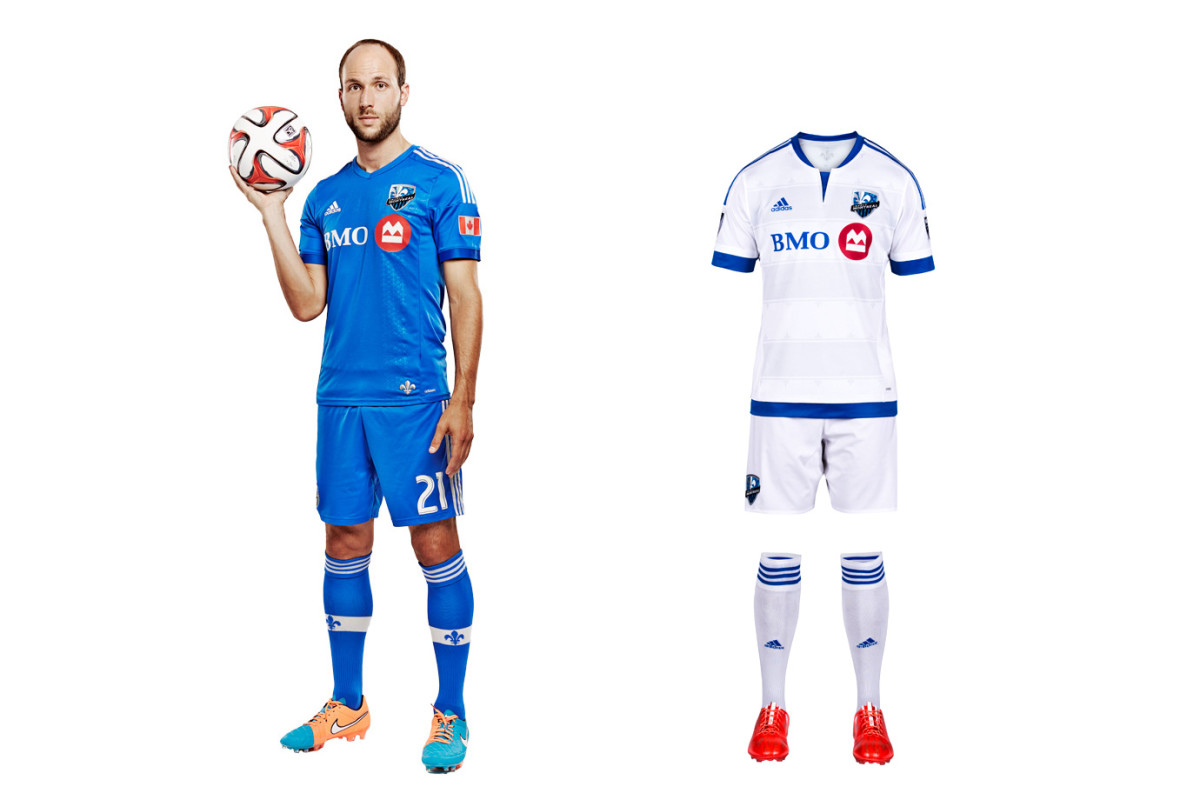
Montreal exemplifies MLS/Adidas’ fixation on tiny details rather than the impact (sorry) a uniform makes when viewed from more than three feet away, which is where most people watch a game. The new away kit features a tiny silver fleur-de-lis affixed to the back and more woven subtly into the fabric. But overall, it’s just another anonymous all-white uniform that mirrors the existing, plain blue primary set. The tragedy is that Montreal’s gorgeous blue-and-black striped alternate, which would be the only striped kit in MLS, is gathering dust. It should be the club’s primary.
D.C. United
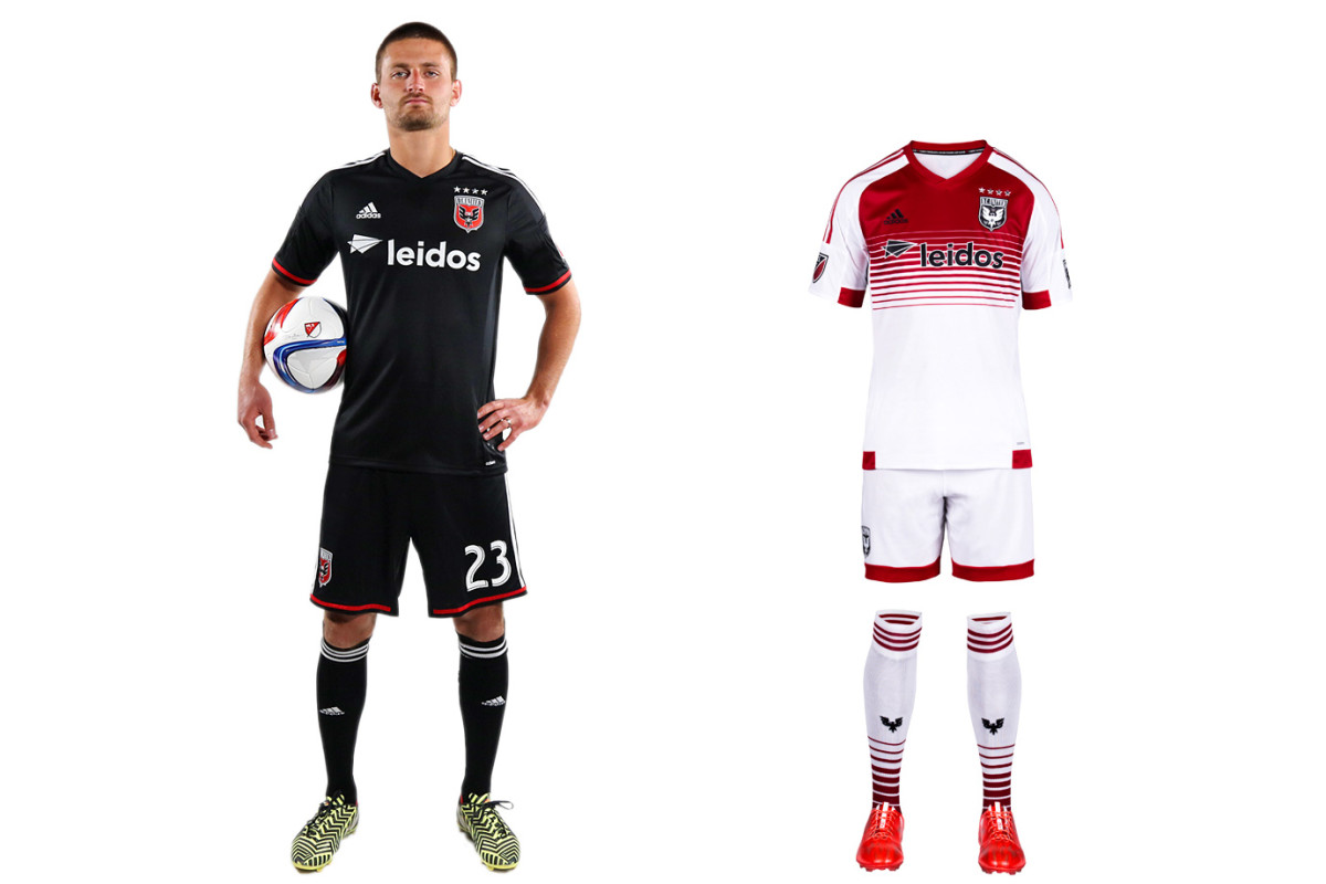
D.C. United calls itself the “Black and Red,” but its uniform palette typically has ignored the latter. That’s been rectified with the club’s new secondary kit, which features a welcome splash of red on the traditional white jersey. The home uniform, which carries over from 2014, still looks unfinished without the white chest stripes that were dropped in 2008. If D.C. could find a way to re-introduce them, perhaps above the sponsor logo and behind the crest, it once again would boast one of the sport’s most distinctive designs.
Real Salt Lake

RSL stubbornly refuses to look great. It took a small step forward with its new secondary uniform, which now features two blue sleeves. It's too bad there isn’t even more of RSL’s beautiful claret, cobalt, and gold color scheme in the kit. The red home set carries over from 2014, making it six seasons since RSL abandoned the claret shirt, cobalt shorts/socks combo it wore when winning its only MLS title. The yellow chest stripe adds a little something extra, but RSL’s preference for an all-red kit similar to others around the league instead of a classy, one-of-a-kind look with championship pedigree is baffling.
Toronto FC
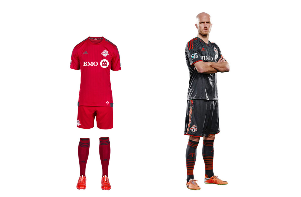
Toronto FC’s new home set could be the reddest uniform in the history of a league that loves red uniforms, which we suppose is noteworthy (guess Adidas insisted on the contrasting three stripes). Club management has focused on building a team capable of ending an eight-year playoff drought, likely leaving little time for kit design. The holdover secondary set is charcoal gray, which features in the TFC logo and is a unique uniform color in MLS. The hooped socks finish off a striking look and make us wish there was a bit more gray in the primary.
New England Revolution
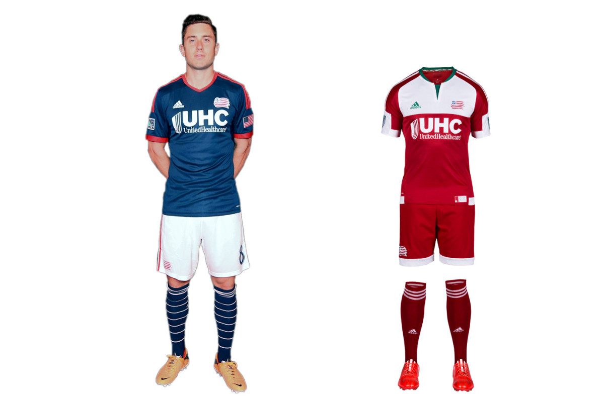
The Revs are Exhibit A for the effect a second color, even if it comes from something as mundane as a plain pair of shorts, has on a club’s brand. Long a believer in boring, N.E. last year overhauled its home blues with white shorts and hooped socks. It’s a classy yet instantly recognizable look. The image shake-up continued Tuesday with a new secondary kit inspired by the regional flag flown during the American Revolution. The red-and-white set is clunky and geometric, but it’s different, daring and local. Better to take a chance than look dull and anonymous.
Philadelphia Union

The Union got it right in 2010. The inaugural navy kit with the gold center stripe, reflecting the Philadelphia flag, was iconic. The gold-and-blue away set, a reversal of the primary, was one-of-a-kind. The holdover home uniform still looks great, although the sponsor’s logo wrecks the balance. But the new secondary is a disaster, a needless departure from the brand and an 10th all-white MLS kit. Once innovators, the Union are now followers. The “WE ARE ONE” collar slogan, the tiny snake below the neckline and the embossed stars on the front are lost in a sea of white.
Vancouver Whitecaps

The Vancouver Whitecaps new primary uniform is meant to be experienced up close. It’s slogan heavy. “Our All. Our Honour.” appears inside the neck and on the hip. “SINCE 1974” is on the back. The thin, diagonal pinstripes that featured on the previous home kit have been replaced by light blue shading designed to represent Vancouver’s water and mountains. It’s all a bit too subtle. The shirt will look nice with jeans, but in the end, Vancouver’s all-white kit—and the holdover mono-navy secondary—simply blends in.
Portland Timbers

Portland quietly switched crests, from a logo featuring its name to a simpler version focusing on the axe and chevrons (the old logo lives on elsewhere). Few teams wear a badge with no writing, but the Timbers can because they’ve built such a powerful brand. Only they could wear the new home set, a bold green-and-white offering anchored by the chevrons. They're a bit wide, and the yellow below the collar clutters the shirt, but it's impressive overall. The road kit, released in 2014, is everything a good one should be: distinctive, perhaps edgy, yet connected to the club. In this case, Rose City red.
Columbus Crew
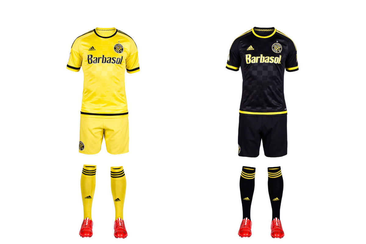
The Crew released new home and away sets featuring the club’s revamped logo, a roundel that looks nice enough but makes sense only with a cheat sheet. The explanations (the ‘O’ for Ohio, the founding year, the checkerboard pattern found in flags waived by fans) certainly tie the club to Columbus more than the goofy construction workers did. As the Crew forge ahead, they’ll stay true to their sartorial tradition. The all-yellow primary is simple but elegant, and certainly recognizable. The mono black secondary could use a bit of flourish–why so subtle with the checkers? But it works and shouldn't be needed that often, anyway.
Orlando City SC
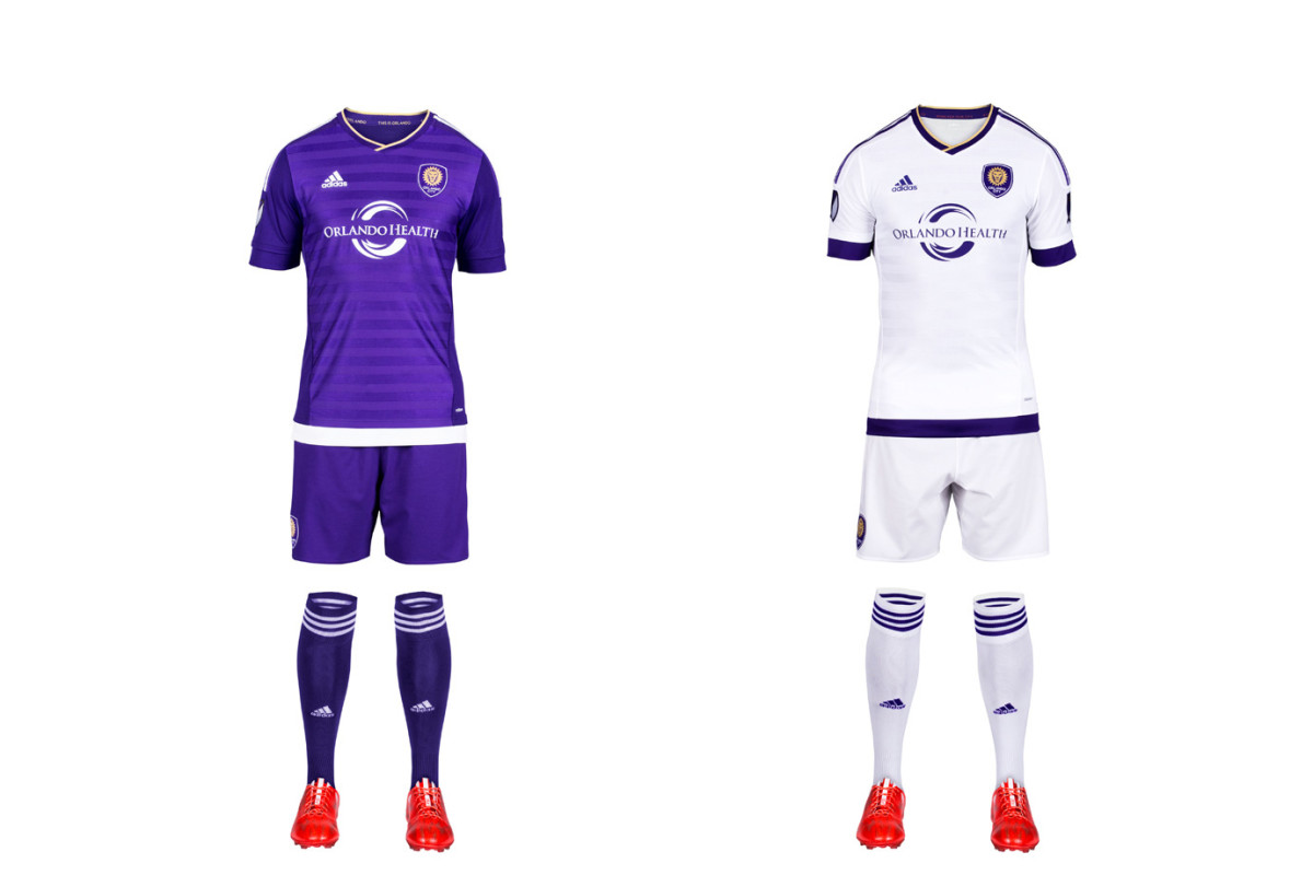
The Lions’ love for purple is welcome in a league featuring so many similar looks. But it didn't result in creative inaugural kits. The home uniform features more up-close details, like “jacquard engineered banding…representing Orlando City’s transition to a new era” and even the club's old USL logo inside. The mono-white secondary has colored hoops on the waist and sleeves and includes more small symbols and slogans. But it’s still just another white set. The answer is obvious—swap the socks. The “Chelsea” look is underrated. White hosiery at home and purple on the road would make all the difference.
New York Red Bulls
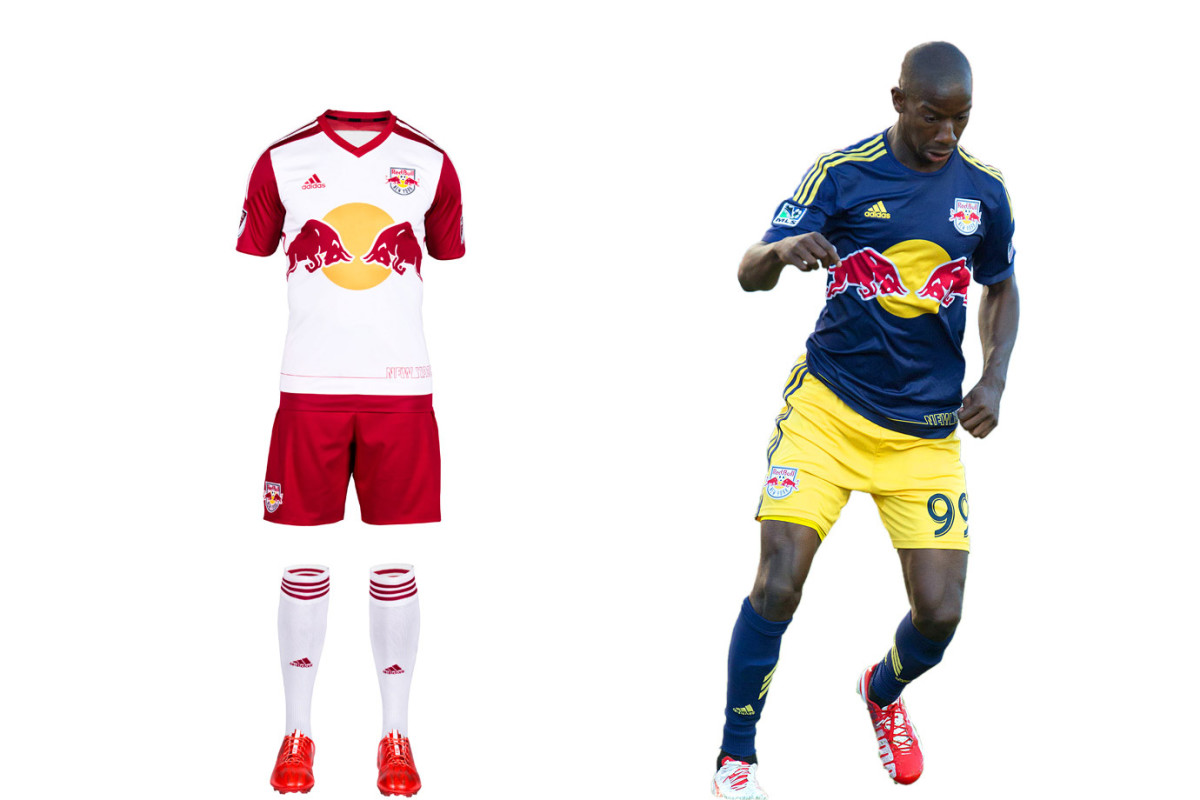
The Red Bulls have company in New York so have set out to reinforce their tenuous connection to the market within the constraints of the club’s corporate brand. The only white-red-white team in the league, RBNY now must compete with NYCFC’s pale blue. The Red Bulls’ new home set doubles down on that contrast with red sleeves and “NEW YORK” emblazoned on the shirt’s lower left in a manner “mimicking the iconic New York skyline.” The “EST.1996” on the back collar reminds fans who was there (or nearby) first. The holdover secondary definitely is unique and is great in reasonable doses.
Houston Dynamo
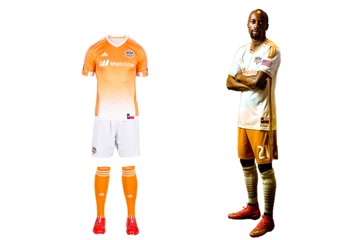
Houston’s club motto is “Forever Orange,” and while that remains the cornerstone of the brand, the Dynamo typically add a wrinkle here and there to ensure we’re not beaten over the head with it. The new home uniform is a great example. The white shorts and checkered fade on the jersey add the right amount of contrast. On occasion, the Dynamo have worn monochrome both home and away. But there’s no need to do so, especially on the road. The balance in the primary kit and the immediately identifiable orange shorts with the secondary set showcase the Dynamo at their best.
Sporting Kansas City
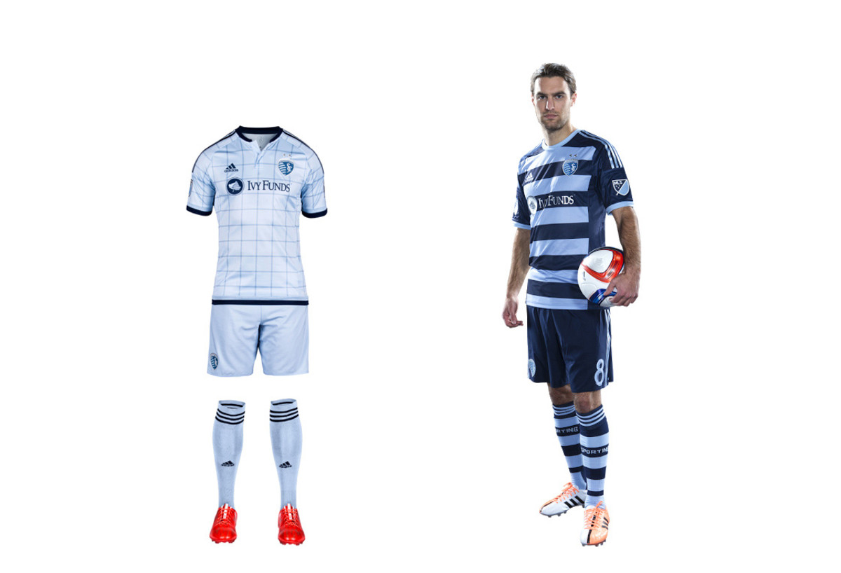
From irrelevant to trendsetting, SKC has profited from one of the most successful sports rebrands in recent history. The club now must share light blue with NYCFC, but Sporting still stands out. The new home set is a departure form the bicolor “state line” uniform of 2013-14 and is anchored by a “fashion-forward window pane pattern” that’s almost as preppy as the recent argyle alternate kit. The secondary uniform is stunning. The hoops, which mirror the stripes on the club crest, highlight one of the most eye-catching sets in MLS history. It’ll be tough to see it go after this season.
FC Dallas
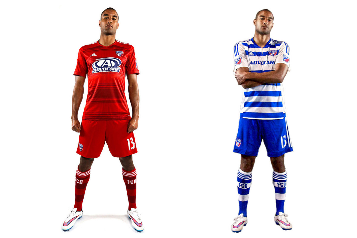
FCD’s kits are an example of a good idea, poorly executed. The club made an inspired decision to go with hoops when rebranding in 2005, but the jerseys always let them down. Unnecessary seams, plackets and panels always ruined the shirt. Dallas gave up last year and went with a boring all-red primary. But it stuck with the hoops on the new blue-and-white secondary, where the side panels and sleeves still disrupt the flow. Both blue and white shorts are an option. Our 2016 ideal: a primary jersey with seamless, sleek red and blue hoops. Unique and colorful, but less jarring. Make it happen.
Colorado Rapids

Another club that’s bounced from brand to brand (green-and-white, blue-and-black), the Rapids have settled in nicely with the unique but elegant burgundy-shirt, white-shorts combo. The sleeves, which mirror those worn by sister club Arsenal, add a subtle touch of flair. The new away uniform is a prime example of how a secondary kit can be tasteful and connect to a club’s brand. Last season’s mono blue state-flag set has evolved into a sharp gold-and-blue kit that maintains Colorado's colors and stands out from the crowd. We’re not fans of recolored badges—logos should be sacrosanct—but overall it’s a winner.
Seattle Sounders
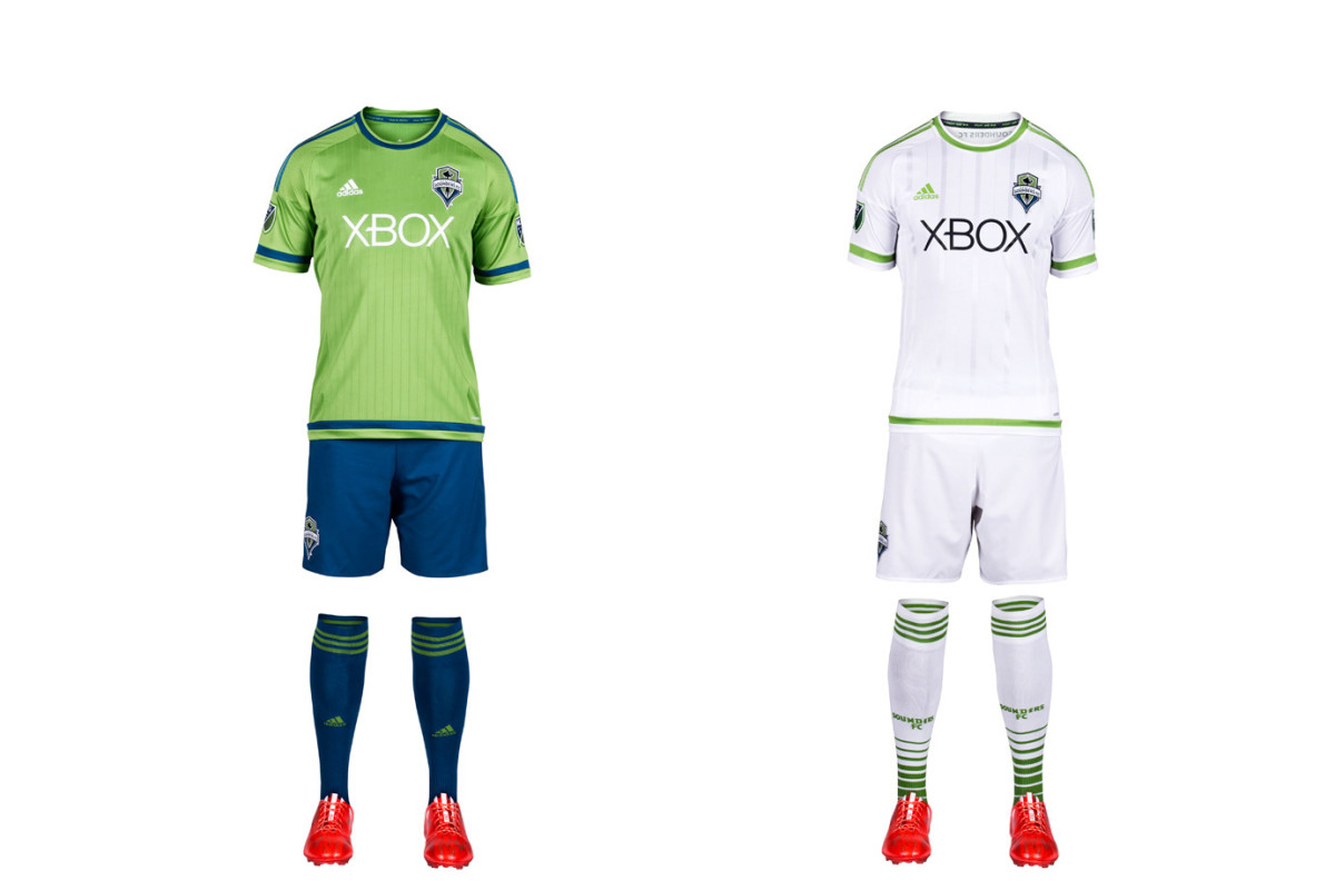
The club that brought us rave green, cascade shale, super cyan and electricity has succumbed to the all-white virus. Seattle is one of five MLS clubs to adopt the look this season, ensuring half the league now embraces the white-out copout. The Sounders new away kit is especially devoid of any personality—a surprising choice for a club that has much of it. The new home set features a less cluttered shirt than in seasons past. It’s a template, but it’s a step up. The uniform also features blue shorts and socks for the first time. Here’s hoping we see it as often as possible.
San Jose Earthquakes
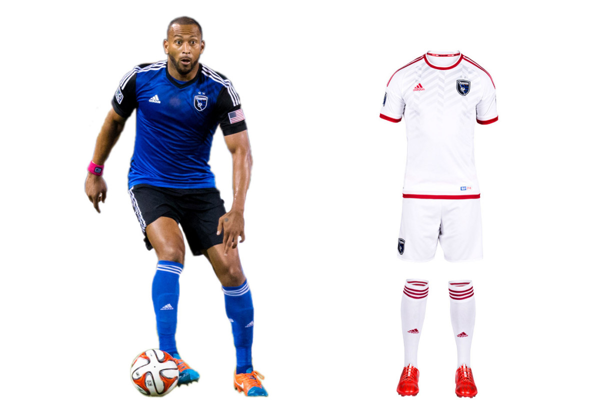
"Earthquakes" is an appropriate moniker for a club that’s experienced so much upheaval. While the new Avaya Stadium offers stability, the brand remains in flux. SJ’s '14 overhaul produced a beautiful blue-and-black primary kit that’s already a modern classic. But the logo, awkwardly anchored by “Quakes”—a nickname of a nickname—lacks gravitas. We liked the re-introduction of the NASL-era red, which inspired last year’s away kit. That’s been replaced by a new white secondary set (yes, another one). It lacks the creativity, individuality and ambition that should be associated with a Bay Area club on the rise.
