%20%20--%3E%0A%3Csvg%20version%3D%221.1%22%20id%3D%22Layer_1%22%20xmlns%3D%22http%3A%2F%2Fwww.w3.org%2F2000%2Fsvg%22%20xmlns%3Axlink%3D%22http%3A%2F%2Fwww.w3.org%2F1999%2Fxlink%22%20x%3D%220px%22%20y%3D%220px%22%0A%09%20width%3D%2239px%22%20height%3D%2240px%22%20viewBox%3D%220%200%2039%2040%22%20enable-background%3D%22new%200%200%2039%2040%22%20xml%3Aspace%3D%22preserve%22%3E%0A%3Cpath%20fill%3D%22%23FFFFFF%22%20d%3D%22M38.5%2C7H28.2v26h10.3V7z%22%2F%3E%0A%3Cpath%20fill-rule%3D%22evenodd%22%20clip-rule%3D%22evenodd%22%20fill%3D%22%23FFFFFF%22%20d%3D%22M26.1%2C25.5c0%2C5.8-4.1%2C7.5-12.9%2C7.5C3.9%2C33%2C0%2C31.2%2C0%2C25.2v-1.1h11.6%0A%09v2.4c0%2C0.7%2C0.1%2C1.4%2C1.2%2C1.4c1%2C0%2C1.2-0.4%2C1.2-1.3v-0.9c0-1.6-0.9-1.6-3.5-2.2C2.2%2C21.7%2C0%2C19.7%2C0%2C15.3v-0.9C0%2C9.3%2C5.5%2C7%2C12.9%2C7%0A%09c10.2%2C0%2C12.8%2C2.6%2C12.8%2C7.4v1.8h-11v-2.9c0-0.6-0.4-1.1-1.2-1.1c-0.6%2C0-1.2%2C0.4-1.2%2C1.1v0.9c0%2C1.5%2C0.9%2C2%2C3.3%2C2.5%0A%09c8%2C1.6%2C10.5%2C3.3%2C10.5%2C7.5V25.5z%22%2F%3E%0A%3C%2Fsvg%3E%0A)
Portland, Porter maintain process to ward off MLS Cup complacency

It’s called the Double Post Bar, and it’s scheduled to open Sunday when the Portland Timbers open their 2016 season at Providence Park. The bar’s location—behind section 109 in the stadium’s north end—is important. It’s for the Timbers Army members who create one of the most spectacular atmospheres in sports. The local beers and 48 tap handles definitely are important. And the name is important. It’s a reminder that games and seasons can be altered by bad bounces or good fortune, and that champions often are the ones who put themselves in position to profit.
Darlington Nagbe shifted inside, closer to Diego Valeri, and the increasingly dynamic Timbers hit the MLS Cup playoffs on a three-game win streak. On Oct. 29, they met Sporting Kansas City in a winner-take-all, Western Conference knockout match. Portland’s Maxi Urruti scored in the 118th minute to level the score at 2-2 and send the game to what would become the longest penalty kick shootout in league history. In the ninth round, SKC defender Saad Abdul-Salaam, who once played for Timbers coach Caleb Porter at the University of Akron, had the chance to end it. But his effort struck the inside of the left post, then the inside of the right, and bounced out.
“Our crowd, our fans, our supporters, the Timbers Army, I think they were the ones who kept that last ball out of the net,” Porter said afterward. “It was either them or God because the thing bounced twice, and I don’t how it didn’t go in. But it didn’t.”
Roundtable: 2016 MLS predictions
In the 11th round, Portland goalkeeper Adam Kwarasey denied SKC counterpart Jon Kempin, and the Timbers survived and advanced. There would be five more playoff games, including the 2-1 MLS Cup final win in Columbus, but it was the double-post penalty kick that inspired the bar’s name. The connection between Timbers fans and their team is real and according to Porter, it was tangible that night against Sporting.
His players then made the most of their environment and good fortune. The Timbers were present, prepared and proactive. Focus on that, Porter said, and the trophies will follow.
“My goal in leading this club is to be the sort of club that can go into any game home or away, playing any team, and have a realistic belief, a consistent way of playing and a consistent mentality, so that every season we’re in a position where we get enough points to be in the playoffs,” Porter told SI.com this week. “That gives you a chance to make the run to win MLS Cup. Some years you might win it. Some years you won’t. That’s just the reality of soccer. But that’s a healthy club. That’s a winning club … That’s all you can ask for. We will win trophies with that approach. We can’t win it every year, but we will win trophies over time.”
A conversation with Porter as he prepares to take his team into Sunday’s opener (a rematch with Columbus) inevitably focuses less on last fall’s playoff run or the final and more on his three years in charge. He proudly rattles off the statistics. Only three teams have more regular season points. No team has lost fewer regular season games, and the Timbers have suffered two consecutive defeats (and never more) only three times. There’s no trophy for any of that, but there’s probably no trophy without it.
GALLERY: Critiquing all 20 MLS 2016 uniforms
Critiquing the 2016 MLS uniforms
Chicago Fire
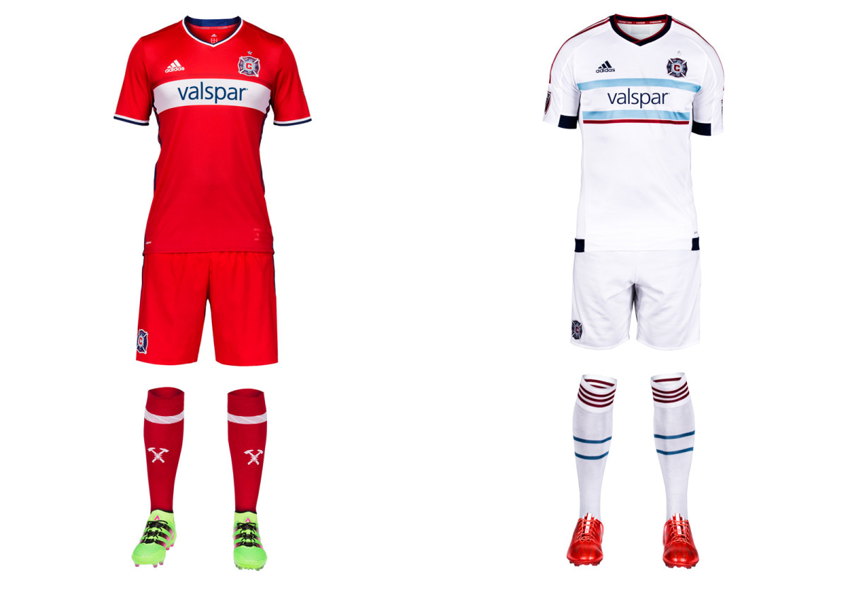
The optimism surrounding a new GM and head coach is accompanied by a welcome return to the red kit and single white hoop the Fire wore when winning trophies. Chicago was the first MLS team in mono-red and has dibs on a look that unfortunately became way too prevalent. The hoop on the new primary uniform is too thin, but otherwise it’s a crisp design that should be well received by fans, some of whom protested the red-and-blue offering worn in 2014-15. The all-white away kit featuring hints of the city flag carries over from last year.
Colorado Rapids
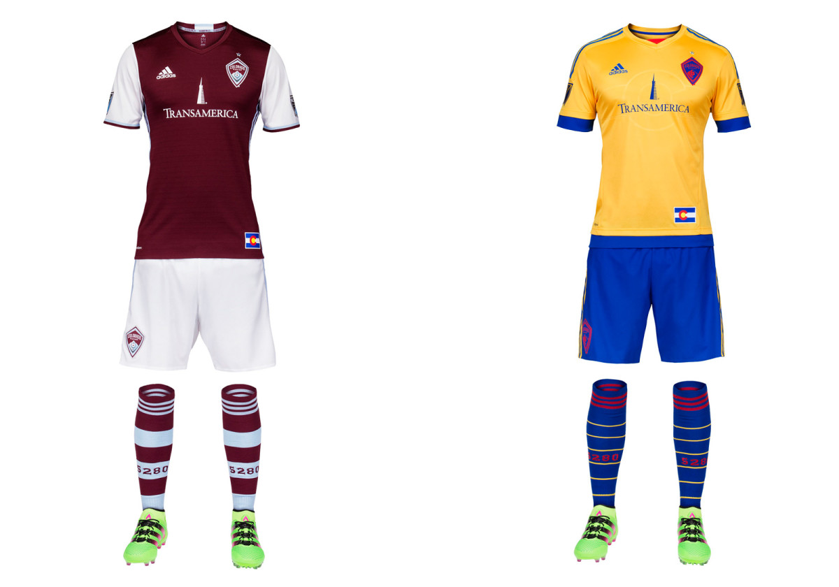
Colorado made just a few very subtle changes to its home uniform this year, and that’s fine. The three stripes moved from the shoulder to the side, there’s a bit of color on the cuffs and the hoops on the sock widened, which is awesome. The burgundy and white is elegant and immediately recognizable. The club's problem remains the logo, a skinny shield featuring a mountain (not rapids) similar to its NHL, NBA and MLB neighbors. It’s tough to suggest a fourth crest for a team that’s had trouble establishing an identity, but it might help. This one leaves no impact. Colorado’s sharp state flag-inspired away set carries over from 2015.
Columbus Crew SC
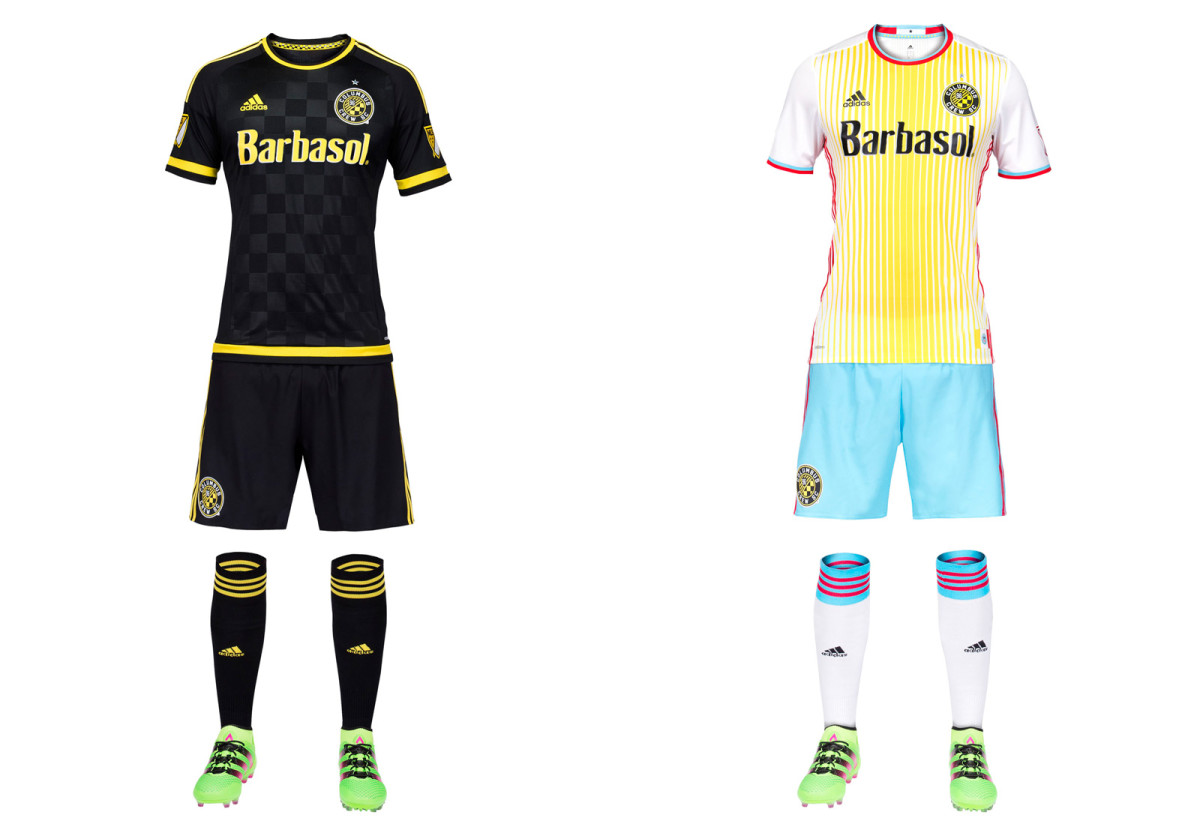
Once known as "America’s Hardest Working Team," Crew SC is trying too hard. For 17 years, Columbus was the only club in MLS, and one of the few in the world, to wear all-yellow. It was immediately recognizable, looked great on the field and was a genuine brand. Now it’s gone, replaced as the primary by last year’s away set. Mono-black is more closely associated with D.C. United. The new secondary is a shock to the system. Designed to reflect the yellow, white and red city flag, it’s certainly distinctive. Clubs are welcome to take chances with their away kits, but only if the overall brand holds steady.
D.C. United
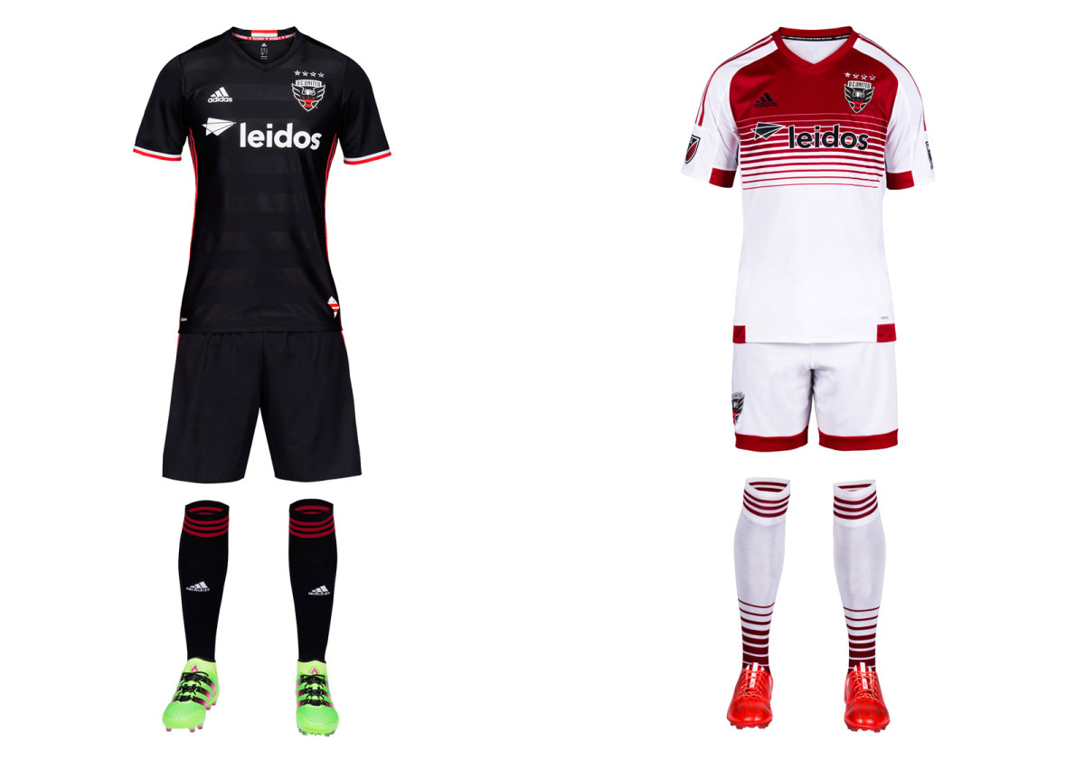
A new stadium in the nation’s capital (scheduled to open in 2018) is preceded by a new club logo, United’s first since 1998. We love the wings breaking through the shield and the redesigned font, but wish the stars on the city flag–which replaces the old ball and championship star–were a bit larger. They’re lost on the black background. The new home kit maintains the club’s classic, all-black brand and the sad absence of the white chest stripes that adorned the most iconic uniform in MLS history. There must be a way to bring those back.
FC Dallas
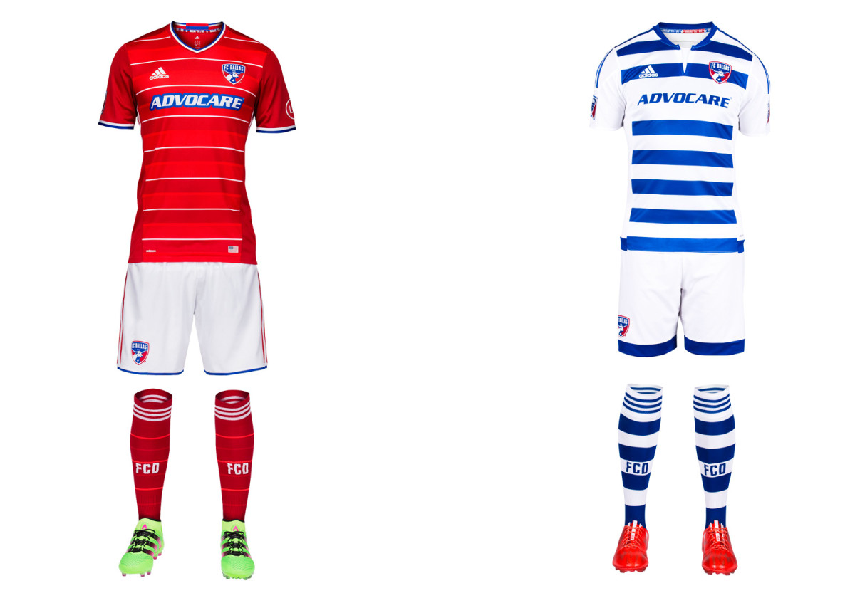
FCD’s new home kit is the nicest in club history. The hoops that accompanied the 2005 rebrand were a good idea but always poorly executed, and Dallas gave up on them two years ago. But the common mono-red look was a failure, leading to this year’s stylish primary. The pinstripe white hoops are sleek and distinctive and aren’t overwhelmed by Adidas’s panels and seams. The uniform pops with the addition of white shorts. Hopefully FCD takes the same approach with the blue-and-white secondary kit next year.
Houston Dynamo
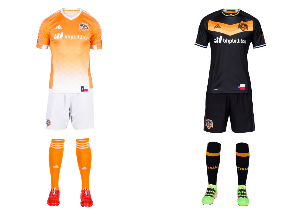
Houston’s new away uniform is a stunning departure from the traditional white. Black has been part of the club’s palette (check the logo). It now dominates the secondary kit save for a bright orange chevron on the chest reminiscent of the Astros’ famous “Tequila Sunrise” jerseys and the shirts Germany wore when winning the 2014 World Cup. We may not see the black too often at home (it’s hot and humid in Houston), but it should sell well. The orange fade on the primary set carries over from 2015. The Dynamo occasionally wear mono-orange, which is a mistake. The white shorts remain the way to go.
LA Galaxy
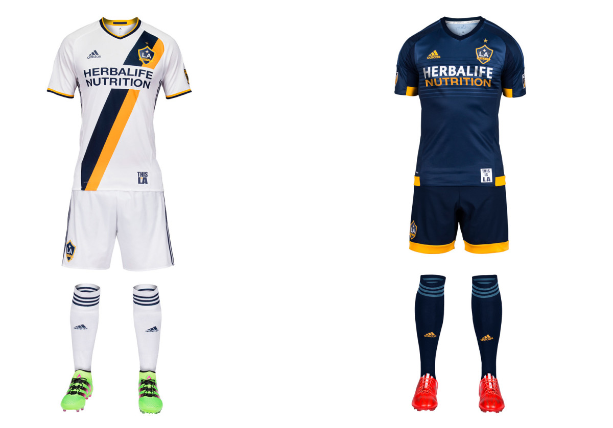
Credit to LA for sticking with the sash introduced in 2012. A club that started black-and-teal and progressed to yellow-and-green finally has an established look to call its own, and it’s a nice one. The new home uniform splits the sash into the modern team colors of blue and yellow, with corresponding flashes on the cuff and collar. It would be perfect save for the enlarged sponsor logo, which cuts too much from the middle of the shirt. The Galaxy carry over their classy blue away kit and thanks to the league's complex new championship star system they'll now wear one gold star above the crest, symbolizing five MLS titles.
Montreal Impact
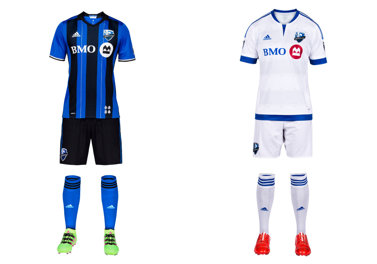
Finally! We never could understand why the Impact (launched in 1993) didn’t opt for their old school blue and black stripes when moving to MLS in 2012. There was history with the plain blue primary as well, but in the end it was just another anonymous monochromatic uniform in a league full of them. The stripes returned as a popular third option in 2013 and now have been elevated to their proper place as Montreal’s home kit. Black shorts, blue socks and silver highlights round out one of MLS’s most distinctive looks. Maybe the Impact can wear those shorts and socks on the road as well.
New England Revolution
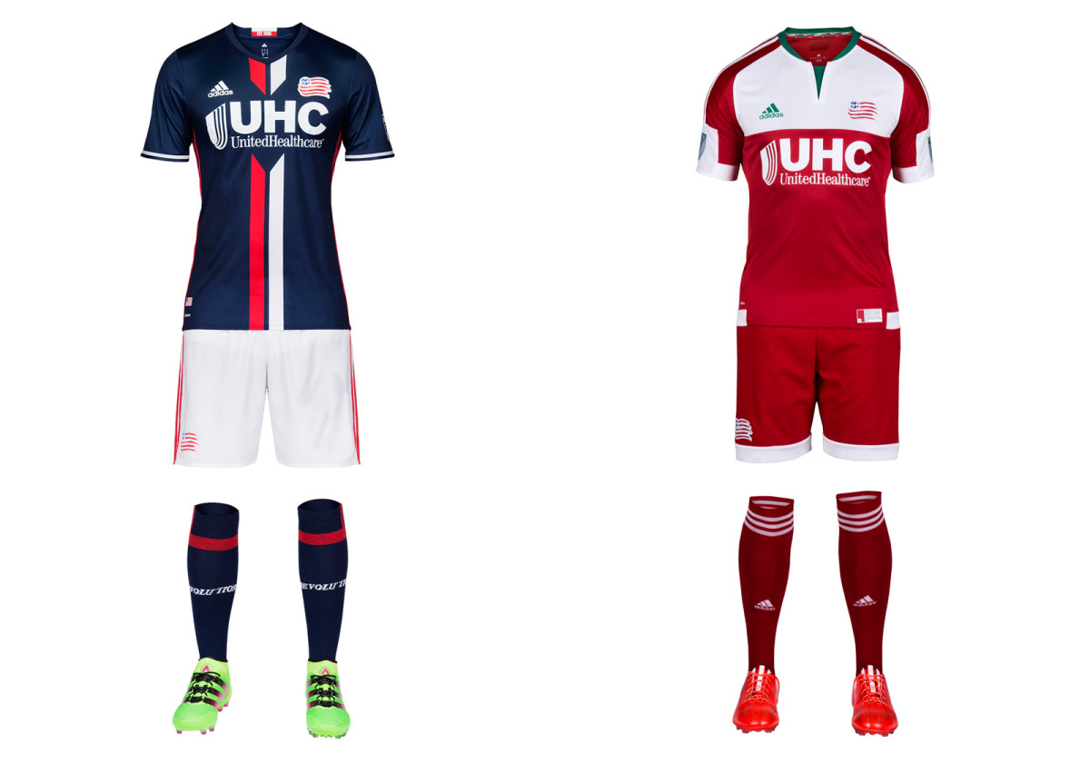
No team embraced the post-1996 regression to the bland like the Revs, who wore the most nondescript uniforms in MLS for years. That changed in 2014 with the addition of white shorts to the navy blue home kit. A total departure from the old all-white aways—a red homage to the old regional flag—followed last year. This season’s primary represents another step forward. The white shorts remain, thankfully, while a beautiful new jersey features red and white stripes down the center. The club said the look is inspired by American Revolution-era jackets. The secondary kit carries over. The inspiration there is commendable but the boxy execution is lacking.
New York City FC
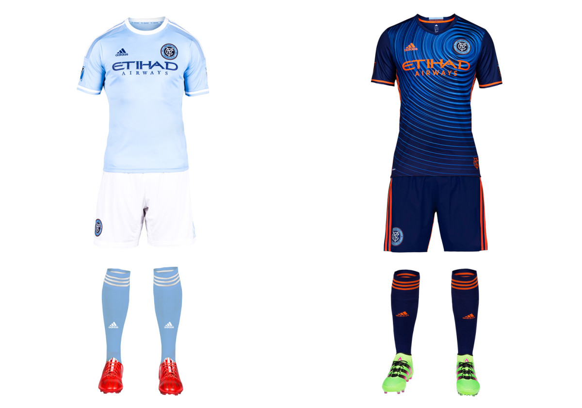
MLS didn’t need another all-black uniform, and NYCFC did the right thing by ditching last year’s away set in favor of something more aligned with the club’s colors and branding. What they came up with, however, will take some getting used to. The dizzying new secondary kit is anchored by a blue jersey with a “ripple pattern inspired by the energy of the five boroughs.” It’s unique, for sure, and while some won’t like it, secondaries don’t necessarily need to be timeless. Adidas also supplied orange shorts as an option, in case the mono-blue isn’t loud enough. NYCFC’s classy home uniform, which looks good even though Manchester City wore it first, carries over from its inaugural season.
New York Red Bulls
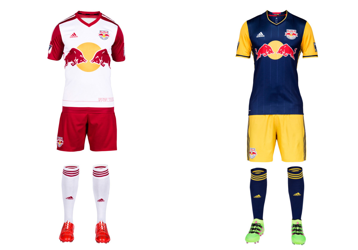
New York is red, except when it’s navy blue and yellow. Despite some supporters’ preference for a red away uniform, the Red Bulls are sticking with the colors they share with the parent company’s teams in Leipzig and Salzburg. The new secondary, which now features yellow sleeves, certainly is eye-catching even if it doesn’t stir fans’ souls. NYRB’s brand transcends the crest and kit, anyway. The stadium, history and the personalities who’ve donned MetroStar red-and-black and Red Bull red-and-white are what give this club its identity. NYRB sort of acknowledges that with the red-and-black necktape and MetroStars shield inside the new away jersey. The red-sleeved home kit is identical to last year’s.
Orlando City SC
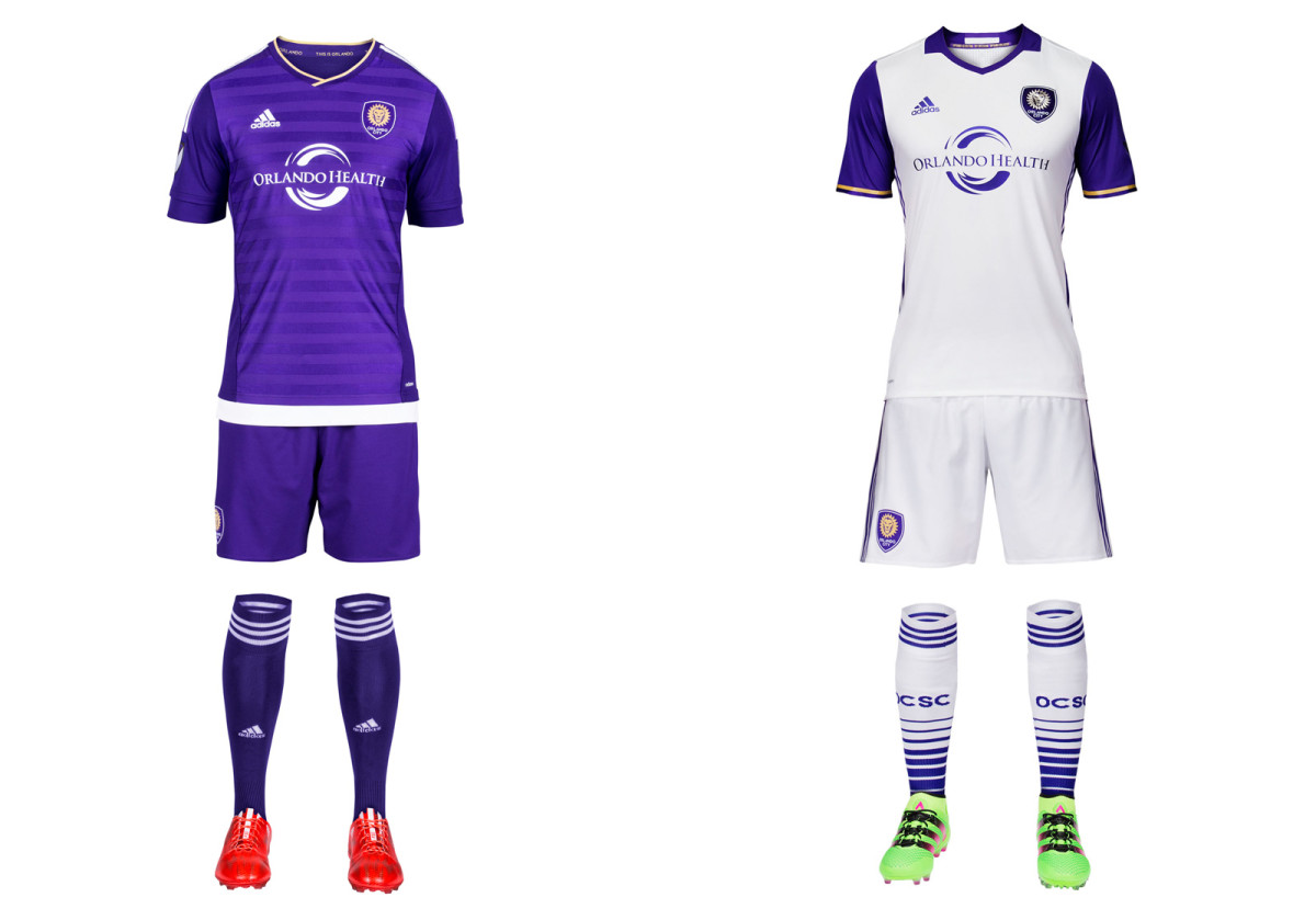
Purple is the defining feature of Orlando City’s brand, but the club blew it during its expansion season by rolling out a plain white away kit that looked too much like all the others. Now there’s progress in the form of purple sleeves, which add a welcome bit of color and make the new secondary uniform one that only Orlando could wear. The crest features a "3D" lion. The monochromatic home set stays the same. Swap the socks–white at home and purple on the road–and City would be close to perfect.
Philadelphia Union
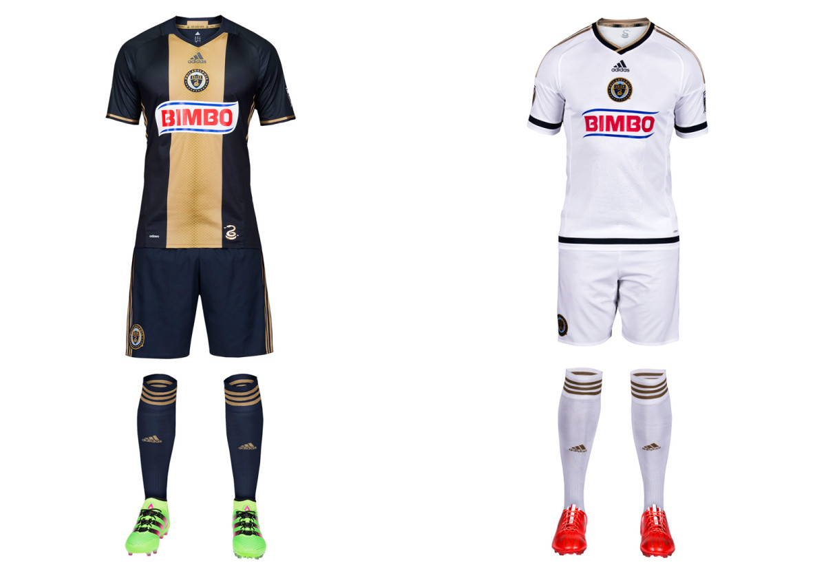
The Union’s home uniform is a modern classic, apart from a garish sponsor logo that looks pasted on instead of integrated with the rest of the jersey. This year’s new primary kit features a lighter gold down the middle, an understated snakeskin pattern (taken from the serpent in the club logo) and the departure of the pinstripes used in 2014-15. It’s as classy and distinctive a set as you’ll find. If only Bimbo could cooperate. Meanwhile, we’re stuck with the regrettable, lazy away kit for one more season.
Portland Timbers
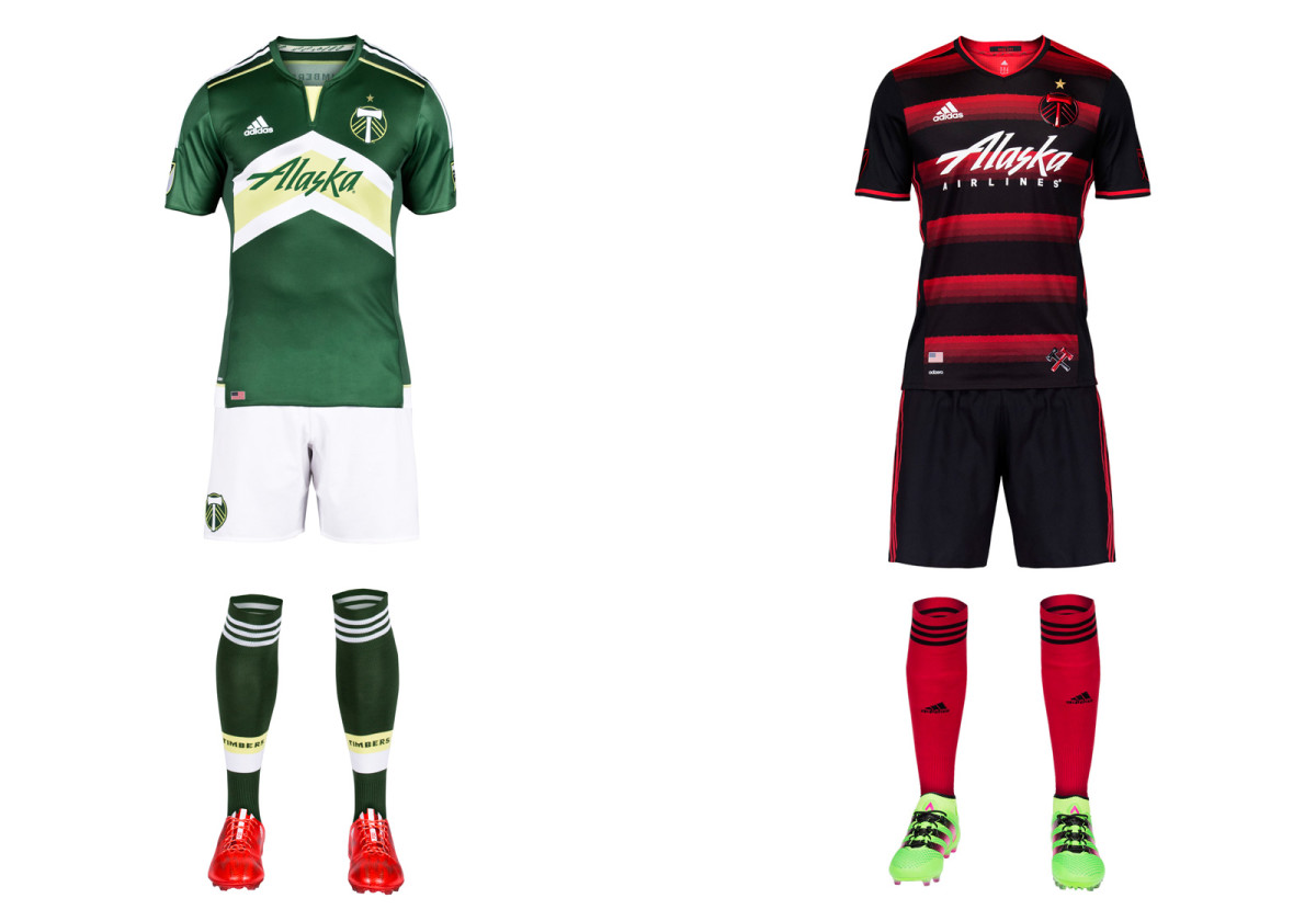
Portland’s "Rose City Red" away uniforms continue to darken, but the overall theme is maintained with the champions’ striking new secondary set. The mostly-black jersey (there's more red on the back) features hoops in shades of red complete with a subtle thorn motif. Red socks add a bit of contrast that would be lost if they were black. The green-and-white home kit is the same as last year’s except for a revised sponsor logo. For Timbers fans, of course, the best part is the new gold star above the crest.
Real Salt Lake

After six years in all-red, RSL at long last is returning to something resembling its unique, championship-winning look. After claiming the 2009 MLS title in red/claret jerseys (with blue/cobalt sleeves), blue shorts and blue socks, RSL inexplicably opted to become one of several mono-red teams. Bad uniforms and a trio of lost finals followed. If there was a kit curse, consider it reversed with the new home set, which features sublimated pinstripes on a sharp red jersey and a return to the cobalt shorts. RSL is RSL again. Let’s hope some variation of “victory gold” replaces the all-white secondary kit in 2017.
San Jose Earthquakes
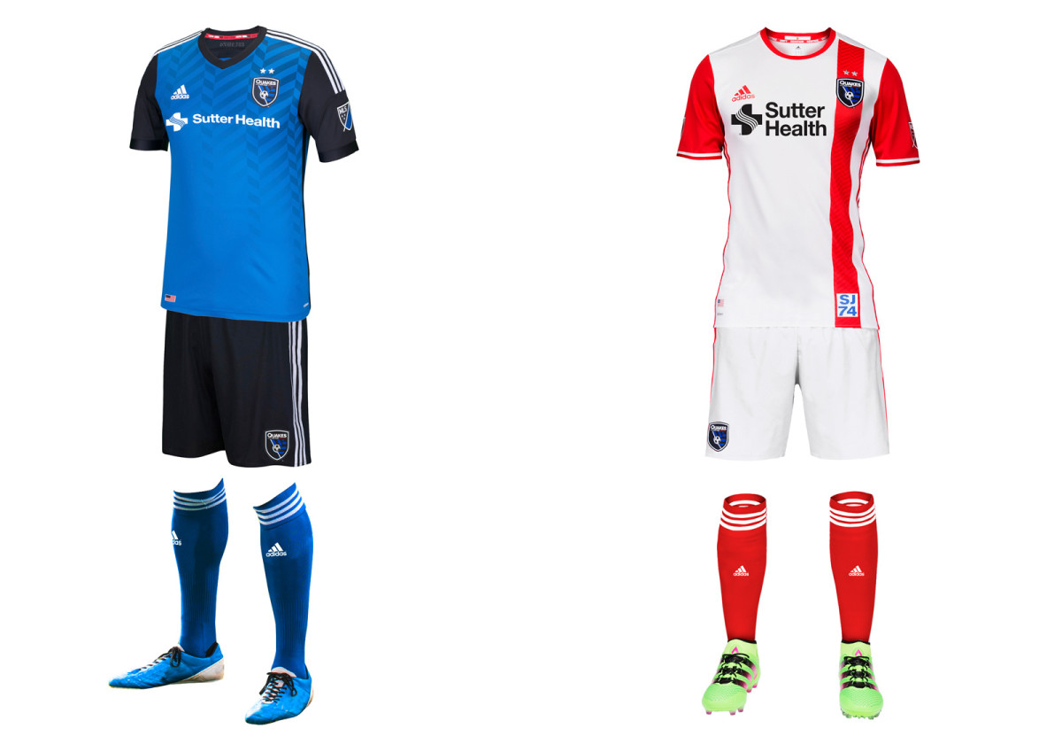
San Jose’s 2014 brand refresh now feels finished with the introduction of a much-improved away set that actually features some red, which connects the modern-day Quakes to their 1970s and ‘80s predecessors. The red stripe, sleeves and socks create a unique, balanced look that ties the club’s crest, primary and secondary kits together. There's also a tiny scorpion inside the neck paying tribute to the branding fiasco that was the San Jose Clash. The sharp blue-and-black home uniform carries over from last season with the addition of the Sutter Health logo. The Earthquakes were the last holdout—for the first time, every MLS team has a jersey sponsor.
Seattle Sounders FC
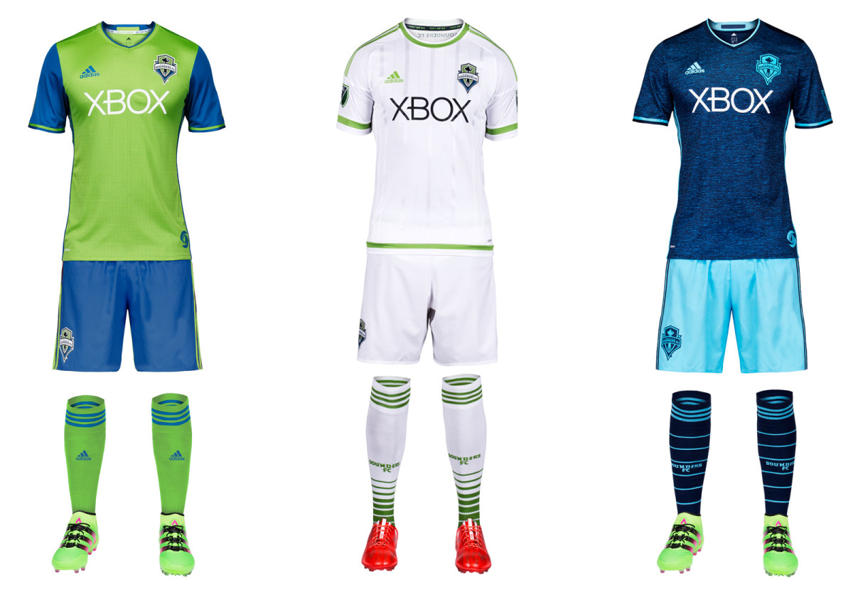
The only club to introduce two uniforms this year, the Sounders will sport a slightly adjusted version of their iconic rave green primary and a new third kit designed to reflect the colors of Puget Sound. The home set now features blue sleeves and an ’SS’ pattern on the body of the jersey. Seattle may continue the odd tradition of swapping the shorts and socks when wearing the primary on the road. It returns to cyan (and shades of darker blue) on the new third kit, which has a nice Cascadia feel. Hopefully, its arrival means the Sounders will wear the silly all-white secondary as infrequently as possible.
Sporting Kansas City
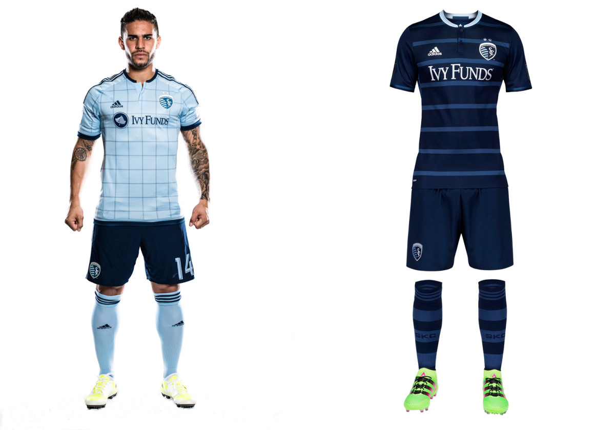
Uniforms typically run on two-year cycles, meaning Sporting had no choice but to move on from its spectacular hooped 2014-15 away set. The replacement is nice enough and the jersey looks good on its own, but the full kit is a bit bland in comparison. The thin hoops are "tonal" rather than "Sporting" blue. The metallic silver numbers and sponsor logo add a bit of glitz. The checkered home uniform debuted last year and still looks good with the dark blue shorts. SKC also will continue wearing its all-white third kit on occasion.
Toronto FC
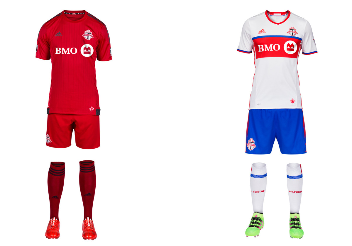
Entering its 10th season, TFC will include blue in its uniform for the first time. The club’s new away uniform is a colorful nod to the city and its soccer past. Toronto’s flag and its NHL, MLB and CFL teams are primarily blue, and the NASL’s Metros-Croatia and Blizzard wore red and blue in the 1970s and ‘80s. The kit stands out without being garish and means something to the club. Well done, TFC. It also can be worn with red shorts. Gone is the classy dark gray, which we wish was more prominent in the all-red primary.
Vancouver Whitecaps
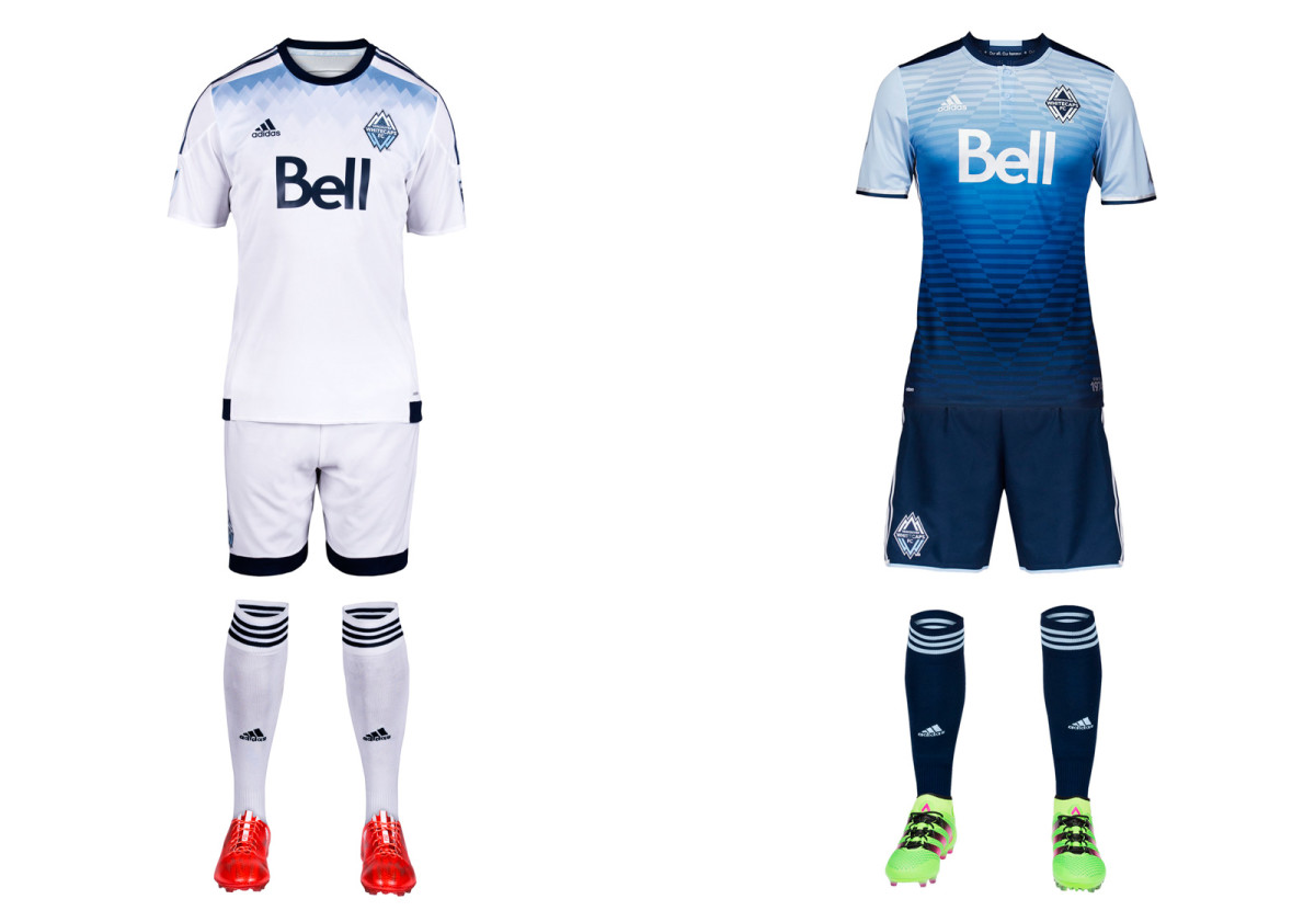
Vancouver’s new away uniform is its most daring design to date, barring the brown third kit introduced in 2012. But where that one was forgettable, the team’s “Sea to Sky” jersey leaves an impression. The blue gradient evokes the horizon, the North Shore Mountains reflecting on the surface of the water and the club’s initials. It’s gorgeous. The all-white primary carries over from 2015. It includes a bit of subtle blue shading at the shoulders but is otherwise pretty anonymous. The Whitecaps just proved they can do better.
The Rose City first welcomed pro soccer in 1975, when the original Timbers lost the NASL final. Through 27 more seasons in multiple leagues, various iterations of the Timbers never played for another trophy. And since the Trail Blazers claimed the NBA title in ’77, Portland hadn’t celebrated a "major" pro sports championship (the Thorns did win the National Women’s Soccer League crown in 2011). Considering the wait and the Timbers’ popularity, the reception following December’s MLS Cup triumph shouldn’t have come as a shock. So many fans welcomed the team at the airport that authorities closed down the road outside. Some 20,000 filled the streets for a parade despite rain the next day, and there were around 10,000 at an evening rally at Providence Park.
“It was pouring down rain and there were questions about whether it was even worth having a parade. Were people even going to show up,” said Timbers veteran Jack Jewsbury, who’s been with the club since it entered MLS in 2011. “Even though we knew what kind of class of fans we had here, I never thought it would be what it was. That was truly a special moment that I’ll always remember … It had been so long since the Trail Blazers had won, for us to share that day with them meant a lot to us. For the fans, the guys who’ve been around since 2011, through the ups and downs, it was special.”
That’s where the movie typically ends. The city celebrates their immortal heroes and a mission accomplished. The wait is over, and a title has been won that can never be taken away. But that isn’t the script Porter wants to write. He’s in this for the long haul—he’s hoping for at least a decade in Portland, he said—and there’s no room for swagger or a champion’s complacency.
“We want to create this mindset, this constant mentality—a culture of winning and a culture of how to think the right way to win,” Porter said. “That’s why we went into the playoffs and nothing changed. It’s not that we were more excited. It’s not that we felt more pressure. It’s always the same … Winning teams are business-like all the time. They’ve got ice in their veins. There’s no big game or little game. Every game is the same in my mind. That’s how we project a consistent mindset game in and game out.”
That’s why the observances before Sunday’s match against Columbus will be limited. There will be a championship banner raising, a few seconds to reflect, and then kickoff. Porter didn’t want to deal with the distraction of a ring ceremony, and he certainly didn’t want to rub December’s result in Crew’s faces.
“The difference in being a good club and a great club comes down to the psychology and the culture and the little things,” Porter said. “Ultimately, this is a new season. We want to take the opportunity to put closure on the championship with our fans. But once the whistle blows, it’s a new start.”
Said Jewsbury, “It really is a brand new season—a brand new team.”
MLS Preseason Power Rankings: Keys to success for each team
Porter and GM Gavin Wilkinson desired some turnover and looked to strike a balance between continuity and change.
They didn’t necessarily want left back Jorge Villafaña to leave for Mexico’s Santos Laguna or midfielder Rodney Wallace to go to FC Arouca in Portugal, but keeping a championship team together in a salary cap league was always going to be tough. Porter embraced it.
The Timbers added defenders Chris Klute (who’s battling a bad knee), Jermaine Taylor and Zarek Valentin, tidy and technical veteran midfielder Ned Grabavoy and former Crew forward Jack McInerney, who scored six MLS goals last season. Porter is still hoping to find an additional winger (Lucas Melano likely will succeed Wallace in the starting lineup), but he’s happy with the additions.
“Having some new guys come in, push the top 11 for their jobs, guys coming in who haven’t won a trophy, that keeps everyone on their toes. But we keep enough continuity to keep that consistency,” Porter said. “You want a mix of guys who haven’t done it with guys who have—enough turnover while a maintaining a piece of the past. You want the senior players, when they take the field, to rub off on some of the new players. This is the way we do things, and we do it this way because we win this way.”
Jewsbury said that what “rubs off” from the Timbers’ core players onto the newcomers won’t be championship pedigree, but rather “a belief in what you do every day.”
Porter has no patience for the narrative. He’s concerned only with what’s in his control and how to plan for the games and season ahead. The championship changes nothing.
“The media, through their questions, wants to shape the psychology of your players. There’s targets on our back. Other teams are going to want to beat us more. I never really agree with that,” Porter said. “It’s not like last year when teams played us, they didn’t want to beat us. It’s not like last year, we didn’t want to win. So the simple psychology of every game, and I build this mindset into the team, is that nothing in the past makes it any easier or harder for the next game. The only thing that determines whether we win each game is the 90 minute after the whistle blows—nothing on the periphery.”
- MLS MINDS: On promotion-relegation | Instant replay | Playoff format
He added, “You only lose hunger and only get complacent, you only lose confidence or feel pressure when you’re not prepared and when you’re thinking about the wrong things.”
SI Now: Wahl on MLS season, CCL, Tottenham vs. Arsenal
Porter is hardly a killjoy or a curmudgeon. He said he enjoyed the MLS Cup triumph more than any moment in a career that's included three NCAA titles (two as an assistant at Indiana and one as the head coach at Akron). And he wants that feeling again. Porter keeps the memorabilia in his office to a minimum, but he does display two framed photos on the mantle. They feature his highest and lowest points as a coach.
The latter is represented by a picture of Porter on the bench managing the U.S. Under-23 team that was sensationally eliminated from Olympic qualifying in 2012. The former depicts the 2010 championship with Akron. That one will be replaced by a scene from last year’s MLS Cup in Columbus. Together, the photos reveal the bigger picture—what Porter called the “fine lines” between winning and losing and the importance of consistency, humility and process.
Those qualities put you in position and if the bounces go your way, then anything is possible. On Sunday, it all begins again. The past 40 years don’t matter–only the one ahead.
“Over time, over three years, you start to see the constant behavior that you find in winning clubs. You delve into that behavior—everybody from the players to management, fans, everything. It was kind of emotional and volatile here for a while and now we’ve become a club that’s healthy and consistent and you’re healthy and consistent, there’s more trust,” Porter said. “If we follow that same approach over the next 10 years, we’ll win more trophies.”
A lifelong soccer player, coach and fan, Brian Straus joined SI in 2013 after covering the sport for The Washington Post, AOL and Sporting News.