2017 MLS uniform critique: Every team's jerseys for the new season

2017 MLS uniform critique: Every team's jerseys for the new season
Atlanta United
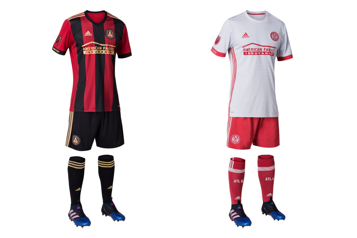
Atlanta becomes the second current MLS team to sport a striped primary (Montreal just launched theirs last year). The red, black and gold uniform is beautifully executed, immediately recognizable and will be Atlanta’s look to own. And that’s vital, since it shares a name with so many others. The away set features a light gray jersey with subtle hoops and red shorts and socks. It’s a solid, distinctive secondary kit and a winner apart from the recolored crest. Don’t recolor your crest.
Chicago Fire
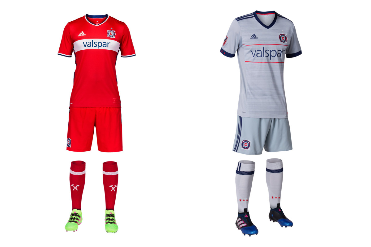
The all-red kit with the wide white hoop finally returned last year, and this season Chicago will complement its traditional primary with a secondary uniform that represents a welcome departure. The gray reflects the circle in Chicago’s beautiful badge and comes with a sublimated pattern that gives the shirt some texture. The narrow red hoops tie it perfectly to the home set, and the stars on the cuff and socks recall the city flag. The jersey should sell well, but we wish the kit came with navy shorts.
Colorado Rapids
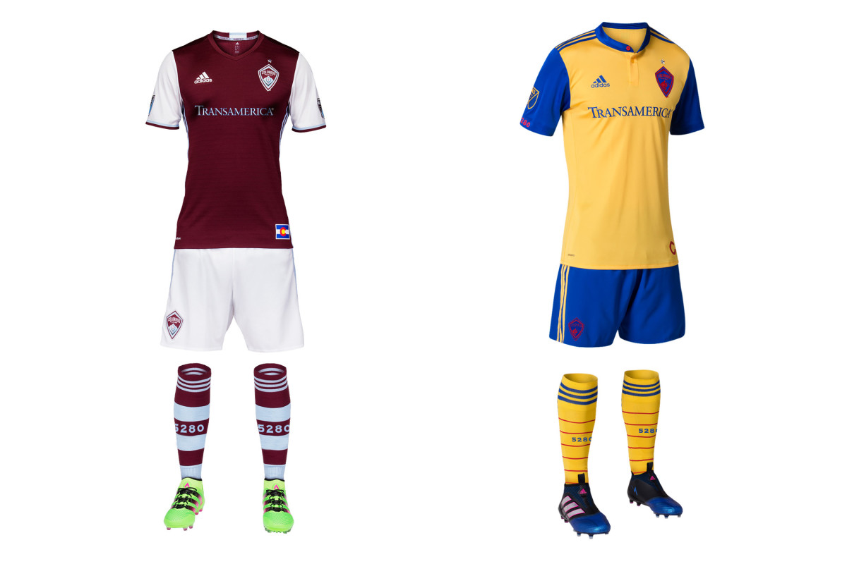
Few clubs manage to establish an iconic secondary kit, but the Rapids may have stumbled on to something in 2013 when they began using the colors of the Colorado flag. The initial all-blues gave way to an improved yellow and navy combo and then to this year’s new away set, which appears to brighten the shorts while adding yellow socks. It’s colorful, symbolic and distinct. And it would be perfect if not for the indistinguishable, camouflaged crest. Say it again: Don’t. Recolor. Your. Crest.
Columbus Crew SC
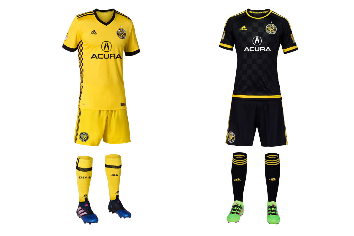
A year after making a massive branding mistake (and missing the playoffs), Columbus has made amends and then some. The Crew had worn yellow at home since 1999–the year they moved into the league's first soccer-specific stadium. They won an MLS Cup in yellow. Then last year, they switched to all-black primaries and wore a strange white, yellow and aqua secondary that nobody liked. Now yellow is back, and it's beautiful. The black checkers on the side reflect those in the crest. It's a novel and stunning touch. Last year's sharp black primary with bright yellow trim returns as the away set, where it belongs.
D.C. United
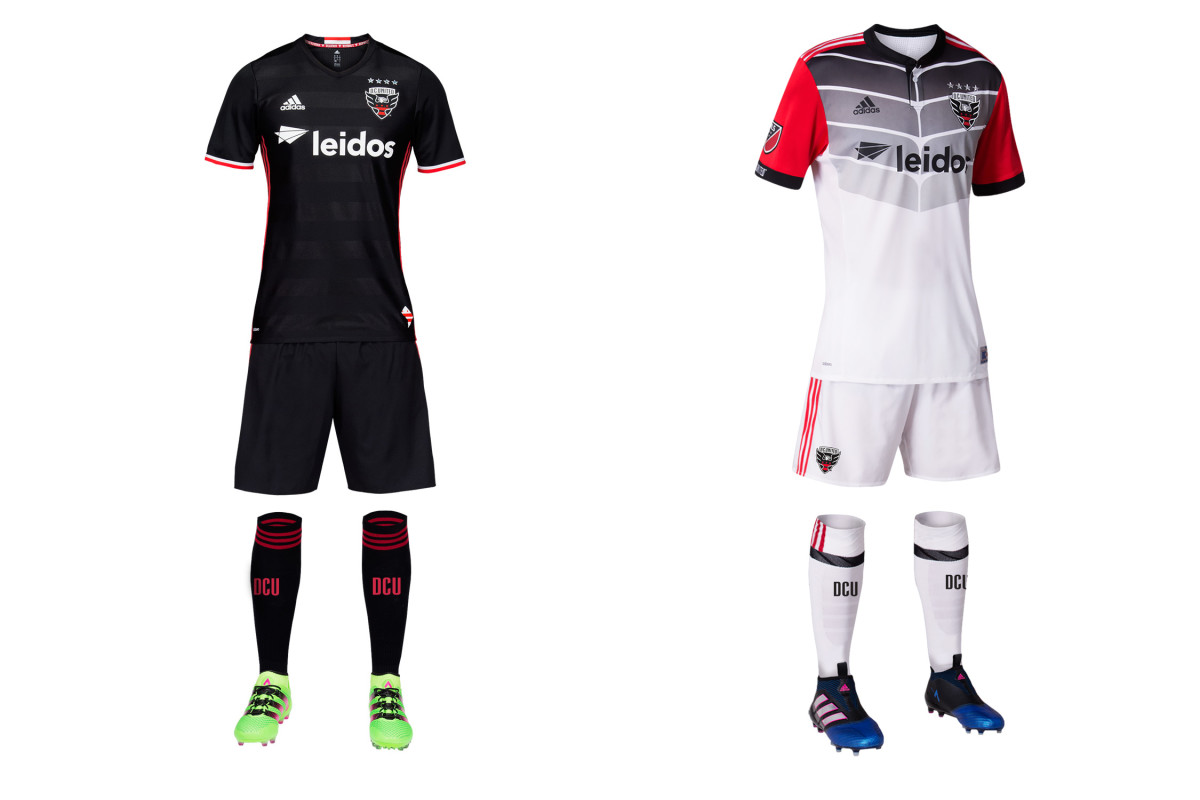
In its last season at RFK Stadium, D.C. United is going bold with a new away set that has a vague superhero, gladiator, ninja turtle sort of feel. Officially, the pattern represents an eagle’s wings. It's jarring and doesn’t really hit the mark. But a risky secondary is O.K., and in this case, DCU deserves credit for adding more black and red to the kit. Combined with the sublimated hoops on the holdover primaries, we’re excited by the suggestion (or even the gradual return) of the horizontal stripes that once adorned American soccer’s most iconic uniform. Someday….
FC Dallas
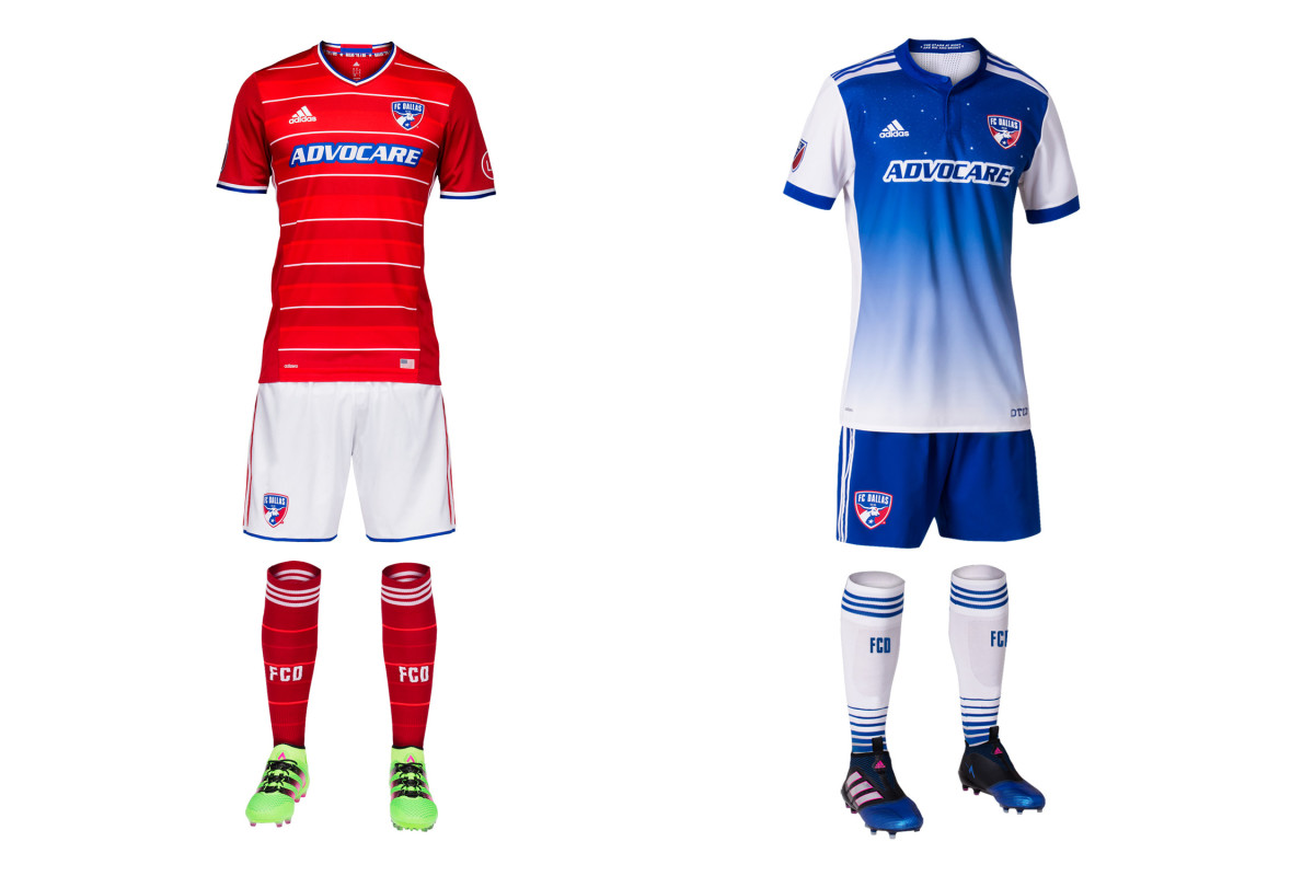
FCD fell short of its first MLS Cup last year, but it’s still adding stars to its jersey. The new away kit features 11 of them and rather than titles, they represent players on the pitch and the Texas sky—“The stars at night are big and bright, deep in the heart of Texas.” Dallas has been wearing blue and white hoops when necessary but they were never executed well. The new blue gradient is a nice change of pace. The real issue isn’t the stars, however—it’s whether FCD will continue to wreck the holdover primary kit (the best in club history) by wearing red shorts instead of white.
Houston Dynamo
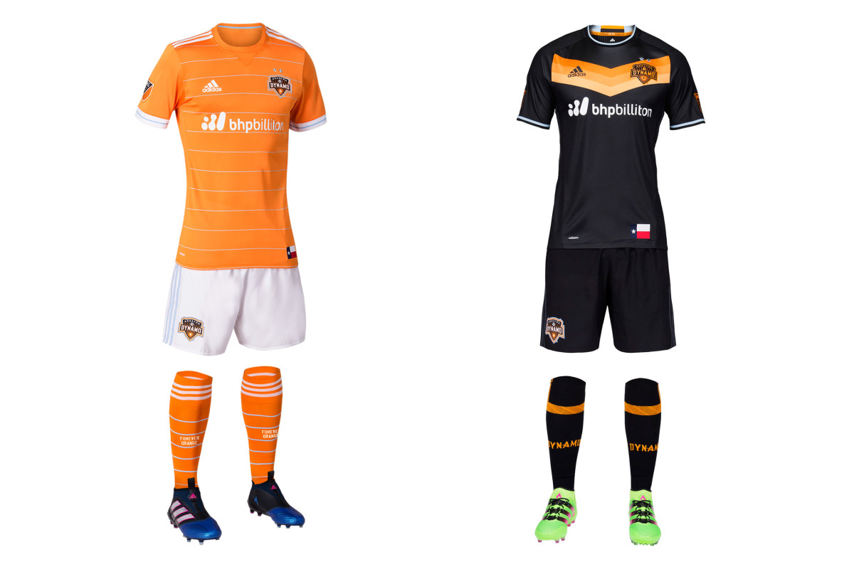
“Space City Blue” is back in the new Houston home uniform, which is the club’s sharpest since its 2006 inception. The Dynamo’s look has improved since it got rid of the asymmetrical plackets and piping that marred early kits. Now this primary set, with the crisp orange jersey and thin, horizontal stripes, is the best of the bunch. Orange is brash, but the jersey and white shorts are classy. The spectacular black secondary with the tequila sunrise chevron returns, giving Houston the best kit combo it’s had.
LA Galaxy
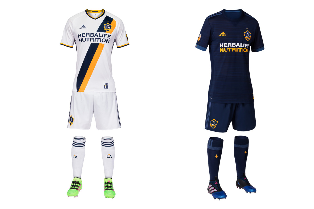
LA wore all blue in just two of its 37 MLS games last season. No MLS primary or secondary kit was used less frequently in 2016. So don’t get used to seeing the new away set pictured here. As usual, the secondary is a deep blue. This year’s adds some subtle shading to the jersey and replaces the yellow trim with a lighter blue. It’ll do the job on the rare occasion it’s called upon. Last year’s all-white homes return. They’re the best since LA’s Beckham-era makeover thanks to the blue-and-yellow sash.
Minnesota United
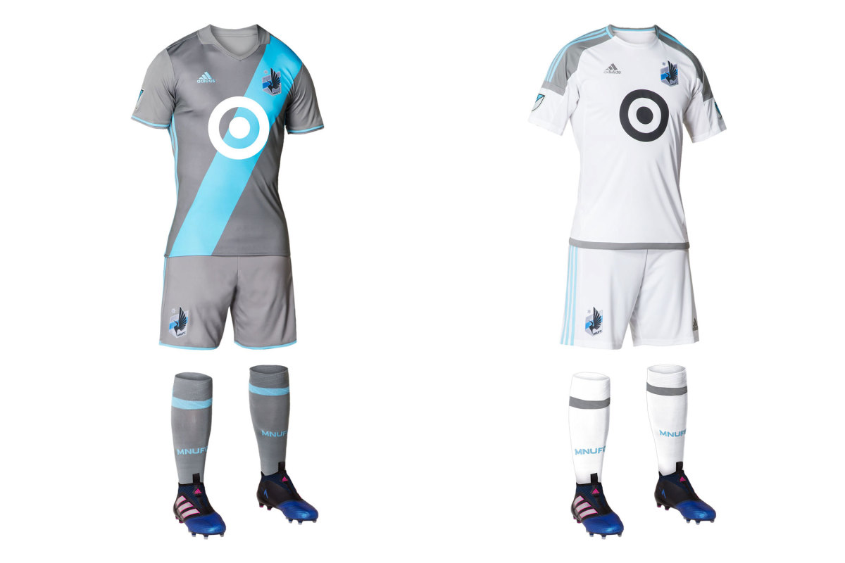
Its 2017 MLS entry was confirmed only six months ago, which didn’t give Adidas sufficient time to recreate the beloved Inaria uniform that MNU wore in the NASL. So gone is the dark gray kit and black loon’s wing and in their place, United will wear pale gray with a sky blue sash. It’s sharp, unique and will suffice, but many will hope for the wing’s return in 2018. The Target logo adds an interesting flourish and the crest probably is the best in American soccer. Minnesota’s secondary kit has changed from light blue to white. Fortunately, the primary usually should be available on the road since it won’t clash frequently.
Montreal Impact
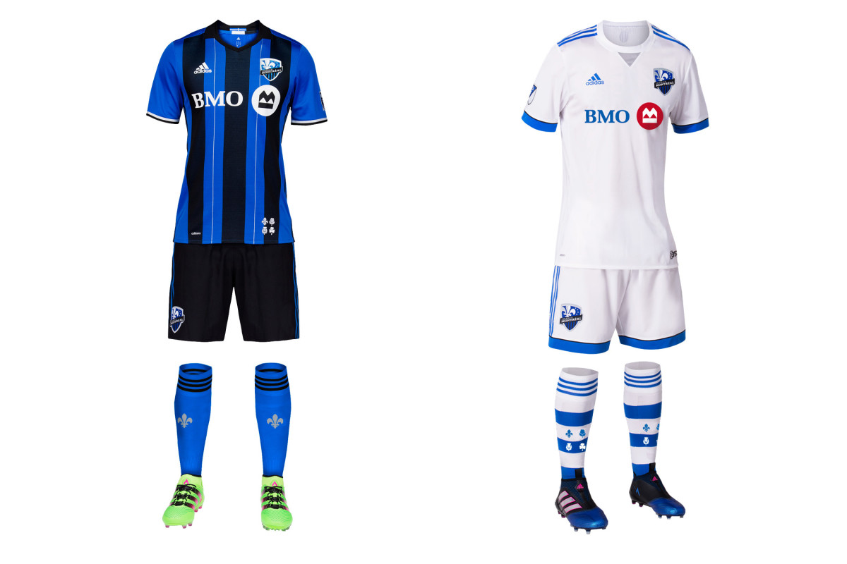
At least the socks are cool. Montreal continues to make next to no effort with its away kit, which once again is a plain, indistinguishable all-white—except for the socks. The hooped hosiery featuring the flowers from the city flag is fantastic. Perhaps in 2019, that inspiration will climb to the shirt and shorts. The Impact once wore a pink and black secondary. Why not bring that back? Meanwhile, the brilliant blue-and-black striped primary, which finally replaced the mono-blues last year, returns.
New England Revolution
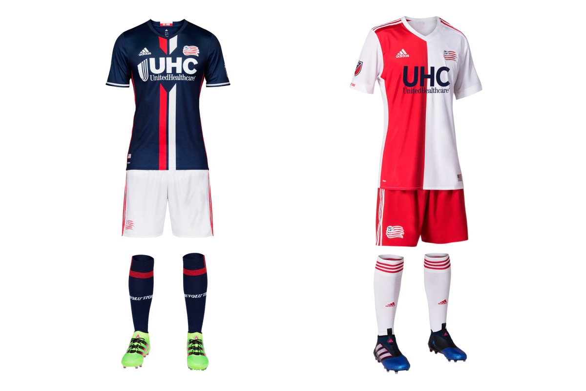
For years, the Revs were the league’s worst-dressed team—flat, predictable and anonymous. Now they may be the best. Last year’s navy-and-white home kit with the center stripes is perfect—U.S. Soccer, which still can’t figure out the national colors, should consider stealing it—and this year the club has improved upon its New England-flag inspired secondary. The jersey with the red-and-white halves is much sleeker than its boxy 2015-16 predecessor and it’s a unique and welcome addition to MLS. Both uniforms feature an ideal balance of colorful contrast and polish.
New York City FC
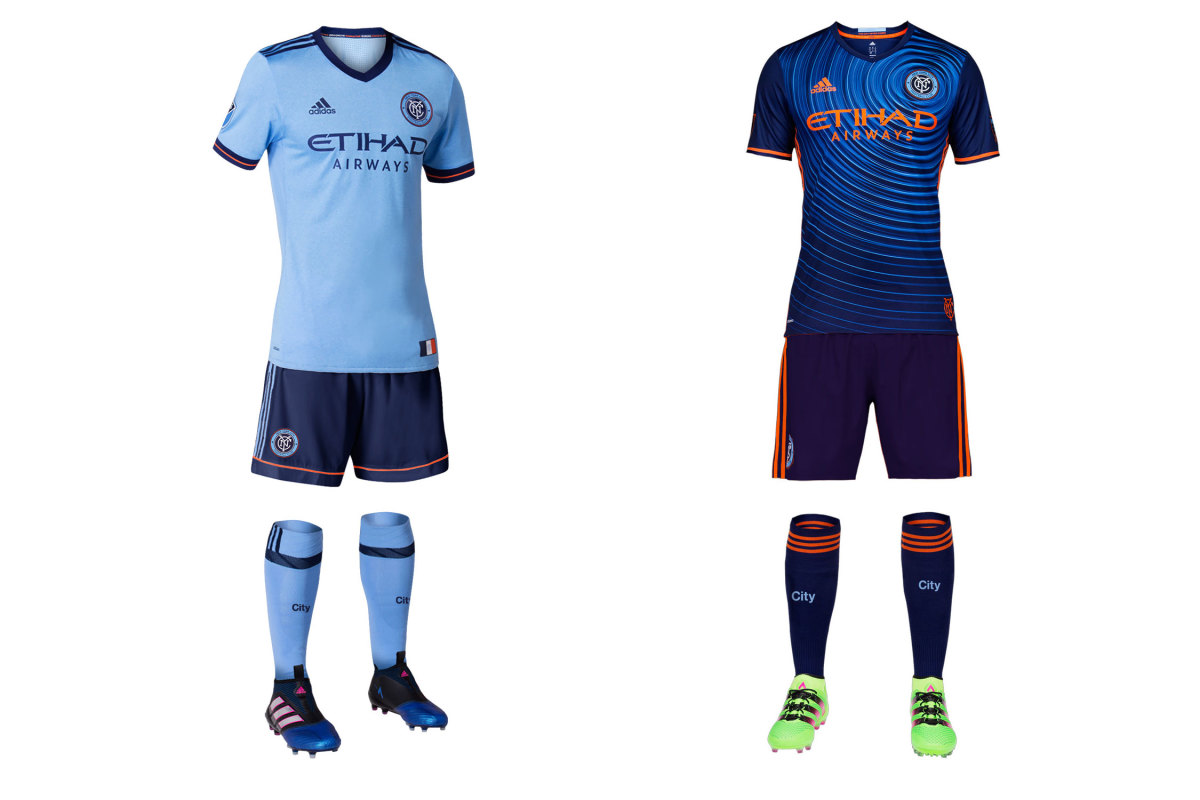
NYCFC is still trying to figure out what to wear. Sky blue is a given, and the new home shirt is an improvement thanks to classy navy and orange trim. But the dark blue shorts represent yet another tweak of a kit that started in 2015 with white shorts and socks, changed to light blue socks and then, toward the end of ’16, to all sky blue. Now they’ll look like Sporting Kansas City, which is wearing white shorts and should suggest a swap. The swirly secondary (the ripples represent "the energy of the five boroughs"), which NYCFC wore in just six MLS games last year, is back.
New York Red Bulls
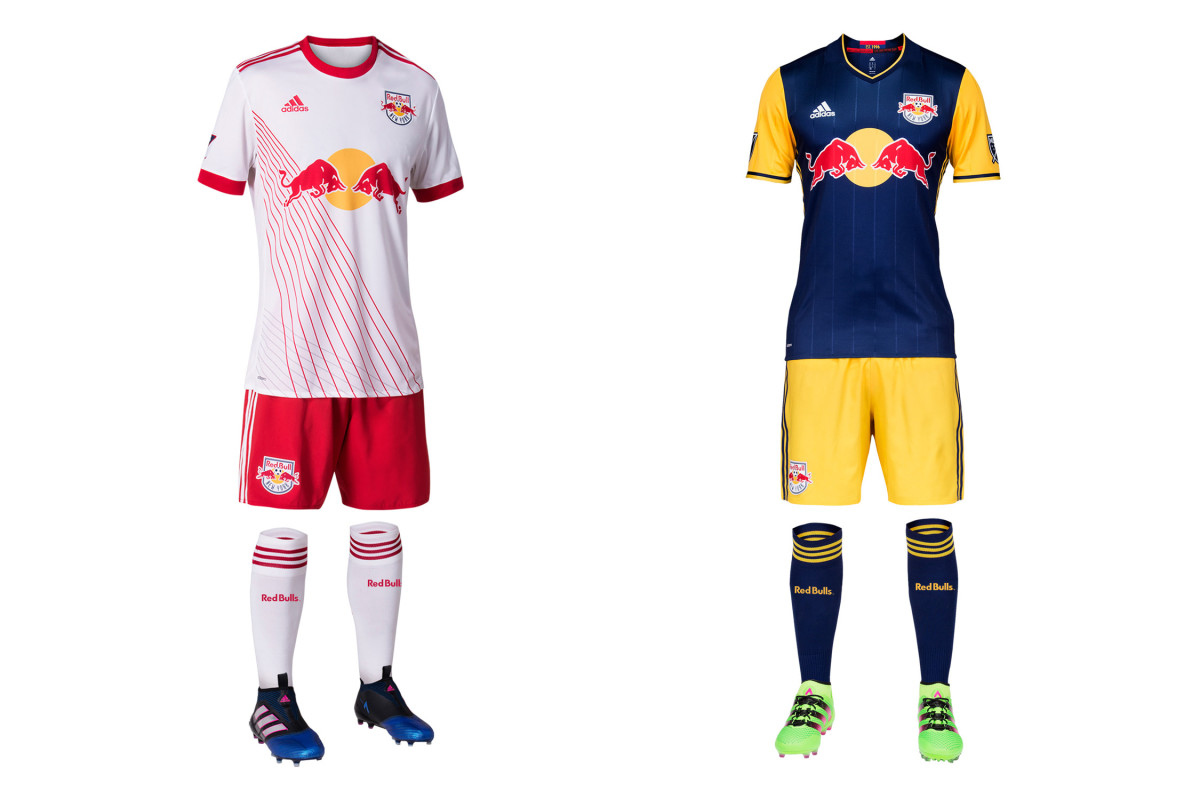
We know the production schedule makes it impossible, but it still seems the Red Bulls’ new home uniform was designed to reflect their chaotic offseason. The classic white jersey now features slashing, intersecting pinstripes in red and gray that officially symbolize an “agile, fast, attacking and relentless” style of play as well as the “layer upon layer of sky-scraping buildings and the tunnels, bridges and roads that connect everything together” in New York. It’s different. Some will like it, others won’t. The always interesting navy and yellow secondary, which NYRB wore just four times last year, returns.
Orlando City
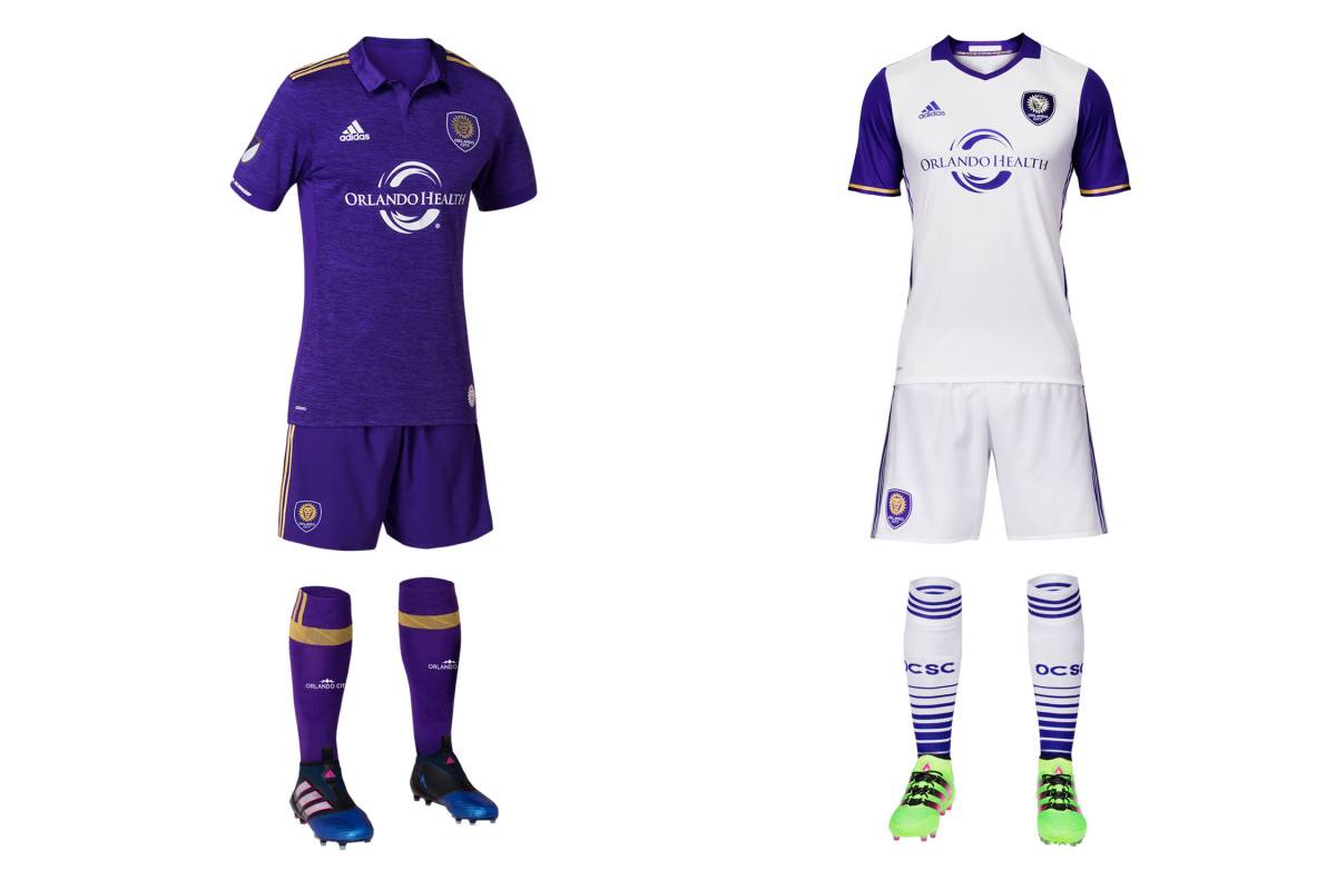
Orlando City’s new home uniform is plain purple, like it was in 2015-16. That’s no surprise. There are a few small tweaks. The good: the gold shoulder stripes and the textured pattern in the fabric. The bad: the huge collar. Who besides Eric Cantona wants to run around on a hot day with a big flapping collar? The white away kit carries over from last season. City’s to-do list remains the same. No MLS team wears primary shirts and shorts of one color and socks of another. Swap the socks, Orlando—white at home, purple on the road. It'll pop. Do it.
Philadelphia Union
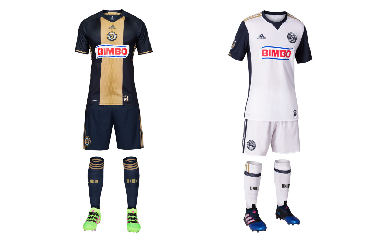
No other team is saddled with as wide a disparity in impact between its home and away uniforms. The Union primary already is a classic, and when well executed (it isn’t always) it features one of the best jerseys in MLS history. Last year’s nearly-perfect set returns. But the secondary again falls flat. This year’s is slightly better than the all-white 2015-16 kit thanks to the navy sleeves and side panel. It’s not ugly. But Philly has gorgeous colors and imagery to work with, and these aways just don’t bother trying. And removing the gold from the crest is branding malpractice.
Portland Timbers
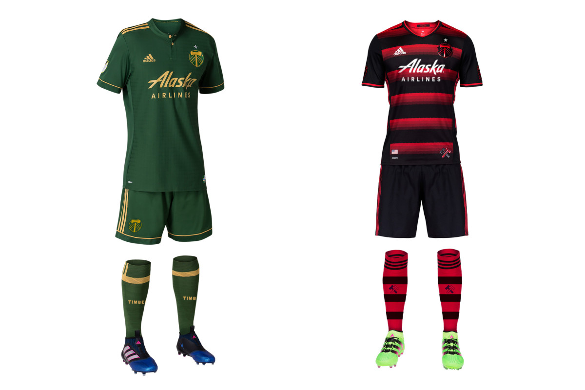
Even though the Timbers won a championship in the bright green jerseys with the brighter chevron, they never really became iconic. And so they’re gone, replaced by a stunning new home set featuring dark green, gold and a faint flannel pattern in the fabric. It’s nice, but represents another subtle identity change for a club that’s made several. The primary color is darker, the vivid yellowish-green is gone and the crest’s white axe is now gold. Perhaps this one will stick. The red-and-black secondary—the club’s best since its inaugural set—is back.
Real Salt Lake
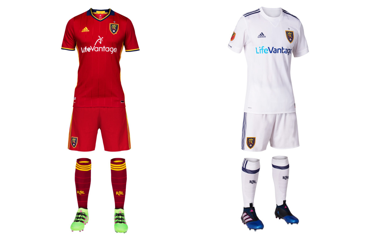
No team has a more frustrating approach to its kits and branding. RSL boasts a beautiful color palette and a home city/state with lots of available iconography. And they ignore it all. Last year, Adidas claimed the blue/cobalt shorts finally would return to the primary kit after six seasons. Fans wanted it. Red/blue/red was unique in MLS. RSL won a title in it. Instead, mono-claret remained in 2016—a year when five MLS clubs had an all-red uniform. And it appears the red shorts will remain this year. RSL’s new away kit looks like it took 30 seconds to “design” and we have nothing to say about it.
San Jose Earthquakes
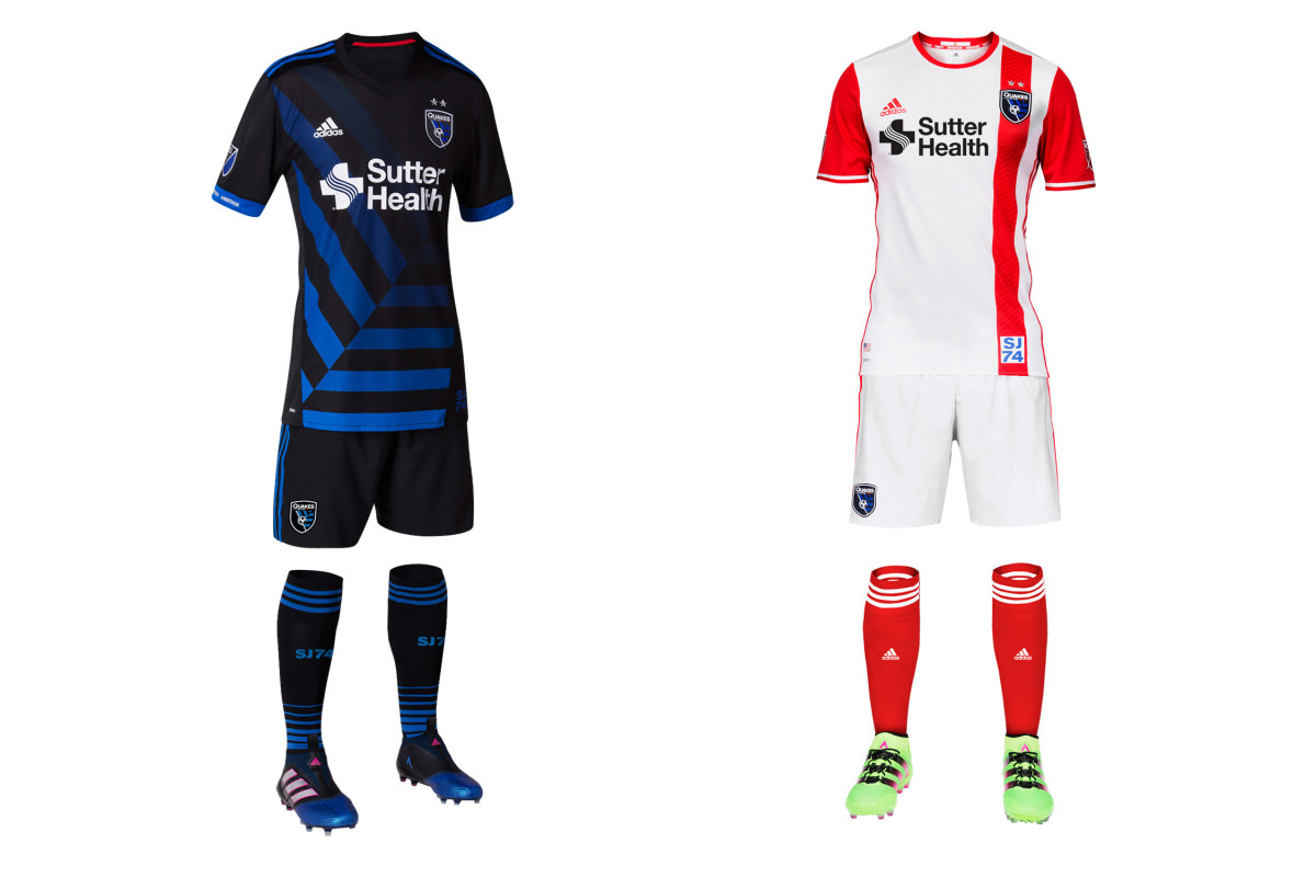
No team is taking a bigger chance this year than San Jose, which needs some spark after missing the playoffs in four straight seasons. The new home kit is a lot to take in. On its own, the black shirt with the “tectonic plate” motif taken from the crest is creative and pretty spectacular. The problem is in the team’s own brand guidelines issued during its 2014 overhaul: “As we move into the future, the club will primarily be a blue team.” San Jose won two titles and opened Avaya Stadium in its blue-black-blue home combo. All-black recalls Buck Shaw Stadium and D.C. United. It’s a great kit, but it’s too much of a departure.
Seattle Sounders
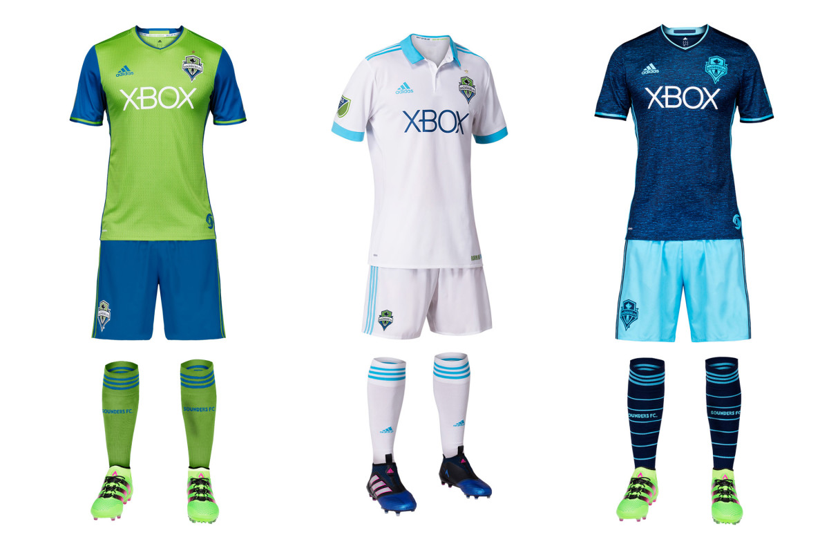
MLS has too many all-white uniforms. Seattle's new away kit brings the total to nine. Unless it’s a tradition fans and viewers recognize, mono-white only dilutes your brand and makes you look like everyone else. The Sounders, however, do have that tradition. In the NASL days, Seattle typically wore white at home, and in the early 1980s, they donned a jersey similar to the club’s new secondary, right down to the big bright blue collar and cuffs. The “Heritage” set “is designed with a lifestyle look in mind,” the club said. Between that and the new gold star on the returning homes and thirds, they’ll likely sell a lot of shirts in 2017.
Sporting Kansas City
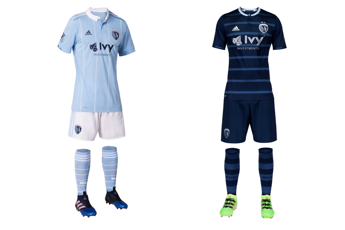
SKC is always in fashion. It’s gone with argyle and a windowpane check pattern in the past, and the new home jersey maintains that trend with faint pinstripes and a button-down collar. If staying stylish is SKC’s identity, so be it, but the white shorts are an unfortunate departure. Instead of the light “sporting” blue and indigo home kit of the past couple years, they’ll now look like NYCFC at a distance. One cool touch—the SKC motto, ‘No Other Club,' in captain Matt Besler’s handwriting on the cuff. The nice dark blue, hooped secondary kit returns.
Toronto FC
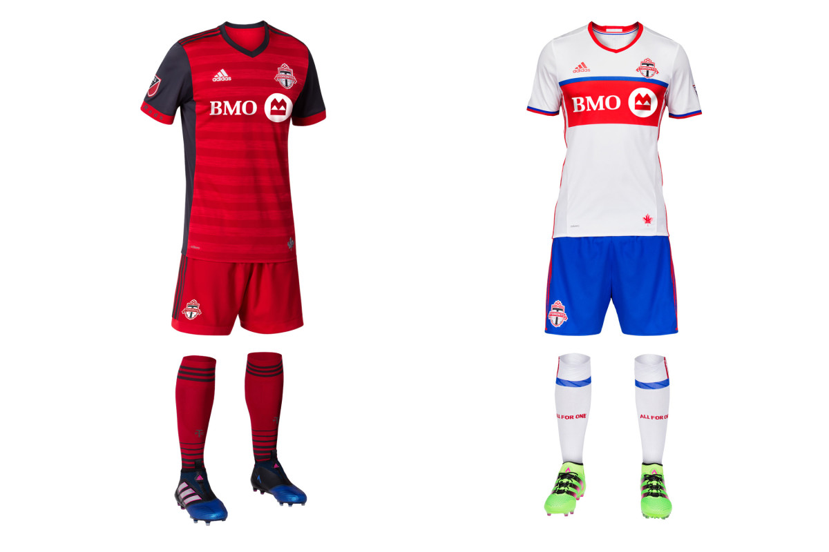
Dark gray has made a welcome return to TFC’s home uniform, which now stands out in a league full of red while still adhering to the club’s brand and history. The Eastern champs donned a jersey with gray sleeves as recently as 2012 and wore mono-gray on the road in 2014-15. The shading and red cuffs on the new primary offset the gray well. It’s a sharp kit, complete with a silver maple leaf at the waist. The white, royal blue and red secondary, which is a distinctive look in MLS, returns.
Vancouver Whitecaps
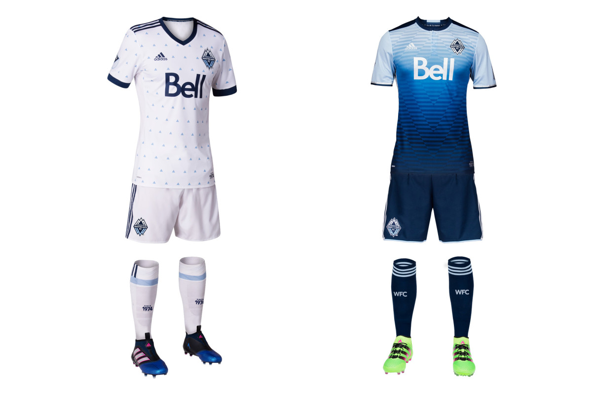
The Whitecaps hit a home run last year with an awesome away uniform that somehow reflected Vancouver’s natural beauty and the club logo all in one unique and memorable jersey. Unfortunately, the club now takes a step back with a new home set that has all the oomph of pajamas or wallpaper. Those little triangles are supposed to evoke rain, which the club said “represents our city” and “unites us.” It may, but the execution is poor. It’s too static and delicate. The 2013 home shirt with the diagonal pinstripes is as close as the Caps have come to ideal.
