It finally happened: D.C. United breaks ground on new, own stadium
WASHINGTON — Since Don Garber became MLS commissioner in 1999, he’s been inside a postgame locker room twice. One visit was at the 2010 World Cup in Pretoria, South Africa, where he joined Bill Clinton in the raucous celebration that followed Landon Donovan’s late game-winner against Algeria. The other was 11 years earlier during his first season on the job, when Garber ventured down to the RFK Stadium basement to look in on D.C. United, which was on the way to its third league title in four years.
“I can remember like it was yesterday, walking into the locker room in ’99. It was the first game that I had attended, and I really was a little stunned by the whole thing,” Garber said with a laugh on Monday afternoon.
He’d spent 16 years at the NFL. RFK wasn’t what Garber was used to. Even in 1999, the circular concrete stadium with the iconic wavy roof and space for local wildlife was far from state of the art.
“This team has needed a stadium,” Garber said. “This team could not have stayed here.”
D.C. United wouldn’t be what it is without the “D.C.” It’s a club that, before any other in MLS, captured what it meant to play in the heart of a city—the grit and the glamour, the noise, the cosmopolitan composition and championship profile. And that’s why on Monday afternoon, no one was worried about the man raising a machete over his head talking about change coming to the nation’s capital. It was no threat. It was the fulfillment of a promise.
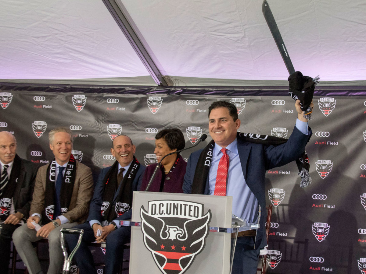
Garber and the machete man, United co-owner Jason Levien, along with Washington mayor Muriel Bowser, club lifer Ben Olsen and other dignitaries, dipped their ceremonial shovels into the ceremonial dirt here on Monday afternoon and celebrated a moment many thought might never come. For 21 years, as so many MLS rivals and newcomers built homes of their own, United has sought a stadium. Levien and his partner, majority owner Erick Thohir, arrived in the summer of 2012. They were the club’s fifth ownership group, and they were versed in their predecessors’ lack of progress and aware of the thicket of obstacles separating them from an arena in the capital.
“We see a pathway and we also know that we’re going to have use our machetes together and we’re ready to do so,” Levien said at his introductory news conference.
MLS expansion: An in-depth look at the many bids for the league's next four clubs
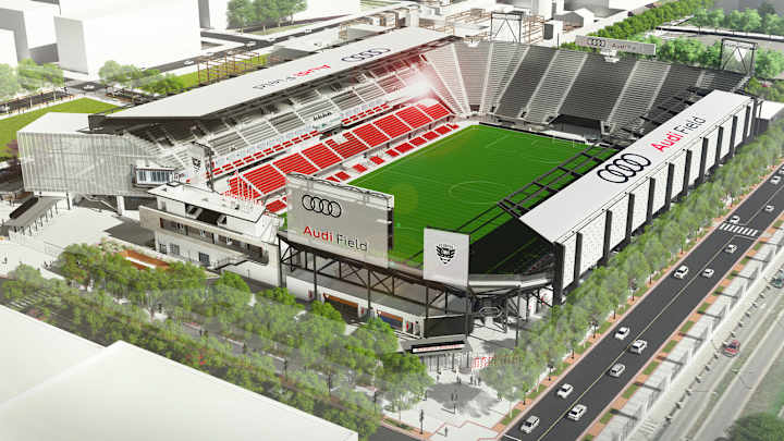
At his first game as managing general partner, fans brought Levien a machete. And he kept it in his office through more than four years of negotiations with city officials. Deals were made and revised, votes were taken, boards and committees had their say and prospects rose and fell. Finally on Feb. 16, there were no more hurdles. The city’s zoning board gave the green light, and the stadium, which will be called Audi Field, was a reality. It will be located on a piece of industrial property on Buzzard Point, just a few blocks southwest of Nationals Park. Where there were parking lots, an electrical substation, a cement company and unused, hardscrabble ground, there will be a 20,000-seat stadium with 31 suites, roofs covering the sideline stands and the promise of stability and revenue the money-losing team has never had.
The project is expected to cost around $300 million total. Bowser and her administration acquired and assembled the property. Thohir will fund construction. United hopes to be playing there by June 2018. Other plots on Buzzard Point have been set aside for additional mixed-use development that will accompany the stadium.
“It’s a day that couldn’t come soon enough for us,” Levien said, and referencing the site’s proximity to the D.C.’s federal core he added, “There’s no better time in our nation’s capital to build a cathedral, a mosque, a house of worship for the game of soccer.”
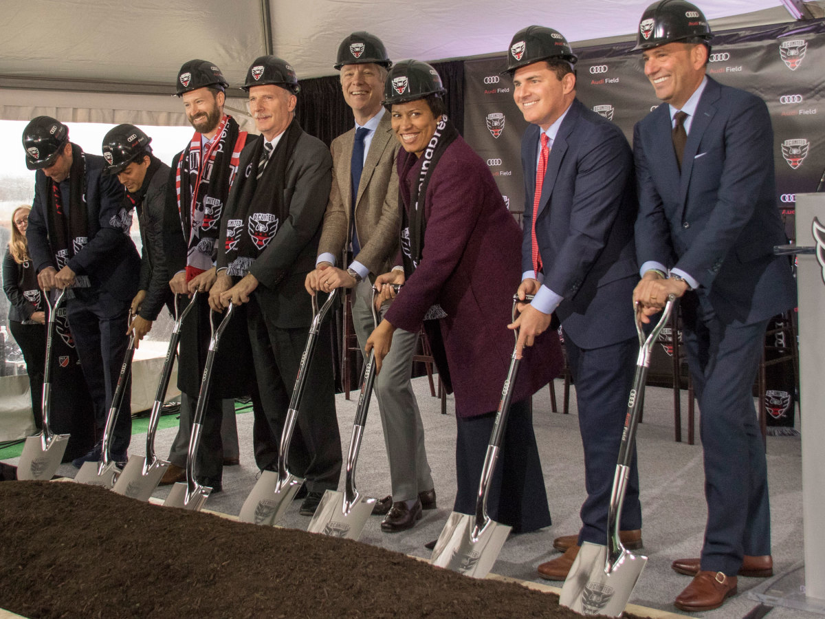
While he spoke, big orange excavators already were at work behind him.
It’s a cathedral that Levien, Garber and Olsen said that United players and fans have long deserved.
“This team always represented what we wanted professional soccer in America to be,” Garber said. “It was a very authentic brand. It was a winning club. It really was focused on its fans and really created the supporter movement, but never had a soccer stadium that it could call its own. To finally sit up there with the mayor and with Jason Levien and Benny and with our new sponsor to celebrate the new future of soccer in the district, it really warms my heart. It’s a pretty emotional moment.”
Up next, while construction ramps up, will be season of emotions at RFK. There’s a lot of love and nostalgia for the old edifice even though it outlived its usefulness a long time ago. United goalkeeper Bill Hamid, who grew up in nearby Annandale, Virginia, spoke eloquently about attending games as a kid and playing soccer with his friends on the concourse and ramps of RFK. The Redskins became an institution there. Baseball returned there. The U.S. national team has played at RFK more frequently than any other venue. World Cup matches were staged there. And now the championship banners that hang on the ragged green wall behind the south goal are the only ones remaining, and they're black and red.
“RFK has held very strong for us. We’ve created so many memories here. Those memories can never die. Those memories are in our trophy cabinet,” Hamid said. “We have to go out strong. We have to send it out the right way.”
Mix Diskerud hints at NYCFC exit in cryptic Instagram poem
Olsen didn’t want to get too caught up in looking ahead, even though the new stadium can’t possibly mean more to many others. He’s been with United since 1998 and took the coaching reins in 2010. He was there when D.C. was a dynasty and he was there as much of the rest of MLS passed it by. His focus is on the team he has now and Saturday night’s league opener against Sporting Kansas City. But the impact Audi Field will have in the long term wasn’t lost on him. An independent study conducted in 2014 concluded that United loses $7-$10 million per season playing at RFK.
“I do think this changes the tactics of building a team,” he said. “We never have trouble recruiting players. It’s still the nation’s capital. I don’t think people are saying, ‘No, I don’t want to come live in Washington D.C.’ But yeah, there’s obviously some financial issues that because of the situation we’re in, are what they are. Yeah, this will change things. And Jason has said so.”
2017 MLS uniform critique: Every team's jerseys for the new season
Atlanta United
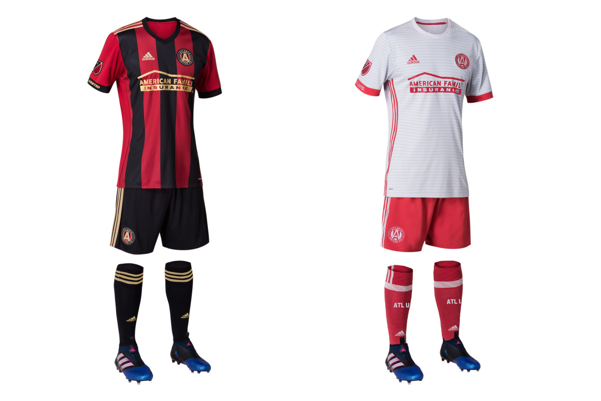
Atlanta becomes the second current MLS team to sport a striped primary (Montreal just launched theirs last year). The red, black and gold uniform is beautifully executed, immediately recognizable and will be Atlanta’s look to own. And that’s vital, since it shares a name with so many others. The away set features a light gray jersey with subtle hoops and red shorts and socks. It’s a solid, distinctive secondary kit and a winner apart from the recolored crest. Don’t recolor your crest.
Chicago Fire
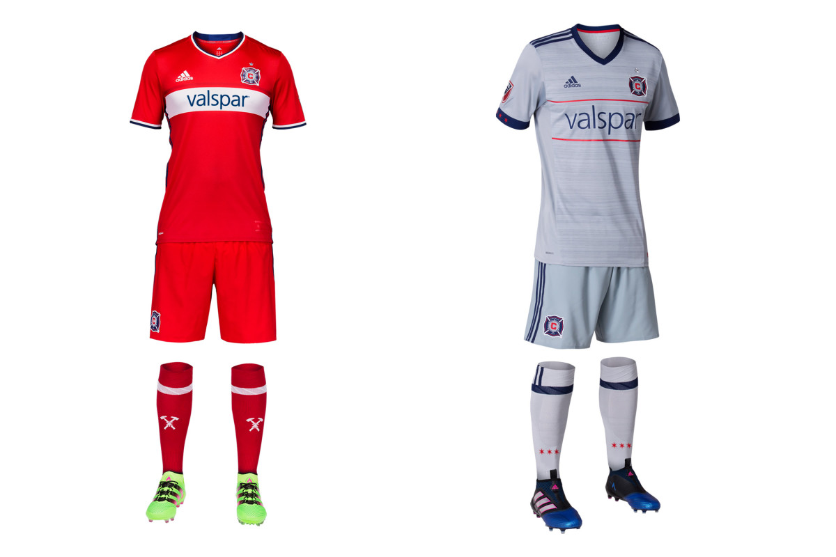
The all-red kit with the wide white hoop finally returned last year, and this season Chicago will complement its traditional primary with a secondary uniform that represents a welcome departure. The gray reflects the circle in Chicago’s beautiful badge and comes with a sublimated pattern that gives the shirt some texture. The narrow red hoops tie it perfectly to the home set, and the stars on the cuff and socks recall the city flag. The jersey should sell well, but we wish the kit came with navy shorts.
Colorado Rapids
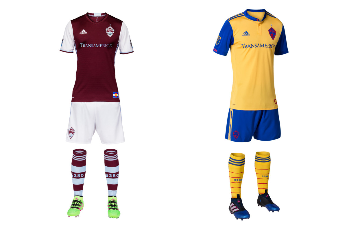
Few clubs manage to establish an iconic secondary kit, but the Rapids may have stumbled on to something in 2013 when they began using the colors of the Colorado flag. The initial all-blues gave way to an improved yellow and navy combo and then to this year’s new away set, which appears to brighten the shorts while adding yellow socks. It’s colorful, symbolic and distinct. And it would be perfect if not for the indistinguishable, camouflaged crest. Say it again: Don’t. Recolor. Your. Crest.
Columbus Crew SC
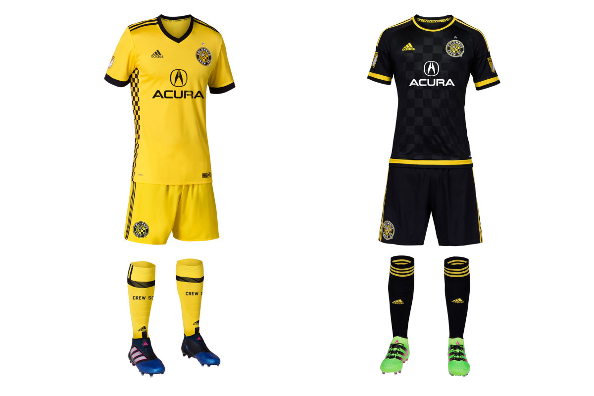
A year after making a massive branding mistake (and missing the playoffs), Columbus has made amends and then some. The Crew had worn yellow at home since 1999–the year they moved into the league's first soccer-specific stadium. They won an MLS Cup in yellow. Then last year, they switched to all-black primaries and wore a strange white, yellow and aqua secondary that nobody liked. Now yellow is back, and it's beautiful. The black checkers on the side reflect those in the crest. It's a novel and stunning touch. Last year's sharp black primary with bright yellow trim returns as the away set, where it belongs.
D.C. United
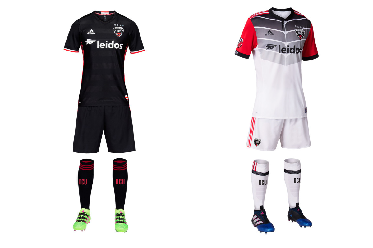
In its last season at RFK Stadium, D.C. United is going bold with a new away set that has a vague superhero, gladiator, ninja turtle sort of feel. Officially, the pattern represents an eagle’s wings. It's jarring and doesn’t really hit the mark. But a risky secondary is O.K., and in this case, DCU deserves credit for adding more black and red to the kit. Combined with the sublimated hoops on the holdover primaries, we’re excited by the suggestion (or even the gradual return) of the horizontal stripes that once adorned American soccer’s most iconic uniform. Someday….
FC Dallas
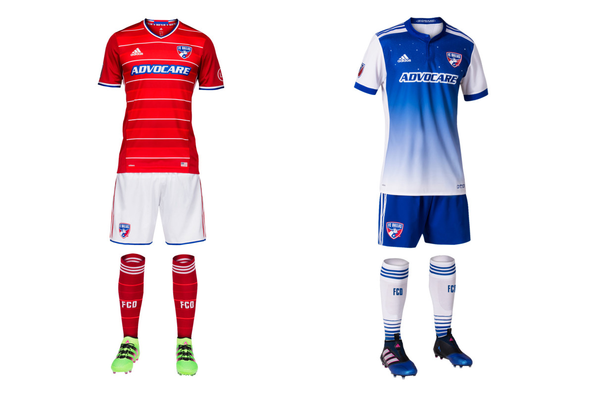
FCD fell short of its first MLS Cup last year, but it’s still adding stars to its jersey. The new away kit features 11 of them and rather than titles, they represent players on the pitch and the Texas sky—“The stars at night are big and bright, deep in the heart of Texas.” Dallas has been wearing blue and white hoops when necessary but they were never executed well. The new blue gradient is a nice change of pace. The real issue isn’t the stars, however—it’s whether FCD will continue to wreck the holdover primary kit (the best in club history) by wearing red shorts instead of white.
Houston Dynamo
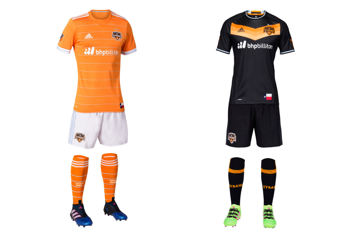
“Space City Blue” is back in the new Houston home uniform, which is the club’s sharpest since its 2006 inception. The Dynamo’s look has improved since it got rid of the asymmetrical plackets and piping that marred early kits. Now this primary set, with the crisp orange jersey and thin, horizontal stripes, is the best of the bunch. Orange is brash, but the jersey and white shorts are classy. The spectacular black secondary with the tequila sunrise chevron returns, giving Houston the best kit combo it’s had.
LA Galaxy
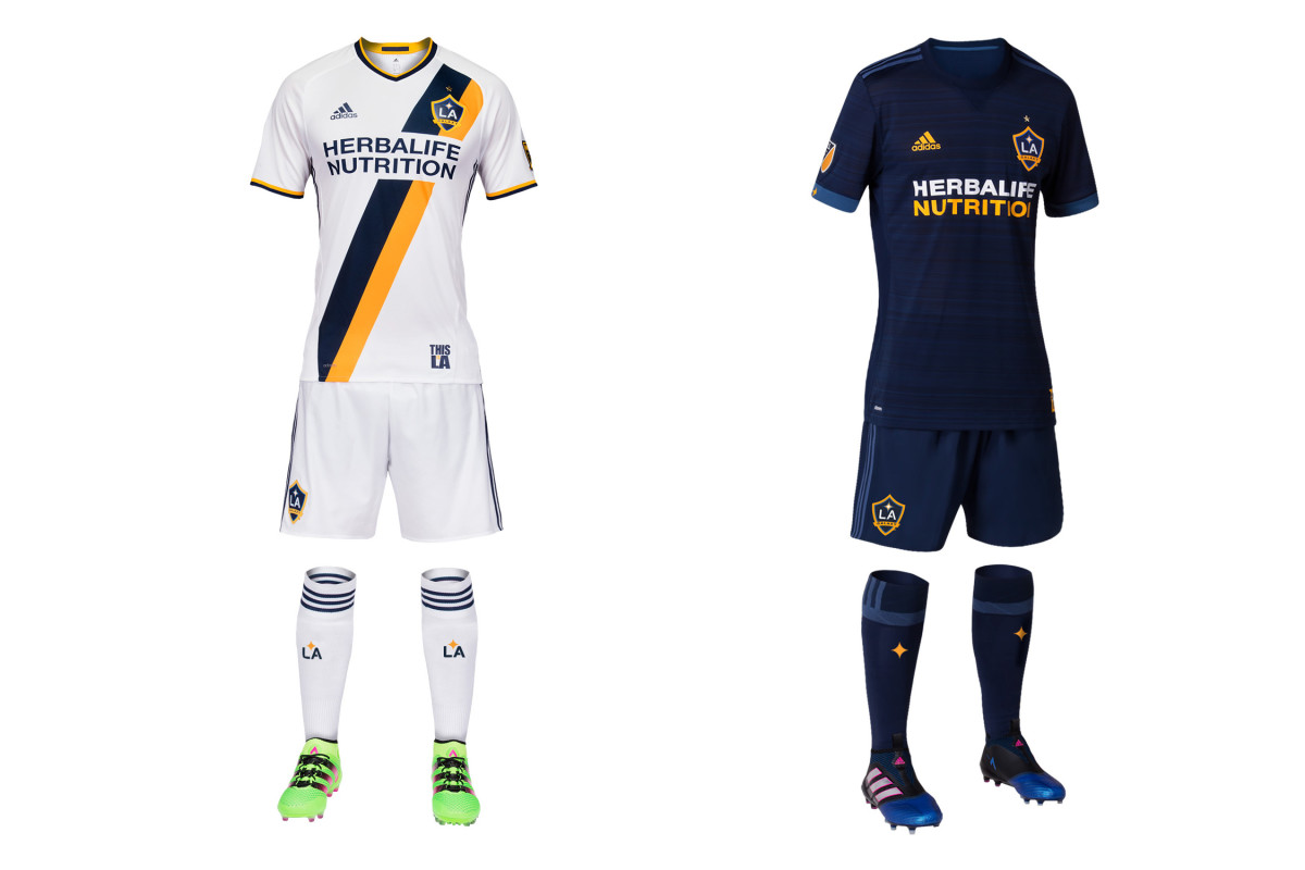
LA wore all blue in just two of its 37 MLS games last season. No MLS primary or secondary kit was used less frequently in 2016. So don’t get used to seeing the new away set pictured here. As usual, the secondary is a deep blue. This year’s adds some subtle shading to the jersey and replaces the yellow trim with a lighter blue. It’ll do the job on the rare occasion it’s called upon. Last year’s all-white homes return. They’re the best since LA’s Beckham-era makeover thanks to the blue-and-yellow sash.
Minnesota United
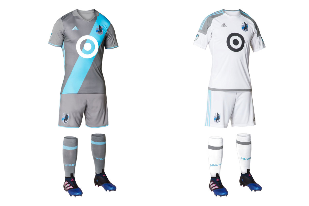
Its 2017 MLS entry was confirmed only six months ago, which didn’t give Adidas sufficient time to recreate the beloved Inaria uniform that MNU wore in the NASL. So gone is the dark gray kit and black loon’s wing and in their place, United will wear pale gray with a sky blue sash. It’s sharp, unique and will suffice, but many will hope for the wing’s return in 2018. The Target logo adds an interesting flourish and the crest probably is the best in American soccer. Minnesota’s secondary kit has changed from light blue to white. Fortunately, the primary usually should be available on the road since it won’t clash frequently.
Montreal Impact
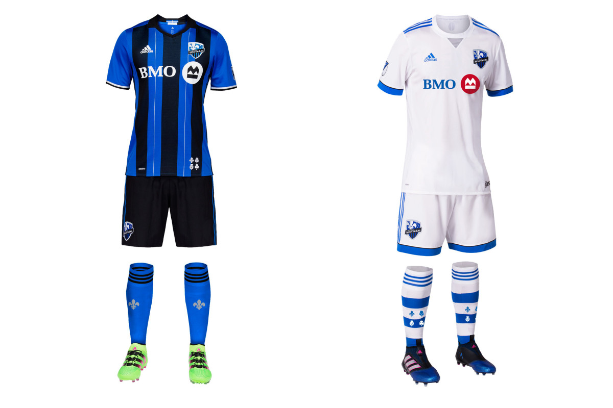
At least the socks are cool. Montreal continues to make next to no effort with its away kit, which once again is a plain, indistinguishable all-white—except for the socks. The hooped hosiery featuring the flowers from the city flag is fantastic. Perhaps in 2019, that inspiration will climb to the shirt and shorts. The Impact once wore a pink and black secondary. Why not bring that back? Meanwhile, the brilliant blue-and-black striped primary, which finally replaced the mono-blues last year, returns.
New England Revolution
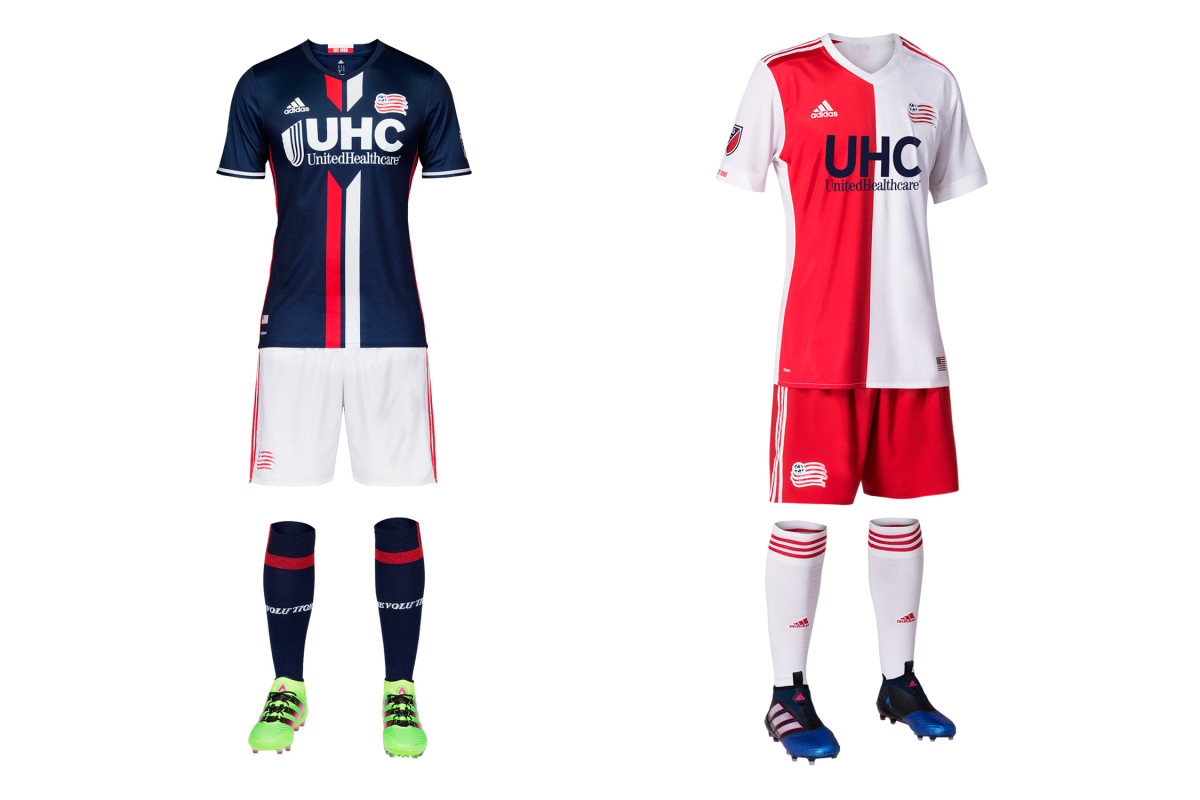
For years, the Revs were the league’s worst-dressed team—flat, predictable and anonymous. Now they may be the best. Last year’s navy-and-white home kit with the center stripes is perfect—U.S. Soccer, which still can’t figure out the national colors, should consider stealing it—and this year the club has improved upon its New England-flag inspired secondary. The jersey with the red-and-white halves is much sleeker than its boxy 2015-16 predecessor and it’s a unique and welcome addition to MLS. Both uniforms feature an ideal balance of colorful contrast and polish.
New York City FC
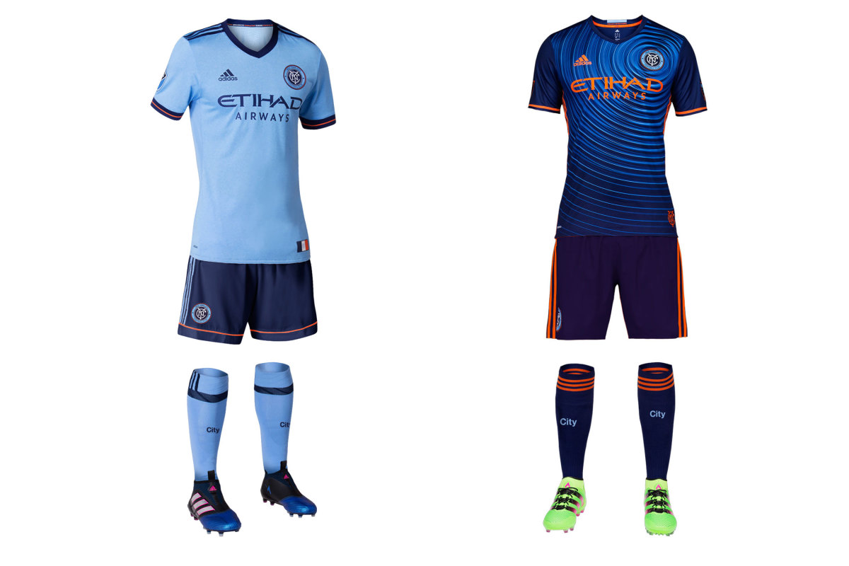
NYCFC is still trying to figure out what to wear. Sky blue is a given, and the new home shirt is an improvement thanks to classy navy and orange trim. But the dark blue shorts represent yet another tweak of a kit that started in 2015 with white shorts and socks, changed to light blue socks and then, toward the end of ’16, to all sky blue. Now they’ll look like Sporting Kansas City, which is wearing white shorts and should suggest a swap. The swirly secondary (the ripples represent "the energy of the five boroughs"), which NYCFC wore in just six MLS games last year, is back.
New York Red Bulls
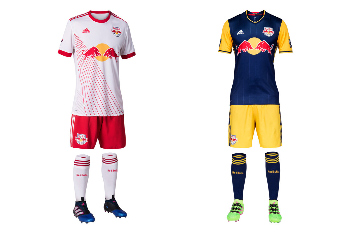
We know the production schedule makes it impossible, but it still seems the Red Bulls’ new home uniform was designed to reflect their chaotic offseason. The classic white jersey now features slashing, intersecting pinstripes in red and gray that officially symbolize an “agile, fast, attacking and relentless” style of play as well as the “layer upon layer of sky-scraping buildings and the tunnels, bridges and roads that connect everything together” in New York. It’s different. Some will like it, others won’t. The always interesting navy and yellow secondary, which NYRB wore just four times last year, returns.
Orlando City
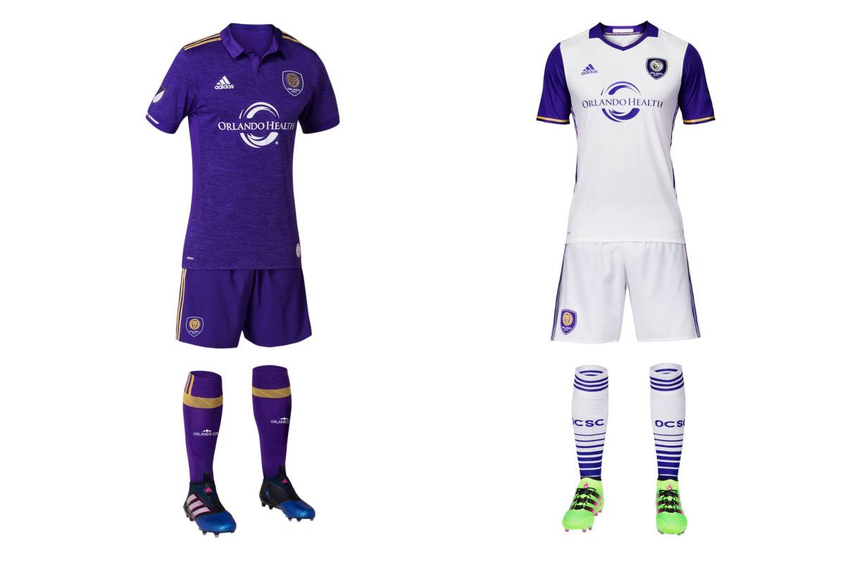
Orlando City’s new home uniform is plain purple, like it was in 2015-16. That’s no surprise. There are a few small tweaks. The good: the gold shoulder stripes and the textured pattern in the fabric. The bad: the huge collar. Who besides Eric Cantona wants to run around on a hot day with a big flapping collar? The white away kit carries over from last season. City’s to-do list remains the same. No MLS team wears primary shirts and shorts of one color and socks of another. Swap the socks, Orlando—white at home, purple on the road. It'll pop. Do it.
Philadelphia Union
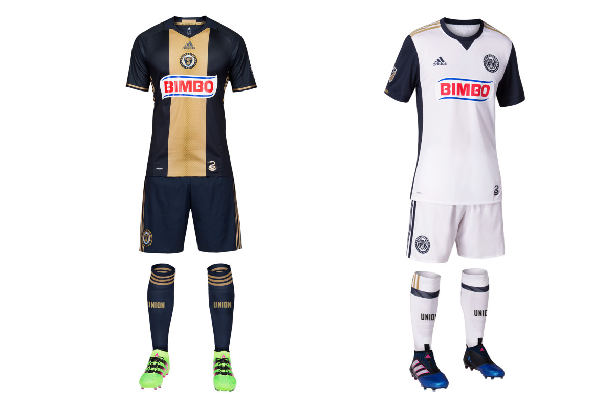
No other team is saddled with as wide a disparity in impact between its home and away uniforms. The Union primary already is a classic, and when well executed (it isn’t always) it features one of the best jerseys in MLS history. Last year’s nearly-perfect set returns. But the secondary again falls flat. This year’s is slightly better than the all-white 2015-16 kit thanks to the navy sleeves and side panel. It’s not ugly. But Philly has gorgeous colors and imagery to work with, and these aways just don’t bother trying. And removing the gold from the crest is branding malpractice.
Portland Timbers
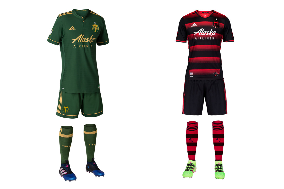
Even though the Timbers won a championship in the bright green jerseys with the brighter chevron, they never really became iconic. And so they’re gone, replaced by a stunning new home set featuring dark green, gold and a faint flannel pattern in the fabric. It’s nice, but represents another subtle identity change for a club that’s made several. The primary color is darker, the vivid yellowish-green is gone and the crest’s white axe is now gold. Perhaps this one will stick. The red-and-black secondary—the club’s best since its inaugural set—is back.
Real Salt Lake
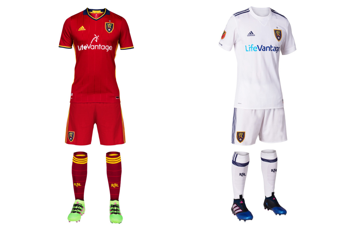
No team has a more frustrating approach to its kits and branding. RSL boasts a beautiful color palette and a home city/state with lots of available iconography. And they ignore it all. Last year, Adidas claimed the blue/cobalt shorts finally would return to the primary kit after six seasons. Fans wanted it. Red/blue/red was unique in MLS. RSL won a title in it. Instead, mono-claret remained in 2016—a year when five MLS clubs had an all-red uniform. And it appears the red shorts will remain this year. RSL’s new away kit looks like it took 30 seconds to “design” and we have nothing to say about it.
San Jose Earthquakes
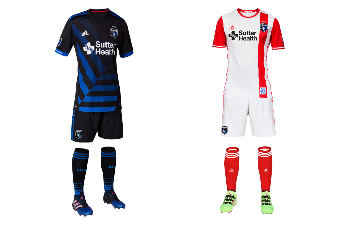
No team is taking a bigger chance this year than San Jose, which needs some spark after missing the playoffs in four straight seasons. The new home kit is a lot to take in. On its own, the black shirt with the “tectonic plate” motif taken from the crest is creative and pretty spectacular. The problem is in the team’s own brand guidelines issued during its 2014 overhaul: “As we move into the future, the club will primarily be a blue team.” San Jose won two titles and opened Avaya Stadium in its blue-black-blue home combo. All-black recalls Buck Shaw Stadium and D.C. United. It’s a great kit, but it’s too much of a departure.
Seattle Sounders
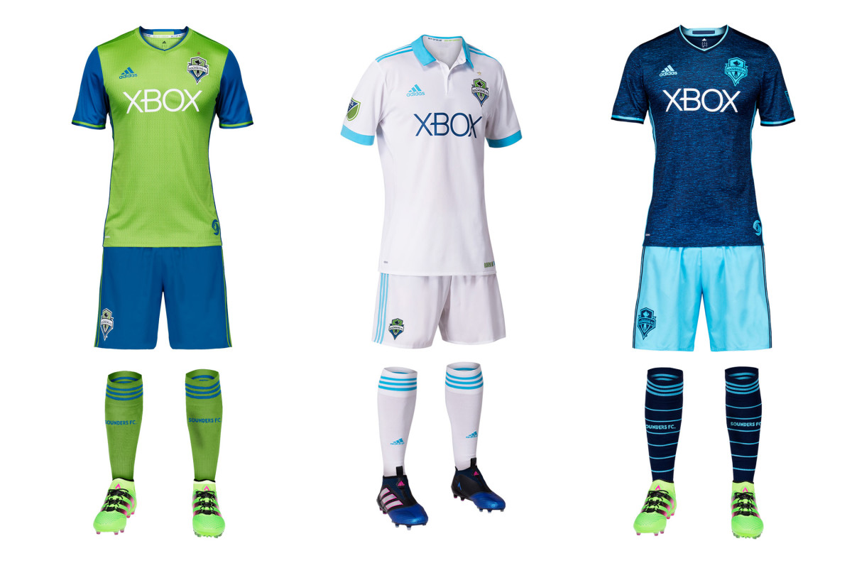
MLS has too many all-white uniforms. Seattle's new away kit brings the total to nine. Unless it’s a tradition fans and viewers recognize, mono-white only dilutes your brand and makes you look like everyone else. The Sounders, however, do have that tradition. In the NASL days, Seattle typically wore white at home, and in the early 1980s, they donned a jersey similar to the club’s new secondary, right down to the big bright blue collar and cuffs. The “Heritage” set “is designed with a lifestyle look in mind,” the club said. Between that and the new gold star on the returning homes and thirds, they’ll likely sell a lot of shirts in 2017.
Sporting Kansas City
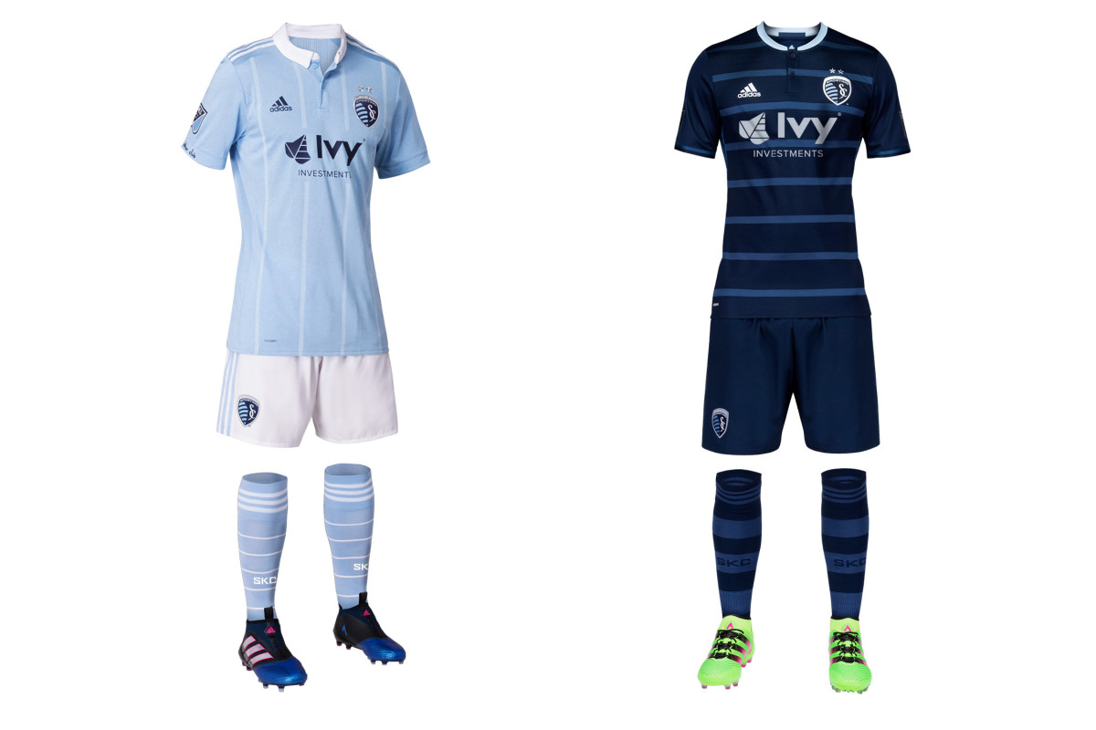
SKC is always in fashion. It’s gone with argyle and a windowpane check pattern in the past, and the new home jersey maintains that trend with faint pinstripes and a button-down collar. If staying stylish is SKC’s identity, so be it, but the white shorts are an unfortunate departure. Instead of the light “sporting” blue and indigo home kit of the past couple years, they’ll now look like NYCFC at a distance. One cool touch—the SKC motto, ‘No Other Club,' in captain Matt Besler’s handwriting on the cuff. The nice dark blue, hooped secondary kit returns.
Toronto FC
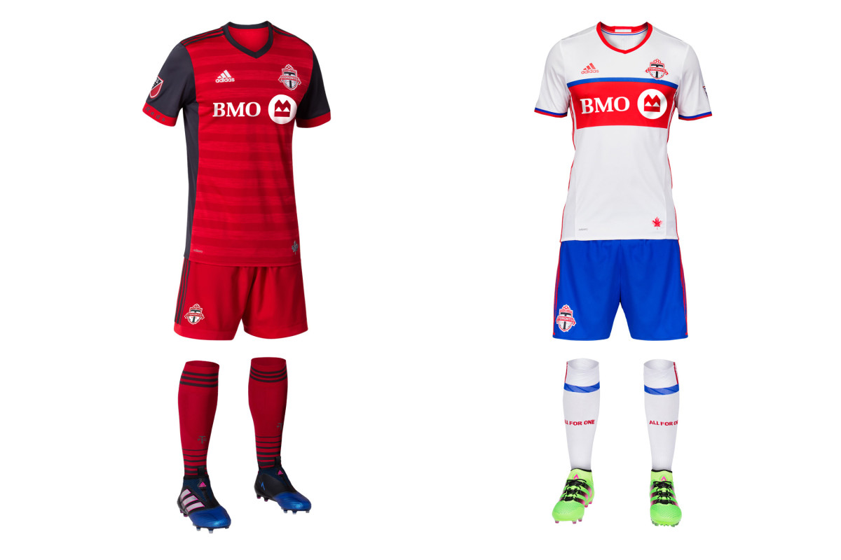
Dark gray has made a welcome return to TFC’s home uniform, which now stands out in a league full of red while still adhering to the club’s brand and history. The Eastern champs donned a jersey with gray sleeves as recently as 2012 and wore mono-gray on the road in 2014-15. The shading and red cuffs on the new primary offset the gray well. It’s a sharp kit, complete with a silver maple leaf at the waist. The white, royal blue and red secondary, which is a distinctive look in MLS, returns.
Vancouver Whitecaps
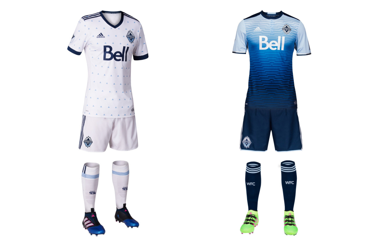
The Whitecaps hit a home run last year with an awesome away uniform that somehow reflected Vancouver’s natural beauty and the club logo all in one unique and memorable jersey. Unfortunately, the club now takes a step back with a new home set that has all the oomph of pajamas or wallpaper. Those little triangles are supposed to evoke rain, which the club said “represents our city” and “unites us.” It may, but the execution is poor. It’s too static and delicate. The 2013 home shirt with the diagonal pinstripes is as close as the Caps have come to ideal.
MLS hardly resembles the league it was in the late 1990s, and there’s no telling whether United will be able to repeat the glory years of Marco Etcheverry, Jaime Moreno, John Harkes and Eddie Pope. But come 2018, it’ll have a level playing field for the first time in a long time. It made little sense that the club that helped get MLS off the ground would never break some of its own—that it might not have a future in the city that offered energy and identity.
That’s why, Garber said, Monday will remain memorable.
“I have to say after all the groundbreakings and all what seemed at the time to be favorite moments, I think this one is probably the most special for me,” he said. “This is the one we wanted most, and we finally have it today. I think everyone who’s involved in our league and our sport has a soft spot for how hard it’s been.”
He paid homage to former United chief Kevin Payne and lauded Levien, who hacked away until he reached the promised land.
“So we have one more to do in New England,” Garber concluded. “I might hang up the cleats at that groundbreaking.”
