Sony’s remasters disregard strong and intentional art direction

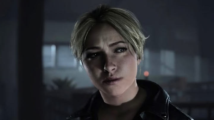
Sony’s remake of Until Dawn came out not long ago, and comparison screenshots are making the rounds in its wake. If you didn’t play the original game or see what it looked like before the remake, you might be forgiven for thinking the new version looks good. It doesn’t. It’s overly colorful, far too bright, and stripped of everything that made the original visually interesting.
Supermassive’s Until Dawn was a smash hit when it was released on PS4 in 2015. It was a little bit rough in certain places – some of the facial animations, for example, exist deep in the uncanny valley – but it had a strong concept and art direction to match. It was supposed to be a cheesy teen slasher flick, filled with suspense in its story and dark, bluish tones in its visual design. Set on the top of a snowy mountain, Until Dawn looked and felt appropriately cold, isolating, and terrifying.
Ballistic Moon’s remake has none of that. Gone are the cold, blue tones ripped straight from the medium it sought to mimic, instead replaced with bright, colorful lighting that Sony says is using “a broader cinematic tonal color palette” but feels more like an attempt at “realistic” lighting.
And sure, maybe it is realistic. Maybe the light in Until Dawn (2024) is reacting exactly as real light would, bouncing off hard surfaces in real time and illuminating scenes exactly like you’d see with your own two eyes. But that’s not what Until Dawn is, and it’s heartbreaking to see realism put ahead of art direction and tone. I don’t know if Ballistic Moon doesn’t know about Until Dawn’s cinematic origins, or just doesn’t care, but the end result is something that looks like every other game that strives for realism. Bland, uninspired, and unexciting.
This isn’t the only time Sony’s done this, either, although it is the first to make it to market. The recently revealed Horizon Zero Dawn Remastered aims to bring the game up to the visual standard introduced in Horizon Forbidden West, which admittedly was a very pretty game. Since its announcement, I’ve seen people fawning over the graphics, telling me that it looked “objectively better” or that the results were obvious.
“Look at the foliage!” they say. “The polygon count is much higher!”
And again, sure, maybe the polygon count is higher. But objectively better? Really? If you can look at the side-by-side footage and tell me with a straight face that the Remastered version looks better, then I truly don’t know what to tell you. I absolutely do not agree, and I think it looks worse in more ways than it looks better. Mostly just different, to be clear, but still worse.
The main issue is that the lighting is absolutely cooked. If you’ll allow a layman to speak for a moment here, I suspect that Nixxes, the developer in charge of the remastered version, has brought Zero Dawn into the updated version of Decima used for Forbidden West, and swapped out a few models in the process. The lighting methods and visual language used for Forbidden West have been slapped onto Zero Dawn, and alongside some minor tweaks here and there, the result is what we see here.
But Forbidden West is set in California and other sunny west-coast locales. Zero Dawn, on the other hand, is set in the Mountain states, a rocky, mountainous region with snow capped peaks and muted colors. I haven’t been to either place, but I know that both are very different visually, and trying to pretend otherwise is just silly. But that’s what Horizon Zero Dawn Remastered does — it takes the sunny, west-coast lighting and aesthetics from Forbidden West and applies them haphazardly to a game that it just doesn’t fit with.
There are other issues too, like character models that look horrendously out of place in a post-apocalyptic society, as if they’ve been run through a TikTok beautify filter. “They yassified the baby,” as I told my colleagues, and it’s deeply unsettling to say the least.
And after all of this, I have to wonder… why? Why make such drastic changes to games with such solid art direction? Every moment and every scene in both Until Dawn and Horizon Zero Dawn looks deliberate, intentionally crafted to perfectly capture a mood and a locale. In their updated versions, that intention is stripped bare, leaving little but mismatched, uninteresting visual experiences that barely feel like the same game.
If Sony is insistent on remaking and remastering its games, it needs to do more than just take the games we know and love and slap a “modern” coat of paint on top. It needs to understand why these games look the way they do, and preserve that look and feel for players both new and old. There’s no substitute for good art direction, no matter how many times your rays are bouncing, or how many polygons your leaves have.
