Ranking Every New WNBA Uniform
As the WNBA is set to begin its 25th season later this spring, its players will do so sporting new team uniforms. On Thursday, the league released three new jersey designs for each team, debuting the Heroine Edition, the Explorer Edition and the Rebel Edition.
In the wake of the latest jersey drop, Sports Illustrated ranked each new Explorer and Rebel uniform from worst to best.
Ranking Every 2021 WNBA Uniform
12. Minnesota Lynx
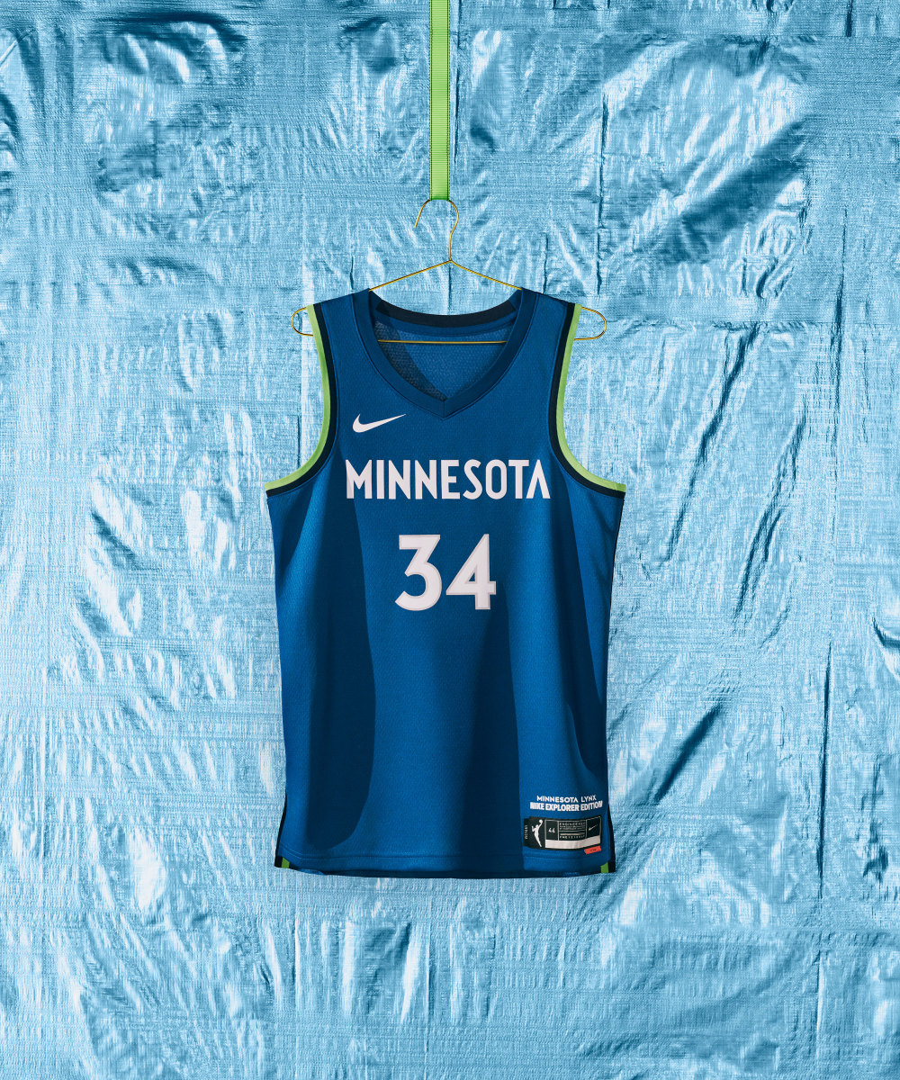
To be clear, there are no weak uniforms in this collection. But the Lynx’ Explorer Edition uniform reminds me too much of the T-Wolves’ versions (which I am not that much a fan of).
12. Minnesota Lynx (continued)
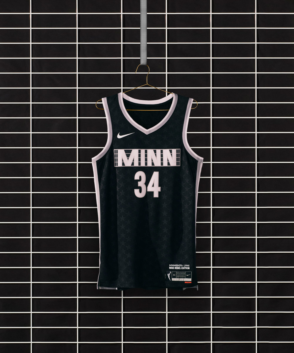
The Rebel Edition, according to Nike, is inspired by one of the longest-running, independently owned and operated music venues in the country, located near the Lynx’ home arena.
11. Dallas Wings
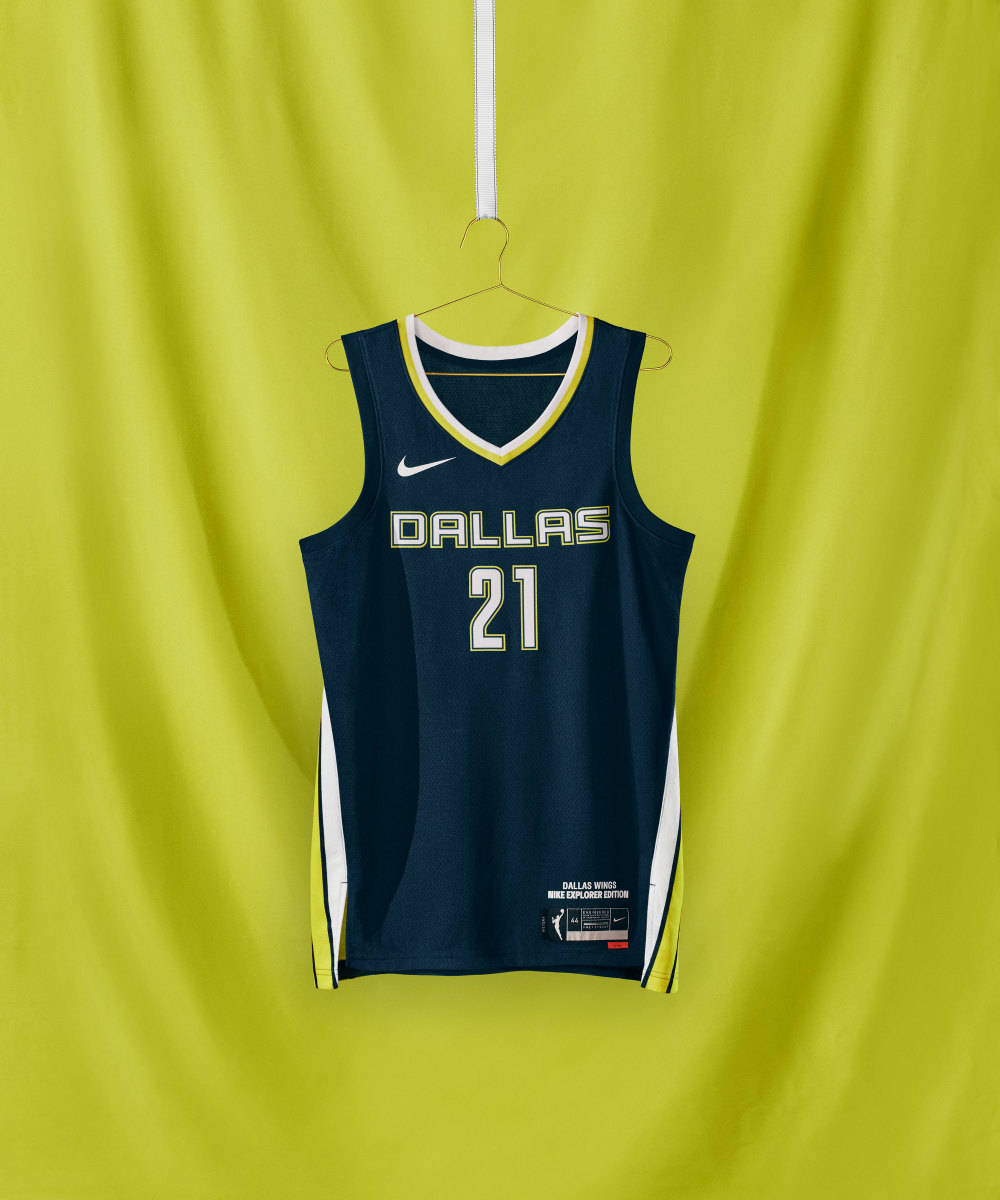
I wish the Wings' Explorer Edition uniform had something on the side: Maybe some wings? (Sorry.)
10. Connecticut Sun
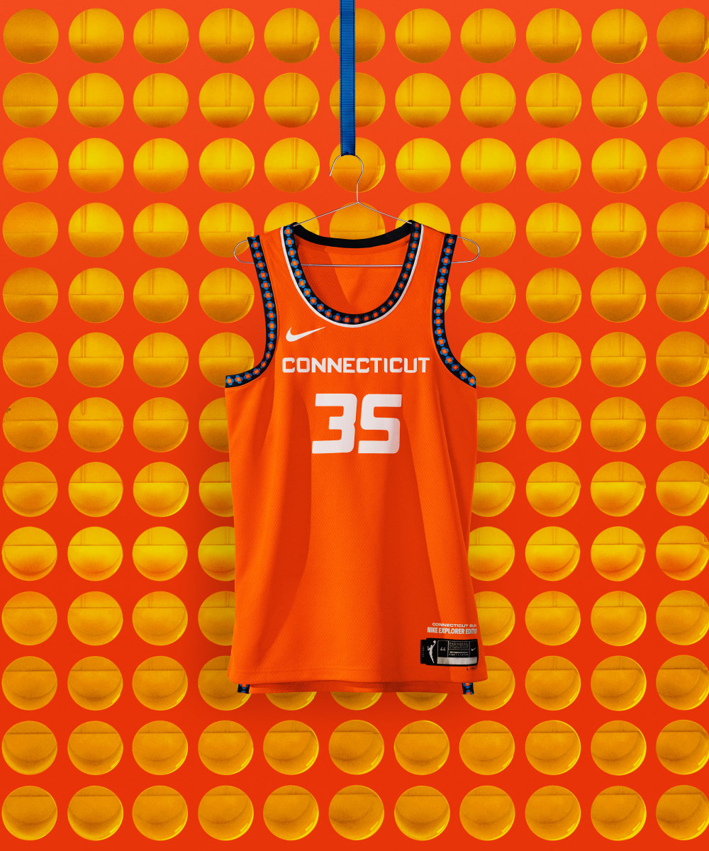
This is awesome! I love the reference to the traditions and history of the state’s indigenous people. The pattern has some amazing detail.
10. Connecticut Sun (continued)
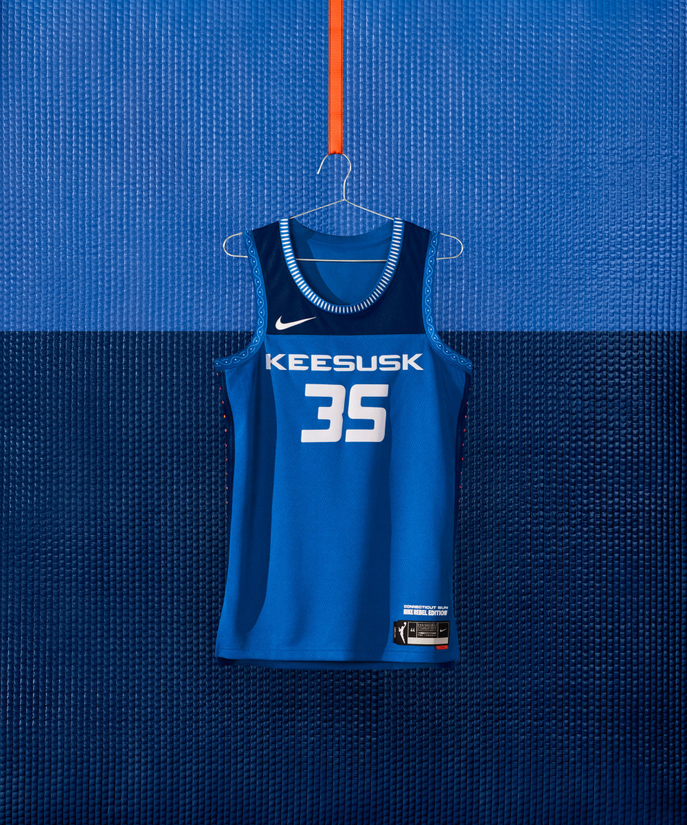
From Nike: The uniform’s graphic side-taping offers a reverent nod to the Trail of Life, connecting past and future generations. Featured front and center, “Keesusk” is the Mohegan word for “sun.”
9. Phoenix Mercury
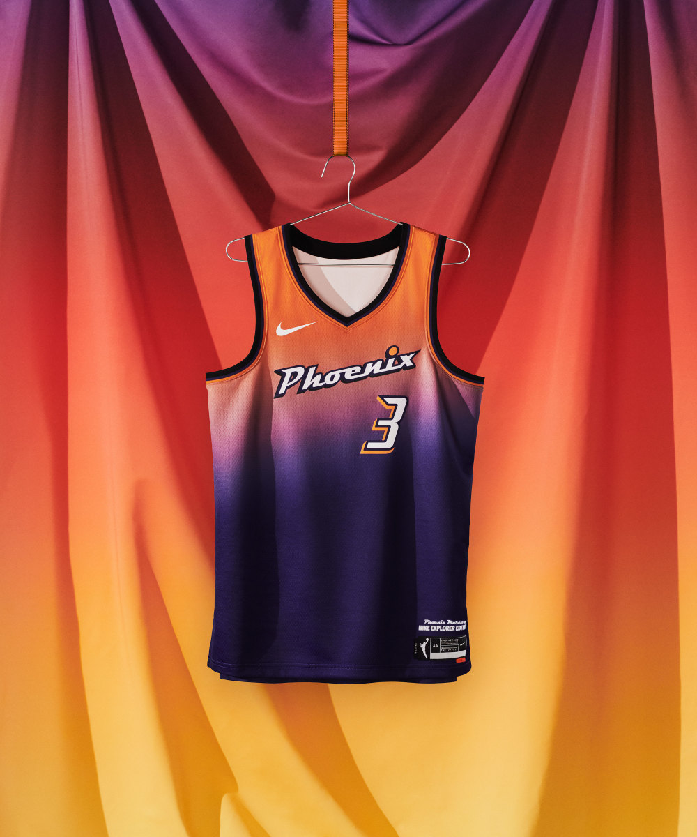
I like this a lot! I am just a bit scarred because of the Miami Heat's new City Edition uniform, which is very similar. But this is WAY better.
9. Phoenix Mercury (continued)
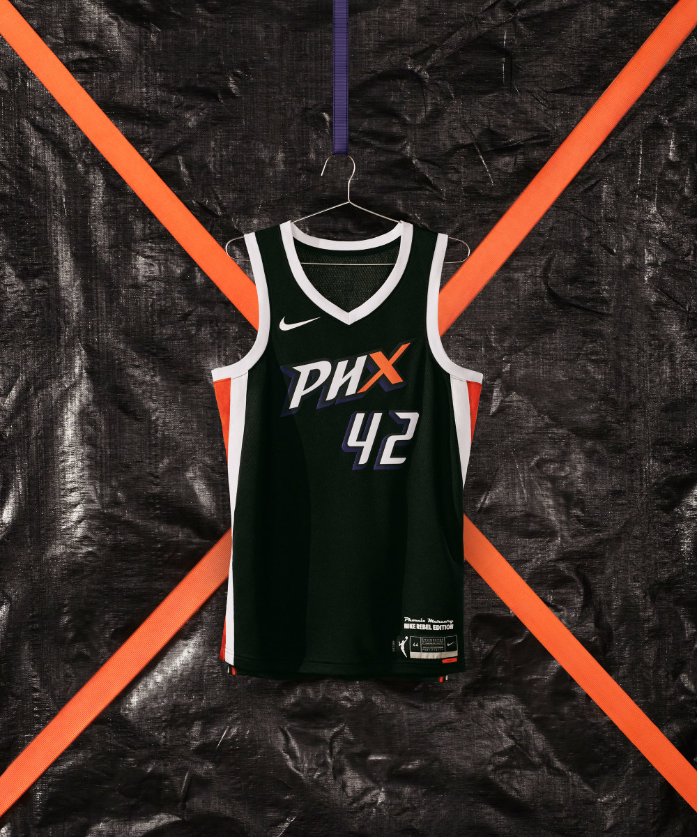
From Nike: Sharp lettering and white-hot details blaze across the uniform’s front and back in an homage to the "X-Factor"—the team’s passionate fan base.
This is not bad. I just wish there was another element. Maybe it should have had orange lining all around instead of the white.
8. Los Angeles Sparks
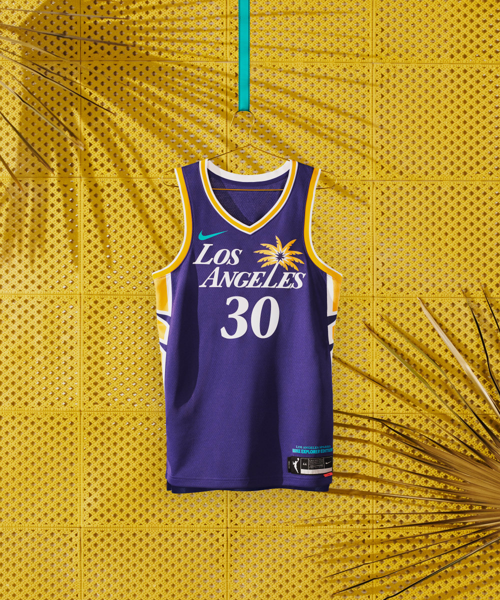
This is clean with the team’s updated palm-inspired logo.
8. Los Angeles Sparks (continued)
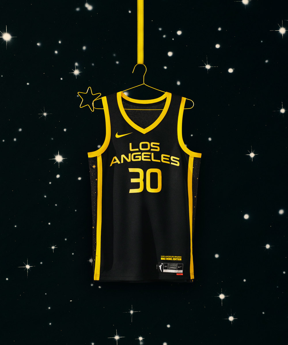
From Nike: A black field bordered by yellow stripes and dozens of shining stars embodies the boundless brightness of the City of Angels.
I wish the sparks on the side of the uniform were splattered a bit on the front.
7. Seattle Storm
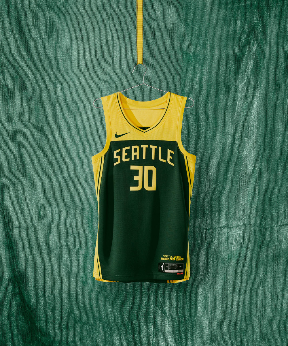
I love the aesthetic. Mixes a bit of new and old.
7. Seattle Storm (continued)
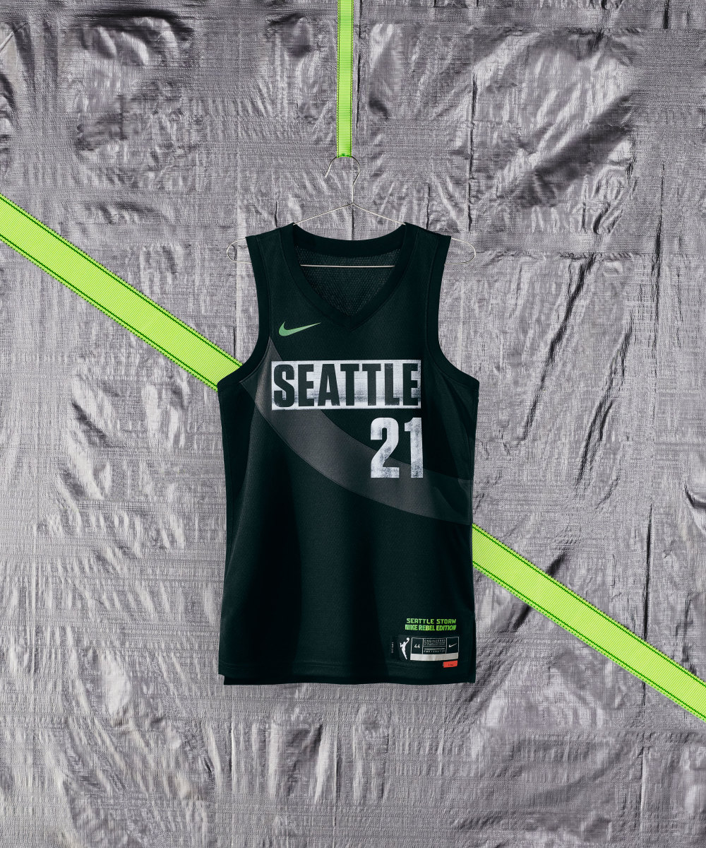
From Nike: In celebration of the city’s lineage of political engagement, the Storm’s uniform centers a sash-like swoop across the chest and back symbolizing female empowerment coupled with bold, graphic type in well-worn relief.
I couldn't help but think how awesome the sneakers worn by Sue Bird, Jewell Loyd, and Ty Young would look with this jersey.
6. Washington Mystics
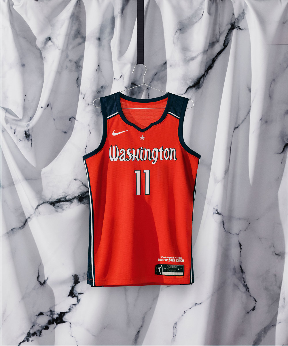
The Mystics did not change much, but that is perfectly fine in terms of overall design.
6. Washington Mystics (continued)
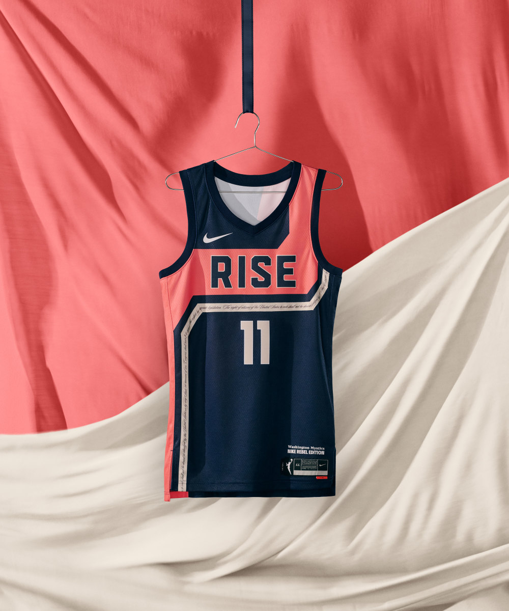
From Nike: The uniform includes the words and script of the Nineteenth Amendment—giving women the right to vote—in the gold wrapping around and running down the jersey and short.
This Rebel Edition uniform is remarkable. My only knock is that it doesn't pair well with the Explorer edition uniform like other teams—which is a small thing because they are not going to wear them at the same time, obviously.
5. Atlanta Dream
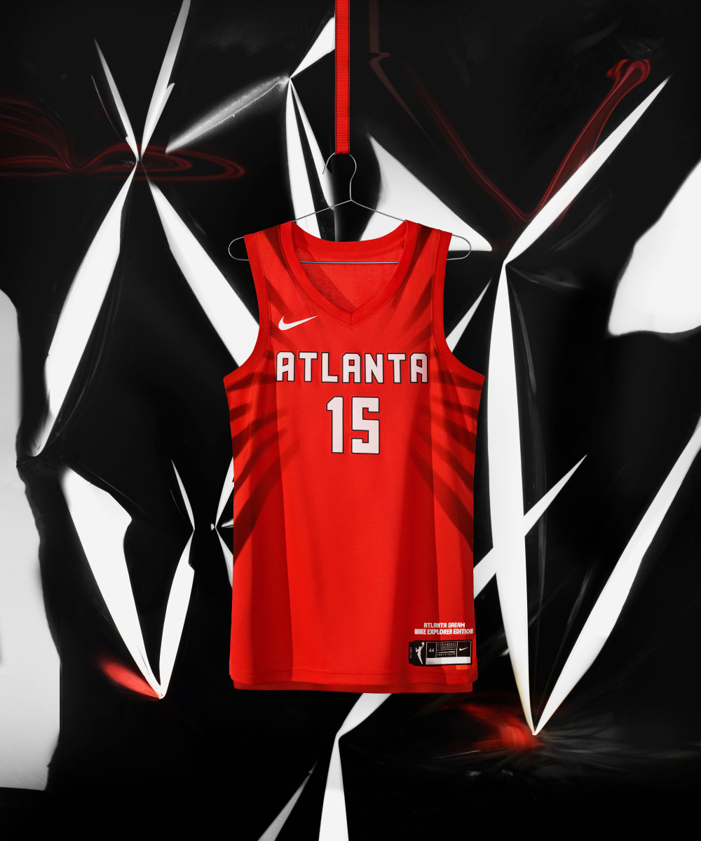
I love this. Drawn from inspiration from the signs made during civil rights marches.
5. Atlanta Dream (continued)
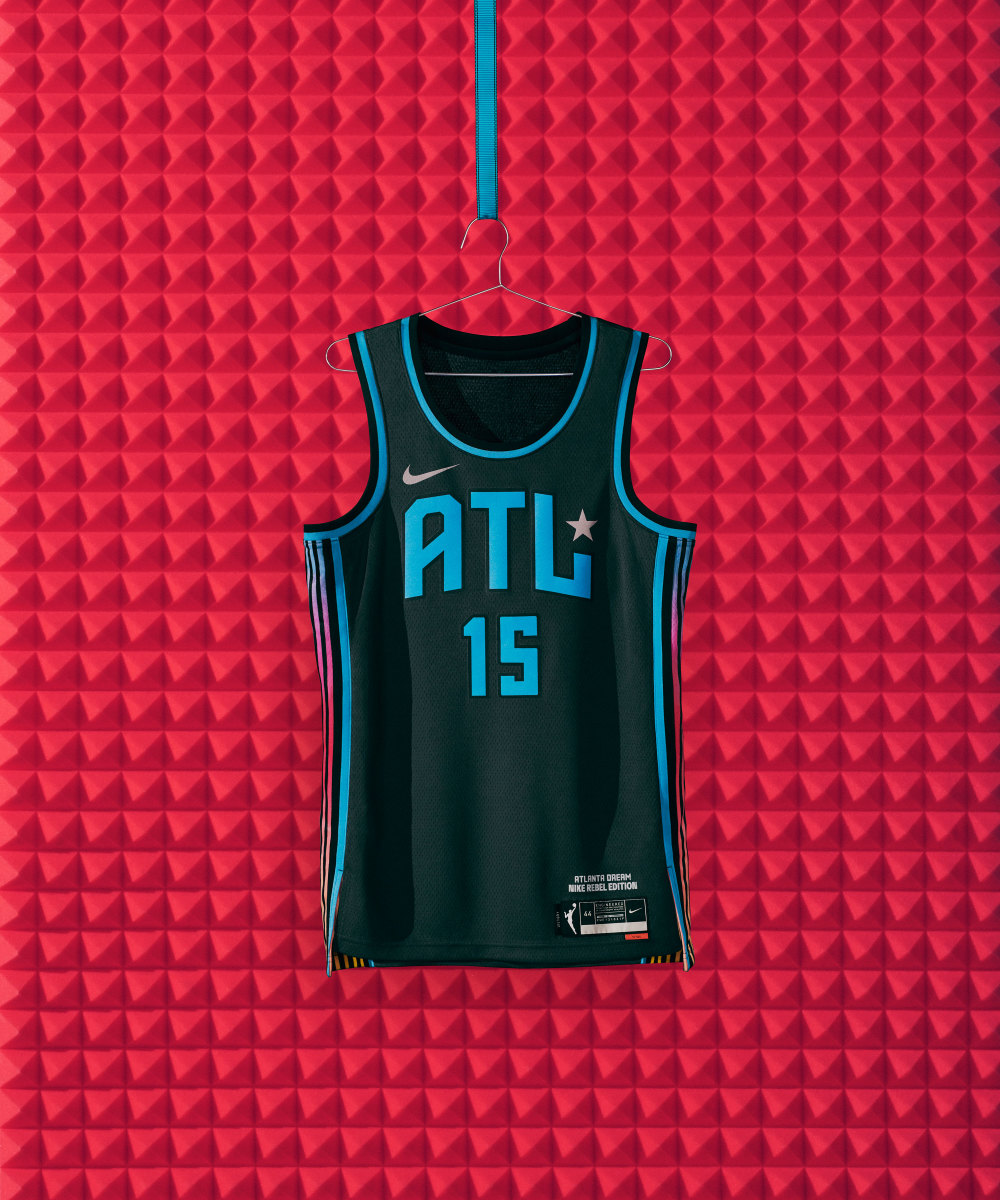
From Nike: The subtle hints of silver in the uniform—such as the silver star and logo detailing—are symbolic of the platinum and gold records produced in the city.
Another jersey I think would pair well with the right pair of sneakers.
4. Indiana Fever
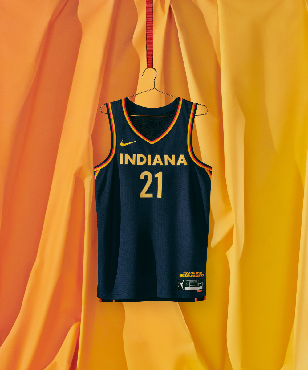
Simple and clean. But it's the next one that will have people talking.
4. Indiana Fever (continued)
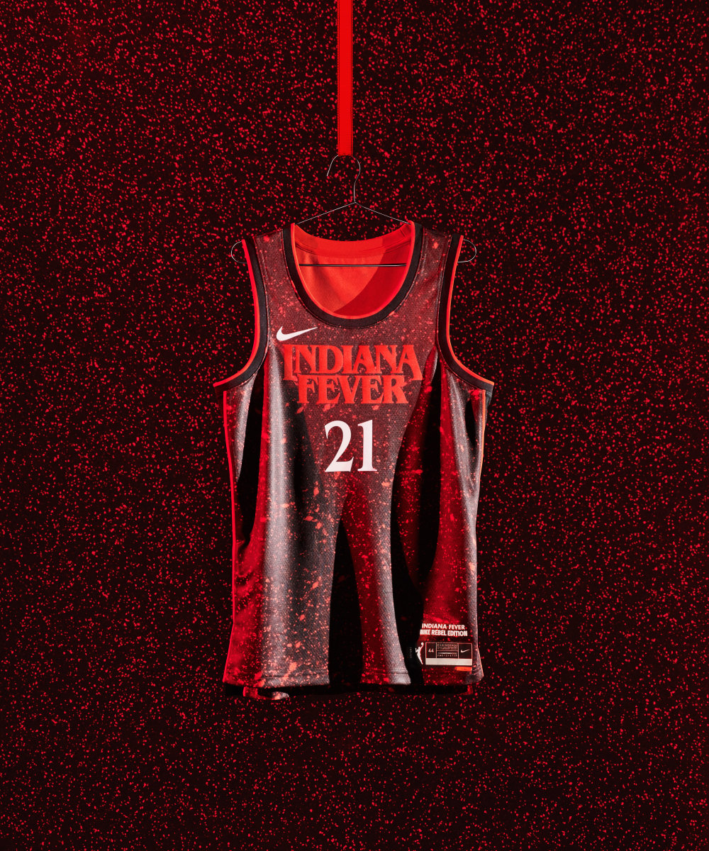
From Nike: The uniform’s color, jersey wordmark and number font are drawn from the hit series that takes place in the fictional town of Hawkins, Indiana.
Have to give credit for the Fever for being creative and drawing from pop culture. The Stranger Things theme is going to be a fan favorite throughout the season.
3. New York Liberty
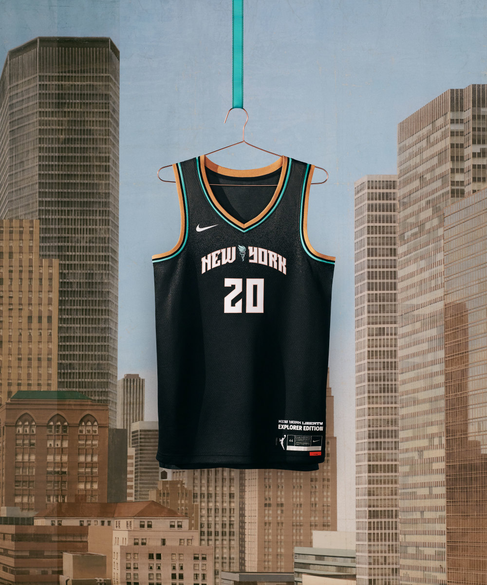
This is simple but so clean at the same time. The gold lining takes it to another level.
3. New York Liberty (continued)
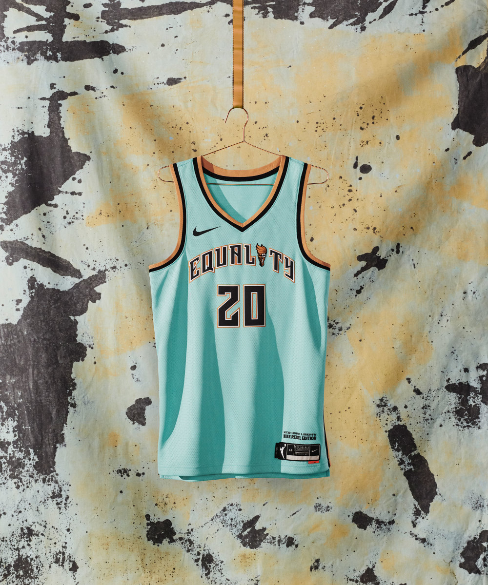
From Nike: Inspired by the striking colors of the city’s iconic monument and all that it represents, the uniform features "Equality" across the chest, framed by copper and black taping.
2. Las Vegas Aces
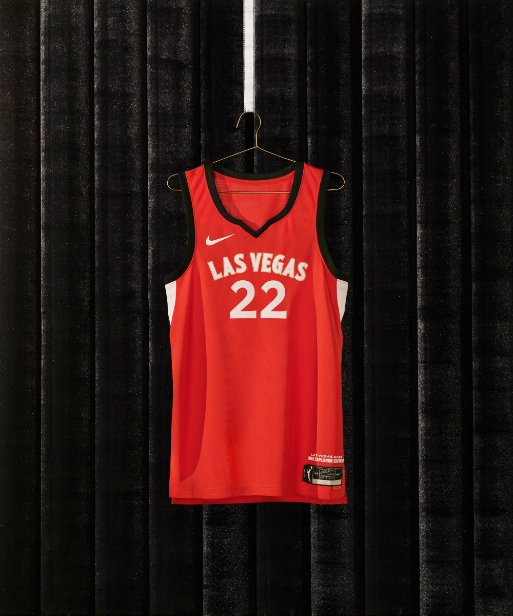
I always loved the Aces' aesthetic. This uniform looks very luxurious but gives off a retro feel.
2. Las Vegas Aces (continued)
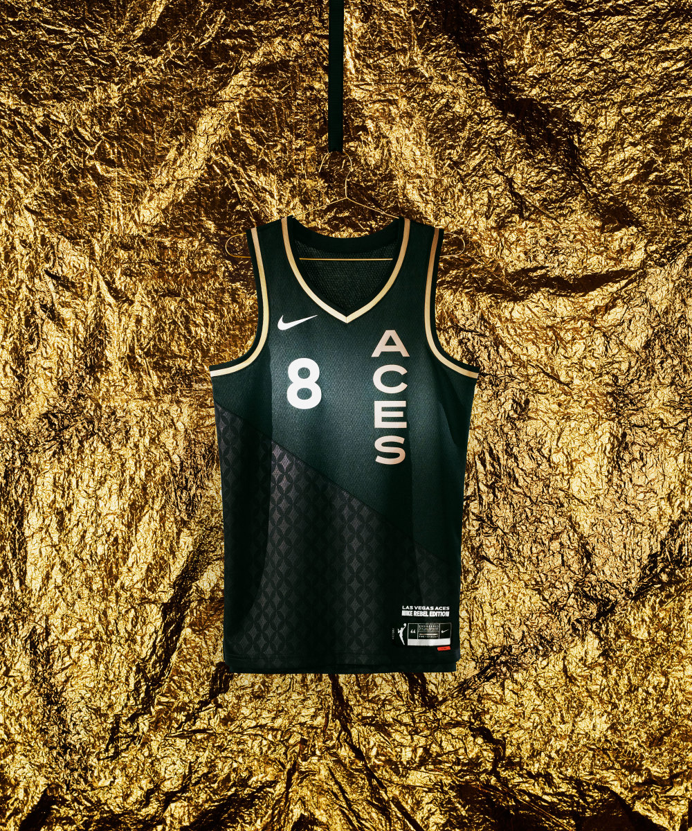
From Nike: Inspired by the Ace card and in reference to those who have mastered their craft, the uniform conveys excellence and quality.
I need this jersey in my collection!!!!! This is beautiful.
1. Chicago Sky
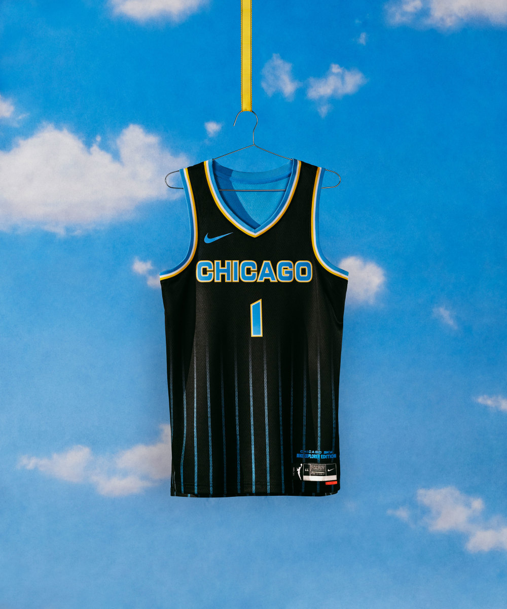
This might be the best jersey in basketball. The 10x10 pinstripe grid represents Chicago’s city blocks and the five-on-five for the number of players on the court.
1. Chicago Sky (continued)
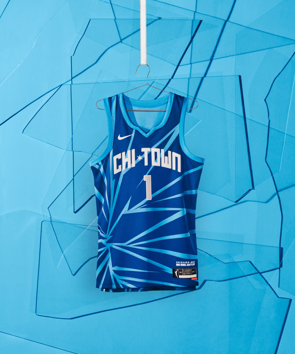
From Nike: With shattered lines and a cool hue, the uniform is a reminder to all that nothing can stop a team born from the heart of the Windy City.
I'm not that big of a fan compared with the pinstripe uniform, but they get extra credit for creativity.
