Miami Heat Receive Hilarious Logo Redesign On Social Media

In this story:
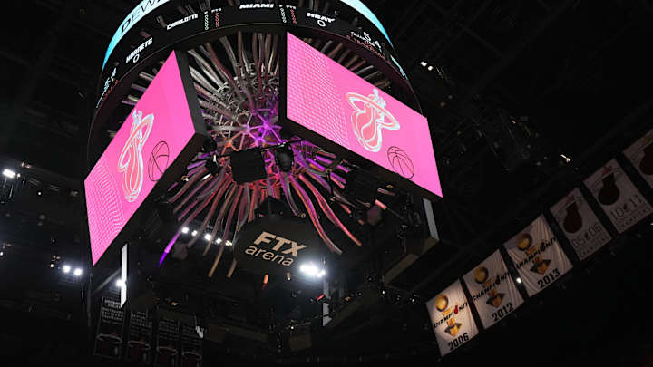
The Miami Heat are a successful organization that has one of the most creative and memorable logos in the league.
But that didn’t stop one NBA fan from finding its flaws.
The social media user, NBA Paint, is known for hilarious renditions of logos. Instead of their usual critiques, the user compliments Miami’s current emblem and switches to judging their secondary ‘MH’ icon.
They explain the secondary logo as follows: "it’s just two letters with a pony tail, pony tails are NOT spooky, isn’t hot at all, mhhh not a great logo."
The user begins their version of the logo which contains an oven set to 305 degree Fahrenheit with human characteristics holding the recognizable flaming basketball.
Miami Heat logo redesign. Which team should I do next?? pic.twitter.com/UcEPpyEosn
— nba paint (@nba_paint) August 29, 2023
The description of this newfound emblem explains:
- bball is the right color,
- ball is on fire,
- fire = spooky, but also cool,
- other teams wont be able to handle the ball bc too hot,
- 305 fahrenheit is hot! I think i spelled that right,
- 305 = miami. hot!
In their 30-year history, the Heat have used two primary logos. The only difference being a change in the main color from orange to red. Although I’m sure the Miami organization doesn't intend on using this updated logo, it’s still quite a creative idea.
MORE HEAT-RELATED STORIES
Watch every Heat buzzer beater. CLICK HERE
Jerry West praises Heat center Bam Adebayo. CLICK HERE
Nikola Jovic may be the best bet to get Damian Lillard. CLICK HERE
Anthony Pasciolla is a contributor to Inside The Heat. He can be reached at anthonypasciolla36@gmail.com or follow him on Tik Tok @anthonysports_

Anthony Pasciolla is a sports journalist who began covering the NBA in June 2023. A Philadelphia native, Anthony has experience covering the Philadelphia 76ers as a credentialed reporter. He has written for Miami Heat, Back In The Day Hoops, Kansas State Wildcats, and Illinois Fighting Illini on Sports Illustrated. His work also includes 76ers coverage for The Sporting News and previous stories for Athlon Sports and BasketballNews. When he’s not covering the NBA, you can find him spending time with friends and family or diving into the world of fantasy football. Follow him on X @AnthonyPasci or reach him via email at ampasciolla@gmail.com
Follow anthonypasci